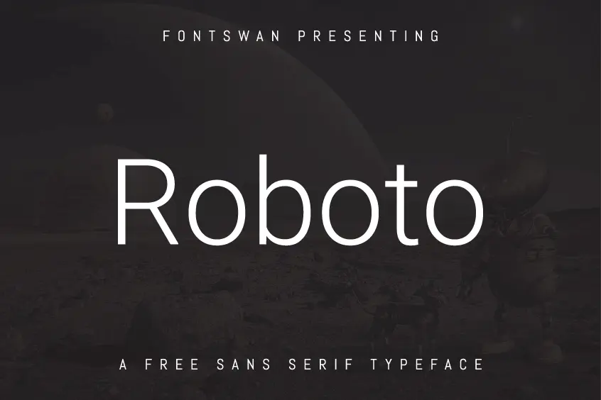
A Typeface for the Digital Age
The Roboto Font, a quintessential example of Antiqua linear sans serif typefaces, exudes a classic grotesque character that sets it apart from its contemporaries. Designed by Christian Robertson under the auspices of Google, Robertson’s previous work includes the notable Ubuntu font “Ubuntu-Titling”. Roboto’s unique aesthetic and user-friendly design makes it an ideal choice for content delivery across various platforms and mediums.
Roboto’s Distinctive Features
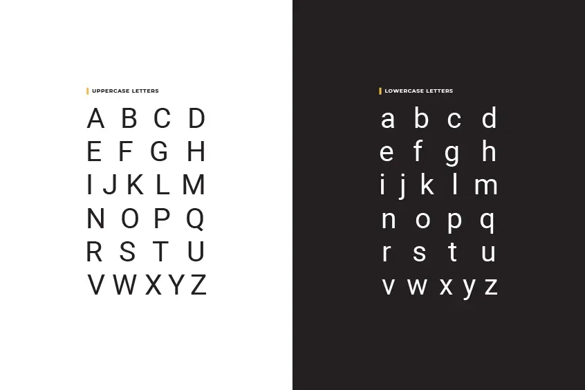
The uniqueness of Roboto Font lies in its striking yet easily recognizable shape. The typeface effectively melds uppercase letters with a slightly weakened quality and lowercase letters that add strength and variety. This intentional design decision breaks the monotony of a uniform structure, thus facilitating effortless readability.
The transition from Droid Sans to Roboto
While Android utilized the Droid Sans font for versions up to 4.0, Roboto Font made its debut with version 4.0. This shift ushered in a new era of visual design, brimming with contemporary flair and modern sensibilities. Matias Duarte, in a statement on Google+, elaborated on the development team’s aspiration to craft a novel typeface that diverged from conventional print fonts. This new font would align with the evolving nature of inter-media interaction and cater to high-density screens like the Galaxy Nexus terminal without compromising on clarity in low-resolution devices.
The Elegance of Roboto
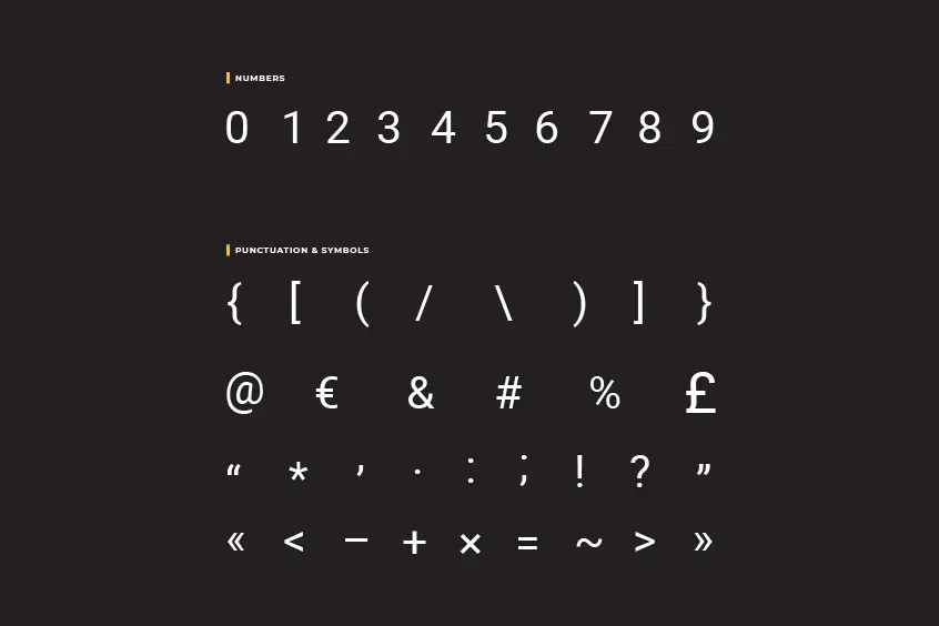
One of the key attributes of the Roboto font is the subtle distinction between its bold and normal states. This nuanced difference enables users to seamlessly transition between bold and normal fonts while reading emails, for instance. Duarte further emphasized that Roboto also incorporates a flat style, maintaining a consistent width for its numerals.
The Dual Nature of Roboto
Roboto Font possesses a fascinating duality, characterized by a mechanical structure and predominantly geometric shapes, while simultaneously exuding warmth through its friendly, open curves. This ingenious combination creates a natural reading rhythm, embodied in elegant lines that enhance the overall reading experience.
Roboto and Helvetica: A Case of Creative Inspiration?
Upon Roboto’s release, several sources drew comparisons between it and the renowned Helvetica font, with some suggesting that Google sought to recreate Helvetica. While Roboto and Helvetica share certain similarities, Roboto distinguishes itself through a selection of letters with marginally shorter ends.
Roboto Font Family
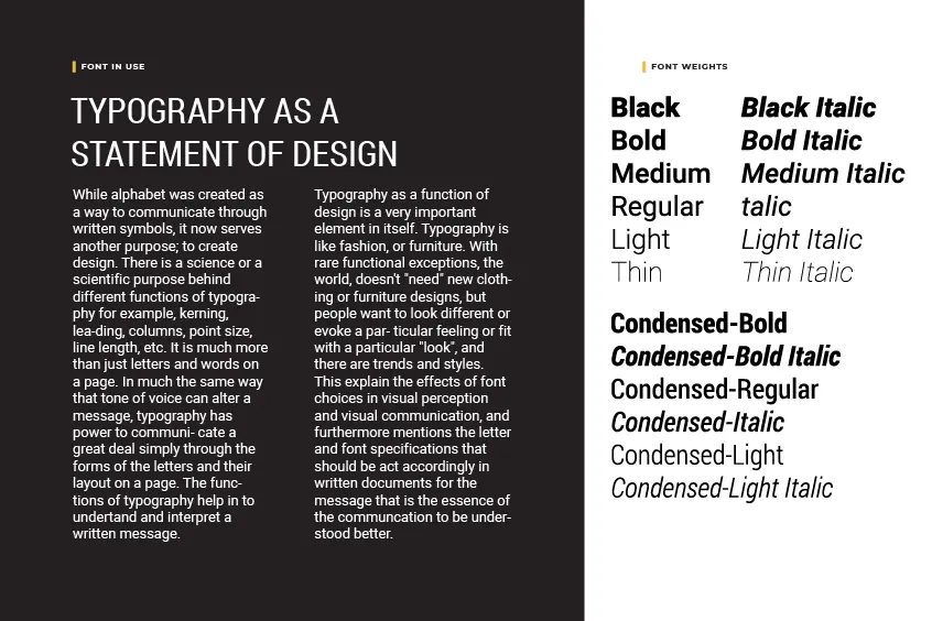
Roboto boasts an extensive array of cuts, comprising six weights – Thin, Light, Regular, Medium, Bold, and Black – and their corresponding italics. Additionally, the font family includes Roboto Condensed style with Light, Regular, and Bold weights, as well as their matching italics. A serif version of Roboto, dubbed “Roboto Slab,” further broadens the scope of this versatile typeface.
Roboto Font License
Since the advent of the Android 4.0 Ice Cream Sandwich, Google has utilized Roboto as its interface font. In recent years, Google made Roboto an open-source font, granting developers free access to use and modify it. Initially developed for use in Android and Chrome OS interfaces to align with Google’s Material Design philosophy, Roboto was subsequently made available for public download. However, despite its free accessibility, the font remained exclusive until its open-source release.
Roboto Font Pairing
Roboto is a highly versatile sans-serif typeface that boasts a plethora of design applications. In order to attain a seamless and cohesive visual aesthetic, it is recommended to combine Roboto with a diverse range of complementary fonts. Some of the recommended font pairings with Roboto include Archivo, Spectral, Roboto Slab, Lato, Playfair Display, Montserrat, Encode Sans, and Open Sans. By thoughtfully selecting and skillfully blending these fonts, designers can elevate their compositions and effectively communicate their message to their intended audience.
Roboto Font Alternatives
In the realm of design projects, there is a multitude of free alternative fonts at your disposal to utilize instead of the ubiquitous Roboto font. We have compiled a list of some highly recommended alternative fonts that you may consider using:
In Conclusion: the Roboto Font, with its unique blend of mechanical structure and friendly curves, has carved a niche for itself in the world of typography.