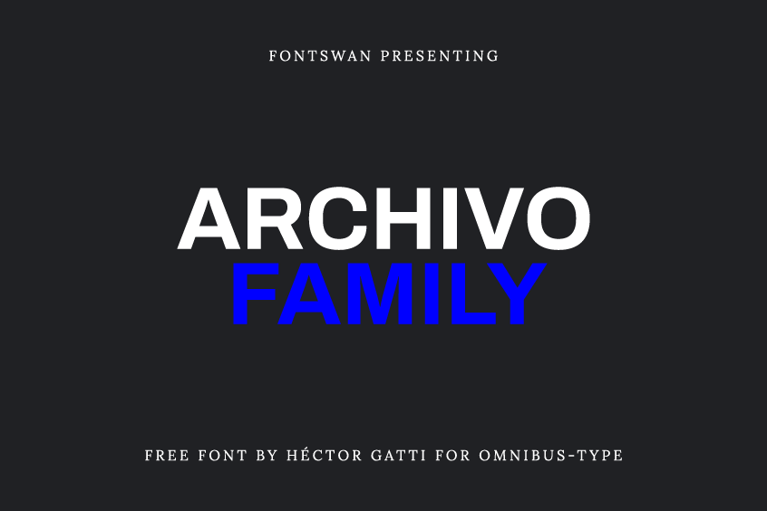
About Archivo Font
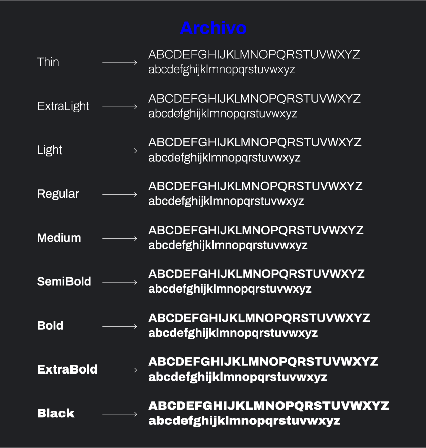
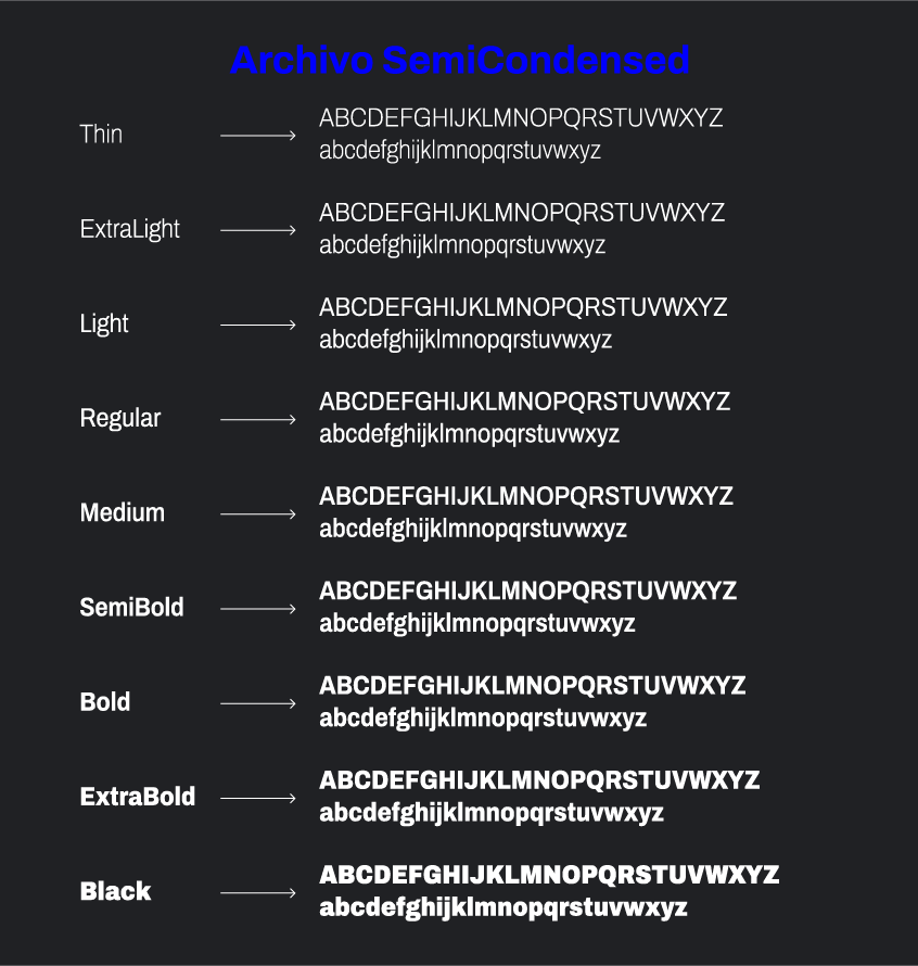
Archivo Font is a versatile and highly functional grotesque sans serif typeface that was derived from Chivo. It is designed to be used in both print and digital platforms. This impressive font family consists of six different styles, each with their own unique width: Normal, Semi-Condensed, Condensed, Extra-Condensed, Semi-Expanded, and Expanded. The font was created by the talented designer Héctor Gatti from Omnibus-Type, with a focus on high-performance typography.
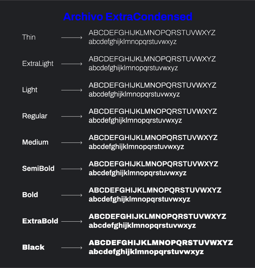
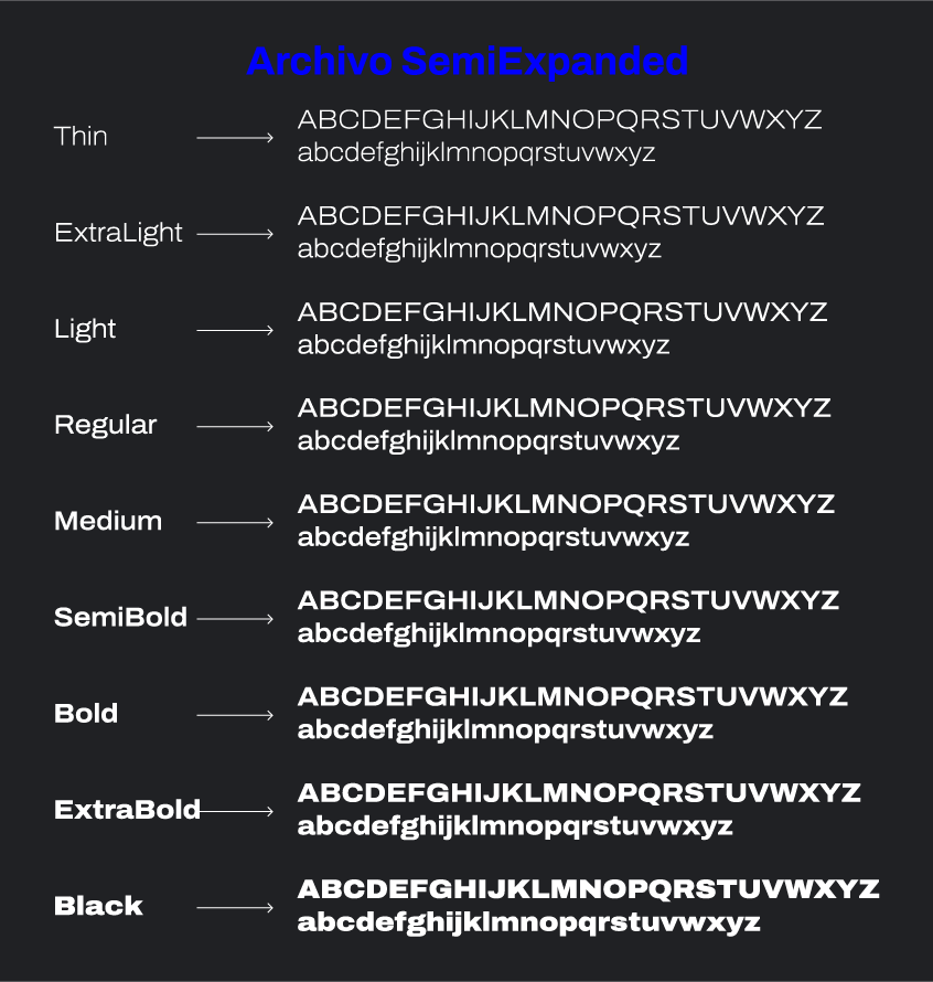
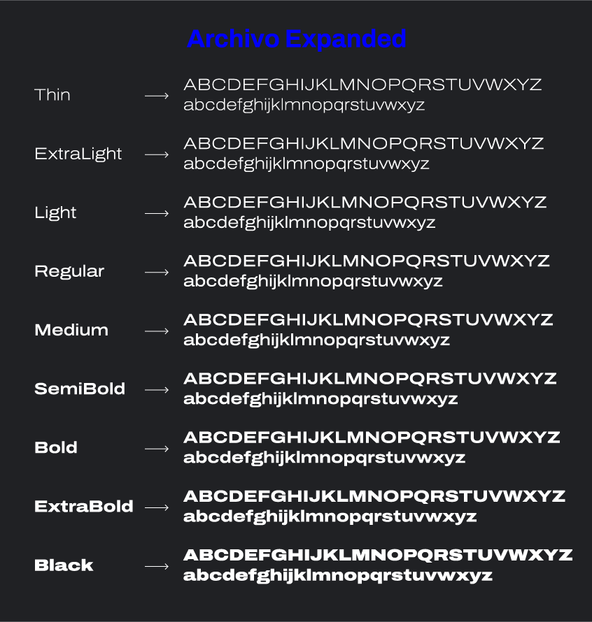
The technical and aesthetic characteristics of the Archivo Font are carefully crafted to deliver exceptional performance in both text and headlines. Originally designed for highlights and headlines, the family boasts a single Black weight and Narrow style and is reminiscent of late 19th-century American typefaces. This font family includes a total of 108 weights, making it an incredibly versatile and useful tool for designers working on a variety of creative projects.
One of the standout features of the Archivo Font is its meticulous neutrality, which makes it a universal weapon in the designer’s arsenal. It is armed with approximately 641 glyphs for each of the 9 weights, along with their corresponding italic characters of each width. Additionally, Archivo Font supports over 200 global languages, ensuring that it is accessible and useful for designers working in diverse regions of the world.
Despite its impressive range of weights and styles, Archivo Font manages to maintain a harmonious and clear look that is perfect for both text and headlines. The font’s nuances help to enhance its clarity, making it an excellent choice for large format prints, body copy, brand identities, social media, advertising, editorial design, posters, magazines, logos, titles, editing, and signages. It works great for larger applications and is incredibly useful for almost any creative design.
Archivo Font Pairing
When considering the selection of a complementary font pairing to enhance the visual aesthetics and cohesiveness of a project that utilizes the Archivo font, various factors must be taken into account. The intended use and overall design of the project are critical determinants in identifying a suitable font pairing.
Numerous font pairings have demonstrated compatibility with Archivo, and among the popular ones are Lora, Open Sans, Poppins, Roboto, and Montserrat. However, it is important to note that the effectiveness of a pairing is dependent on the specific design and implementation of the project.
Therefore, it is advisable to explore a variety of options and experiment with different pairings until a visually appealing and harmonious composition is achieved. By doing so, a well-executed font pairing can significantly enhance the overall quality and impact of a project.
Licensing
Archivo is licensed under the Open Font License, meaning that it can be used in any product or project, whether print or digital, commercial or otherwise. The font is a beautiful example of a well-crafted and versatile typeface that can be used across various mediums and platforms.
Overall, the Archivo Font is a fantastic choice for designers who are looking for a versatile and high-quality font family that delivers exceptional performance in both print and digital platforms. With its meticulous neutrality, a wide range of weights, and support for multiple languages, this font family is a universal tool that should be in every designer’s toolkit.