About Roboto Slab Font
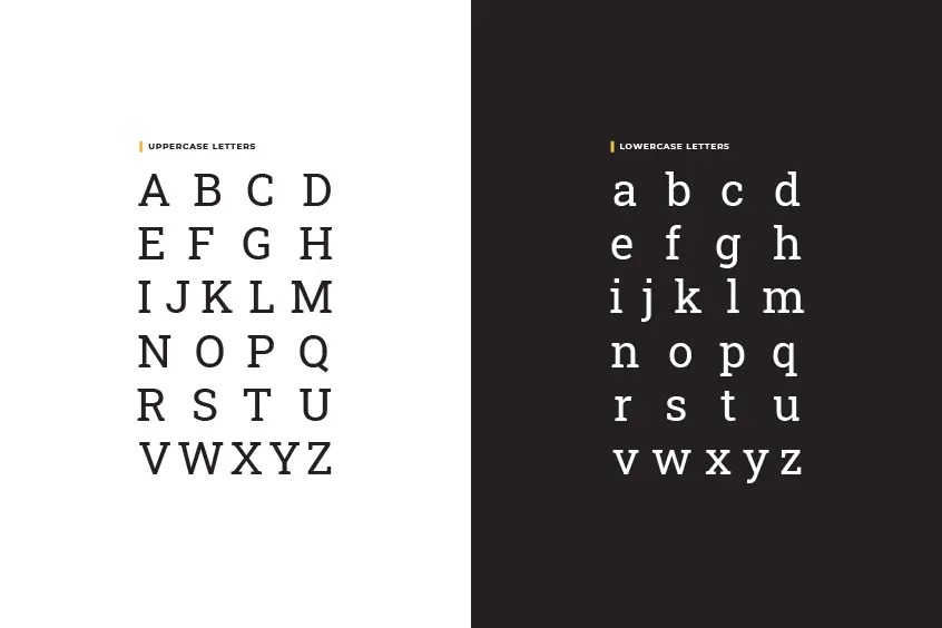
Roboto Slab Font was designed to accompany its unfinished counterpart, Roboto. Roboto Slab is as rough as other Egyptian serifs. It was released in March 2013 by Christian Robertson, based on the Roboto font with added slab serifs. Roboto Slab is a neo-grotesque font meaning elegant, practical, and modern that has a very geometric form.
Robertson created this font for Google that was used as the base font for a note-taking service called Google Keep. It is unknown if Google will use it in more applications or if this new text font will come standard in Android 5.0 (Key Lime Pie).
Including Styles
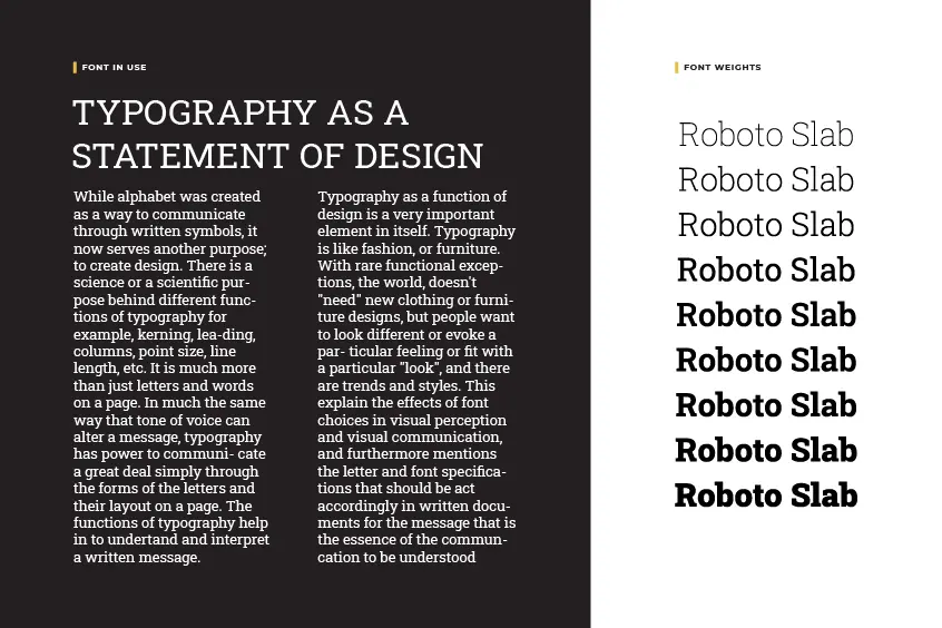
Roboto Slab font was before consisting of four styles (Thin, Light, Regular, and Bold). In 2019 the family adjusted and 5 new weights were added: Extra-Light, Medium, Semi-Bold, Extra-Bold, and Black. Unlike the regular Roboto, there were no italic versions of the typeface released for it.
Best Used For
Like Roboto in its sans serif version, it is an ideal typeface for use in a long text, in which case, it will be printed. Although its combination with Roboto is perfect, it is also highly recommended to pair it with different weights of its family. The “thin” style is too light to be used in paragraph text, but we can use it for specific elements within the same project.