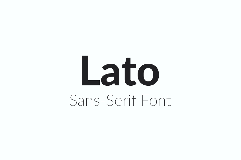
Introduction to Lato Font Family
The Lato Font Family is a free sans-serif typeface that has become popular due to its unique balance of originality and transparency when used in body text. It is characterized by its classical proportions and sleek modern look, which lends it a sense of elegance and contemporary appeal. Lato’s semi-rounded details provide warmth and a friendly atmosphere, while its strong structure ensures stability and seriousness.
The Origins and Creation of Lato
Lato was first conceived in the summer of 2010 by Warsaw-based designer Łukasz Dziedzic when a large bank commissioned him to create a new typeface. The name “Lato” means “Summer” in Polish, reflecting the designer’s intent to create a font that exuded warmth and positivity. However, the bank withdrew from the project, leaving Dziedzic with a complete but unsold typeface. Consequently, Lato was shelved until the winter of 2010.
Release and Reception of Lato Font
In December 2010, Dziedzic decided to release Lato on the internet and made it available for free under the Open Font License on Google Fonts. Initially, the font family consisted of 400 glyphs in 10 styles, providing users with a versatile and accessible typeface for various purposes. Lato’s unique design and approach to balancing form and function quickly garnered attention, and its popularity began to grow.
The Design Principles of Lato Font
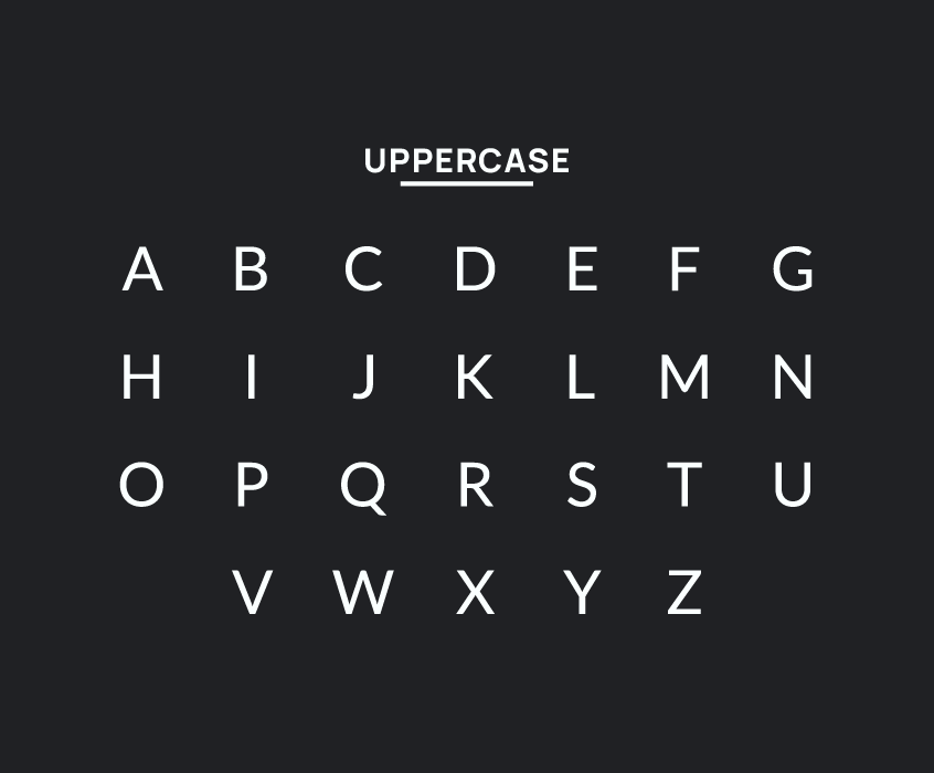
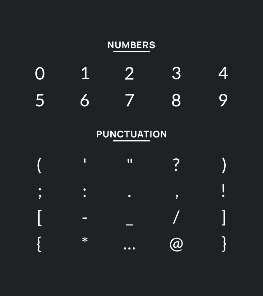
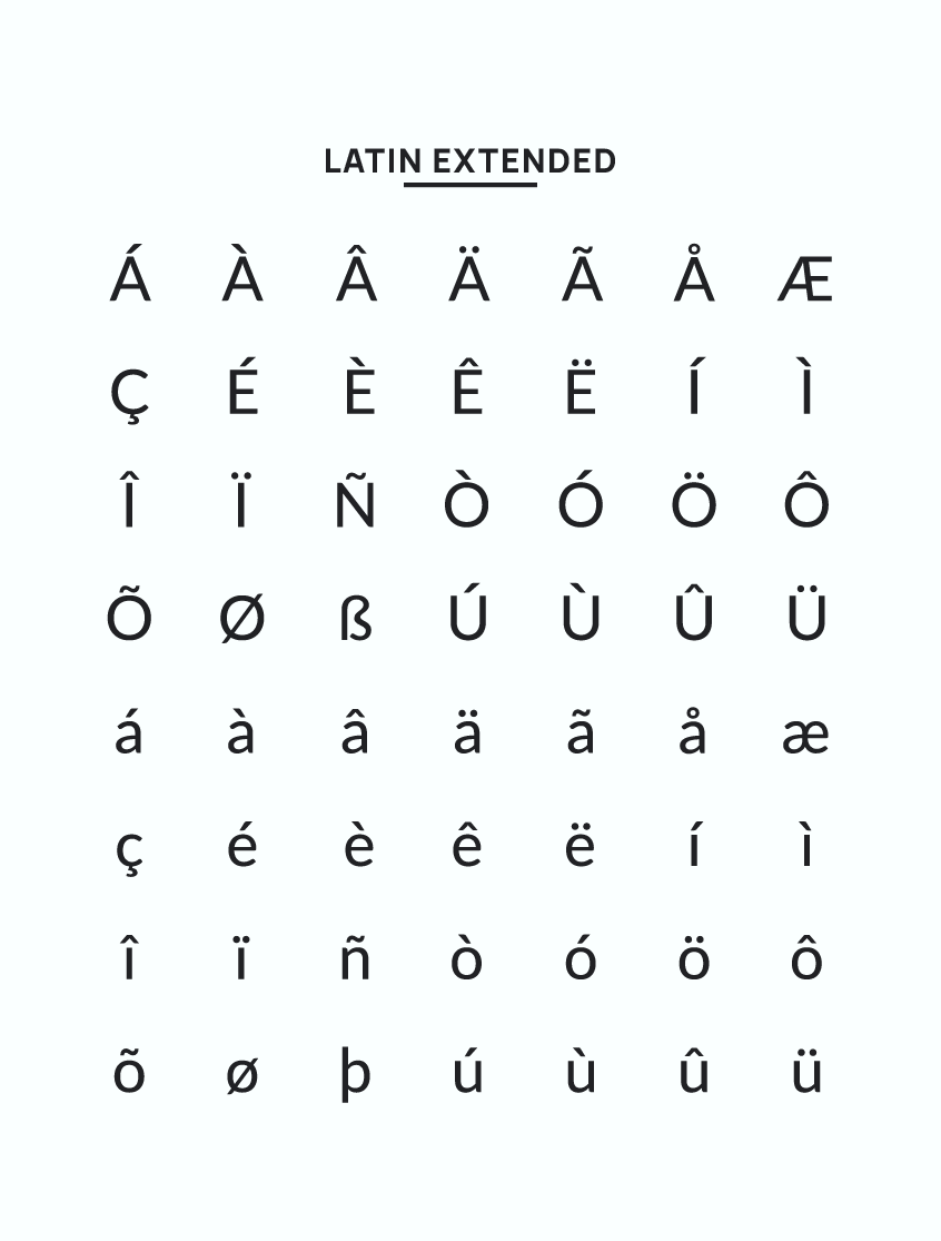
The guiding principle behind Lato’s design was to create a typeface that appeared “transparent” when used in the body text while showcasing its original features when used in larger sizes. Dziedzic employed classical proportions, particularly in uppercase letters, to give the letterforms a familiar harmony and elegance. Over the years, Lato has expanded to include over 4,000 glyphs in 18 styles, supporting Latin, Cyrillic, and Greek alphabets.
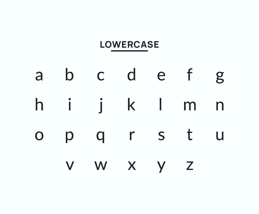
Dziedzic’s design choices resulted in an elegant, two-element sans-serif look. The semi-rounded details of the letters imbue Lato with warmth and gentleness, while its strong structure lends stability and seriousness. Subtle nuances, such as the delicate curves in the letter “t” and the balanced thickness of the lines in the letter “g,” catch the eye and contribute to Lato’s friendly demeanor.
Global Popularity of Lato Font
Lato has experienced significant success, becoming the fifth most popular font globally, according to the Google repository. It has consistently ranked among the top three Google Fonts since 2015, with a notable 23% increase in popularity in 2018. In that year alone, Lato garnered over 426 million views.
Use of Lora Font in Various Sectors
Lato’s widespread appeal has led to its use in various industries and applications worldwide. In addition to being a popular choice for website design, Lato can be found on city lights, information boards, and even in presidential election campaigns, as was the case in the 2015 Polish elections. Lato’s versatile design also makes it a favorite choice for student projects, further solidifying its presence in the design world.
Lato’s Impact on Other Typeface Designs
Lato’s success has inspired the creation of other typefaces, such as Carlito, which is distributed as part of LibreOffice and is metrically compatible with Calibri, the default Microsoft Office font since 2007. Carlito’s design is influenced by Lato’s clean and modern aesthetic, showcasing the lasting impact of Dziedzic’s creation on the world of typography.
Lato Font Weights
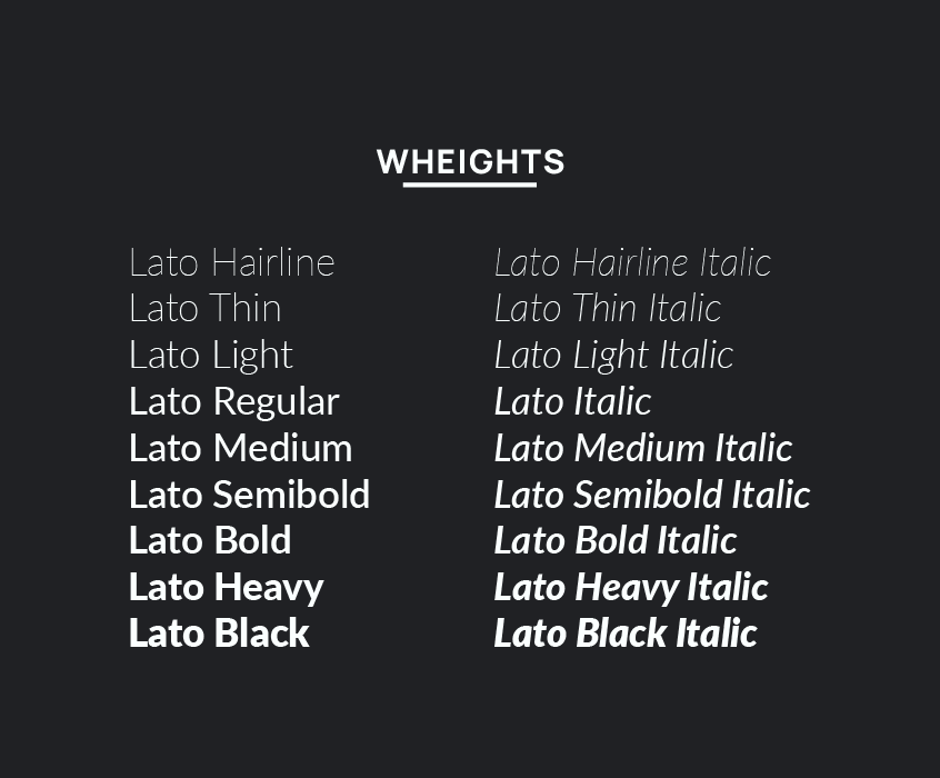
The Lato font offers a diverse range of 18 styles and weights, starting from the delicate Hairline to the robust Black, each accompanied by a matching italic variant. These various Lato weights can be effectively utilized for multiple purposes, such as headlines, subheadings, body text, and captions. The Lato font weights include:
- Lato Hairline
- Lato Hairline Italic
- Lato Thin
- Lato Thin Italic
- Lato Light
- Lato Light Italic
- Lato Regular
- Lato Italic
- Lato Medium
- Lato Medium Italic
- Lato Semibold
- Lato Semibold Italic
- Lato Bold
- Lato Bold Italic
- Lato Heavy
- Lato Heavy Italic
- Lato Black
- Lato Black Italic
Lato Font Pairing
When pairing Lato with other fonts, it’s essential to create a visual hierarchy and maintain readability. Here are some free fonts that pair well with Lato:
- Alegreya
- Raleway
- Wendy One
- Aller
- Fira Sans
- Open Sans
- Lustria
- Yellowtail
Lato Font License
The font Lato is published under the Open Font License by its foundry tyPoland, with backing from Google. As per the license terms, you can utilize Lato for any personal or commercial project, alter it, and distribute it, provided you retain the license file with the font. Additionally, Lato can be employed with your Adobe Fonts account in the same way as any other font from the Adobe Fonts collection. For further details on the potential applications of Lato, please refer to its official website at www.latofonts.com.
Lato Font Download and Install
We are pleased to inform designers that Lato is readily available for download from our website. Upon successful download, the font can be installed on your computer, enabling its use in various software applications, including Microsoft Word, Cricut, Capcut, Photoshop, and Illustrator. For a comprehensive guide on downloading and installing the Lato Font, kindly refer to the tutorial provided at the following link: https://fontswan.com/how-to-install-fonts-on-pc-windows-and-mac/
Using Lato Font in Design Projects
Here are several examples of incorporating Lato font in design projects:
- A refined and minimalist logo for an upscale hotel, employing Lato Black in white against a dark backdrop, accompanied by a straightforward geometric symbol as an emblem.
- A vibrant and whimsical poster for a children’s festival, featuring Lato Bold in various colors and dimensions, complemented by illustrations of animals and balloons.
- A polished and contemporary website for a technology firm, utilizing Lato Light and Regular in shades of gray and blue, enriched with icons and graphs to display their products and services.
- An elegant and sophisticated magazine cover for a fashion-oriented publication, using Lato Heavy in black on a white background, accentuated by a captivating photo of a model and an engaging headline.
- A welcoming and enticing brochure for a travel agency, incorporating Lato Regular and Italic in brown and orange hues, adorned with images of exotic locations and testimonials from satisfied clients.
Conclusion
In conclusion, Lato is a widely favored and adaptable typeface suitable for an array of design endeavors. Its design is both contemporary and uncluttered, exuding a warm and approachable ambiance. Lato offers support for numerous weights and styles and can be harmoniously combined with various fonts and color schemes. As a free and open-source typeface, Lato is both accessible and user-friendly. Employing Lato in your designs can effectively elevate their visual appeal and distinguishability.