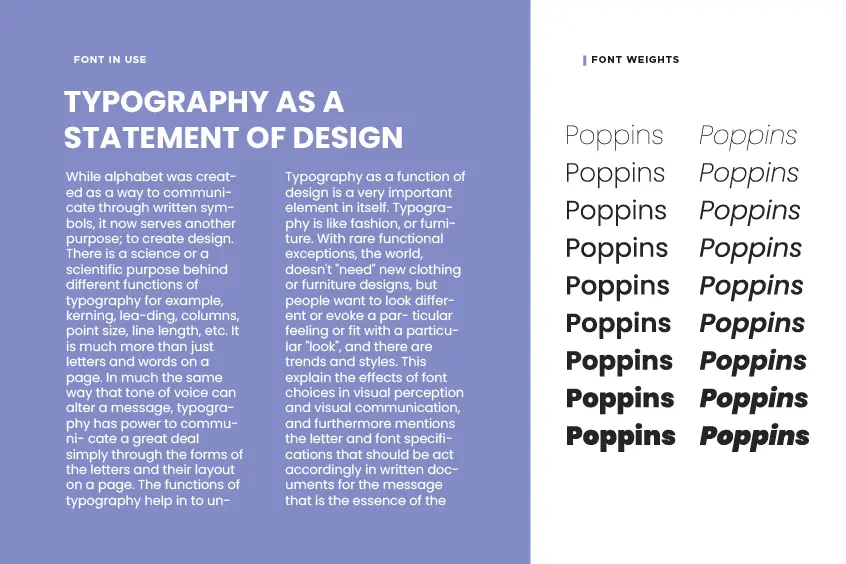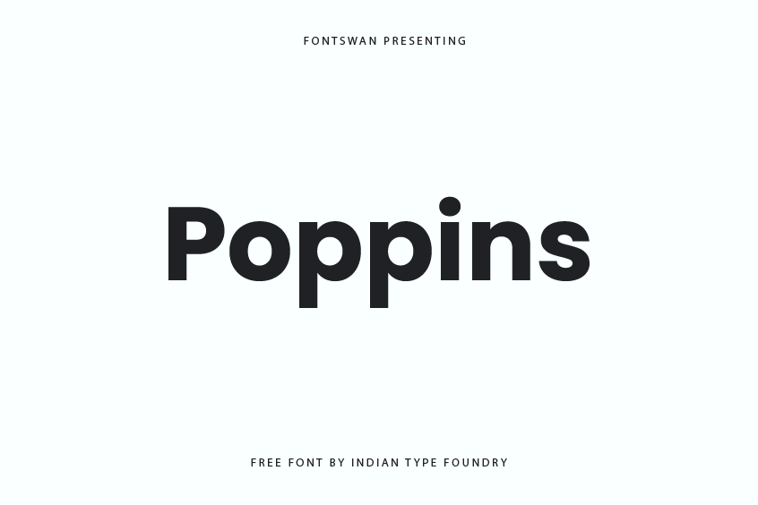
Poppins Font is one you should definitely check out. It’s a sans-serif font family with a whopping nine different weights—from the super-thin “Thin” to the bold and attention-grabbing “Black.” So, whether you’re designing something light and airy or something that needs to stand out, Poppins has you covered.
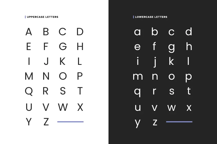
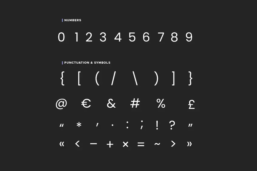
What makes Poppins special? Well, first off, each font in the family comes with a huge set of 1,060 glyphs. That’s pretty impressive, right? Plus, it’s one of the first fonts to bring a monolinear style to the Devanagari script (which is a big deal if you’re working with Indian or Nepali languages).
Poppins is actually a combination of two scripts. The Devanagari script was designed by Ninad Kale, while the Latin script was crafted by Jonny Pinhorn. They really knocked it out of the park, blending these two scripts seamlessly. Since it first came out in 2014, thanks to the Indian Type Foundry, Poppins has taken off, showing up on more than 3.2 million websites and digital projects worldwide. That’s a lot of love!
What’s So Great About Poppins?
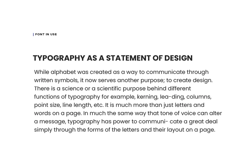
Poppins is what you’d call a Geometric Sans Serif typeface. Basically, it’s got these clean, nearly uniform shapes that make everything look super neat. The Latin letters in Poppins have a high x-height (that’s fancy talk for the height of the lowercase letters), which helps make the text really easy to read, especially on screens.
The Devanagari script used in Poppins is a beautiful, complex alphabet used by over 120 languages in India and Nepal. It’s usually written from left to right and has these lovely, circular shapes. Poppins does a great job of keeping that geometric style consistent across both Devanagari and Latin scripts, making it look balanced and cohesive no matter what language you’re working with.
Another cool thing is that in Poppins, the height of the Devanagari characters matches the height of the Latin ascenders (like the top of a lowercase ‘b’ or ‘d’). This makes the whole font family look really unified, even when you mix the two scripts together.
Poppins Font License
Now, here’s some good news if you’re thinking about using Poppins font for your projects: it’s licensed under the Open Font License. That means you can use it pretty much anywhere—whether it’s for personal projects, professional work, or even commercial use. You can use it in print, on websites, in apps—whatever you need. And it’s all free!
To further support the growth and development of this font, individuals are encouraged to visit the repository hosted on Github at github.com/itfoundry/poppins, where they can contribute and partake in the maintenance and improvement of the font.
Poppins Font Preview