Introduction to Fira Sans Font
Fira Sans font is a humanist sans-serif that has gained popularity among designers and developers for its versatility and legibility. Originally commissioned by Telefónica and Mozilla Corporation during the development of Firefox OS, Fira Sans has evolved into a widely-used font for various applications, thanks to its open-source nature and numerous styles and weights. In this article, we’ll explore the origins of Fira Sans, its design characteristics, and how it has become a go-to choice for many in the design community.
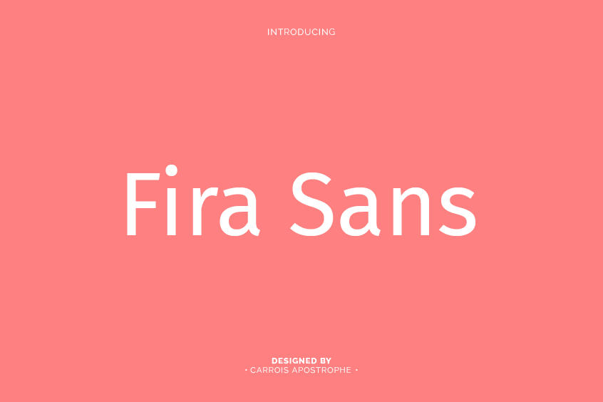
The Designers and Origins of Fira Sans Font
Fira Sans was collaboratively designed by Erik Spiekermann, Ralph du Carrois, Anja Meiners, Botio Nikoltchev of Carrois Type Design, and Patryk Adamczyk of Mozilla Corporation. The typeface was created as a slightly wider and calmer adaptation of Spiekermann’s Meta, which was Mozilla’s brand typeface at the time. The design was optimized for legibility on small screens, making it an excellent choice for digital applications.
The name “Fira” was chosen to convey concepts of fire, light, and joy in a language-agnostic way, reflecting the global nature of the Firefox OS project. This inclusive approach is a cornerstone of Fira Sans’ widespread adoption and appeal.
Evolution of Fira Sans’ Styles and Weights
When Fira Sans was initially released in 2013, it was available in four weights with corresponding italics: light, regular, medium, and bold. In response to the growing demand for more options, the typeface expanded its offering in May 2014 to include 16 different weights. A condensed style was added to the family in 2015, providing even more flexibility for designers.
In addition to its various weights and styles, Fira Sans has a large character set that includes text figures and small caps. The typeface also offers Fira Mono and Fira Code versions to cater to the needs of programmers and developers.
Open-Source Licensing and Accessibility
Fira Sans is licensed under the Open Font License (OFL), which grants users the freedom to use, distribute, and modify the font. This open-source approach has contributed to Fira Sans’ widespread availability and usage, making it an appealing choice for designers and developers alike.
Applications and Use Cases
Fira Sans’ readability, legibility, and versatile design have made it a popular choice for a wide range of projects. Its open-source licensing and extensive range of weights and styles allow it to be utilized in various contexts, from digital applications to print materials. As a result, Fira Sans has become a staple font for many designers and developers.
Fira Sans Font Pairing
Determining the ideal pairing for Fira Sans hinges on a variety of factors, including your project’s unique design objectives and aesthetic inclinations. In light of this, we present you with a carefully curated list of some of the most suitable Fira Sans pairings to consider: Merriweather, Source Serif Pro, Roboto, PT Serif, and Lora.
These recommended typefaces have been meticulously chosen to complement Fira Sans font, and each one offers a distinct and visually compelling design experience. By thoughtfully selecting the right typeface, you can achieve a harmonious and effective design composition that elevates the impact and success of your project.
Conclusion
Fira Sans font stands as an example of the power of collaboration and adaptability in design. The typeface’s global appeal, extensive range of styles and weights, and open-source licensing have made it a popular choice for designers and developers worldwide. Fira Sans continues to be a versatile and reliable font that caters to the needs of various projects, solidifying its position as a go-to typeface for the design community.