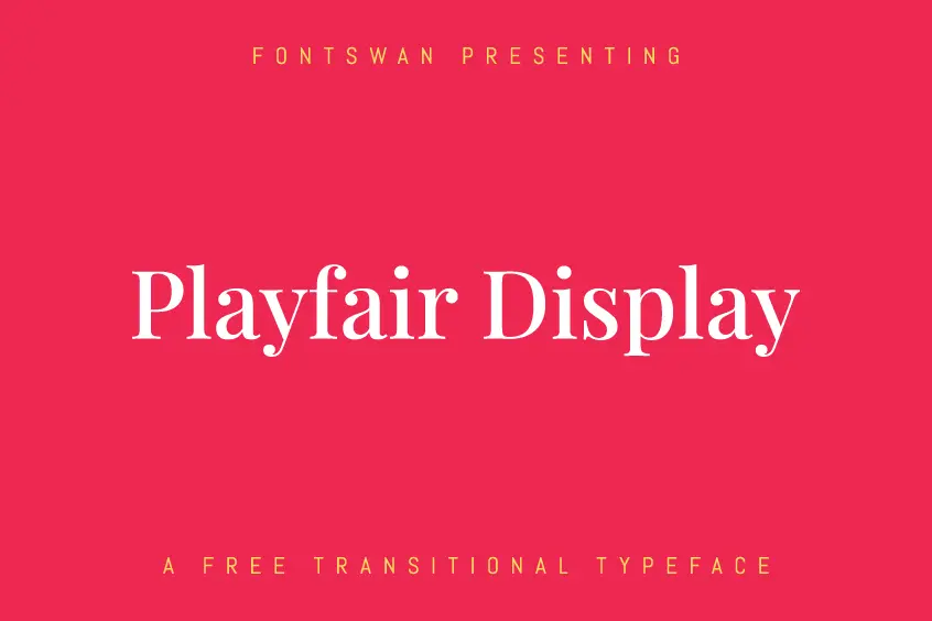
About Playfair Display Font
Playfair Display Font is an elegant and cool typeface, also referred to as Transitional Design. Playfair was designed in 2011 by Danish designer Claus Eggers Sørensen. Playfair Display has the advantage of having extra-large x-heights and short descendants. Although the Playfair Display’s high contrast and hairline strokes make it a perfect typeface for titling and headlines. Stylistically Playfair can accompany Georgia, to be used for the body of the text.
Playfair Display is a modern typeface whose inspiration can be traced back to the late 18th century, particularly in the United States. During this time, the development of pointed steel pens made it possible to replace quill pens with wide nibs. This and the development of printing technology have allowed designers to create letter shapes characterized by the delicate hairline and high contrast. Playfair Display Font was particularly influenced by the design of printer and font designer John Baskerville and the “Scotch Roman” printing era that appeared soon after.
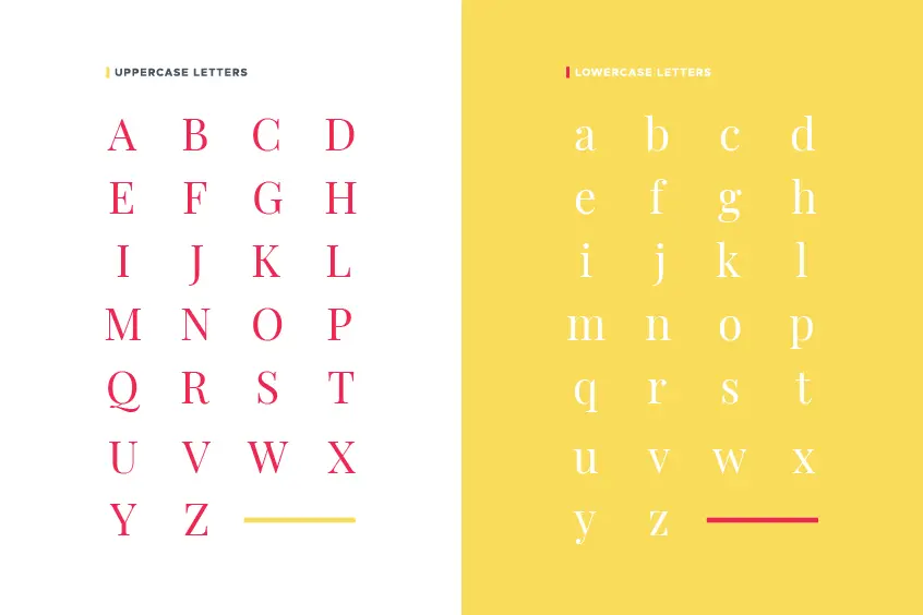
While Playfair Display Font has a large X-HEIGHT and short descendants. It Can be set without prefix if space is tight, for example in news headlines, or for stylistic effect in headlines. The uppercase letters are very short, and they are a little heavier than the lowercase letters. This helps achieve a more even typographical color when writing names and initials.
Languages, such as German, where nouns are written in capital letters, take special advantage of this minimal contrast between lowercase and uppercase glyphs. In German, with many capital words, and in other European languages that use many diacritics, more prefixes are recommended.
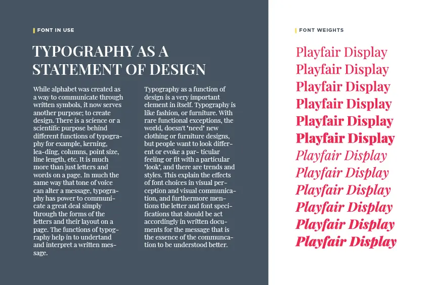
Weights & Styles
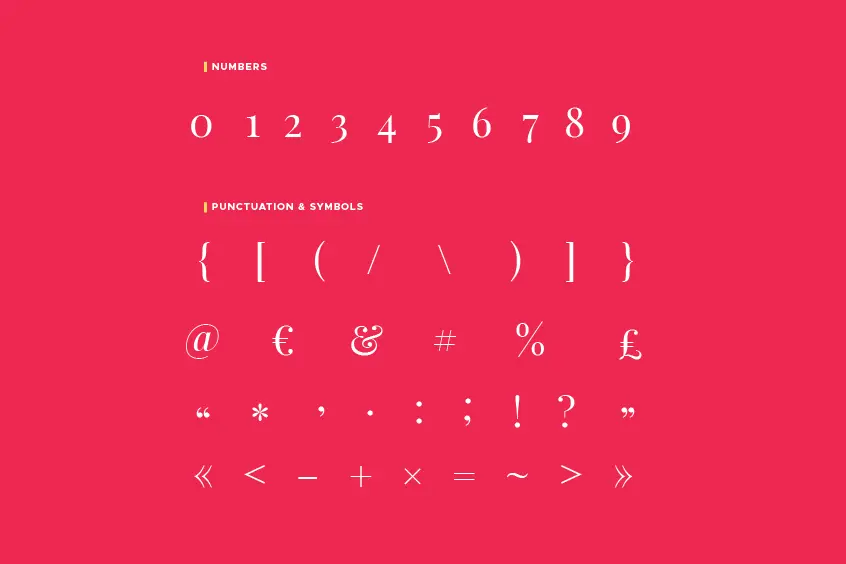
Playfair Display became a variable font in August 2019. It consists of six static weights with two styles, including uppercase, lowercase, standard double characters, and discretionary ligatures for all weights and styles. Regular is the thinnest of the six weights, is best suited for both titling and body copying. As the rendition becomes more extreme in contrast, as seen with the remaining two weights, labeled bold and black, the typeface takes on a lead character, making it more suited to headlines and large copies. The oblique versions exemplify the same features as their regular counterparts but have more subtle motifs.
Including Styles
- Regular
- Medium
- SemiBold
- Bold
- ExtraBold
- Black
- Italic
- MediumItalic
- SemiBoldItalic
- BoldItalic
- ExtraBoldItalic
- BlackItalic
Licensing
Playfair Display Font is published under Open Font License 1.1, which is free to use. Additionally, the font family may be extended or modified if required. Playfair Display is free to download from our website.
Playfair Display Font Pairing
Playfair Display goes well with the following fonts: