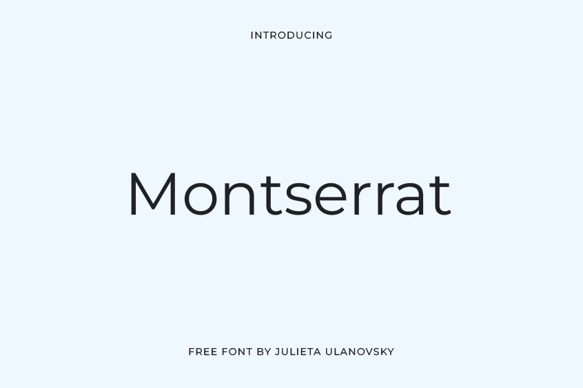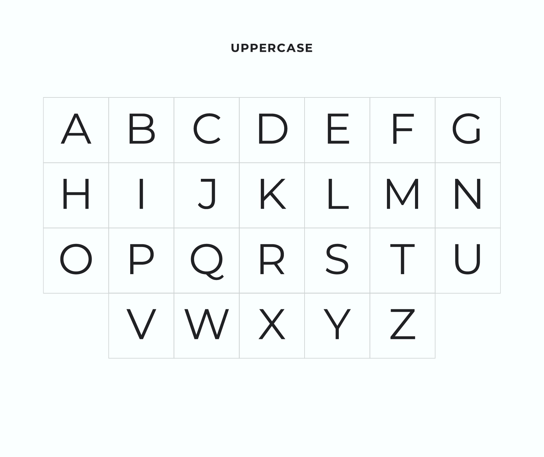
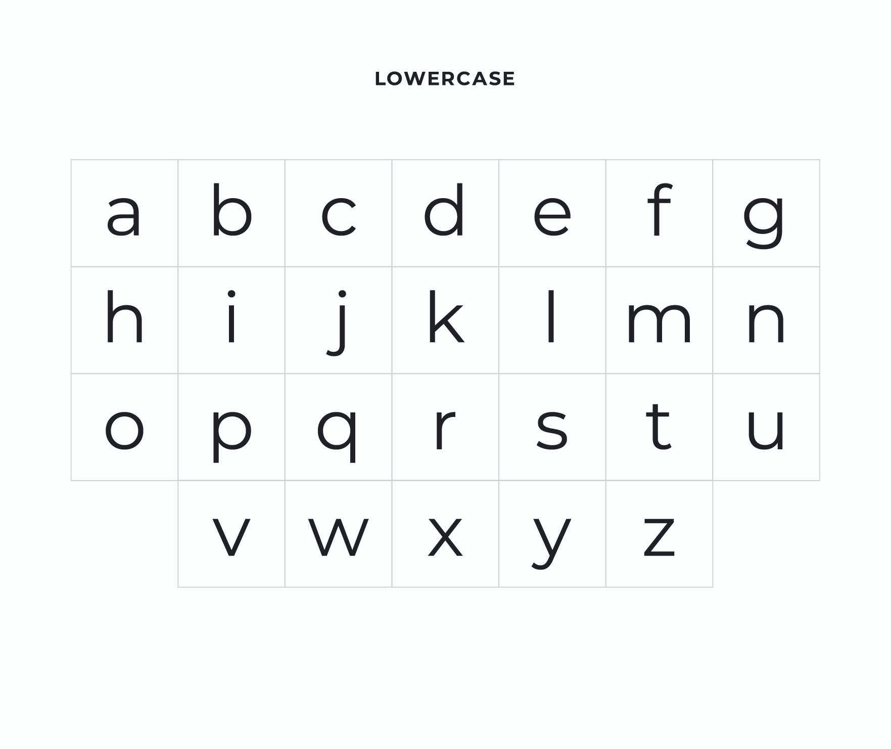
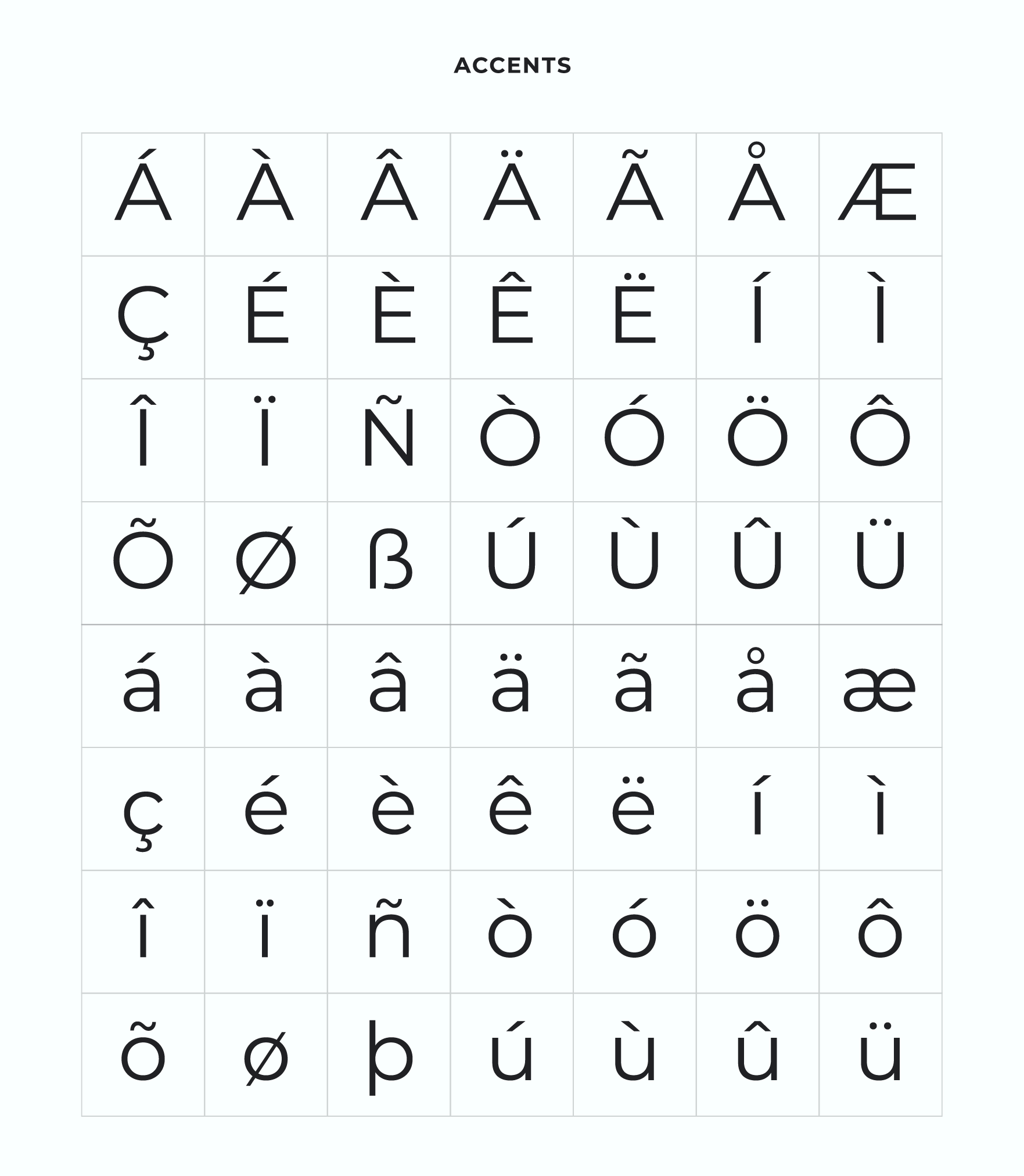
Introducing the Montserrat Font
Montserrat font is a classic sans serif typeface that embodies the essence of traditional neighborhood marquees, posters, and illuminated signs from Buenos Aires. It was introduced in 2011 and received an update in 2012, featuring highly geometric and legible characters that are favored by designers both domestically and internationally.
As an open-source font, Montserrat has gained widespread popularity and can often be seen in contemporary website designs. Its elegant, stable, and commercially driven aesthetic is what sets it apart from other font styles, offering a compelling alternative to the premium font Gotham.
The Montserrat font serves as a tribute to the urban typefaces from the early 20th century, as the original aesthetic of the neighborhood from which it was inspired is lost due to the constant changes of urban development. Julieta Ulanovsky, the creator of Montserrat, saw the need to preserve the beauty and unique characteristics of these designs before they were lost forever.
The process of creating Montserrat involved studying and drawing inspiration from letters found in urban spaces. Each letter was unique in size and variants, contributing to the diverse family of Montserrat. This font is a documentation of the past, as Ulanovsky emphasizes the irreplaceable loss of such designs when they are replaced by modern development.
Despite its focus on preserving the past, Montserrat also incorporates functional and contemporary aspects of typographic design. The result is a geometric sans-serif family with versatile applications in both the publishing and corporate industries.
As a sans-serif font, Montserrat is characterized by its geometric style and legible characters, making it ideal for a wide range of uses. This typeface can be used to showcase the elegance of Argentine wine, showcasing the inspiration behind the creation of the Montserrat font in a visually appealing way.
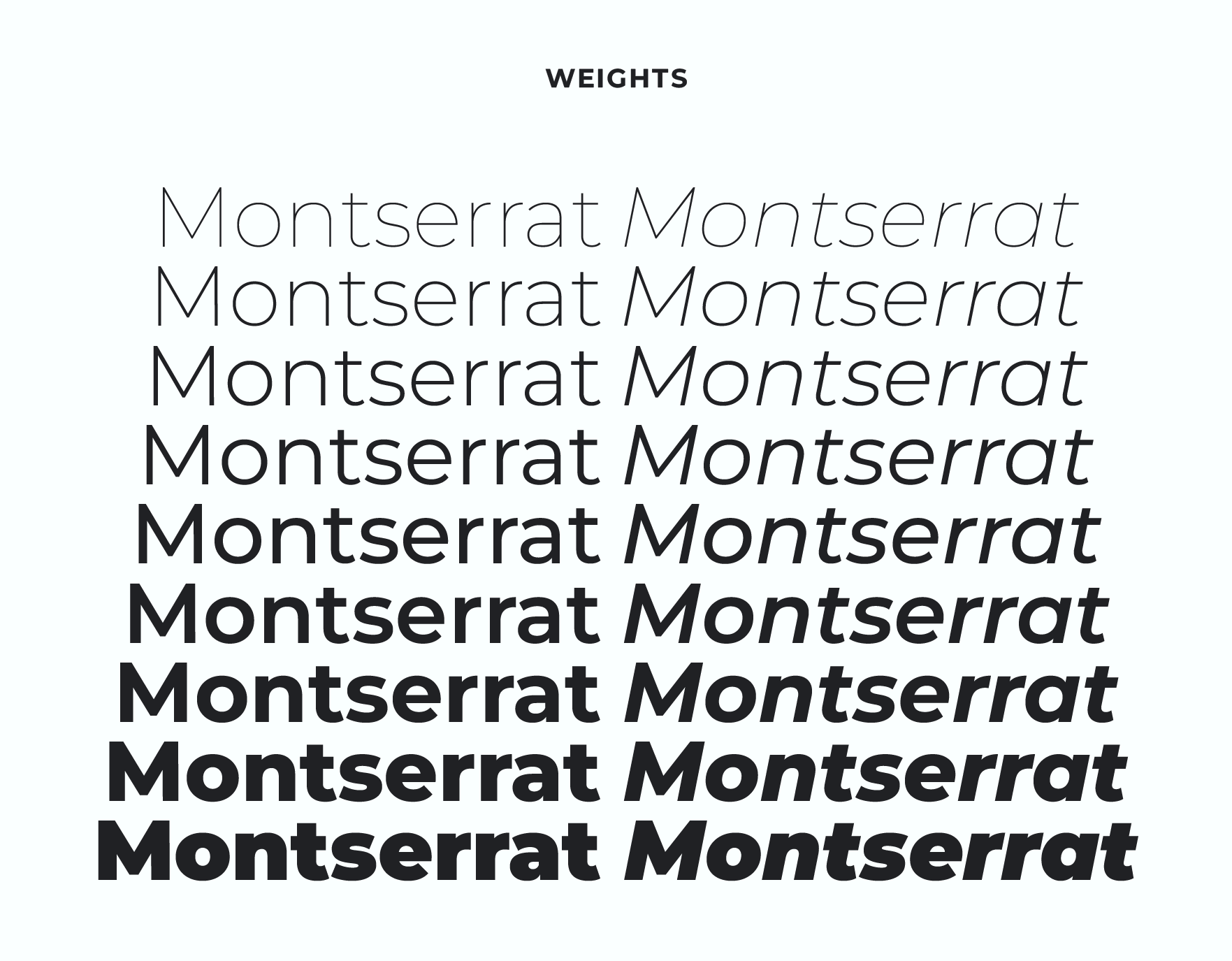
The Montserrat font family underwent several crucial updates in the year 2017. The talented graphic artist, Jacques Le Bailly, redrew the family, giving it a fresh and modern touch. Additionally, the full set of weights was meticulously fine-tuned, with a particular focus on making the Regular weight lighter, thereby making it more suitable for use in longer texts.
Later in the year, a team of experts was assembled to bring Cyrillic support to Montserrat. This team was led by Julieta Ulanovsky and consisted of talented individuals such as Sol Matas and Juan Pablo del Peral. During the development process, the team consulted with other industry leaders such as Carolina Giovagnoli, Maria Doreuli, and Alexei Vanyashin to ensure the highest level of quality.
The Montserrat project continues to thrive and evolve under the guidance of Julieta Ulanovsky. Those interested in contributing to this exciting project can visit the official GitHub repository at github.com/JulietaUla/Montserrat.
Who is Julieta Ulanovsky?
Julieta Ulanovsky is a highly accomplished graphic designer and the proprietor of ZkySky, a design studio founded in 1989. She holds a degree in Type Design, and her work is centered in the historic Montserrat neighborhood of Buenos Aires.
As a respected member of her field, Julieta is known to admire several renowned typographers, including Harald Geisler, Juan Pablo del Peral, and Alejandro Paul. Her current creative pursuits are focused on expanding the scope of Montserrat by developing various new variants of the typeface.
Montserrat Font Families
The Montserrat typeface is comprised of two subsidiary font families, namely the Montserrat Alternates and the Montserrat Subrayada. The Montserrat Alternate boasts a distinctive set of letterforms, while the Montserrat Subrayada, which translates to “underlined” in Spanish, showcases a unique style of underlining integrated into the letterforms originating from the Montserrat neighborhood. These 38 Montserrat fonts offer boundless creative potential for designers and users alike.
Optimal Utilization of Montserrat Typeface
Montserrat is a versatile and aesthetically pleasing geometric sans-serif font, ideal for both editorial and digital applications. Its unassuming and modern design resonates with contemporary audiences, lending itself to a broad range of design projects.
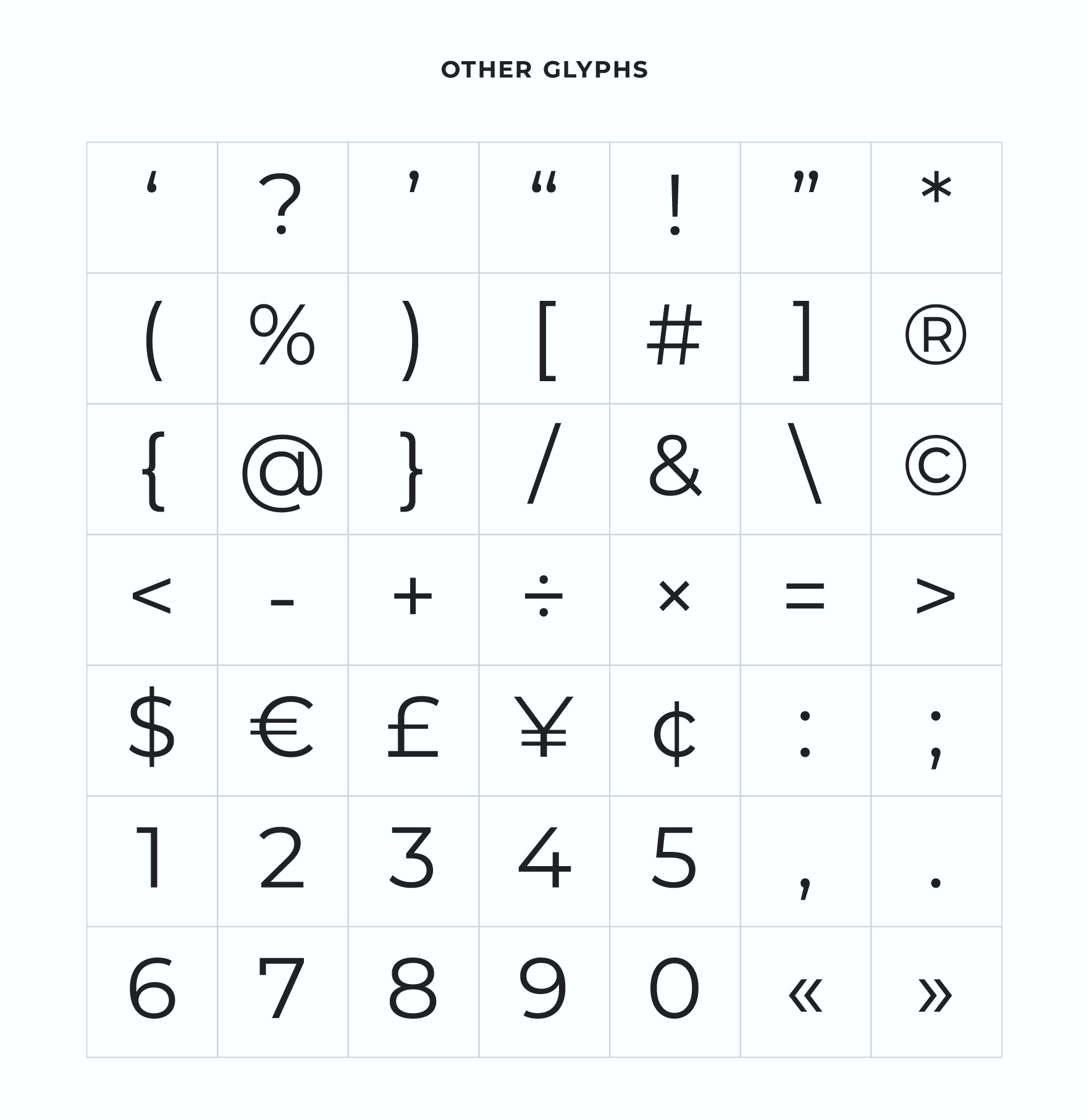
With its rounded forms and square terminal shapes, Montserrat proves particularly well-suited for web and user interface design. Despite its efficacy in running text, its lack of serifs makes it unsuitable for typesetting book-length works. A standout feature of Montserrat is the proportionality of its capital letters relative to its lowercase letters, as well as its geometric simplicity in letterforms.
Montserrat Font Pairing
When combining the typeface Montserrat with others, it is imperative to reflect upon the visual and sensory effect you aspire to generate. To assist you in your selection, we have listed a few prevalent font pairings that go well with the Montserrat font:
- Open Sans, an attractive and approachable sans-serif font, perfectly complements Montserrat’s geometric form.
- Lora, a traditional serif font with soft, calligraphic curves, creates a harmonious balance with Montserrat’s clean lines.
- Bodoni, a classic serif font with a sharp contrast between thick and thin strokes, provides a sophisticated and elegant contrast to Montserrat’s modern aesthetic.
- Bebas Neue, a sans-serif font with a strong, square structure, adds boldness and minimalism to Montserrat’s character.
- Roboto Slab, a sans-serif font with distinct serif-like qualities, offers a modern twist on traditional serif font pairings with Montserrat.
- Raleway, a versatile sans-serif font with multiple weights and styles, provides flexibility and versatility in your Montserrat font pairing.
- Lato, a sans-serif font with a rounded structure and subtle variations in stroke weight, creates a warm and approachable contrast to Montserrat’s geometric form.
- Oswald, a sans-serif font with a condensed structure and sharp terminal strokes, provides a distinctive and impactful contrast to Montserrat’s structure.
Please note that these are just a few recommendations, and there exist numerous other possibilities to ponder. Ultimately, the optimal font pairing is the one that meets your visual objectives most effectively.
Montserrat Font Free Download License
Montserrat font is available for download and use under the SIL Open Font License (OFL), which is a free, libre, and open-source license that allows anyone to use, modify, and distribute the font.
