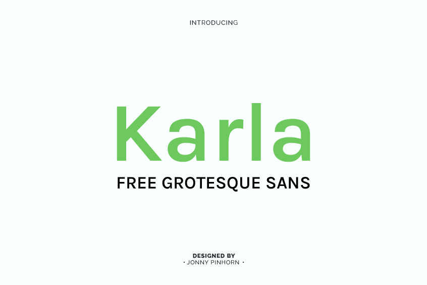
Introducing Karla Font
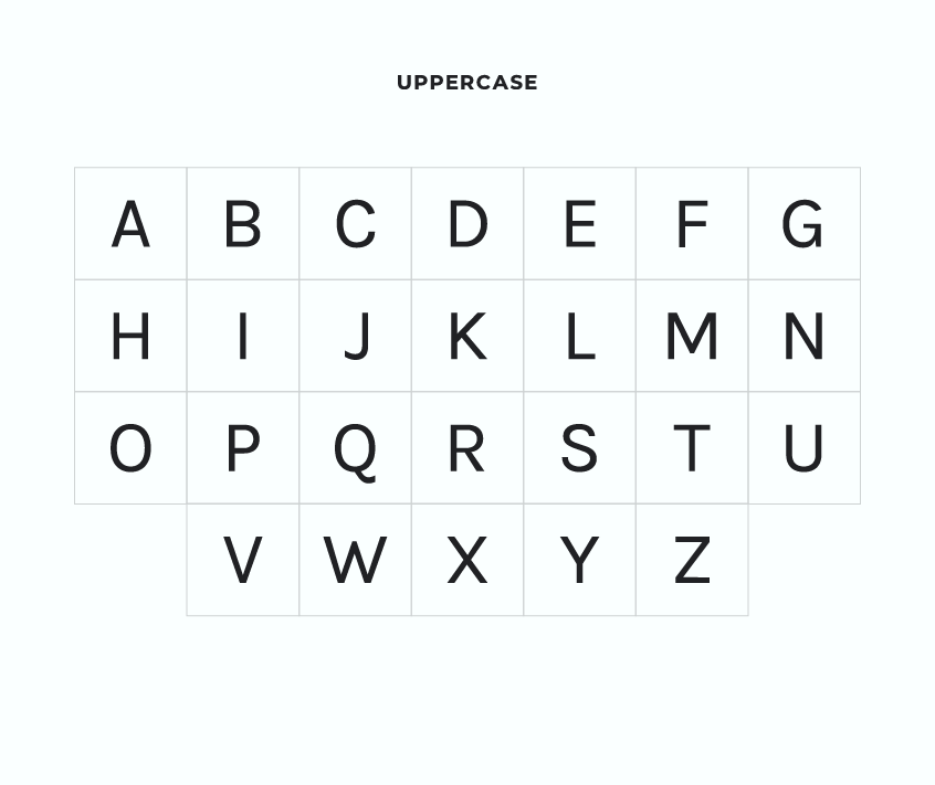
Karla Font, a remarkable typeface, was designed in 2012 by the talented typeface designer Jonny Pinhorn. As a sans-serif typeface, Karla has gained widespread popularity among designers and typographers due to its versatility and high legibility.
This modern font combines a clean, geometric design with subtle humanist touches, giving it an appealing look that can be used in a variety of settings. Its proportions are optimized for legibility both on screen and in print, making it a good choice for use in UI design and digital applications.
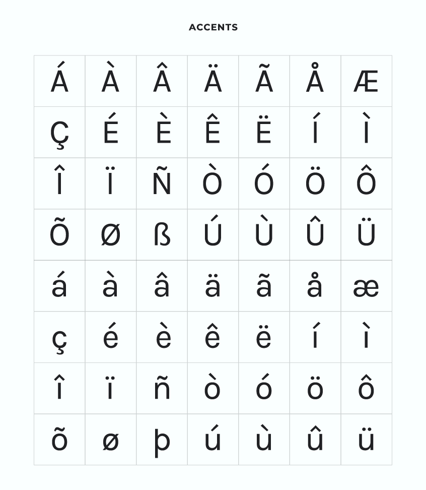
Karla is unique in that it supports both the Latin script and the Tamil script, making it a versatile font for use in a wide range of applications. With a unique blend of simplicity and functionality, Karla has become a go-to choice for both body text and display purposes.
Versatility and Applications
One of the main reasons why Karla Font has become so popular is its versatility. With its clean, geometric design and subtle humanist touches, Karla is an ideal font for use in UI design and digital applications. The typeface is easy to read on screen, making it a great option for designers working on websites, mobile apps, and other digital projects.
Moreover, Karla supports both the Latin script and the Tamil script, giving it even more flexibility when it comes to the types of projects it can be used for. This makes it an excellent choice for designers working on international projects, as it can cater to a wide range of linguistic needs. Its clean design and high legibility make it a go-to choice for both body text and display purposes, making it a valuable asset for designers working on a broad spectrum of projects.
Design Features
At its core, Karla Font embodies a modern and unpretentious design approach. The typeface presents a clean and neutral appearance, with balanced proportions and well-considered kerning. Each character in the font is carefully crafted to ensure maximum readability, making Karla an excellent choice for long-form texts, such as articles, books, and reports.
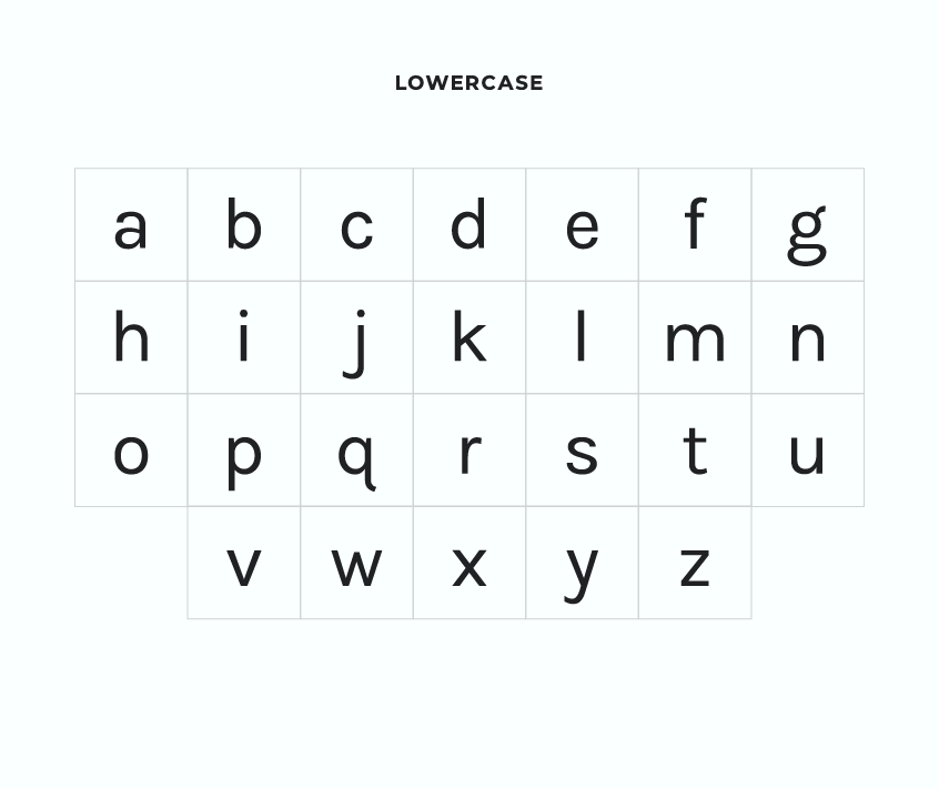
One of the key features of Karla’s letterforms is their slightly condensed shapes. These not only contribute to its distinct look but also help conserve space, making it an ideal font for use in narrow columns and tight layouts. Designers working on projects with limited space will appreciate this feature, as it allows them to fit more text into a smaller area without compromising readability.
The font’s x-height, which refers to the height of lowercase letters, is relatively high. This allows for improved legibility, especially when used in smaller sizes. As a result, Karla is an excellent choice for designers working on projects where small text is necessary, such as footnotes or captions.
Another interesting aspect of Karla’s design is the subtle quirks in some of the characters. For example, the lowercase ‘g’ and ‘k’ have unique shapes that add a touch of personality to the typeface without compromising its readability. These small design elements help set Karla apart from other sans-serif fonts and give it a distinct character that is both charming and functional.
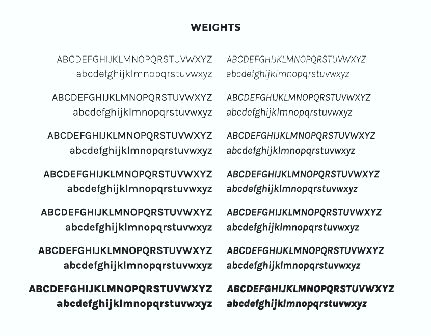
Karla Font Family and Weights
The Karla font family includes seven different weights, giving designers a wide range of options when it comes to choosing the right style for their project. The available weights are:
- Karla Extra Light
- Karla Light
- Karla Regular
- Karla Medium
- Karla Semi Bold
- Karla Bold
- Karla Extra Bold
Each weight is accompanied by its respective italic counterparts, offering users a suitable range of styles for various design applications. This versatility makes Karla an excellent choice for branding, website design, print materials, and more. Designers can easily choose the appropriate weight and style to suit the specific needs of their project, whether it’s creating eye-catching headlines or crafting easily-readable body text.
Having access to a wide range of font weights and styles allows for greater flexibility and creativity in design. For instance, designers can create a visual hierarchy by using different font weights to emphasize certain elements or to distinguish between headings, subheadings, and body text. Additionally, the italic variants of each weight offer a further layer of stylistic options, enabling designers to use Karla Font in a variety of contexts.
Variable Font and Availability
In addition to the standard weights and styles, Karla is also available as a variable font. A variable font is a single font file that contains multiple styles and weights, allowing for seamless transitions between them. This innovative font format offers even more flexibility for designers to fine-tune the font to their specific needs. With the ability to make subtle adjustments to weight, designers can achieve the perfect balance between style and legibility for their projects.
Karla is available for free download and uses, making it accessible to designers working on both personal and commercial projects. Its availability ensures that it can be easily integrated into a wide range of design projects without incurring additional costs. Furthermore, Karla is available through Google Fonts, a popular web font library, making it easy to add to websites and digital applications with just a few lines of code.
The Tamil parts of the font are also available for download from the Early Access page.
Licensing and Contribution
This font is licensed under the Open Font License (OFL), allowing you to use it in your products and projects, whether they are print or digital, commercial or otherwise.
If you’d like to contribute to the development of Karla, you can visit github.com/googlefonts/karla.
Karla Font Pairing
Here are some suggestions for free font pairings with Karla:
Conclusion
In conclusion, Karla Font is a versatile and practical sans-serif typeface that offers users a clean and functional design without sacrificing personality. Its legibility, combined with its understated elegance, makes it a valuable asset for designers and typographers working on a broad spectrum of projects. From UI design and digital applications to print materials and branding, Karla’s adaptability and high-quality design make it a go-to choice for professionals in the field.
With its support for both Latin and Tamil scripts, its range of font weights and styles, and its availability as a variable font, Karla Font truly stands out as a versatile and practical typeface. Its ease of use, availability for free download, and integration with Google Fonts further contribute to its widespread popularity among designers and typographers.
As the world of design continues to evolve, it’s essential for professionals to have access to versatile and functional typefaces like Karla Font. With its unique blend of simplicity, functionality, and personality, Karla Font is sure to remain a popular choice for years to come.