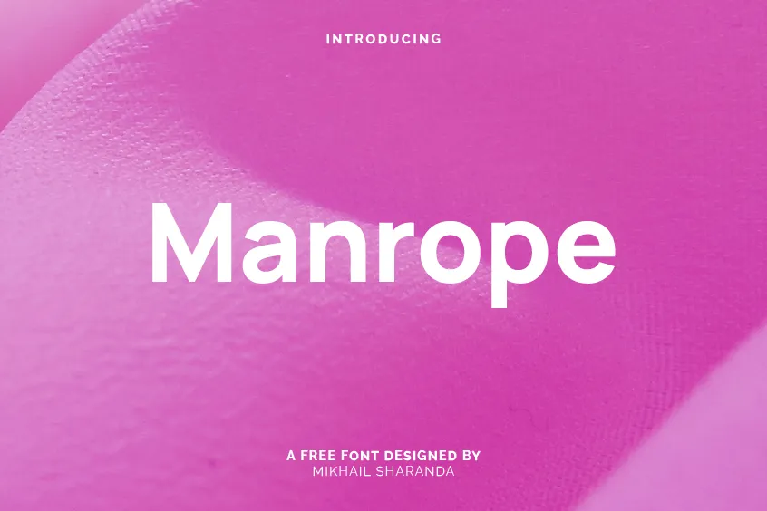
Introduction to Manrope Font
The Manrope font is a contemporary and refined sans-serif typeface that was masterfully designed by Mikhail Sharanda in 2018. Conceived specifically for digital platforms such as websites, apps, and user interface (UI) design, Manrope’s versatile nature lends itself to a variety of other settings as well. This font has garnered a strong reputation for its simplicity and legibility, making it a popular choice for both web and print design projects.
Main Features
Legibility
One of the most distinguishing features of the Manrope font is its exceptional legibility. The font employs a consistent stroke width, which ensures that the text remains easy to read even at smaller sizes. Furthermore, the font’s relatively low contrast between the thick and thin parts of the letters enhances its legibility, ensuring that it remains accessible and appealing to a wide range of audiences.
Versatility
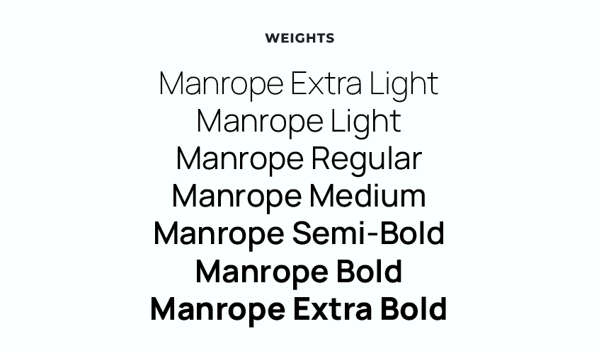
Another notable aspect of the Manrope font is its remarkable versatility. The font is available in multiple weights, ranging from Thin to Extra Bold, making it suitable for an extensive range of applications. These weights include:
- Extra Light
- Light
- Regular
- Medium
- Semi-Bold
- Bold
- Extra Bold
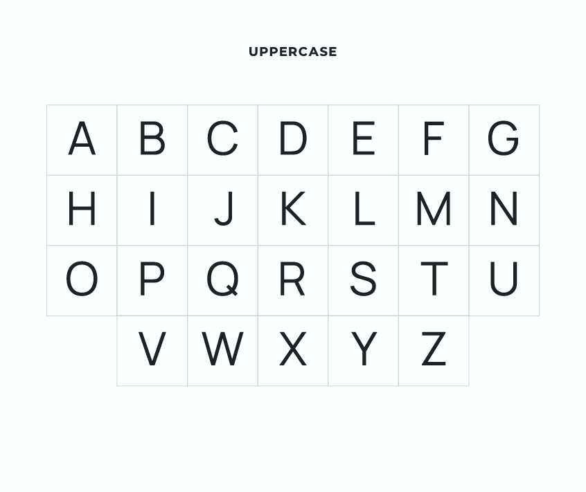
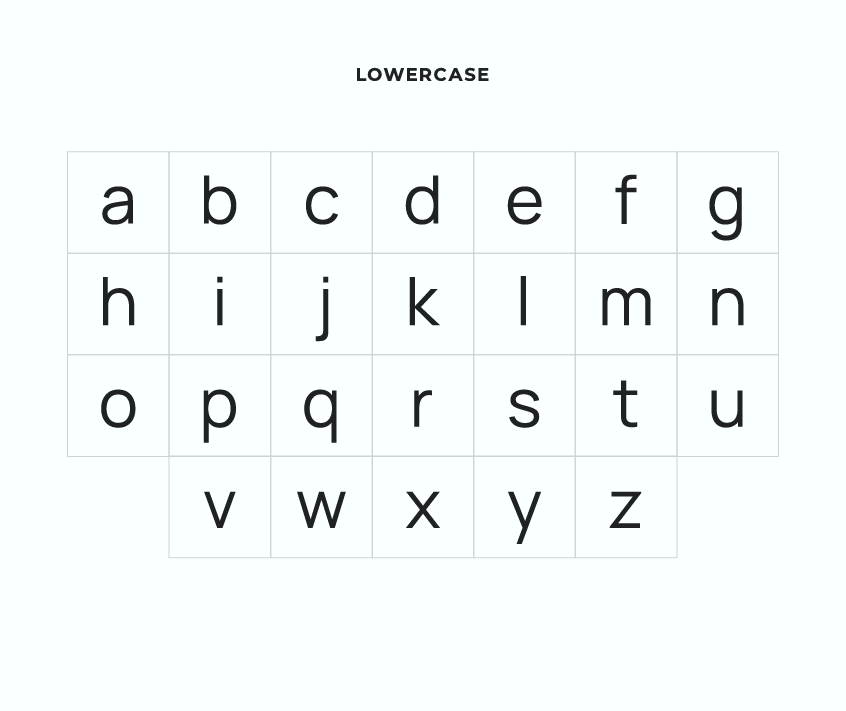
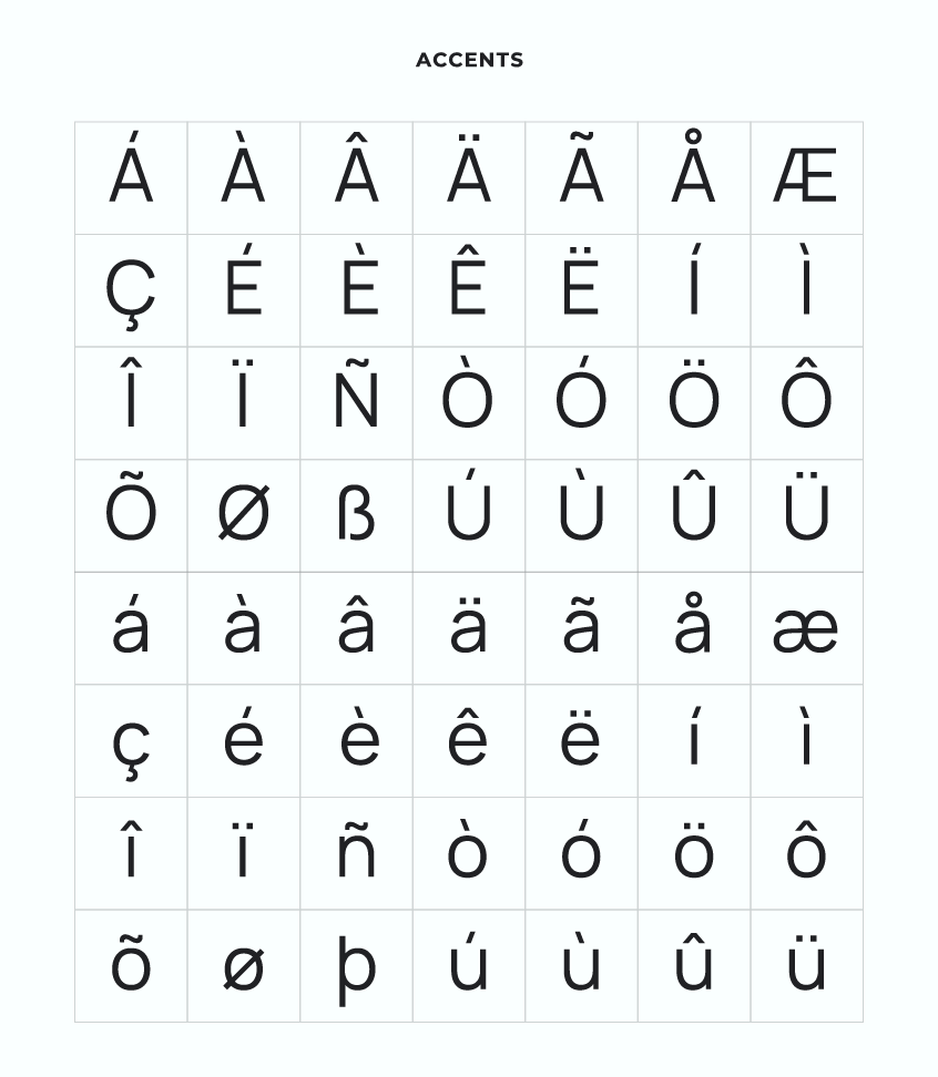
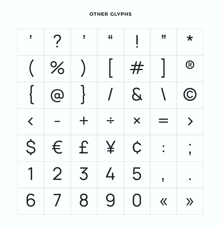
The variety of weights available ensures that designers have ample choices when utilizing the Manrope font for their projects. In addition, the font boasts a comprehensive set of characters, featuring various diacritic marks and special symbols that make it an excellent choice for multilingual text.
Variable Font
According to the Manrope webpage on Google Fonts, the font possesses multiple axes, including weight, width, and optical size. This indicates that Manrope is indeed a variable font, providing designers with an incredible degree of flexibility and customization when incorporating the font into their work.
Style
In terms of style, the Manrope font exudes a modern and minimalist aesthetic. The letters are geometrically straight, boasting rounded edges that imbue the font with a friendly and approachable appearance. Additionally, the font has a slightly condensed design, which not only conserves space when employed in UI designs but also lends the font a contemporary feel.
Crossover Font Types
Manrope is a unique and innovative font that melds various font types, making it a true hybrid. It is semi-condensed, semi-rounded, semi-geometric, semi-din, and semi-grotesque. This combination creates a distinctive appearance that sets it apart from other typefaces. The font utilizes minimal stroke thickness variations and a semi-closed aperture, further emphasizing its hybrid nature.
Fourth Version Features
The fourth version of the Manrope font introduces an exciting development in the form of a Variable Font format. This allows designers to have more control over the appearance of the font, customizing it to their specific needs. Additionally, the fourth version maintains the seven legacy weights, ensuring that users have a plethora of choices when using the font.
Additional Features
Alternative Glyphs for Uppercase Styles
The Manrope font is not only equipped with alternative glyphs for uppercase styles, but it is also context-sensitive. This means that the font automatically changes glyphs while the user is typing, streamlining the design process and enhancing the overall user experience.
Digits Optimized for Interface Design and Numeric Data
Manrope’s digits have been meticulously designed to be perfect for interface design and numeric data, such as phone numbers, card numbers, watch faces, and more. This attention to detail ensures that Manrope is an ideal font choice for projects that require clear and concise numeric representation.
OpenType Feature for Correct Apostrophes
Manrope also utilizes an OpenType feature that sets the correct apostrophe automatically. While some software replaces the standard apostrophe with the typographically correct version according to the context, no internet browser currently performs this task. By incorporating this OpenType feature, Manrope ensures that the appropriate apostrophe is used, maintaining the professional appearance and readability of the text.
Custom Ligatures for Special Symbols and Icons
Manrope’s custom ligatures enable designers to display special symbols and basic icons more easily. These ligatures provide a seamless and visually appealing way to incorporate unique elements into a design, adding an extra level of sophistication to the final product.
License and Usage
Manrope font is free for both personal and commercial use, making it accessible to a wide range of designers and creatives. It is distributed under the SIL Open Font License, Version 1.1, which allows users to use the font without restrictions while ensuring that the designer’s work is protected. The license, accompanied by a FAQ, is available at http://scripts.sil.org/OFL.
Manrope Font Pairing Suggestions
Manrope’s versatility and modern aesthetic make it an excellent font to pair with various other typefaces. The following font pairing suggestions complement Manrope’s design, creating harmonious and visually appealing combinations:
By pairing Manrope with these fonts, designers can create captivating and cohesive designs that effectively convey their intended message.
Conclusion
In summary, Manrope is a versatile and elegant sans-serif font that offers unparalleled legibility and readability, making it an excellent choice for a myriad of design projects. Its clean and modern design, combined with its extensive language support and OpenType features, renders it an ideal choice for branding, packaging, advertising, and digital interfaces.
Manrope’s innovative approach to combining various font types and its exceptional versatility make it a valuable asset for any designer’s toolkit. By incorporating the Manrope font into their projects, designers can rest assured that they are using a high-quality and professional typeface that is not only visually appealing but also highly functional.
With a growing emphasis on digital platforms and user experience, the Manrope font is well-positioned to become an indispensable resource for designers and creatives alike. Its unique combination of style, legibility, and versatility make it a font that truly stands out from the rest, and its continued development and improvement demonstrate a commitment to providing a superior design experience.
As the world of design continues to evolve and embrace new technologies and platforms, the Manrope font is poised to become a mainstay in the industry, offering designers a reliable and adaptable typeface that meets the ever-changing demands of the modern design landscape. With its impressive range of features and its contemporary aesthetic, the Manrope font is sure to remain a popular choice for designers seeking to create impactful and memorable visual experiences.
To contribute, see github.com/sharanda/manrope.
