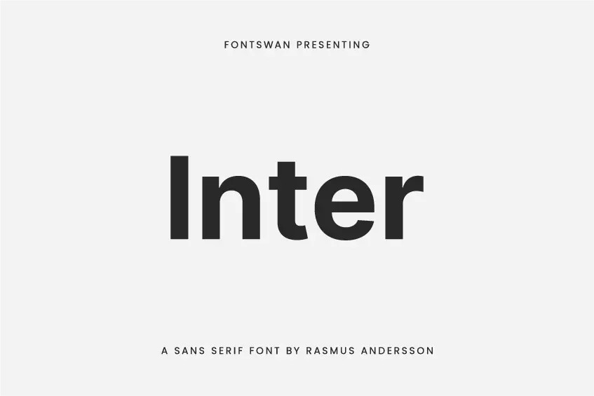
Introducing the Inter Font Family
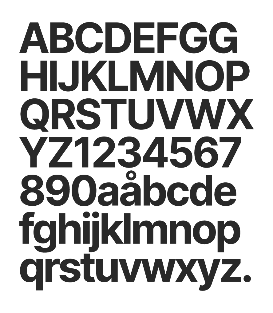
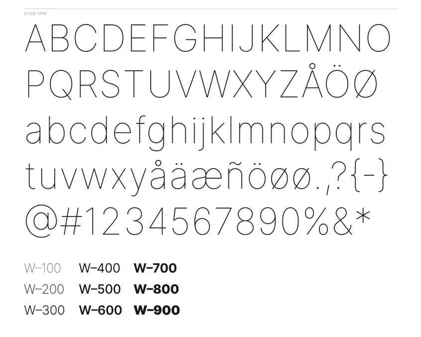
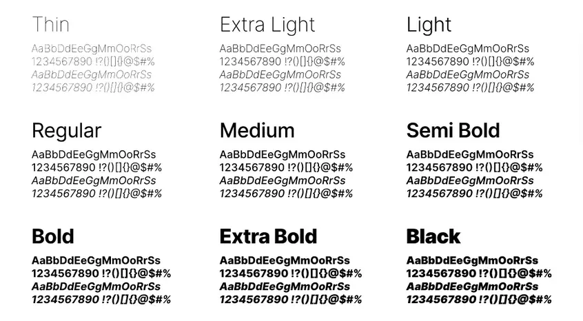
Inter Font is a highly legible and versatile sans-serif typeface designed with the specific needs of user interfaces in mind. Developed by Rasmus Andersson, specifically for small and medium-sized text on computer screens. The font family is comprised of 18 different styles, each with a tall x-height that greatly improves the readability of mixed-case text.
In addition to its high legibility, Inter font also includes a wide range of OpenType features that allow for further customization of the typeface to suit specific needs. These features include contextual alternates, tabular numbers, fractions, case alternates, compositions, ligatures, numerators, denominators, superscripts, subscripts, stylistic sets, and character variants. The typeface also includes a unique slash in zero feature, which helps to distinguish the number 0 from the letter “o” for improved clarity.
With a total of 2548 characters and the ability to combine multiple OpenType features, Inter font offers an unparalleled level of flexibility and design options for any user interface. Whether you’re looking to improve the legibility of your text or add some aesthetic flair, Inter font has everything you need to create a polished and professional look.


Origin and History of the Inter Font
Inter, a font project that began as an experiment in 2016, was created with the goal of building pixel-matched fonts of a specific small size (11px) in order to achieve the highest level of clarity and readability. The project utilized a specific coordinate system and targeted a specific rasterization size, with the belief that this method would result in the best possible font.
However, after testing an early version of Inter, it was discovered that this method had some serious problems in real-world use. The pixel alignment feature of the font resulted in an almost constant-width appearance, making it easy to read numbers, punctuation marks, and very short words, but difficult to read longer texts, causing eye strain.
In light of these issues, the project was restarted with a different approach. The use of a specific UPM (units per em) was maintained, but the way in which the glyphs and kerning were created was altered to allow for more changes in rhythm and smoother vertical and horizontal stems. The Inter font was developed and tested using an internal version of Figma and was gradually improved based on feedback and experience.
On August 20, 2017, Rasmus Andersson, the designer behind Inter, announced the first release of the font, which was originally called “Interface”. The source code was also released under a very permissive license, allowing anyone to use and improve the font for free.
Inter Font Usages Ideas
Inter font is a modern and versatile typeface that can be used in a variety of design projects. Its clean geometric shapes and legible letters make it an ideal choice for website design, where it can be used for both headlines and body text to create a sleek and polished look. Additionally, its aesthetic is well-suited to graphic design, particularly for creating posters, brochures, and other marketing materials that require a clean and minimalistic look.
Inter is also a great choice for user interface design, as its legibility and clarity make it easy to read and navigate. Its aesthetic makes it a perfect fit for mobile app design, particularly apps that focus on simplicity and minimalism. Additionally, its clean geometric shapes make it an excellent choice for logo design, creating unique and memorable symbols.
Inter’s modern look also makes it a good choice for magazine and book design, particularly for projects that focus on design or technology. Its clear and legible letters make it an ideal choice for signage and wayfinding systems, allowing viewers to easily read and understand the information presented. Finally, the clean and modern aesthetic of Inter makes it a suitable option for advertising materials such as billboards, posters, and print ads.
Inter Font Pairing
Inter is a widely adopted open-source typeface that is specifically designed for use on the web. It boasts a geometric sans-serif design that makes it highly legible on screens and works seamlessly in different sizes and contexts. When choosing a font to pair with Inter, it is crucial to select one that complements its overall style and personality, yet provides enough contrast to create an interesting visual appeal.
Some of the top font choices that are known to pair well with Inter include:
- Montserrat, a classic and versatile sans-serif font that can add a touch of elegance to a design.
- Lato, a humanist sans-serif font that has similar geometric shapes to Inter but with slightly softer curves that can add a touch of warmth.
- Roboto, a modern and clean sans-serif font that shares Inter’s geometric shapes and high legibility.
- Raleway, an elegant and versatile font that can add a touch of sophistication to a design.
Ultimately, the most suitable font pairing depends on the context and purpose of the design, and it is always recommended to test different combinations to determine the best match.
What is The Inter Font License?
Inter font is available for use under the highly permissive SIL Open Font License, which means you can use it for any purpose, be it personal or commercial, without any worry. With this license, you can use, study, modify, and distribute the font, ensuring that you have complete creative freedom. However, it’s important to note that any modifications made to the font must also be made available under the same license, maintaining the font’s open-source nature.
Inter Font Download
To acquire the Inter font, kindly utilize the designated button. Activation of the link will initiate an instantaneous download of the Inter font, which will be stored within a compressed file format commonly referred to as a “zip” file.