EB Garamond Font – Reviving the Classic Typeface
Garamond font styles have been a cornerstone of type design since their inception in the mid-16th century. They have been the subject of much admiration, emulation, and even competition over the years. The Garamond typeface is so iconic that it has become the go-to choice for designers in many fields, from publishing to branding. EB Garamond, an open-source project led by Georg Duffner, seeks to continue this legacy by creating a revival of Claude Garamont’s original humanist typeface.
Origins of Garamond Font
Garamond is a classic serif font that has been in use for over 500 years. The font was named after Claude Garamond, a French engraver who lived in the 16th century and was known for his exquisite typefaces. Garamond fonts are distinguished by their elegant, sophisticated, and refined appearance, which makes them a popular choice for a wide range of printed and digital materials.
The original Garamond font was designed by Claude Garamond in the 16th century, and it was based on the roman typeface of the period. Garamond’s typeface was widely used during the Renaissance era and was renowned for its readability and elegance. Unfortunately, the original font was lost over time, and the Garamond we use today is a revival of the original typeface.
Variations of Garamond Font
Today, there are many variations of Garamond, each with its own unique characteristics. Some of the most popular variations include Adobe Garamond, ITC Garamond, and Monotype Garamond. While they each have their own distinct style, they all share the same basic characteristics that make Garamond fonts so popular.
Garamond Font Characteristics
One of the main reasons for the enduring popularity of Garamond fonts is their high legibility. The serifs on the letters are relatively small and delicate, giving the font a more refined and sophisticated appearance. This, combined with the font’s generous spacing, makes it very easy to read.
Garamond fonts are also known for their versatility. They can be used in a variety of contexts, from formal invitations to marketing materials to digital media. They are particularly popular for use in printed materials because of their legibility and readability, but they can also be used on screens and in digital media.
The elegance and versatility of Garamond fonts have made them a classic choice for anyone looking to create materials with a refined and sophisticated appearance. From books and newspapers to branding and advertising, Garamond fonts continue to be used today in a variety of contexts.
The enduring appeal of Garamond fonts can be attributed to their timeless elegance and legibility. Garamond is a font that has stood the test of time and will continue to be a popular choice for designers, writers, and publishers for years to come.
Why Another Garamond Font?
So why create another Garamond font when there are already many excellent options available? The answer lies in the open-source nature of the project. While there are many high-quality Garamond-inspired fonts available, very few exist in the world of free software. Additionally, by creating an open-source classical Garamond font, the project is providing a valuable resource for designers, students, and other users who might not have access to commercial fonts or who may be looking for an authentic, historically accurate Garamond typeface.
Another advantage of the open-source nature of the project is that it allows for collaboration and community involvement. The EB Garamond font is constantly being updated and improved by a team of volunteers, and users are encouraged to contribute to the project by reporting bugs, suggesting improvements, or even submitting their own modifications and additions to the font. This creates a sense of community ownership and involvement that is unique to open-source projects and can lead to a font that is truly responsive to the needs and desires of its users.
The EB Garamond project also highlights the importance of preserving and promoting historical typefaces. By reviving the original Garamond typeface and making it open-source, the project is contributing to the preservation of this important aspect of cultural heritage.
Type design is not only a technical skill, but it is also a craft that has played an essential role in the communication of information throughout history. A well-designed typeface can elevate the aesthetic appeal of a piece of text, aid legibility, and help communicate the message more effectively.
Historical typefaces are an important aspect of cultural heritage, and they often embody the spirit and style of a specific era. By studying and preserving these typefaces, we can learn about the design trends and cultural values of the past, and we can also use them to create contemporary designs that evoke the same spirit and style.
The Garamond typeface is a perfect example of a typeface that has stood the test of time. It was created in the mid-16th century by Claude Garamont, a French punch-cutter, and it quickly became popular for its legibility and elegant, humanist style. Since then, countless designers have taken inspiration from Garamond and created their own variations of the typeface.
The EB Garamond project, however, seeks to revive the original Garamond typeface as faithfully as possible, using historical models and techniques to ensure its accuracy. The project’s dedication to historical accuracy is commendable, and it provides an excellent example of the importance of preserving and promoting historical typefaces.
Furthermore, the open-source nature of the project means that the typeface is accessible to everyone, regardless of their financial situation. This is a crucial aspect of promoting cultural heritage, as it ensures that these historical typefaces can continue to be used and appreciated by future generations.
The Design Plan of the EB Garamond Font Family
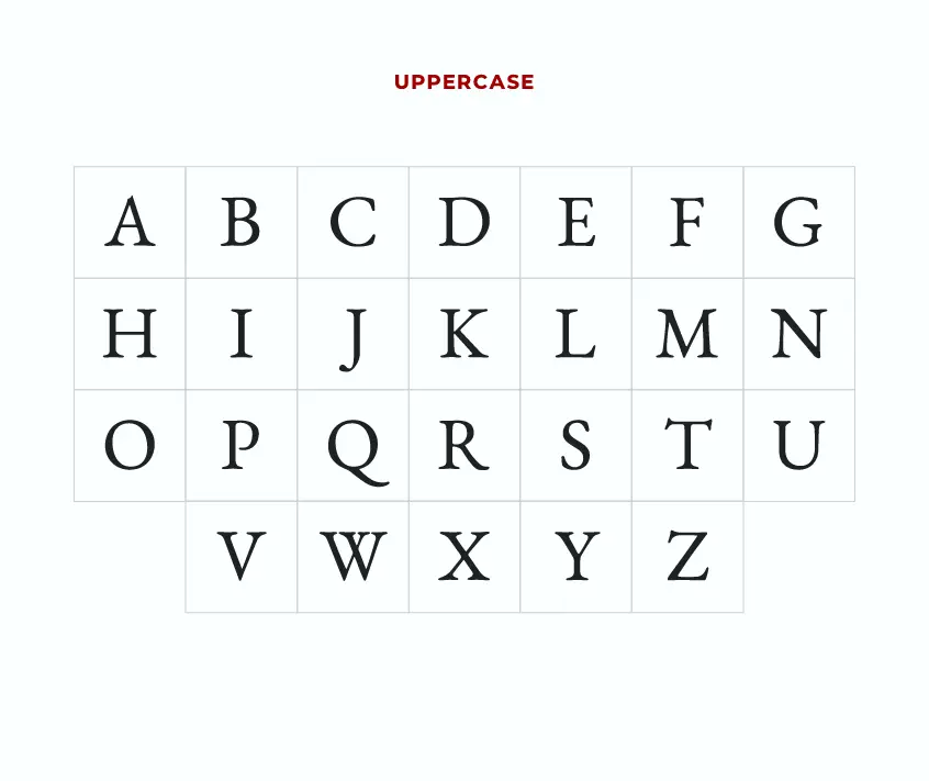
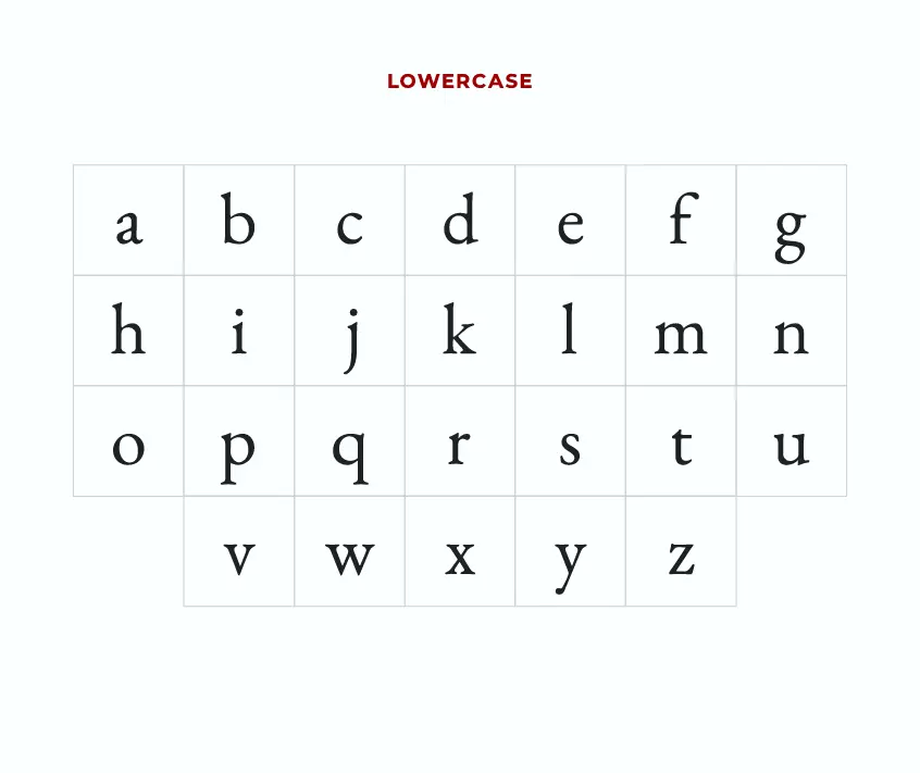
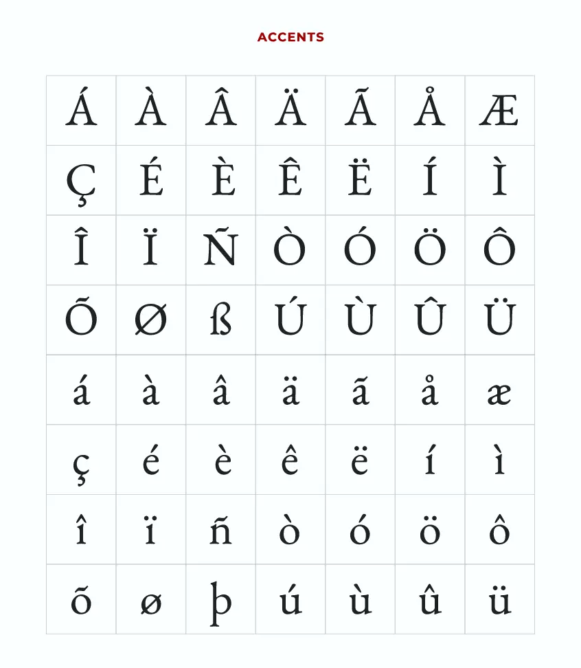
The aim of the EB Garamond project is to recreate the original typeface in its entirety, with a focus on authenticity and historical accuracy. The source for the letterforms is a scan of a specimen known as the “Berner specimen”, which was composed in 1592 by Conrad Berner. The specimen shows Garamont’s roman and Granjon’s italic fonts at different sizes. The project aims to provide a font family consisting of roman, italic, bold, and bold italic fonts in different optical sizes. It also provides initials based on renaissance designs, and the character sets planned to be covered include Latin, Greek (including polytonic), Cyrillic, IPA, ornaments, and MUFI compliance.
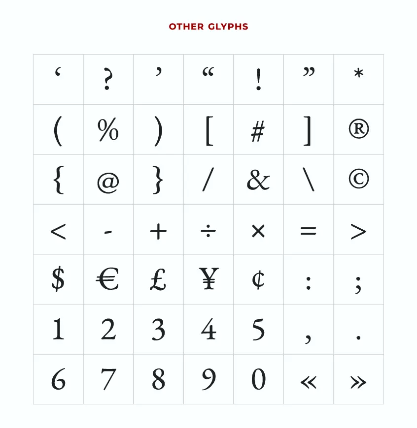
EB Garamond has been designed to contain old style and lining numbers (proportional and tabular), true small-caps, sub- and superscripts, ligatures, and all those nice things, accessible by appropriate OpenType features. The current version of the font provides a large palette of glyphs from Latin, Greek, and Cyrillic and the corresponding extended ranges. Latin and Greek are also available as small caps.
However, the italic is much less complete, with Latin and Cyrillic being usable but some spacing being unsatisfactory and diacritic placement not always good. The Greek is based on Granjon’s original, which is not acceptable for modern use, so it will need to be redone. Additionally, many special glyphs such as sub/superscripts and small-caps only exist as automatically slanted Romans, making them unusable at this time.
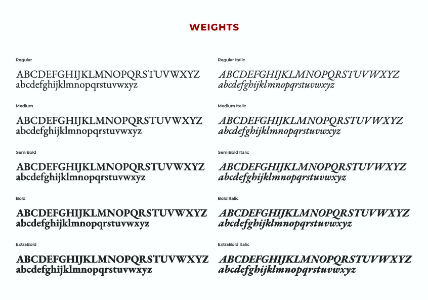
EB Garamond currently has five weights plus their matching italics. In November 2019, the family was updated to a variable font family, which allows for greater flexibility and control over the font’s weight and style.
EB Garamond Font Pairing
EB Garamond is a timeless and elegant serif font, exuding a refined and sophisticated aesthetic that is reminiscent of the graceful calligraphy of bygone eras. This beautifully crafted font is well-suited for a range of design applications, from formal invitations to professional documents.
When paired with other fonts, EB Garamond offers a striking contrast that enhances the visual appeal of any design. Its versatility is demonstrated by the numerous popular font pairings that have emerged over time. For instance, Open Sans complements EB Garamond with a clean and modern sans-serif style, while Carlito and Montserrat provide a more geometric and contemporary feel. Inter, Raleway, and Kollektif are also popular choices that offer a sleek and minimalist approach.
On the other hand, for those seeking a more traditional look, Oswald and Lora bring a classic touch that works seamlessly with EB Garamond. Playfair Display and Cinzel provide a charming and whimsical look, ideal for creative and artistic projects.
In conclusion, EB Garamond’s versatility is evident in the plethora of font pairings available to designers. Each combination offers a unique style that complements the elegant charm of this serif font, making it a reliable and stylish choice for any design project.
EB Garamond Font License
The EB Garamond project is licensed under the SIL Open Fonts License (OFL), which means that users are free to modify and distribute the font as they wish, as long as the OFL notice is retained, the font is not sold on its own, and credit is given to the original designer.
Conclusion
The EB Garamond project represents an important contribution to the world of type design and cultural preservation. By reviving the original Garamond typeface and making it open-source, the project is ensuring that this important aspect of cultural heritage is preserved for future generations. The project also provides an excellent example of the importance of historical accuracy in type design and the benefits of making cultural heritage accessible to everyone.