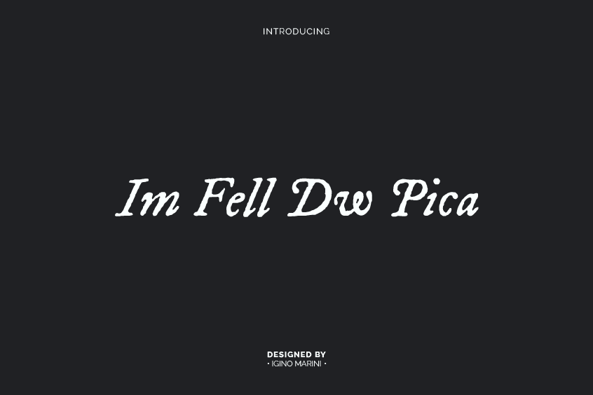


Introducing IM Fell DW Pica Font
IM Fell DW Pica Font, a distinctive and elegant serif typeface, boasts an engaging and multifaceted history that continues to captivate the imagination of designers and typographers worldwide. The font family includes both IM Fell DW Pica Regular and IM Fell DW Pica Italic styles, and it has been used in a variety of applications, including book covers, websites, and advertisements.
As a member of the prestigious Fell Types family, this captivating typeface owes its origin to the visionary work of John Fell, an eminent English theologian who held the esteemed position of Bishop of Oxford in the late seventeenth century. The allure of IM Fell DW Pica Font lies in its fascinating historical roots and the remarkable digital revival that has breathed new life into this timeless classic.
History and Background
A. The Seminal Influence and Visionary Work of John Fell
The indelible impact of John Fell on the landscape of typography can be traced back to his fervent desire to establish a learned press in Oxford that would rival its European counterparts in terms of quality and prestige. Born on June 23, 1625, Fell was raised in an intellectually stimulating environment that nurtured his scholarly pursuits. Throughout his illustrious career, Fell served as a prominent figure in the Church of England, holding the prestigious positions of Dean of Christ Church and Bishop of Oxford.
Fell’s unwavering commitment to education and the pursuit of excellence in publishing led him to recognize the indispensable role of high-quality typefaces in the establishment of a successful press. Consequently, he invested substantial resources in procuring an extensive array of foreign types from eminent type-producing nations, including France, Holland, and Germany.
B. The Magnanimous Bequeathment to the University of Oxford
Upon his demise on July 10, 1686, John Fell exhibited a profound sense of philanthropy by bequeathing his entire collection of types, punches, and matrices to the University of Oxford.
Fell’s instructions to his executors were unambiguous: he envisioned the preservation and maintenance of his invaluable collection for the edification of the university and subsequent generations.
Over the years, the Chancellor, master, and Scholars of the University of Oxford have dutifully honored Fell’s wishes, ensuring that his remarkable collection remains intact and accessible for scholarly study and practical use.
C. The Indispensable Role of Peter De Walpergen
In his quest to develop an array of exquisite typefaces for his own workhouse, John Fell enlisted the services of Peter De Walpergen, a gifted type founder. Born in Frankfurt am Main, De Walpergen was a descendant of a Protestant refugee from Antwerp. Initially engaged by the Dutch East India Company in 1671 to work as a type-founder and printer in Java, De Walpergen’s prodigious talents were soon recognized by Fell, who invited him to collaborate on the creation of new typefaces for the Oxford Press.
D. The Artful Development and Design of Various Sizes
Under the discerning guidance of John Fell, De Walpergen masterfully crafted an assortment of typeface sizes, including Pica, Double Pica, and Great Primer. These typefaces were characterized by their unique design, which drew inspiration from the Dutch type design prevalent during the latter half of the seventeenth century.
While De Walpergen’s work has not been immune to criticism—British typographer and historian of printing, Stanley Morison, once described the design of the larger Fell Types as “difficult to characterize and impossible wholly to approve”—their enduring appeal over the centuries is a testament to their intrinsic value and the lasting impact of the Fell Types on the world of typography.
The Roman Italic & Black Letter Bequeathed to the University of Oxford by Dr. John Fell,” which offered a comprehensive analysis of the Fell Types and their intriguing history. Further exploration of the subject was undertaken by Harry Carter in his 1968 publication, “The Fell Types: What Has Been Done in and About Them.”
E. The Enduring Legacy of the Fell Types
The Fell Types have continued to enjoy widespread admiration and usage since their inception in the seventeenth century. In 1951, Stanley Morison published “The Roman Italic & Black Letter Bequeathed to the University of Oxford by Dr. John Fell,” which offered a comprehensive analysis of the Fell Types and their intriguing history. Further exploration of the subject was undertaken by Harry Carter in his 1968 publication, “The Fell Types: What Has Been Done in and About Them.”
Digital Revival: Resurrecting a Timeless Typeface for the Modern Age
A. The Astute Work of Igino Marini
Igino Marini, a perceptive type designer, and engineer recognized the historical significance and visual charm of the Fell Types and resolved to bring them into the digital era. With meticulous precision, Marini digitized the IM Fell DW Pica Font, ensuring that the typeface remained faithful to its original design while incorporating the capabilities and flexibility afforded by modern technology.
B. Standard and PRO Versions: Catering to a Diverse Range of Needs
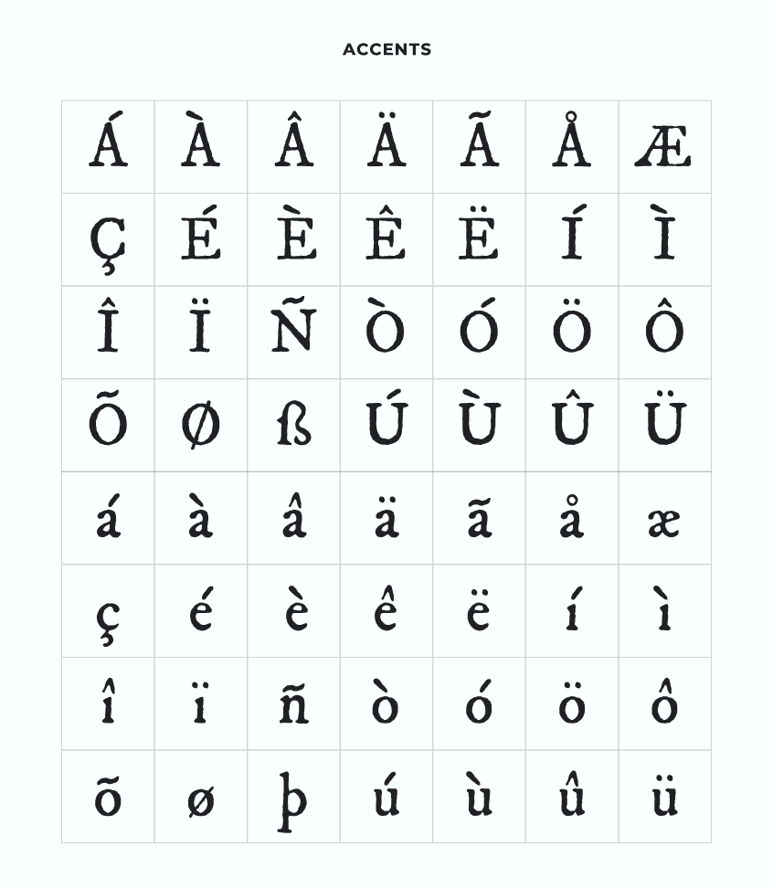
In his digital revival, Marini astutely offered the IM Fell DW Pica Font in both standard and PRO versions to cater to a diverse range of needs and preferences. The standard version provides designers and typographers with a versatile typeface that retains the historical authenticity of the original design. The PRO version, on the other hand, includes supplementary features such as ligatures, contextual alternates, and stylistic sets, providing an enhanced level of versatility and creative options for users.
C. Additional Features in the PRO Version: Expanding Creative Horizons
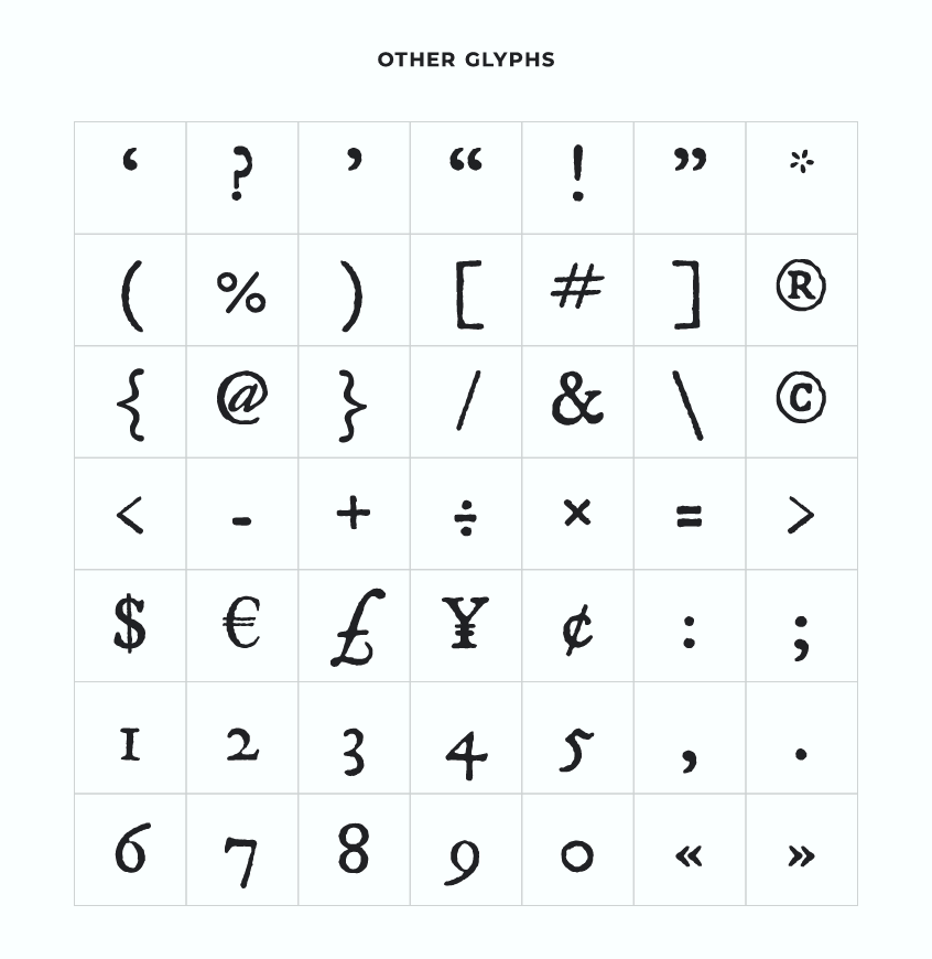
The PRO version of the IM Fell DW Pica Font boasts an array of advanced typographic features that augment its usability and allure. Ligatures are specialized characters that replace particular letter combinations to improve the fluidity and visual appeal of the text. Contextual alternates are alternate letter shapes that are automatically applied in specific situations, such as the beginning or end of a word, to enhance the overall aesthetics of the text. Stylistic sets provide alternative letter shapes that can be applied to the entire text or specific portions, allowing for further customization and creative expression.
Design Characteristics
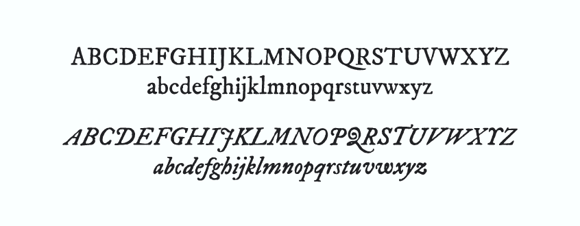
A. High Contrast and Elegant, Rounded Serifs
IM Fell DW Pica Font is characterized by its remarkable high contrast and elegant, rounded serifs. This distinctive amalgamation imparts a classic appearance with a hint of modern sophistication. The striking contrast between the thick and thin strokes in the letterforms creates a visually arresting effect, while the rounded serifs infuse a sense of warmth and approachability.
B. Classic Look and Modern Sophistication
The design of IM Fell DW Pica Font seamlessly interweaves classic typographic elements with contemporary refinement. The historical roots of the typeface are evident in the overall structure of the letterforms, yet the digital revival has endowed the typeface with a polished, modern aesthetic. This delicate balance renders IM Fell DW Pica Font an enticing choice for designers and typographers seeking a typeface that exudes both timelessness and freshness.
C. Legibility and Large X-Height
IM Fell DW Pica Font boasts unambiguous legibility and a relatively large x-height, which refers to the height of lowercase letters in relation to uppercase letters. The larger x-height renders the typeface easier to read at smaller sizes, making it an excellent choice for body text in books, magazines, and other printed materials. Its legibility extends to digital contexts, where the typeface maintains its clarity on screens of various sizes and resolutions.
D. Suitability for Various Contexts
The versatile design of IM Fell DW Pica Font renders it suitable for use in a wide array of contexts. Its classic appearance and elegant features lend themselves well to print designs, such as books and magazines, while its digital adaptability ensures that it functions equally well in web design and other digital applications. The typeface’s distinctive style and elegance make it an excellent choice for display settings, such as headlines and titles, where it can effectively convey a sense of sophistication and refinement.
Licensing and Usage
A. Open Font License
IM Fell DW Pica Font is licensed under the Open Font License (OFL), which allows for its use in a wide range of products and projects, both print and digital, commercial or otherwise. This flexible licensing ensures that the typeface remains accessible to designers and typographers from all backgrounds, fostering its continued use and appreciation.
B. Applicability for Different Projects
Thanks to its Open Font License, IM Fell DW Pica can be utilized in various projects, encompassing branding, packaging, editorial design, web design, and more. Its timeless appeal and unique history make it an attractive option for designers and typographers seeking to add depth and character to their creative endeavors.
IM Fell DW Pica Font Pairing
The following esteemed font pairings work well with the distinguished IM Fell DW Pica font:
In the process of selecting complementary fonts, it is crucial to opt for those that exhibit a well-balanced synergy. Typefaces that possess excessive similarity may hinder legibility, whereas those with stark contrasts can create discord and divert attention.
Conclusion
In summary, IM Fell DW Pica Font is a versatile and attractive typeface that offers a classic, elegant look with a touch of modern sophistication. Its connection to the history of typography and its digital revival by Igino Marini makes it an interesting and unique choice for designers and typographers seeking a typeface that is both visually appealing and historically significant. IM Fell DW Pica’s legibility, versatility, and timeless charm ensure that it will continue to captivate and inspire the creative spirit for generations to come.