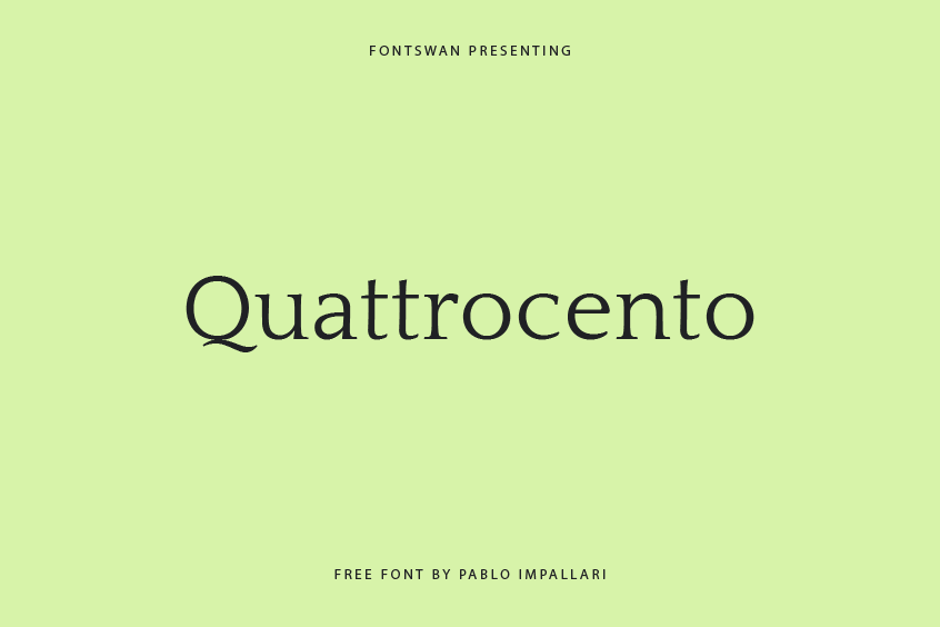
Introducing the Quattrocento Font: Experience Classic Elegance and Timeless Beauty
Quattrocento Font is a masterpiece of typography designed by the visionary Pablo Impallari and unveiled to the world in 2011. This remarkable serif font exudes an air of classic elegance that is bound to leave a lasting impression. With its timeless appeal, the Quattrocento Font stands as a testament to the enduring power of artistic expression.
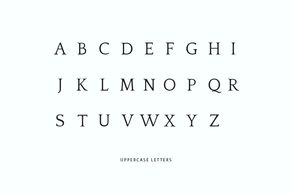
One of the most remarkable features of this font lies in its ability to effortlessly combine classic charm with a contemporary edge. Its wide and open letterforms, complemented by a generous x-height, ensure unparalleled legibility even when used for body text at small sizes. As if that weren’t enough, the Quattrocento Font reveals exquisite nuances and intricate details as it graces larger displays, making it an excellent choice for capturing attention and leaving a lasting impact.
Quattrocento Font draws inspiration from the resplendent art and architectural marvels of the Italian Renaissance. The name “Quattrocento,” derived from the Italian term for “four hundred,” pays homage to the flourishing fifteenth century, an era that witnessed the glorious emergence of the Renaissance in Italy.
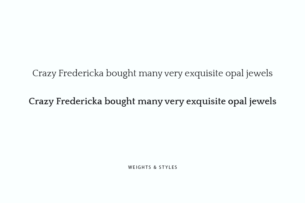
Quattrocento Font has two remarkable styles: Regular and Bold. The Regular style exudes a timeless charm, boasting a unique character that sets it apart. On the other hand, the Bold style commands attention with its intensified impact, making it the ideal choice for captivating headlines and compelling display text. Furthermore, the Quattrocento Font offers two distinct variants: Quattrocento Roman and Quattrocento Sans, each possessing its own distinct allure and visual appeal.
The Distinctive Features of the Quattrocento Font
Firstly, the font showcases low contrast, with the thin strokes delicately balanced to match the weight of the bold ones, culminating in a harmonious and solid appearance that is sure to catch the eye.
The cupped and tapered stems of the Quattrocento Font gracefully curve inward at the ends, naturally flowing into the serifs, thereby exuding an aesthetic that effortlessly melds refinement with subtlety.
Prepare to be captivated by the unique tails of the K, R, and &, as the diagonal strokes extend beyond the baseline, leaving an indelible mark of dynamism and elegance on the page.
The Quattrocento Font’s B, D, E, F, P, Q, R, and T bear an enchanting trait – their horizontal strokes gently curve upward at the ends, imparting a touch of softness and grace to this magnificent typeface.
In a heartfelt tribute to the esteemed type designer and teacher Doyald Young, the Quattrocento Font showcases a distinctive tail on the letter Q, creating a lasting legacy and evoking a sense of reverence within the typographic realm.
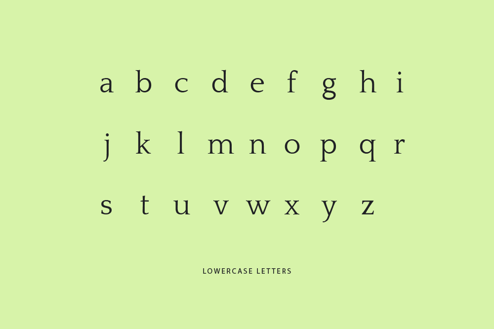
Indulge in the delightful alternate versions of the M and W, where the former features shorter middle strokes, while the latter offers two distinct alternatives with varying widths and angles, opening up a world of possibilities for creative expression.
The Quattrocento Font sets itself apart with its precise attention to detail, as evidenced by the narrow L and T, carefully tailored to improve spacing and enhance the overall balance of the typeface.
Embrace the subtle contrast embodied by the almost flat top serifs on the lowercase letters, a remarkable design choice that adds depth and sophistication to the Quattrocento Font’s aesthetic.
The captivating shoulders of the m and n extend slightly above the serifs, infusing the typeface with movement and energy that effortlessly draws the reader’s gaze.
Discover simplicity at its finest as the lowercase j and y graciously forgo serifs at the bottom, resulting in sleek and streamlined shapes that exude a sense of fluidity and ease.
Quattrocento Font Download & License
By choosing the Quattrocento Font, you not only acquire a masterpiece of design but also gain the privilege of using a font that adheres to the principles of the SIL Open Font License (OFL), ensuring its accessibility and availability to all. Furthermore, the font can also be downloaded from Google Fonts, ensuring a seamless experience for both enthusiasts and professionals alike.
Quattrocento Font Pairing
To further enhance your creative endeavors, allow us to present a selection of font pairings that beautifully complement the Quattrocento Font:
Elevate your creative expression to new heights with the Quattrocento Font and its enchanting font pairings. Immerse yourself in the timeless elegance and remarkable versatility of this remarkable typeface, as it leaves an indelible mark on the realm of design and typographic artistry. Unleash your imagination and embark on a journey of visual storytelling like no other with the Quattrocento at your side.