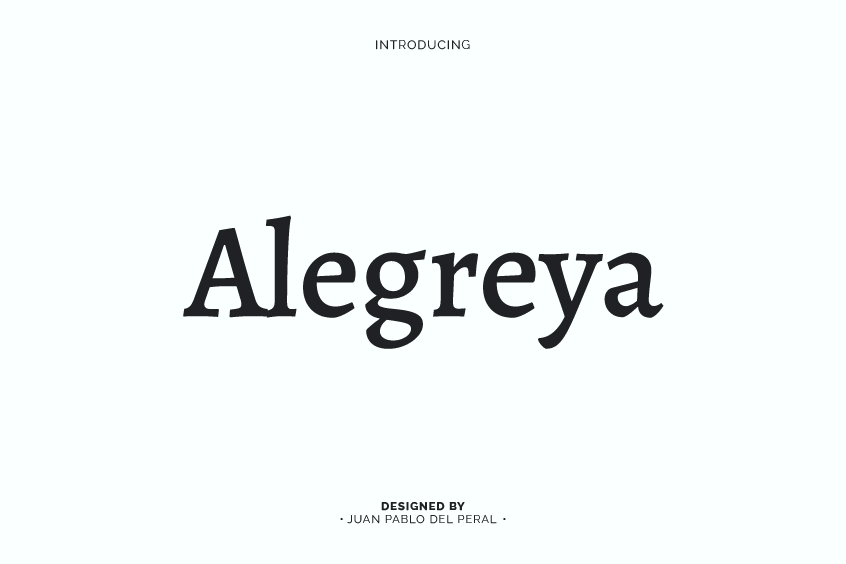
Introducing Alegreya Font
Alegreya Font is a serif typeface that was expertly designed by Juan Pablo del Peral for Huerta Tipográfica. With its original intent to serve literature, this dynamic typeface has evolved to encompass a wide range of applications in the design world. This article delves into the characteristics, features, and versatility of Alegreya, as well as its standing in the typographic community and potential font pairings.
Alegreya is a highly adaptable and refined serif font that offers a wide range of possibilities for diverse design objectives. The typeface’s versatility enables it to be employed in various contexts, such as body text for websites, headings and subheadings, branding and logos, and printed materials. With its elegant and distinctive features, Alegreya can enhance the visual appeal and readability of design projects, making it a valuable asset for designers seeking to create sophisticated and engaging content.
The Unique Characteristics of Alegreya Font
Alegreya Font possesses several distinct features that make it stand out from other serif typefaces. Among its most notable attributes is the dynamic and varied rhythm it conveys, which facilitates the comfortable reading of lengthy texts. Additionally, Alegreya brings a sense of freshness to the page, referencing calligraphic letterforms in a contemporary typographic language, rather than emulating them literally.
The Alegreya Font Family
The Alegreya type system is considered a “superfamily,” originally intended for literary purposes but now encompassing serif and sans serif sister families. Within the Alegreya family, the italic, bold, and Black weights all receive the same meticulous care and attention to detail as the roman. Furthermore, there is a Small Caps sister family, adding to the overall versatility of the typeface.
Alegreya’s Advanced OpenType Features
Alegreya supports expert Latin, Greek, and Cyrillic character sets, making it a robust choice for diverse applications. The typeface also provides advanced OpenType features, such as small caps, dynamic ligatures, and fractions, as well as four sets of figures, super and subscript characters, ordinals, and localized accent forms for numerous languages.
Alegreya’s Accolades and Recognition
The ATypI Letter2 competition in September 2011 recognized Alegreya as one of the top 14 text-type systems. Furthermore, it was selected in the 2nd Bienal Iberoamericana de Diseño, a competition held in Madrid in 2010, as well as in Tipos Latinos. This recognition attests to the typeface’s quality and suitability for various applications.
Open-Source Licensing and Usage
As an open-source font, Alegreya can be freely used for both personal and commercial projects. The only requirement is that it be distributed along with its basic font information, making it an accessible choice for designers and typographers alike.
Alegreya Font Pairing
Alegreya’s versatility allows it to be effectively paired with numerous other fonts, depending on the specific application and design requirements. Some suggested font pairings include Merriweather, Lato, Oxygen, and Open Sans, each offering its own distinct aesthetic to complement Alegreya’s unique characteristics.
Conclusion
In summary, Alegreya Font is a popular choice among designers and typographers seeking a versatile and highly readable serif font. With its extensive features, unique characteristics, and strong standing in the typographic community, Alegreya is a valuable asset for any design project.
To contribute, visit github.com/huertatipografica/Alegreya.