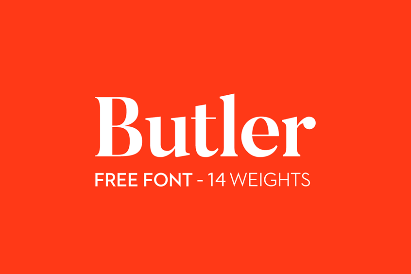
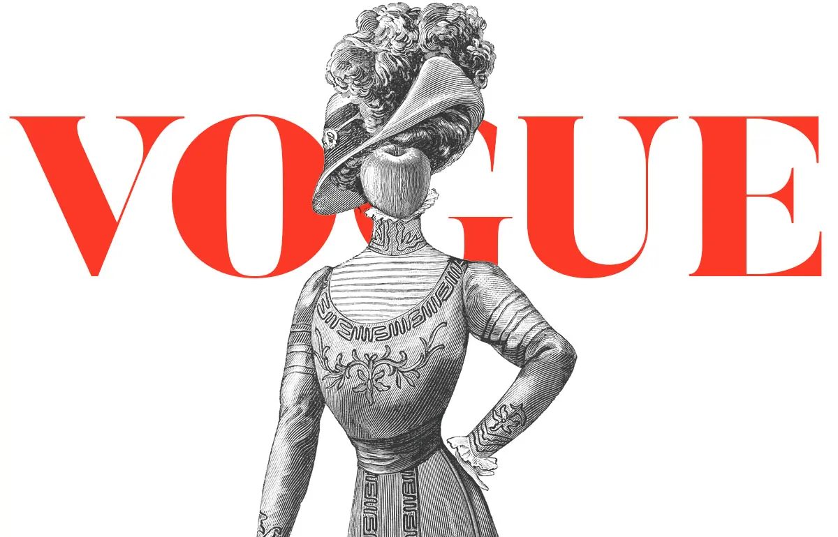


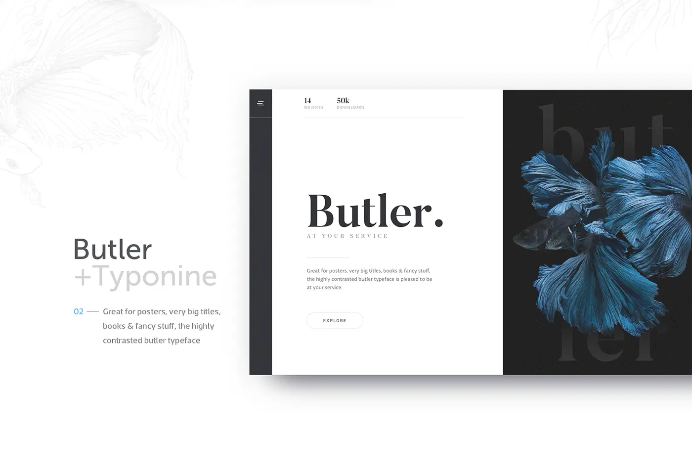
Introducing The Butler Font
The Butler font stands out as a free and open-source stencil serif typeface designed by Fabian De Smet. Drawing inspiration from the elegant and precise Bodoni typeface, Butler introduces a slightly modern twist to its classic predecessor, creating a unique and versatile font family.
Butler Font Family
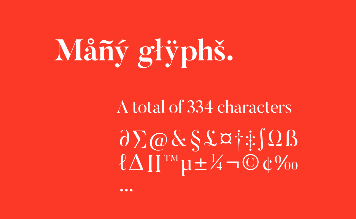
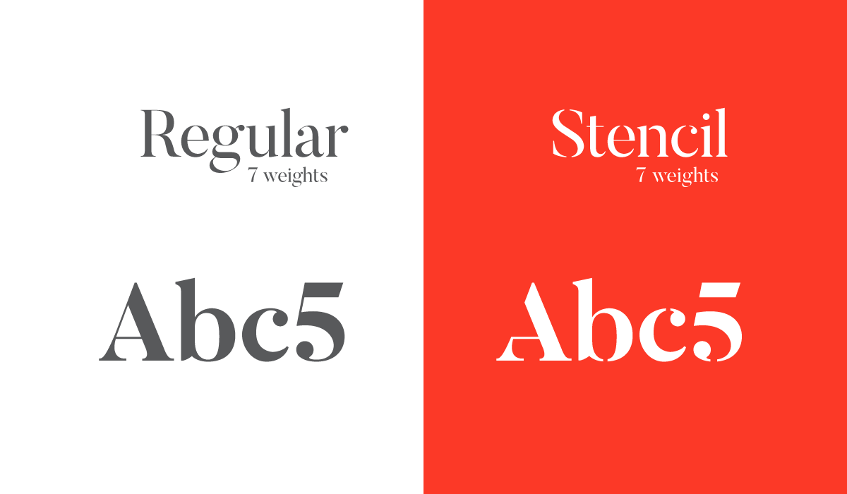
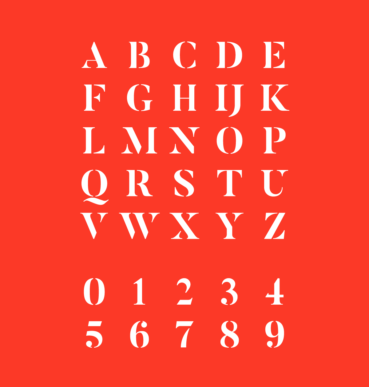
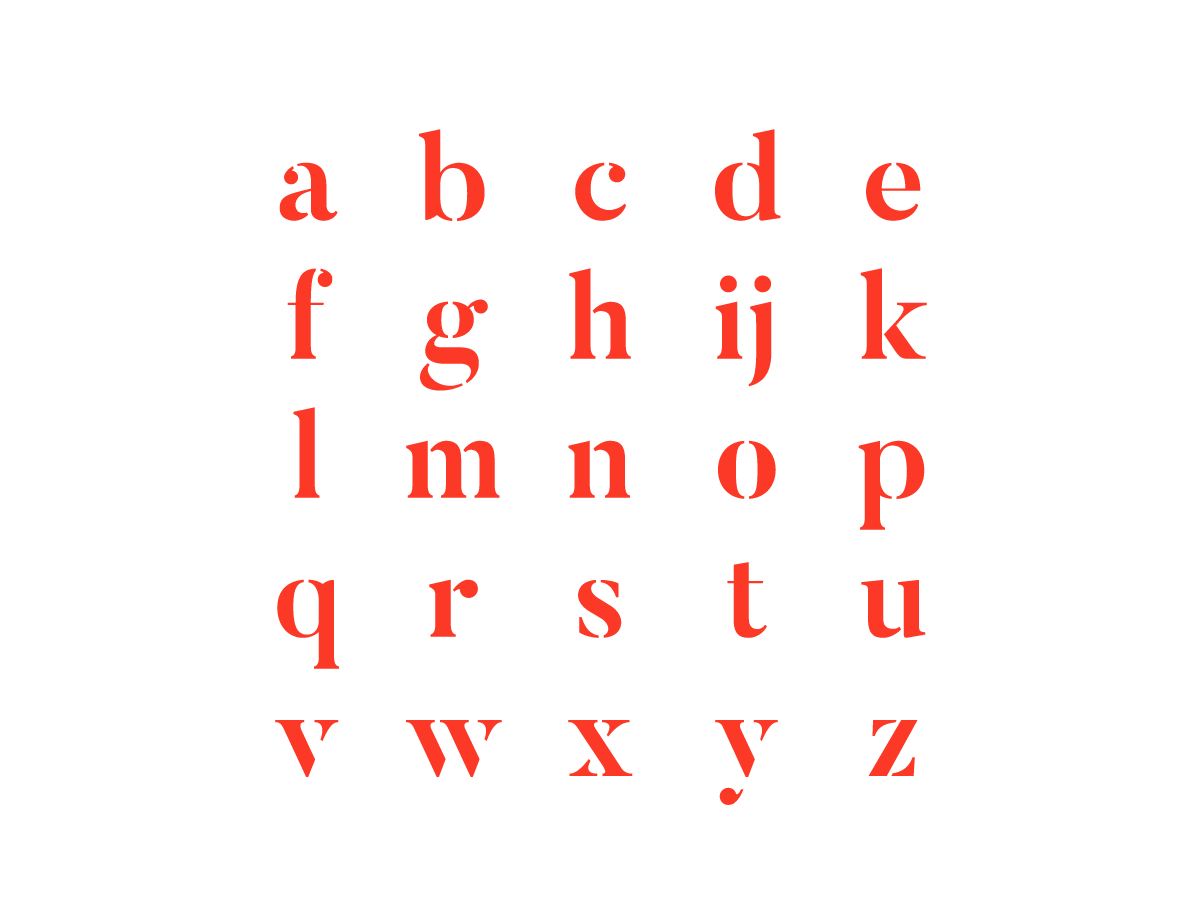
The Butler font family is composed of an impressive array of 14 different weights, including 7 Butler Regular font weights and 7 Butler Stencil font weights. These weights cover a wide spectrum, ranging from light, extra light, regular, medium, bold, extra bold, to black. Each weight boasts a total of 334 characters, encompassing various features such as text figures, ligatures, fractions, and more. The inclusion of added glyphs ensures compatibility with a diverse range of languages, making it a highly adaptable typeface for global use.
Versatility
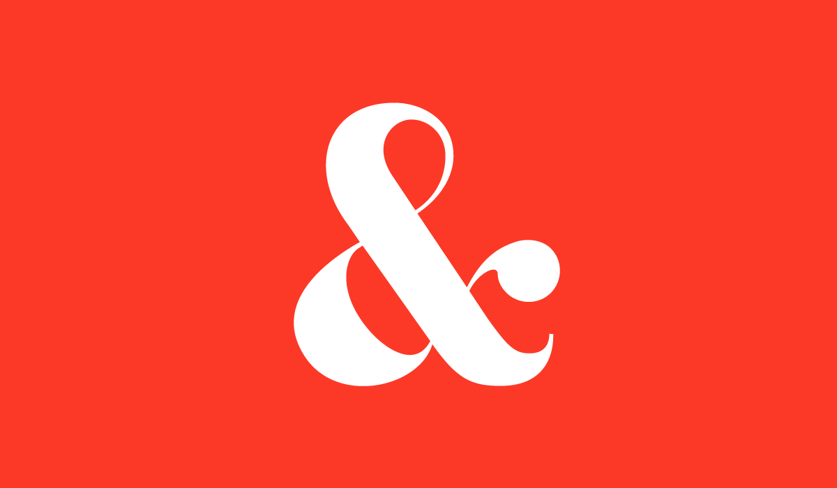
A distinguishing characteristic of the Butler font is its exceptional versatility. Whether used for short or long text, the font maintains a high level of legibility and coherence. This versatility makes it an excellent choice for designers and developers seeking a typeface that can be effectively utilized across various mediums, from traditional print to modern digital platforms.
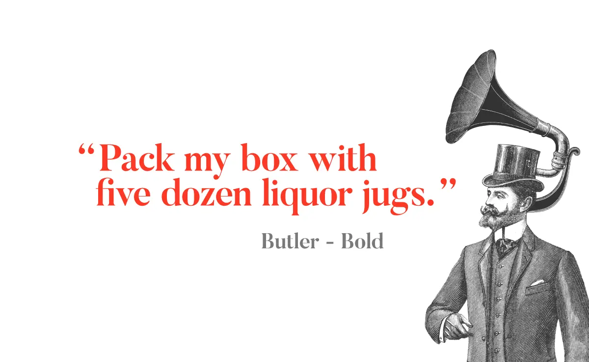
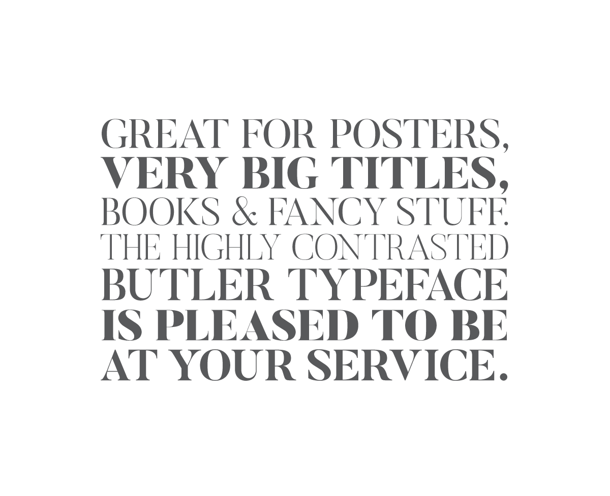
In addition to its adaptability for various lengths of text, Butler’s strong vertical lines and high contrast between thick and thin strokes make it a prime candidate for headlines, headers, and titles. Its clear and consistent spacing ensures that the font remains legible and easy to read even at smaller sizes, further enhancing its appeal for a wide array of design applications.
Recognition and Accessibility
Butler Font has not gone unnoticed in the design world, having been awarded the font of the month by Computer Arts magazine. In a display of generosity and commitment to accessibility, De Smet has made the font available for free for both personal and commercial use. By doing so, he acknowledges that, as a freelancer, his creation may not reach the same level of refinement as a font developed by a professional team. Nonetheless, the quality and versatility of the Butler font speak for themselves, attracting users worldwide.
Practical Application of Class Topics
The process of working with the Butler font allows for the practical application of various class topics related to typography. These include glyph morphology, serif characteristics, and serial font ranges. Engaging with the Butler font in a hands-on manner enables a deeper understanding of these concepts, as the process of actively examining and utilizing a typeface offers insights that cannot be gleaned through passive study alone.
Selection of the Font
The choice to focus on the Butler font was based on a combination of factors, including the criteria provided by a teacher and personal taste. With its modern reinterpretation of traditional serif fonts, Butler captured the attention and resonated with its users. Furthermore, its high readability as a serif typeface and accessibility as a free resource contributed to the decision to explore this font more extensively.
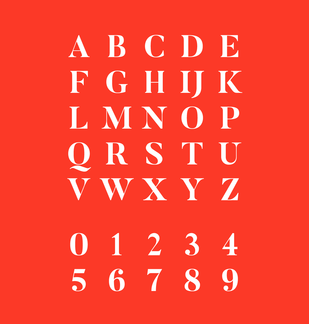
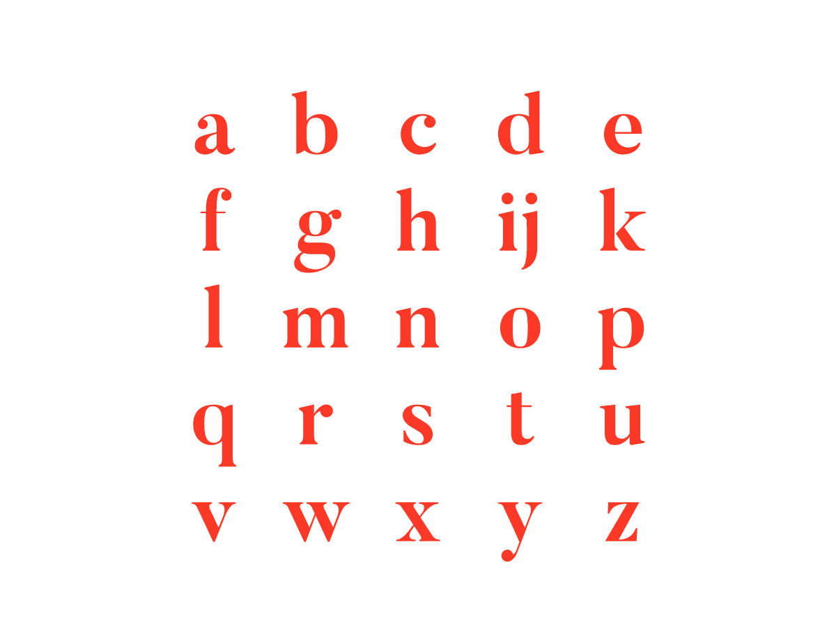
Butler Font Characteristics
While the Butler font is well-suited for paragraphs and announcements, conveying a sense of seriousness and elegance, it is not without its challenges. The high contrast present in its glyphs can, in certain cases, result in a degree of unreadability. However, this potential pitfall does not detract from the font’s overall appeal and functionality, as it remains an attractive and versatile choice for a wide range of design applications.
Anatomy Analysis
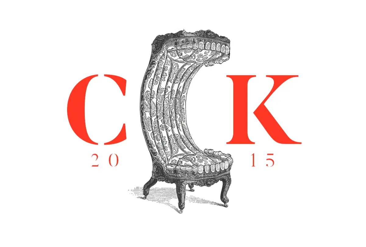
An in-depth analysis of the Butler font’s anatomy reveals a few areas for improvement. One such issue arises from the potential for collisions between the serifs of certain letters. It appears that the designer did not fully consider the impact of these serifs on the ligatures of the font, which can be a critical aspect of readability. Despite this shortcoming, the overall design of the Butler font remains strong, and these issues are relatively minor when considering the font’s many positive attributes.
Variants and Serial Ranges
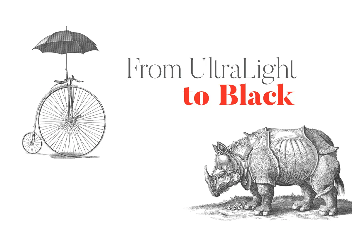
The Butler font offers seven variants, namely Ultra Light, Light, Regular, Medium, Bold, Extra Bold, and Black. This extensive selection allows for greater flexibility in design applications. However, while working with the serial ranges, it became apparent that there is an inconsistency between the Black and Extra Bold weights. Specifically, the Black range is less thick than the Extra Bold range, a discrepancy that defies the typical expectation that the latter should always be greater. While this inconsistency may cause confusion for some users, it does not substantially detract from the overall functionality and appeal of the Butler font.
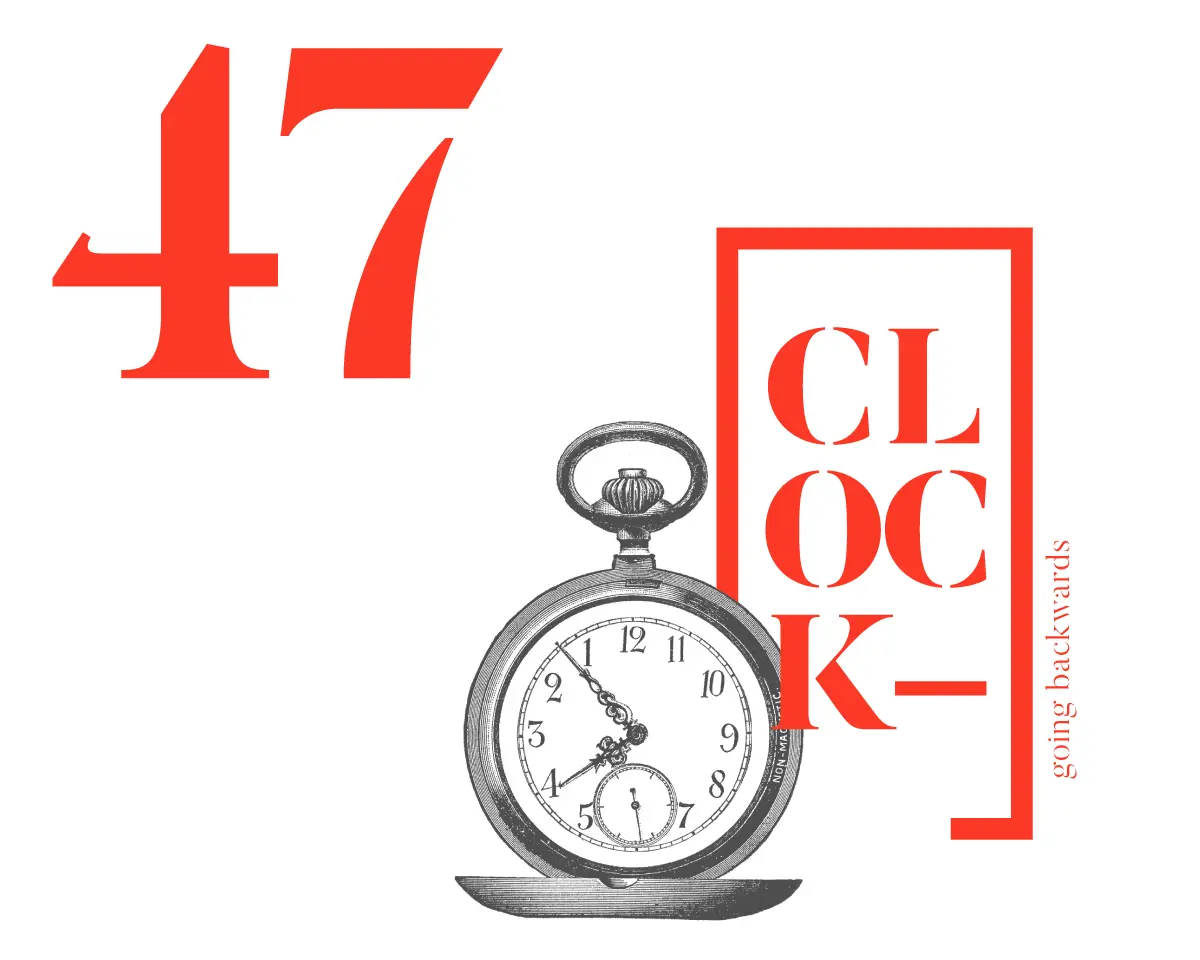
Serif Fonts and the Bodoni Effect
In the world of typography, serif fonts such as the Butler font are often praised for their elegance and sobriety. Many serif fonts possess outstanding legibility attributes, which is one reason they continue to be popular in various design applications. However, one potential drawback of serif fonts, particularly those with high contrast, is the so-called Bodoni effect.
The Bodoni effect is a phenomenon that occurs when fonts with extreme contrast between thick and thin strokes are used, resulting in areas of fragility within the letterforms. Although these fonts may appear elegant, they can also be problematic, especially when used in negative (white text on a dark background). This effect can compromise the legibility of the typeface, as the more delicate strokes may become difficult to discern, particularly at smaller sizes or lower resolutions.
Butler / Butler Stencil Font License
The Butler typeface is accessible for utilization in both personal and commercial applications. This permits individuals to employ, adapt, and disseminate the font without restriction in both digital and printed forms, provided that the fonts themselves are not sold. For further details, kindly consult the accompanying license documentation.
To support the creator in maintaining the project’s complimentary status, please consider making a contribution via PayPal at the following link: https://www.paypal.me/DeSmetFabian.
Butler Font Pairing
There are several font pairings that complement the Butler font effectively, with suitability varying based on the design and its intended use. A selection of notable examples includes:
In the end, the optimal font pairing for the Butler font is contingent upon the unique design requirements and the context in which it is employed.
Conclusion
In summary, the Butler font offers a unique and versatile typeface option for designers and developers seeking an elegant and adaptable font. Inspired by the classic Bodoni typeface, Butler introduces a modern twist that makes it highly appealing for various design applications, from headlines and titles to longer passages of text.
While the font does present some challenges, such as potential collisions between serifs and the Bodoni effect, these issues are relatively minor in comparison to its numerous positive attributes. As a free and open-source typeface, the Butler font represents an outstanding resource for those in the creative community, providing a high-quality, accessible, and versatile tool for a wide range of design projects.