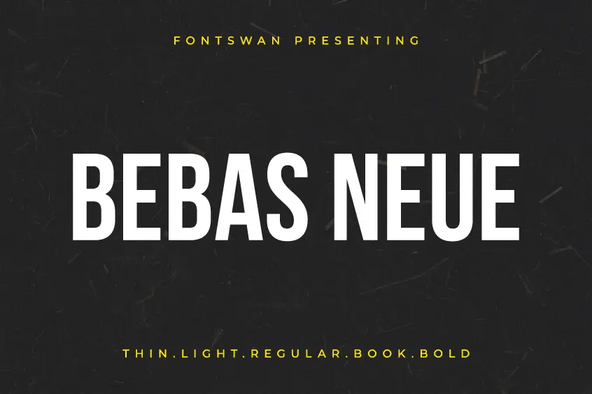
Introducing Bebas Neue Font
Bebas Neue font is a popular free condensed sans serif family that has gained widespread usage and acclaim over the past decade. Created by the Japanese designer Ryoichi Tsunekawa, Bebas Neue is a condensed sans serif font family that was redesigned from the original free font “Bebas” which was released in 2005 for the same purpose. This font is used for many projects, from large companies to startup designers, due to its versatility and simplicity. In this article, we will take a closer look at Bebas Neue Font, exploring its history, usage, design features, and option to download the Bebas Neue Font family.
Bebas Neue Font Usages
One of the defining characteristics of Bebas Neue Font is its elongated shape and simplicity, which allows it to stand out in many applications. However, the only drawback is that it only has capital letters, meaning that it is not ideal for use in text bodies. Instead, it is best used for short sentences, headlines, and slogans. Despite this, the font family has different styles and is very versatile, making it difficult to combine them badly, it looks good with very different fonts, from serif fonts, such as Georgia, to sans-serif fonts, such as Montserrat.
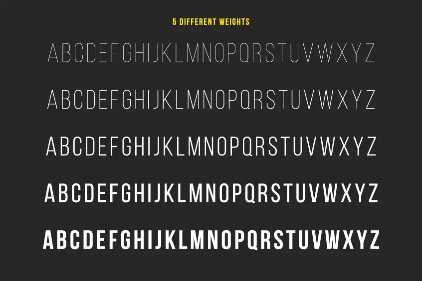
The Bebas Neue Font family has now grown to include four new styles – Thin, Light, Book, and Regular – added by Fontfabric. The new weights remain true to BEBAS’s style and nobility with clean, family-oriented lines, sleek shapes, and a combination of straight technical strength and minimalist warmth, making them uniquely suited to the web, print, and merchant. It is available for free for personal and business use and can be downloaded from our website with just one click.
If you’re looking for a bold font that impacts your headlines, Bebas is perfect. It has been specially designed for this purpose, either for headlines or subheadings. Bebas Neue Font is also perfectly suitable for other purposes such as branding projects, logos, magazines, movies, websites, titles, reviews, games, apps, stickers, clothing, etc.
Design Features
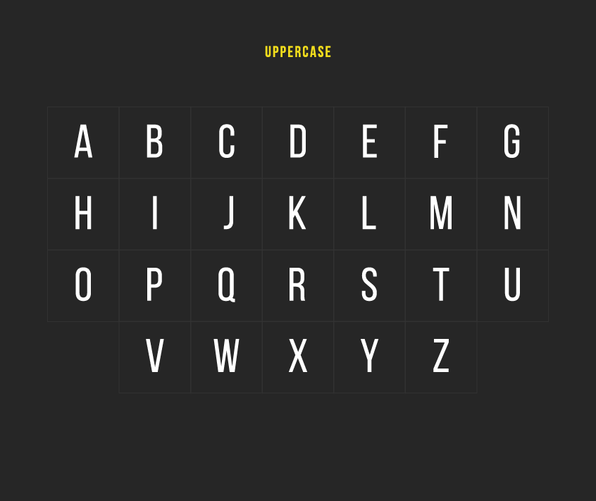
Bebas Neue is a display font for headlines, captions, and titling, designed by Ryoichi Tsunekawa. It is a universal typeface and the most popular font family with only uppercase letters released in 2010. The font has become widely popular due to its elongated and simplified shape. Despite being a sans-serif font, it has a distinctive personality, which makes it stand out from other fonts.
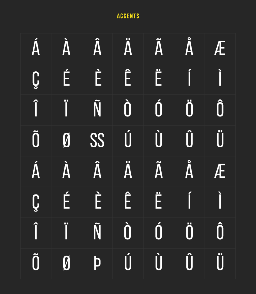
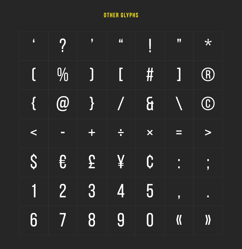
Bebas Neue Font family has been designed with proportion and theory similar to the original Bebas (2005) font. However, the newer versions come with more refined and improved features, including a range of additional glyphs and styles. The new weights added by Fontfabric maintain the original style and nobility of Bebas while also providing a clean, sleek look that is well-suited for a variety of uses.
Open-Source and Git
One interesting aspect of Bebas Neue Font is that its latest version, 2.000, is open-source and licensed under the SIL Open Font License 1.1. This means that anyone can use, modify, and distribute the font for free, as long as they follow the license’s terms and conditions. The font’s source files, including .eot, .otf, .ttf, .woff, and .woff2, are available for download on various platforms, including GitHub.
Bebas Neue’s open-source status has allowed designers from all over the world to use and modify the font to fit their specific needs. As a result, many derivatives of Bebas Neue have emerged, featuring additional languages, alternate glyphs, and other settings. These derivatives have been created by different designers and are available for free or for purchase on various platforms.
To manage the development and distribution of these derivatives, many designers and developers have turned to Git, a distributed version control system that allows for collaboration and code-sharing. Git has become a popular platform for managing open-source fonts like Bebas Neue, as it provides a centralized repository for font files and source code, making it easy for designers to contribute to the project and track changes over time.
Why Open Source?
Bebas Neue’s popularity has led to the creation of various derivatives, additional languages, and alternate glyphs, which created the need for a common platform to develop and share the results. By making Bebas Neue version 2.000 open source, Dharma Type enables designers and developers to create and customize the font to suit their specific needs. The SIL Open Font License 1.1 provides a legal framework for the use, modification, and distribution of the font without any legal constraints.
The Story Behind the Popular Bebas Neue Font Family
Bebas Neue is a popular sans-serif font family that has gained worldwide recognition for its sleek and modern design. Developed by Ryoichi Tsunekawa of Dharma Type, Bebas Neue is known for its bold and powerful look, making it a popular choice for headlines and branding projects. In this article, we will delve into the history of Bebas Neue, its various versions and derivatives, and its recent expansion into the professional font market.
The Beginnings of Bebas
Bebas Neue’s origins can be traced back to 2005 when Ryoichi Tsunekawa created the original Bebas font as a means of practicing his type design skills and receiving feedback from the design community. Bebas was released as a free font and was later followed by Boycott, a commercial font that was distressed and based on Bebas.
In 2010, Tsunekawa redesigned Bebas as Bebas Neue, which retained the original’s proportions and theory. This updated version was also released as a free font and became widely popular for its strong and versatile appearance. Following this, Mocha Mattari, a commercial distressed font based on Bebas Neue, was introduced.
The Evolution of Bebas Neue Font
Bebas Neue Font continued to evolve with the addition of new weights and glyphs designed by Fontfabric, leading to the creation of the Bebas Neue Family in 2014. In the same year, Bebas Kai, a derivative work based on the original Bebas, was released as an open-source font.
In 2018, Bebas Neue version 2.000 was introduced, which was open-sourced and licensed under the SIL Open Font License 1.1. This version included newly added and improved glyphs, as well as regulated spacing and kernings. Bebas Neue SemiRounded and Bebas Neue Rounded, commercial derivative works based on Bebas Neue, were also released in the same year.
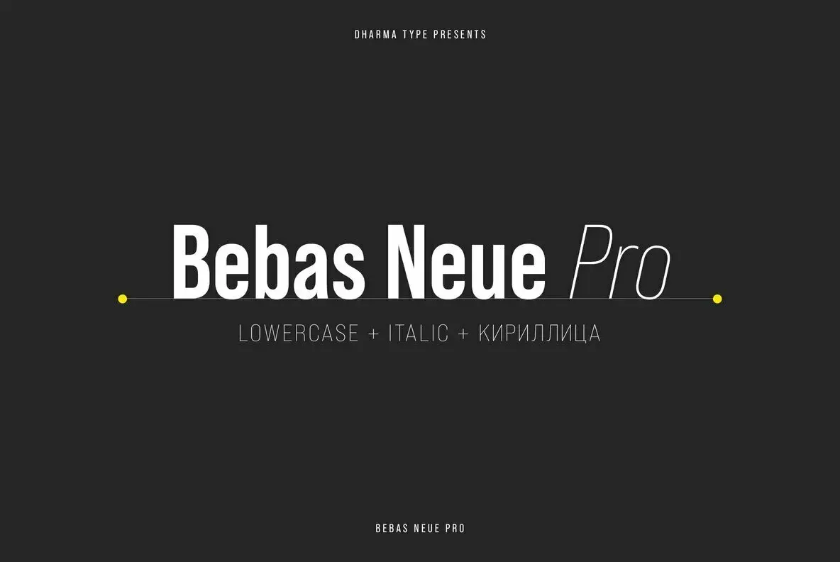
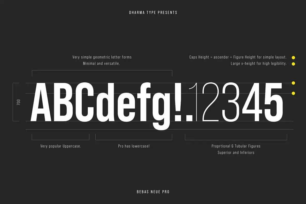
Bebas Neue Pro: The Professional Version
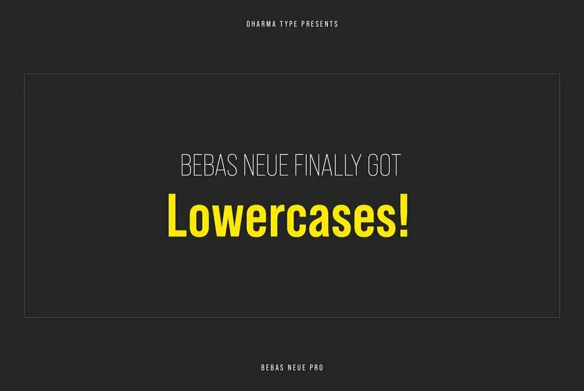
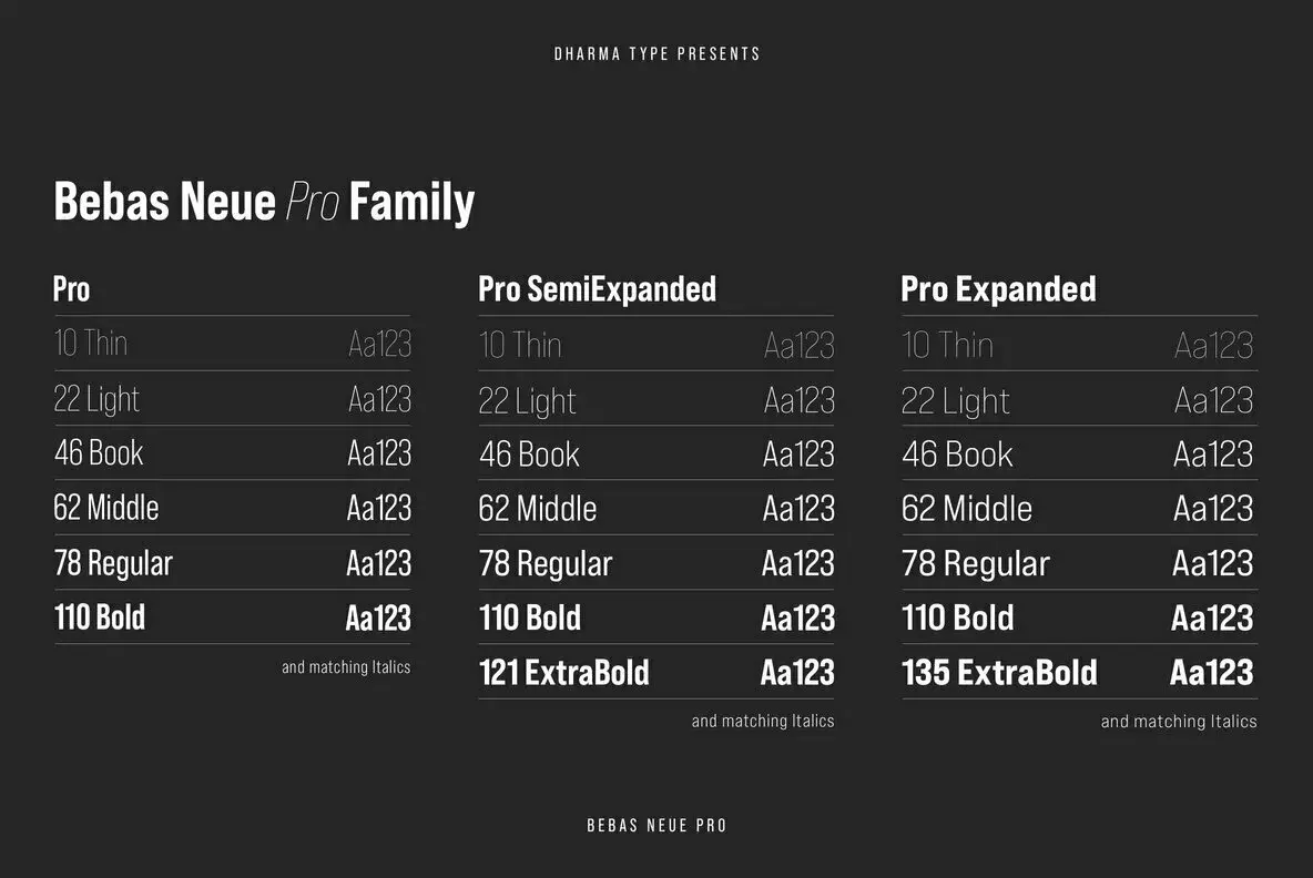
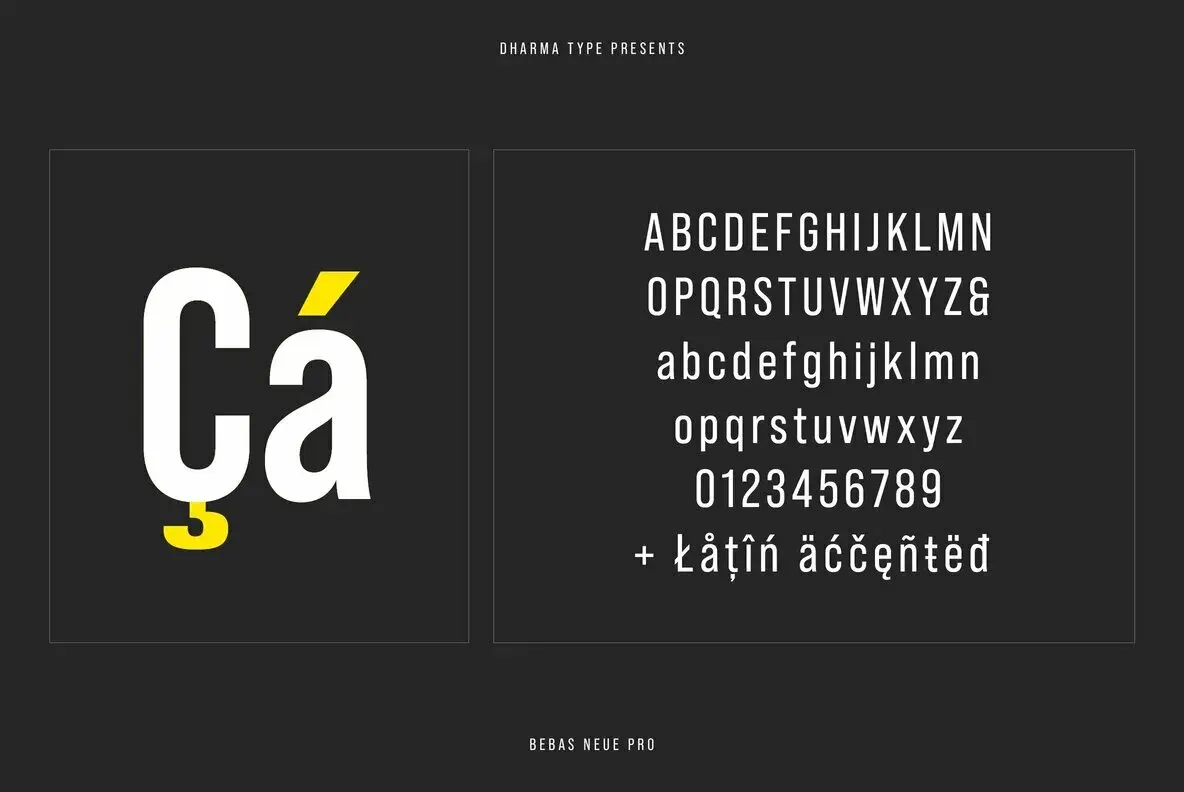
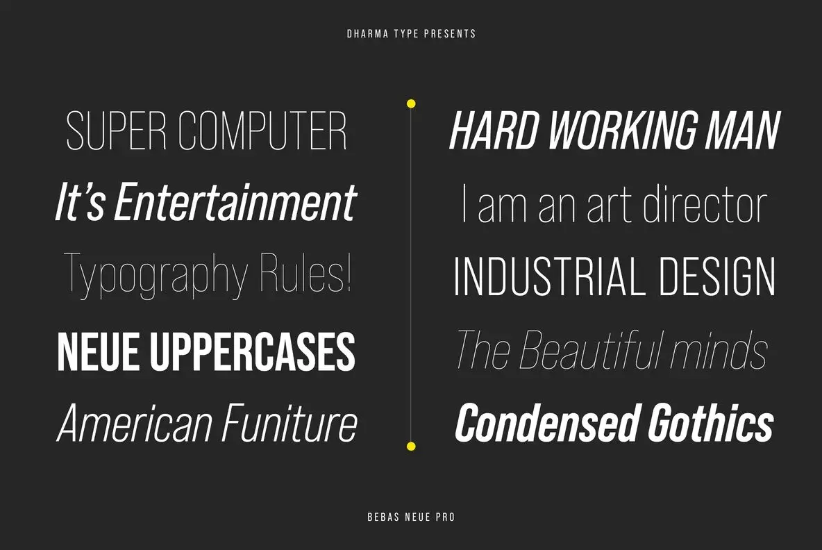
In 2019, Dharma Type launched Bebas Neue Pro, a premium font family with ten styles, including lowercase and italic versions, based on Bebas Neue version 2.000. This professional version of the popular font family was designed to meet the demands of designers who required more flexibility in their typography.
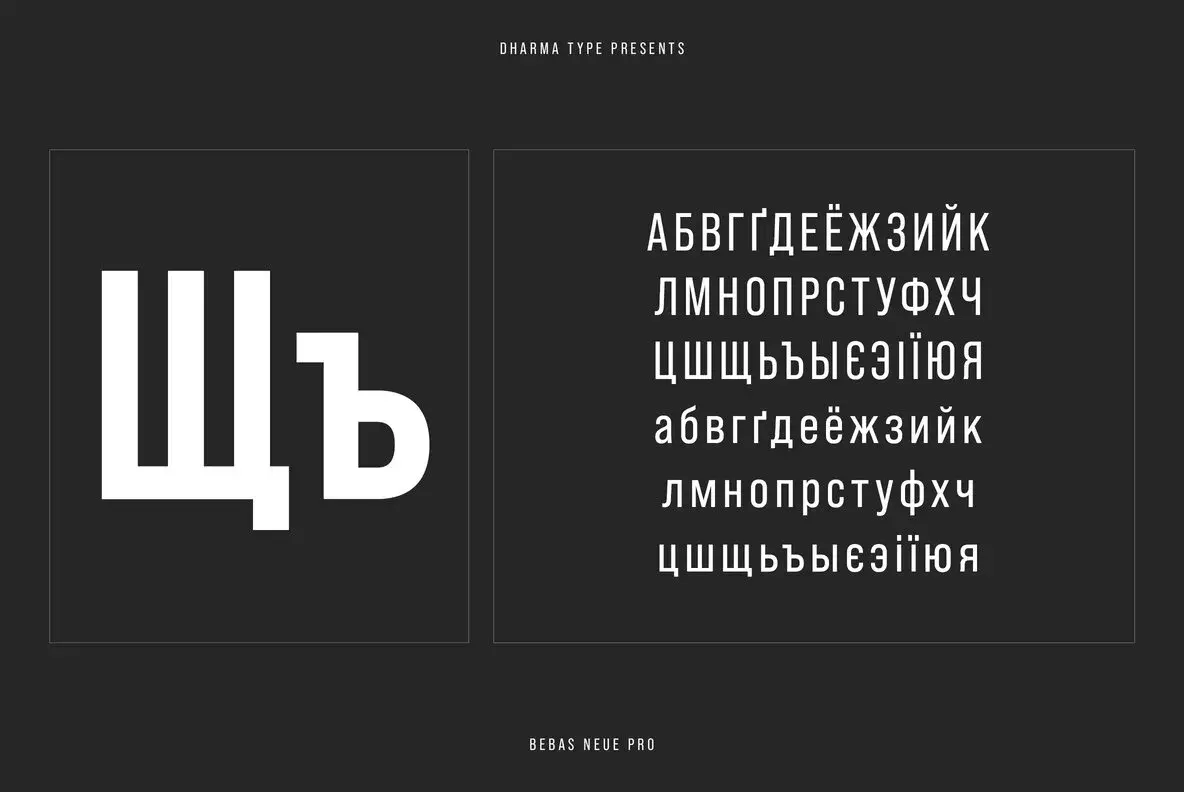
Bebas Neue Pro features thinner uppercase weights that have been redesigned for improved legibility, along with a carefully matched set of lowercase letters. It also supports tabular figures and is compatible with almost all European languages. One of the biggest additions to Bebas Neue Pro is the inclusion of italic styles, which provide users with more creative options when designing their projects.
Bebas Neue Family vs. Bebas Neue Version 2.000
It’s important to note that although Bebas Neue Font Family and Bebas Neue version 2.000 have the same name, they are not identical fonts. Bebas Neue Family was designed by Fontfabric and was based on Bebas Neue version 1. xxx from 2010. Therefore, there are some differences in their design, character sets, style names, and settings. When using these fonts together, designers must be careful and contact Fontfabric if they require any further information about Bebas Neue Family.
Bebas Neue Font Pairing
Bebas Neue Font, a sans-serif with a modern and assertive appearance, has captured the attention of designers and typographers around the world due to its versatility and impact. Its bold and strong lines imbue any design with an air of confidence, which makes it an excellent choice for headlines, titles, and other text elements that demand attention.
When it comes to pairing Bebas Neue with other typefaces, designers have a plethora of options to explore. For a contemporary look:
all make fantastic companions to Bebas Neue. These fonts share the same clean, modern aesthetic that compliments the boldness of Bebas Neue.
On the other hand, if a more futuristic and streamlined appearance is what you are looking for, pairing Bebas Neue with Evolve Sans can create an intriguing combination. Evolve Sans’ neat lines and minimalist features help to create a distinct and powerful effect.
For those seeking a more traditional or classic pairing, Garamond and Lora are two fonts that can work exceptionally well with Bebas Neue. The organic and graceful nature of these typefaces contrasts with the sharp edges of Bebas Neue, resulting in an engaging composition that marries the old with the new.
Overall, whether you need a font that exudes power and impact or one that complements a particular aesthetic, Bebas Neue is a versatile and adaptable choice that will not disappoint.
Conclusion
Bebas Neue is a simple, yet striking font family that has become incredibly popular in recent years. Its elongated shape and condensed sans-serif style make it perfect for headlines, titles, and other short pieces of text. While the font family only features uppercase letters, it has grown to include various styles and derivatives that make it more versatile and usable.
Bebas Neue’s open-source status and availability on various platforms have made it easy for designers and developers to use and modify the font to fit their specific needs. This has led to many derivatives and additional languages, making Bebas Neue a truly global and versatile font family.
Overall, Bebas Neue Font is an excellent choice for designers who want a bold, impactful font that stands out from the crowd. Whether you are creating a logo, a website, a magazine, or any other creative project, Bebas Neue is sure to make a statement and leave a lasting impression on your audience.