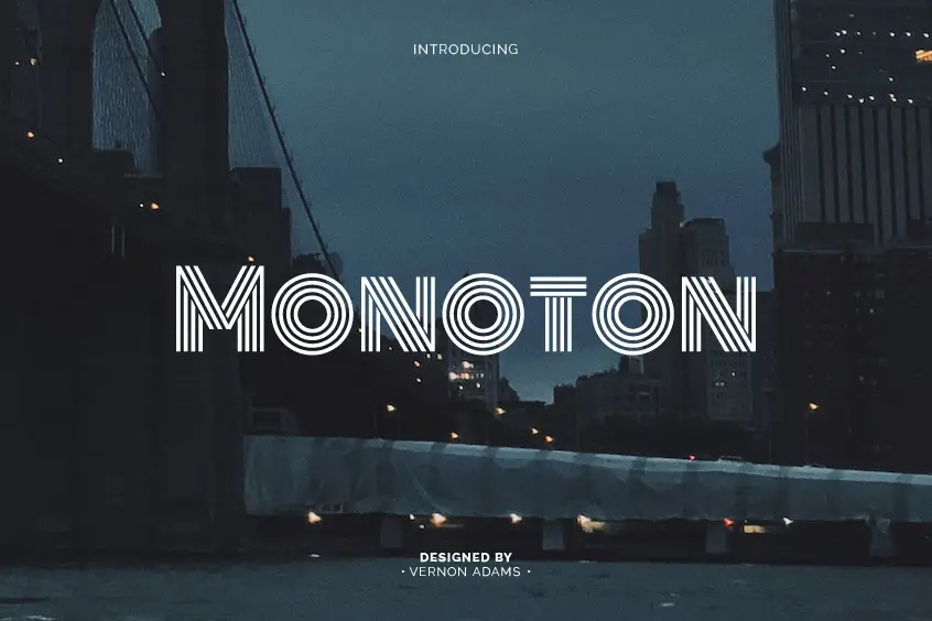
Introduction to Monoton Font
Monoton font stands out as a modern multiline typeface that echoes the classic ‘Prisma’. The typeface, initially designed by the renowned Rudolf Koch in 1931, has been revitalized by Vernon Adams to cater to contemporary audiences. Monoton’s versatility and striking features make it the ideal choice for use on the internet, easily accessible on desktop computers, laptops, and mobile devices. A quintessential display font, Monoton Regular font is perfect for crafting bold headlines, captivating posters, and other designs that demand attention.
The Unique Features of Monoton Font
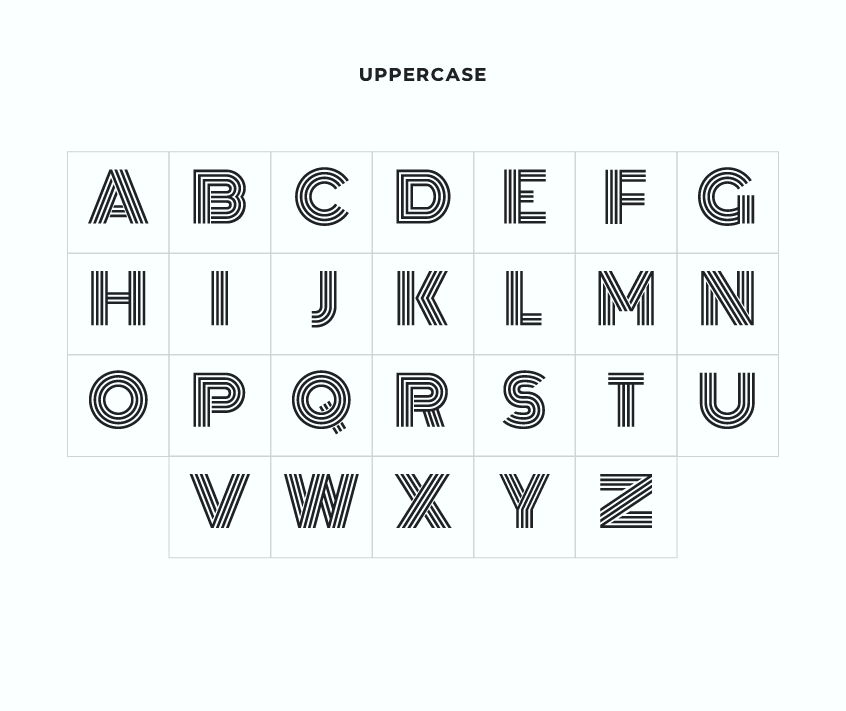
A. Monolinear strokes
One of the defining characteristics of Monoton font is its impeccably monolinear strokes, which exhibit uniform thickness throughout the typeface. This design choice sets Monoton apart from other fonts, giving it a distinct identity. The monolinear strokes not only provide visual coherence but also contribute to the typeface’s retro vibe, reminiscent of vintage signage and lettering.
B. Retro yet contemporary vibe
Straddling the line between the past and the present, Monoton offers a unique blend of retro charm and contemporary flair. Its design elements, such as the monolinear strokes and uppercase lettering, evoke a sense of nostalgia for bygone eras. At the same time, the font feels fresh and current, making it a popular choice among designers looking to create designs that are both classic and modern.
C. Simplicity and legibility
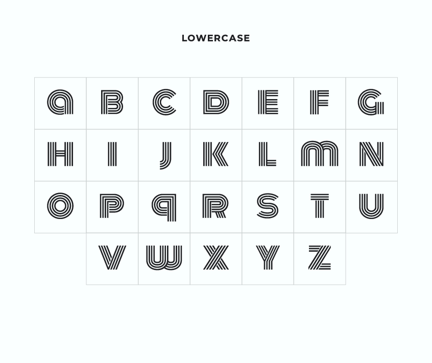
Simplicity is the cornerstone of Monoton’s design. Comprised solely of uppercase letters and numerals, the font prioritizes legibility and ease of use. Its uncomplicated structure allows for quick comprehension, ensuring that the message is effectively communicated. Additionally, the absence of lowercase letters and intricate glyphs streamlines the font, making it more user-friendly for designers and end-users alike.
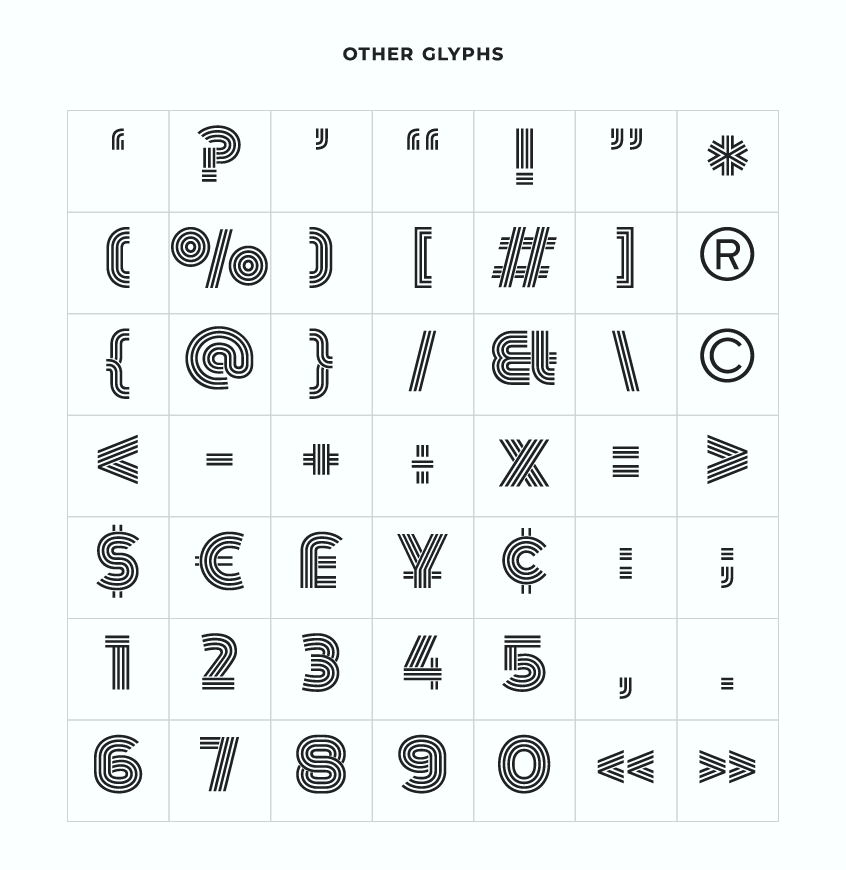
D. Unique letter details
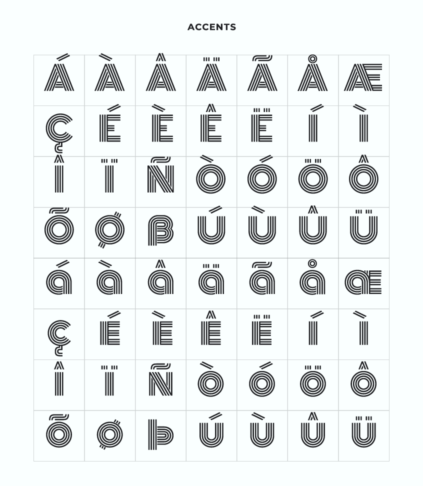
While Monoton’s simplicity is one of its key features, the font also boasts unique letter details that add character and depth to the typeface. For example, the letters M and W showcase wider strokes in their middle sections, deviating from the uniformity of the monolinear strokes. These subtle variations contribute to the overall visual appeal of Monoton, making it a more engaging and memorable font.
Applicable settings
The versatile nature of Monoton font allows it to be utilized in a diverse range of settings, spanning various industries and media formats. Designers working in fashion, music, and advertising can all benefit from incorporating Monoton into their projects. From album covers and event posters to fashion advertisements and branding, Monoton’s bold and striking appearance ensures that the design stands out in a crowded marketplace.
License and Usage Options
Monoton’s availability as a free download further contributes to its widespread use and appeal. The typeface can be easily accessed and used for both personal and commercial projects without any licensing fees or restrictions. This freedom encourages experimentation and innovation, allowing designers from all backgrounds to incorporate Monoton font into their work.
https://scripts.sil.org/cms/scripts/page.php?site_id=nrsi&id=OFL
Monoton Font Pairing Options
To create visually dynamic and balanced compositions, Monoton can be paired with a range of complementary fonts. Pairing Monoton with other typefaces allows for the creation of interesting and engaging designs that draw the viewer’s attention. Some popular font pairings that work well with Monoton include:
The font pairings mentioned above represent only a fraction of the possibilities when combining Monoton with other typefaces. Designers are encouraged to experiment with various font combinations, exploring the vast landscape of typography to find the perfect pairing that caters to their specific design requirements. The key to successful font pairings lies in understanding the individual characteristics of each typeface and finding a complementary balance that enhances the overall design.
Conclusion
In today’s competitive design landscape, Monoton stands out as a unique and versatile typeface that offers a blend of retro charm and contemporary appeal. Its distinct monolinear strokes, simplicity, and unique letter details make it an ideal choice for bold, attention-grabbing designs. The versatility of Monoton allows it to be used across various industries and settings, while its compatibility with a range of complementary fonts enables designers to create visually dynamic and engaging compositions.
Embracing Monoton as a design tool opens up a world of possibilities for creating striking and memorable designs. By experimenting with different font pairings and understanding the nuances of typography, designers can elevate their work to new heights of sophistication and visual impact. Ultimately, Monoton serves as a testament to the power of typography in shaping our visual landscape and communicating ideas in a compelling and captivating manner.