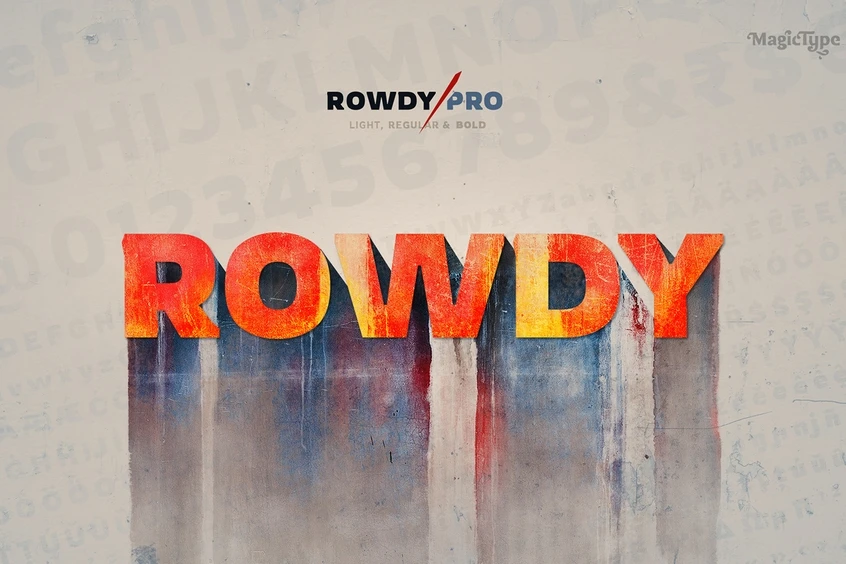
Introducing Rowdies Font
The Rowdies font family, also known as Rowdy Pro font, stands out as a distinctive Latin display typeface that draws inspiration from the rough and tough Indian action cinema.
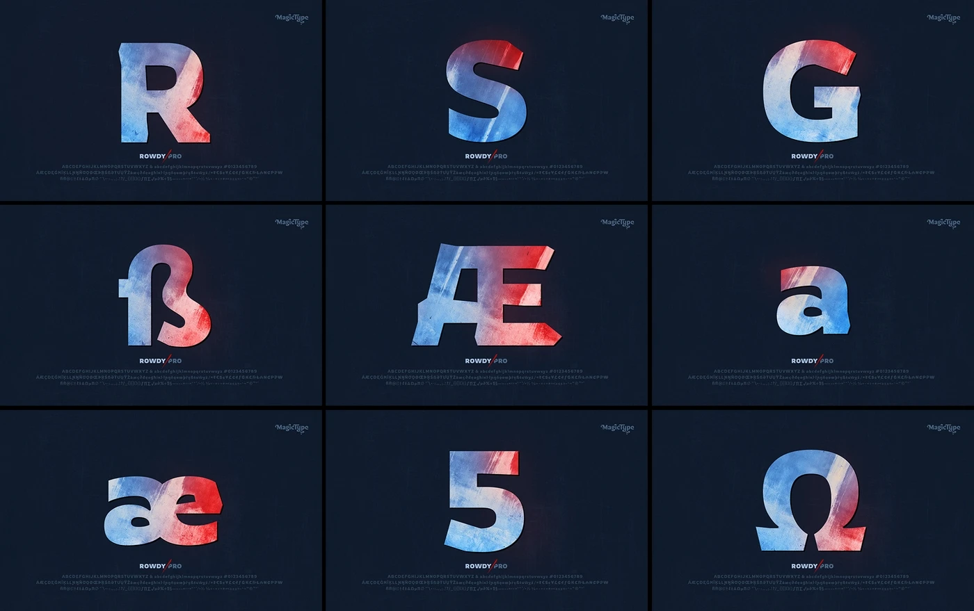
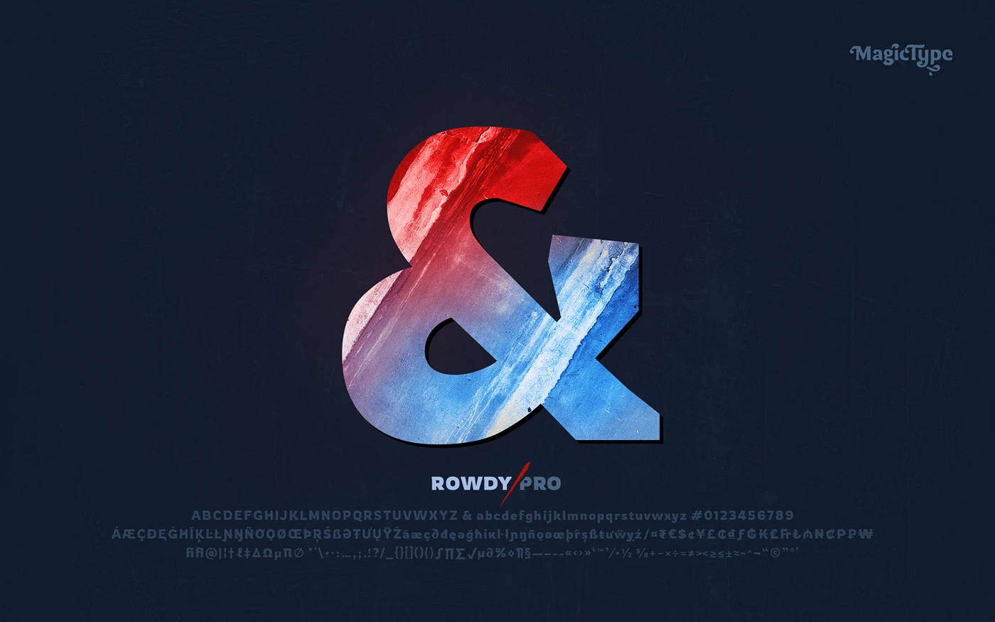
With each individual letter boasting a rough and odd design, the font contributes to an overall rugged look that is both attention-grabbing and memorable.
This versatile typeface can be used in a variety of applications, from desktop publishing to webfont integrations, and is available for free download on various font websites.
Above all, Rowdies is an excellent choice for designers seeking to convey a sense of ruggedness or toughness in their creations.
Characteristics
Rowdies font is a contemporary, playful, and expressive typeface that exudes a sense of fun, energy, and enthusiasm.
Unlike conventional fonts, Rowdies possesses a quirky and dynamic character that sets it apart from the rest.
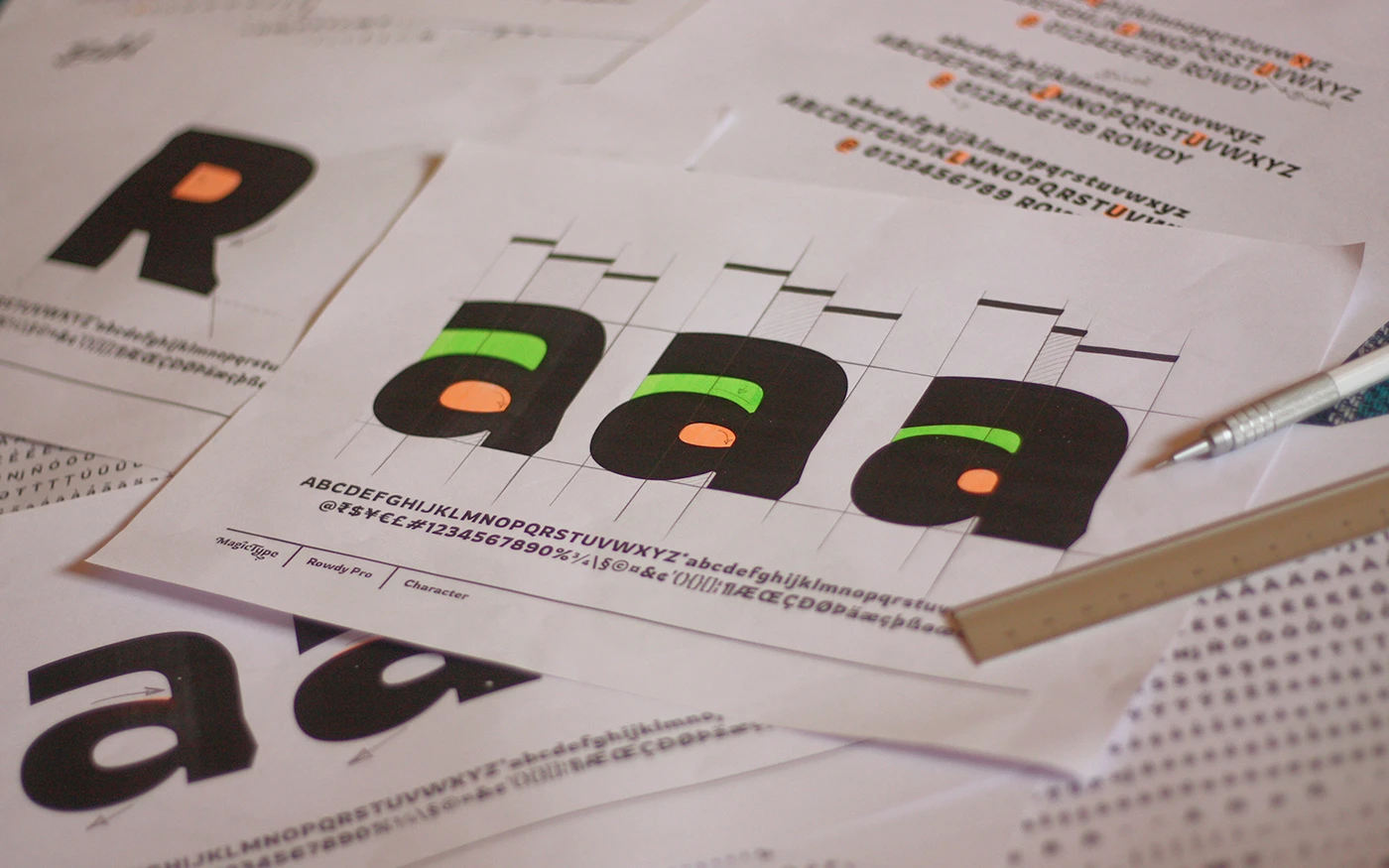
The font family was meticulously designed with the primary goal of evoking a lively and spirited demeanor while maintaining legibility and versatility across diverse applications.
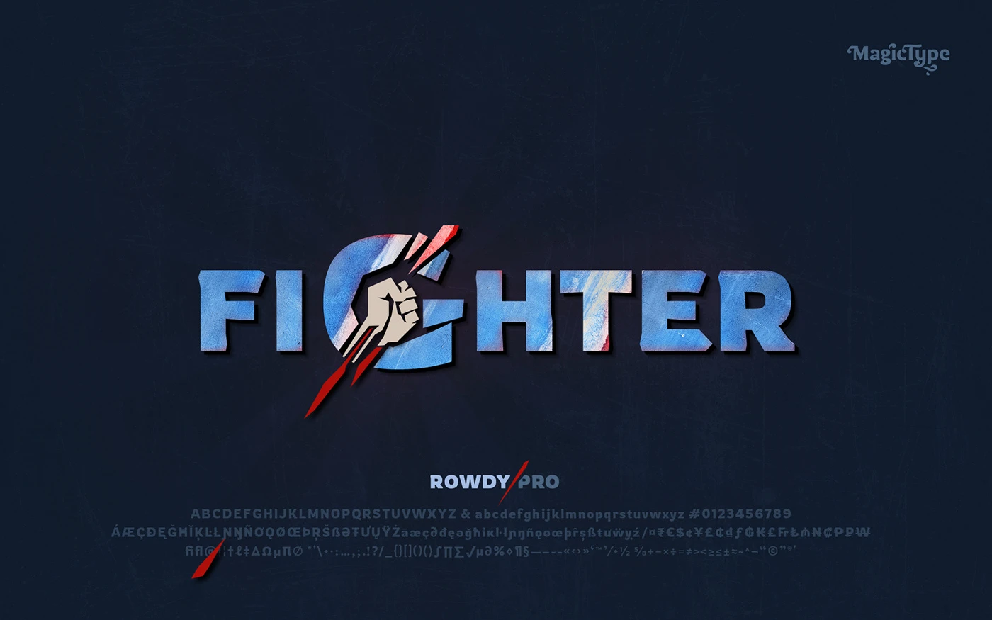
The typeface is characterized by its bold, chunky, and rounded letterforms, making it an excellent choice for creative projects, advertising campaigns, or anywhere a touch of whimsy and playfulness is desired.
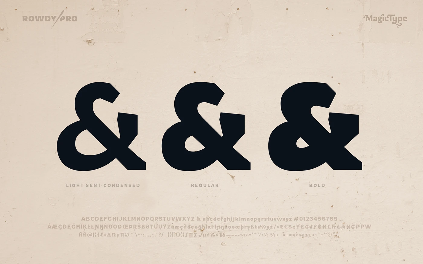
Weights and Styles
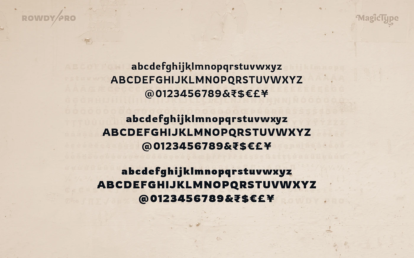
The Rowdy Pro font family offers multiple weights and styles, such as Light, Regular, and Bold, providing a range of options for designers to experiment with and adapt to different contexts.
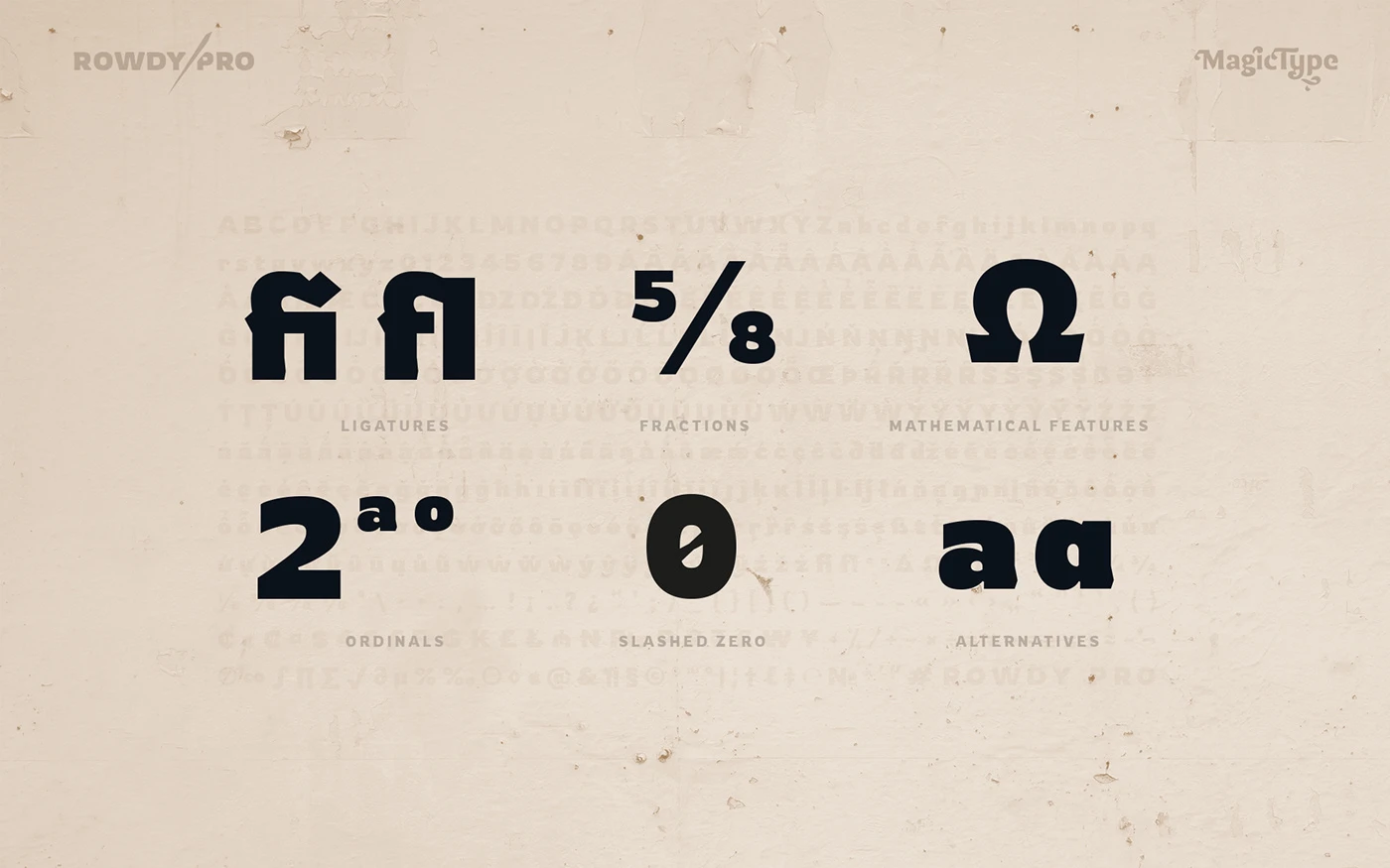
The letterforms feature exaggerated curves and unconventional shapes that lend the typeface its distinctive and endearing appearance.
This unique design not only captures the essence of the typeface but also provides a refreshing alternative to more traditional or formal typefaces.
By breaking away from conventional norms, Rowdies invites a sense of amusement and delight, making it an ideal choice for projects requiring a touch of lightheartedness.
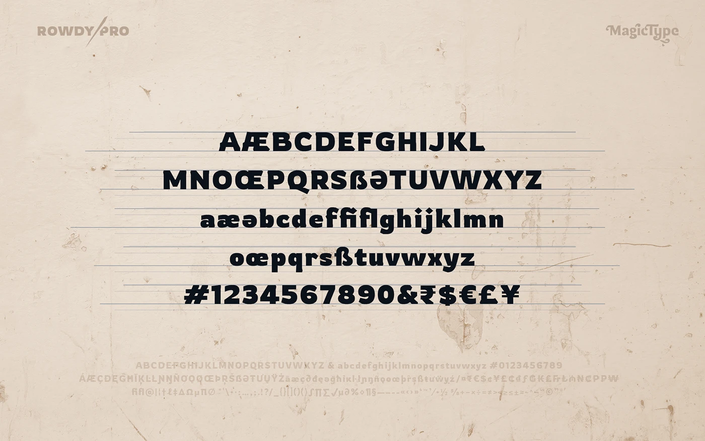
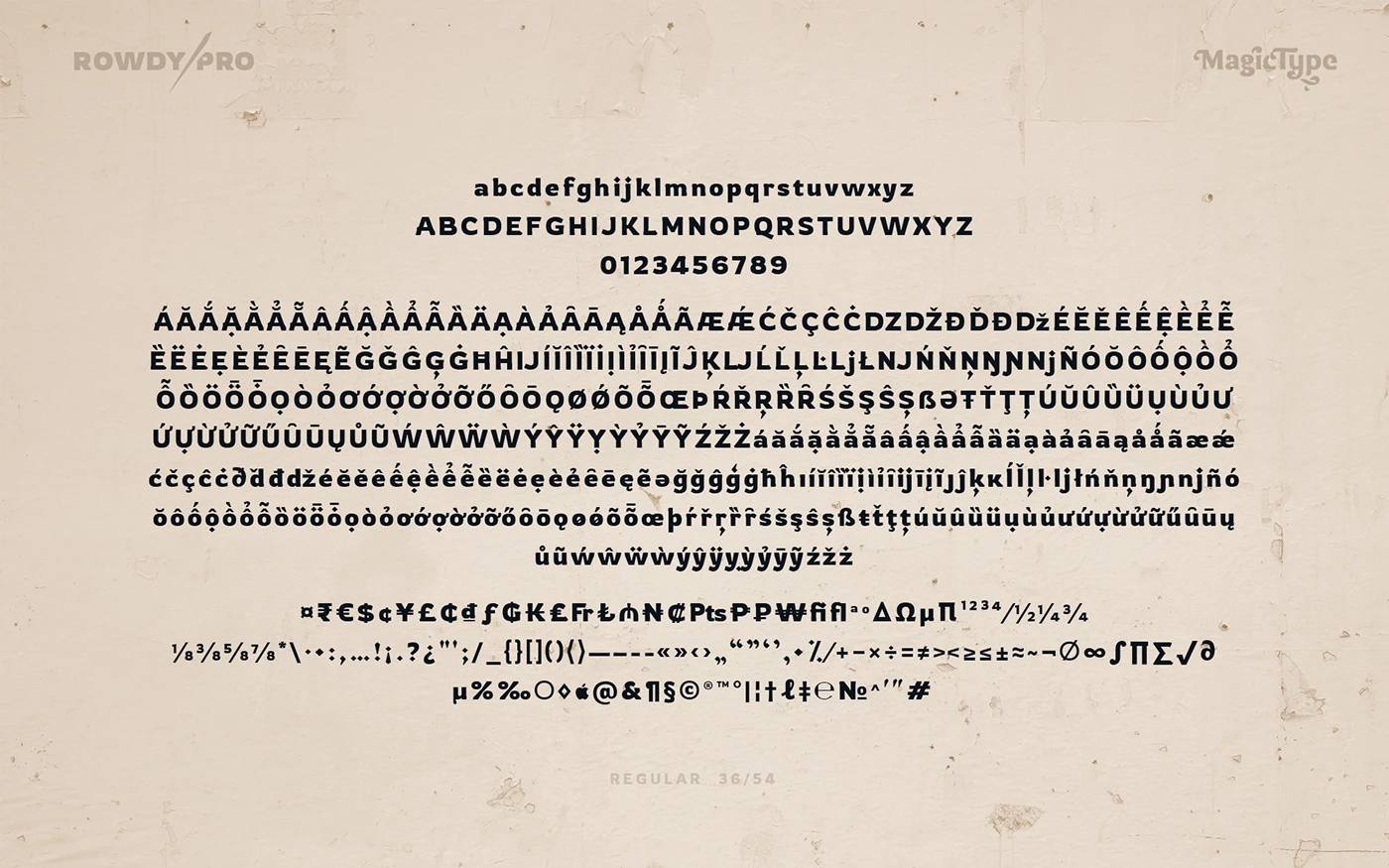
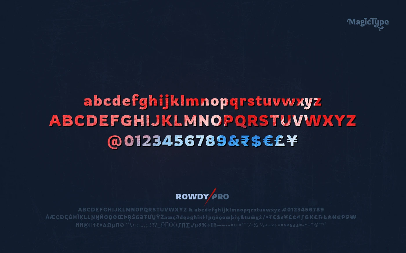
Uppercase and Lowercase Characters
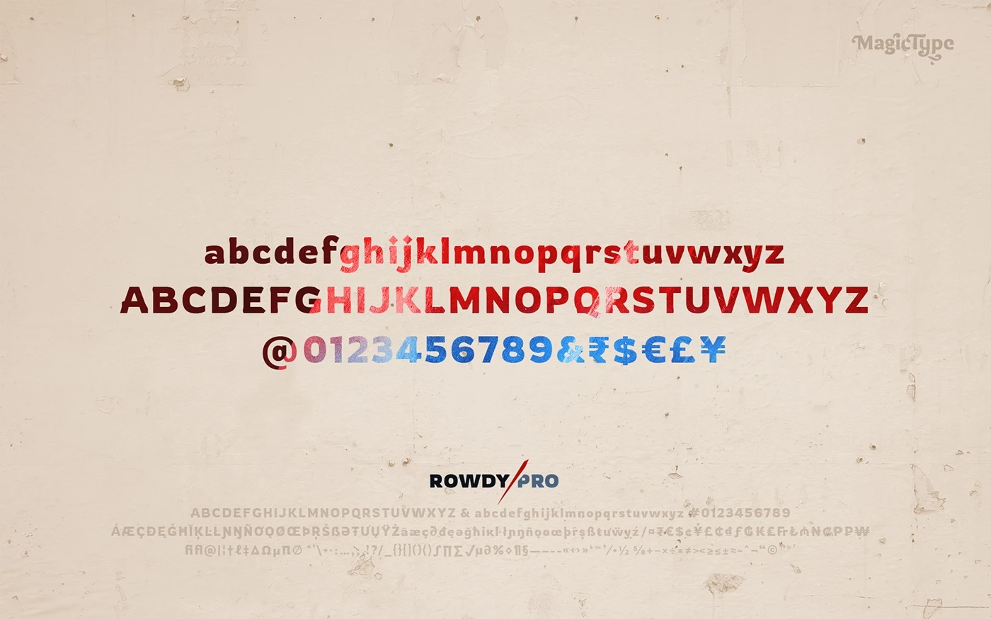
One of the most striking features of the Rowdies font family is the strong presence of its uppercase characters. With wide and hefty strokes, these characters command attention and make a bold statement.
In contrast, the lowercase characters have a more fluid and organic feel, with their rounded and slightly uneven shapes. These elements come together to create a harmonious blend of strength and playfulness.
The font’s numerals and punctuation marks also demonstrate a similar playfulness, imbuing the typeface with a cohesive and harmonious aesthetic that is both visually appealing and engaging.
Kerning and Spacing
In terms of kerning and spacing, Rowdies is thoughtfully designed to ensure optimal readability, despite its unconventional forms.
The generous spacing between letters allows for easy reading at various sizes, making it a versatile choice for both print and digital media.
By striking a balance between its playful design and practical legibility, Rowdies offers designers the best of both worlds – a captivating typeface that can be used effectively in a wide range of applications.
Applications
One of the defining characteristics of the Rowdies font is its energetic and spirited nature, which can inject a sense of fun and excitement into various design projects.
This typeface is particularly well-suited for children’s books, posters, packaging, logos, web design, and any project that aims to convey a light-hearted and engaging message.
With its unique combination of strength and playfulness, Rowdies can effortlessly transform any design into a visually stunning and captivating piece.
Licensing and Terms
To ensure that designers and creators can freely use and distribute the Rowdies font, it is licensed under the SIL Open Font License v1.1 (http://scripts.sil.org/OFL).
This license allows for the use, study, modification, and redistribution of the font, making it a valuable resource for designers and developers alike.
To view the copyright and specific terms and conditions, users can refer to the OFL.txt file included with the font package.
Rowdies Font Pairing Options
As with any typeface, the overall look and feel of a design can be significantly influenced by the font pairings chosen.
With Rowdies, there are many font pairing options available, depending on the desired aesthetic and messaging.
Some examples of font pairings that work well with Rowdies include:
By carefully selecting the appropriate font pairings, designers can further enhance the visual appeal and effectiveness of their creations, ensuring that their designs resonate with their intended audience.
Conclusion
In summary, Rowdies is a captivating and delightful font family that combines the best of both worlds – a playful and spirited design with practical legibility and versatility.
Its distinctive character and charm make it an ideal choice for designers who want to add a touch of whimsy and creativity to their work.
By offering multiple weights and styles, as well as a range of font pairing options, Rowdies provides designers with the flexibility to craft unique and engaging designs that cater to a variety of applications.
As the world of typography continues to expand and evolve, it is essential for designers to stay abreast of the latest trends and developments.
The Rowdies font family serves as a prime example of how innovative and unconventional typefaces can break away from traditional norms and create a lasting impact in the world of design.
By embracing the unique qualities and characteristics of the Rowdies font, designers can not only elevate their work but also contribute to the ongoing growth and diversification of typography.