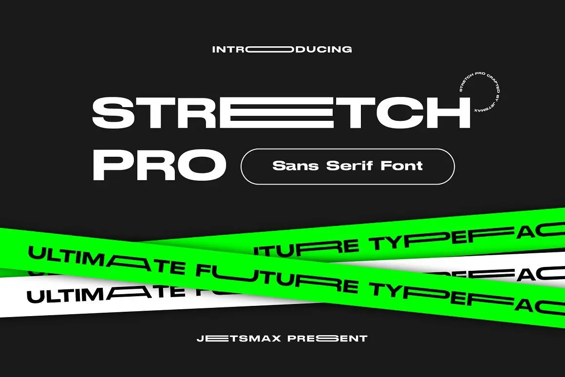
Stretch Pro Font – The Modern Futuristic Sans Serif
If you’re on the hunt for a font that’ll add a cool, futuristic vibe to your design, you’ve got to take a peek at Stretch Pro Font. Imagine taking the classic Helvetica and giving it a fun, stretched-out twist. That’s what you get with this font! Stick around, and we’ll dive into all the awesome details, licensing info, and perks of using Stretch Pro Font in this article.
A Closer Look at Stretch Pro Font
Originating from the creative chambers of Jetsmax Studio — a renowned establishment with a commendable track record in typography, branding, and graphic design — Stretch Pro Font bears the hallmark of quality. The studio’s portfolio is adorned with noteworthy fonts like Arupala Grotesk, Sirukota, and Just Bubble. Released in 2020, Stretch Pro Font is a testament to the studio’s continuous evolution and dedication to typography innovation.
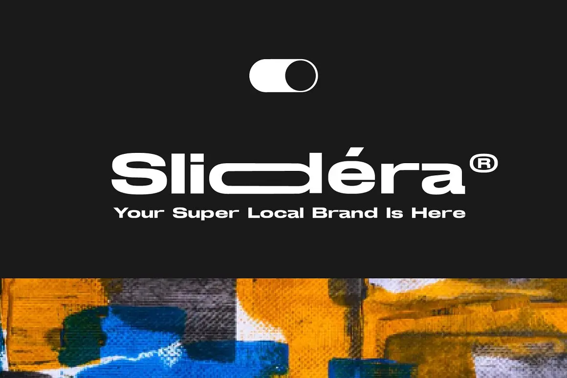
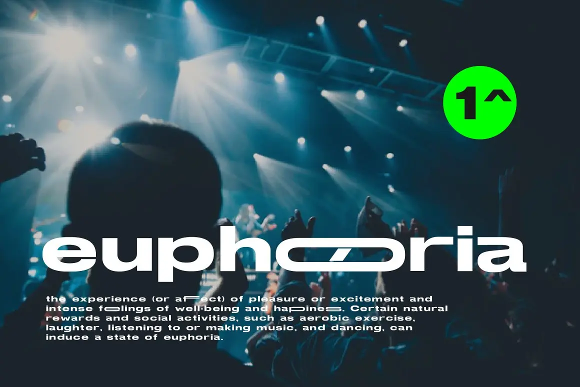
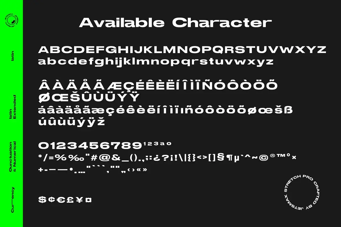
At its core, Stretch Pro Font is a sans serif typeface. It diverges from the regular sans-serif architecture by embodying a low-contrast geometric design. The font’s futuristic motif renders it adaptable to a myriad of design tasks, including but not limited to, logos, banners, posters, and headlines. Two variants exist within this typeface: Regular and Basic, each boasting 330 meticulously crafted characters. These span uppercase, lowercase, numerals, punctuation, and symbols, and even ensure multilingual compatibility.
The Stretch Pro Regular Font variant showcases an elongated, stretched presentation of characters, while the Basic variant epitomizes cleanliness and elegance in letter arrangement. The synergy of the two styles fosters a harmonious blend, making Stretch Pro Font applicable in both formal and avant-garde designs.
Noteworthy Features of Stretch Pro Font
Stretch Pro has some features that make it stand out from other fonts. Here are some of them:
- Stretched and Space-efficient: The elongated design doesn’t just give it a distinctive look; it’s also a boon for designs that lean towards minimalism. This space-efficient design can fit more characters on a single line, making it perfect for compact layouts.
- The Future is Now: Stretch Pro screams contemporary. Whether you’re aiming for a tech-forward appeal or simply looking to modernize your design, its sleek and trendy vibe is the answer. Pair it with gradients, neon splashes, or metallic shades, and you’ve got a design ready to transport viewers to another dimension.
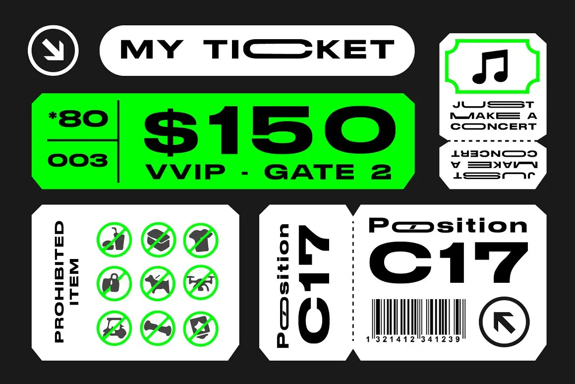
- A Jack of All Trades: No matter the design context – professional or playful, monochrome or colorful, abstract or structured – Stretch Pro Font adapts effortlessly, always enhancing the overall look and feel.
How to Use Stretch Pro Font
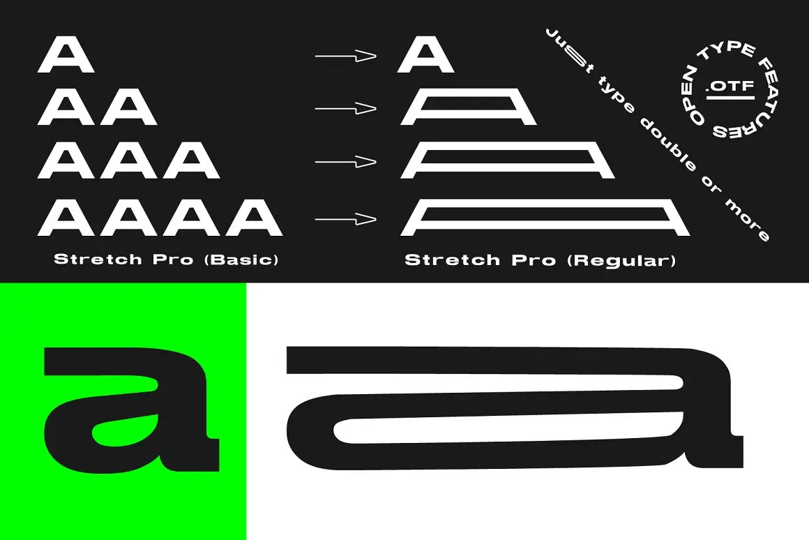
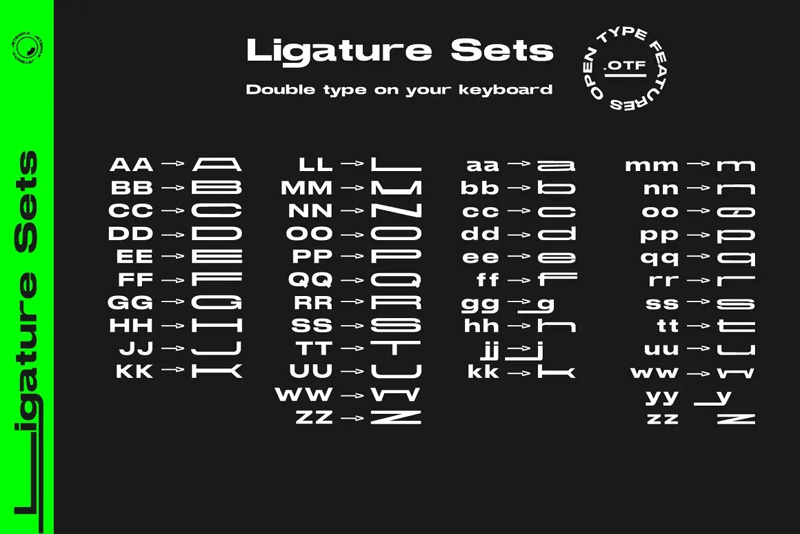
One of the standout features of Stretch Pro Font is its unique stretching capability. This allows designers to play with the typeface, achieving different lengths based on the number of repeated characters. It’s a simple yet effective way to add dynamic variation to a design.
The Stretching Mechanism Explained:
To utilize the unique Stretch Pro Font stretching feature, follow these instructions:
- Double Typing: For a slightly elongated version, type a character twice.
- Example: AA → __
- Triple Typing: For a more pronounced stretch, type the character three times.
- Example: AAA → ___
- Quadruple Typing: For the maximum stretch, type the character four times.
- Example: AAAA → ____
Practical Applications:
This stretching mechanism is not just a gimmick; it can be practically applied in various design scenarios:
- Headlines: To emphasize specific words or to create a sense of motion.
- Logos: Stretching can bring a dynamic touch, making logos more memorable.
- Poster Designs: Especially for events like music festivals or tech conventions, where you want a modern, forward-looking feel.
- Digital Design: For creating visually captivating banners, ads, or website elements that grab viewer attention.
Tips for Designers:
- Consistency is Key: When using the stretching feature in a design, ensure you maintain consistency. If you’ve chosen to stretch certain characters in a title, make sure to apply the same pattern throughout your design for cohesiveness.
- Less is More: Just because you can stretch doesn’t mean you always should. Sometimes, the basic variant might work better, so always assess the design’s needs.
License of Stretch Pro Font
Stretch Pro Font is free for personal use only. This means that you can use it for your personal projects, such as hobbies, school assignments, or non-profit activities. However, you cannot use it for any commercial purposes, such as selling products or services, advertising, or making money in any way.
If you are interested in using Stretch Pro for commercial purposes, you need to purchase a commercial license from here. The commercial license allows you to use the font for unlimited projects and unlimited sales.
In Summation
Stretch Pro Font isn’t just another addition to the typography world; it’s a revolution in design. Its futuristic undertones, coupled with its unique stretched aesthetic, not only make designs stand out but also communicate a message of innovation and progression. Whether you’re a budding designer or a seasoned professional, Stretch Pro is the secret weapon you’ll want in your design arsenal.