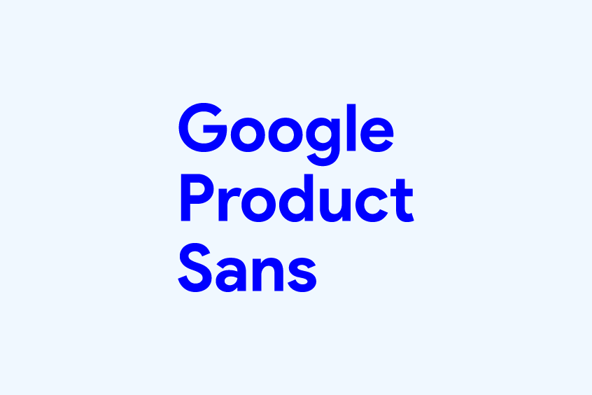
About Google Product Sans Font
Product Sans Font is a sleek, geometric sans-serif family developed by Google for its branding efforts. It was first introduced on September 1, 2015, as the new Google logo. As the company’s branding was becoming increasingly widespread across a variety of devices and platforms, Google aimed to create a typeface that was both legible and consistent in constrained spaces.
The design team sought to preserve the simplicity and accessibility of previous logos while incorporating geometric elements. The font bears a resemblance to the Futura typeface but with notable differences, such as the double-story ‘a,’ which was included to contrast with the circular shapes of other characters. Additionally, Product Sans features stroke terminals that end at approximately 45 degrees and are cut off perpendicular to the tangent of the stroke.
In addition to these design choices, the team made slight optical corrections to the geometric forms for improved legibility. For example, the uppercase “G” has its circular shape slightly pulled inward where it meets the crossbar, and the counters of the ‘6’, ‘8’, and ‘9’ are almost perfect circles. These adjustments were implemented to ensure optimal readability for users.
The new Google logo and identity system were crafted with the intention of being responsive and adaptable to the evolving needs of its users. The system incorporates elements of scale, interaction, and legibility to provide a consistent and visually pleasing representation of the Google brand across all platforms.
To fully realize this brand system, the developer team at Google meticulously created a custom, geometric sans serif typeface known as Product Sans. Designed from the ground up, Product Sans boasts simplicity, humility, and approachability, seamlessly integrating with the company’s logo across a plethora of contexts and product lockups without overpowering it.
Furthermore, Product Sans serves as a primary branding typeface, distinct in both style and character from the interface text elements utilized in Material Design. This thoughtful integration of form and function makes Product Sans a vital component of the comprehensive Google brand system, ensuring a cohesive and unified user experience.
Product Sans Font Features
1. Geometry
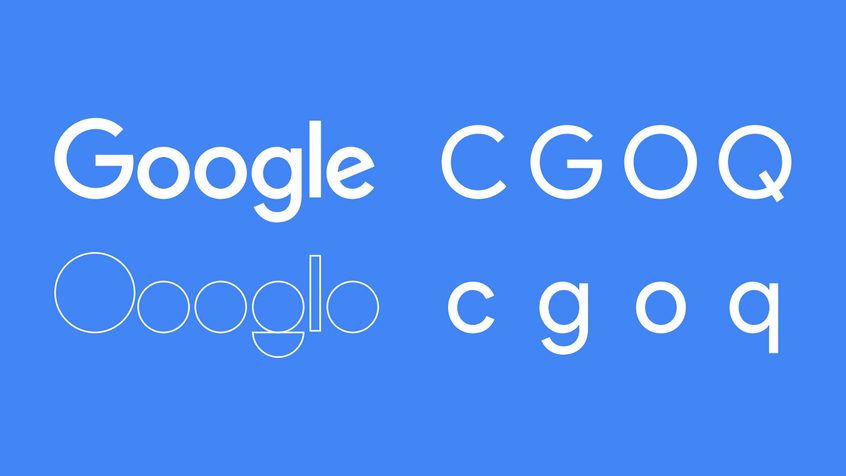
The geometric composition of a sans-serif font plays a significant role in determining its overall aesthetic and characteristics. This is evident in the design of Google’s new Logotype, which exhibits a strong emphasis on its geometric plane composition. It can be surmised that the Logotype was initially conceptualized, and subsequently, visual corrections were made to refine and expand it into a complete font. “Product Sans” reflects this process, as it incorporates optical corrections for improved legibility.
When comparing Google Product Sans Font to Century Gothic, it is evident that they share similarities in their geometric compositions, which are rooted in Constructivism – an art movement that emphasizes the use of basic geometric shapes to abstract letters. This design approach is evident in other notable geometric sans-serif fonts such as Futura in the 1920s, 30 Century Gothic in the 1960s, and The Avant-Garde Gothic in the 1960s. However, DIN, which also incorporates a large geometric design, differs in its grid-based generation method, resulting in a distinct appearance. Another notable font in this category is Adrian Frutiger’s Avenir, which also utilizes a geometric sans-serif design. However, it is possible that Avenir’s design strategy may not align with Google’s preferences for a very geometric font.
Google’s Product Sans Font showcases a highly innovative geometric sans-serif design, which is evident in the use of double lowercase letters as an alternate style. It is an intriguing font that stands out for its attention to detail in its boundary lines. Another notable font in this category is Lineto Circular, which was featured on the alphabet release pages, and it is quite interesting due to its boundary details, which are more pronounced than those of Google Product Sans Font.
2. Terminals
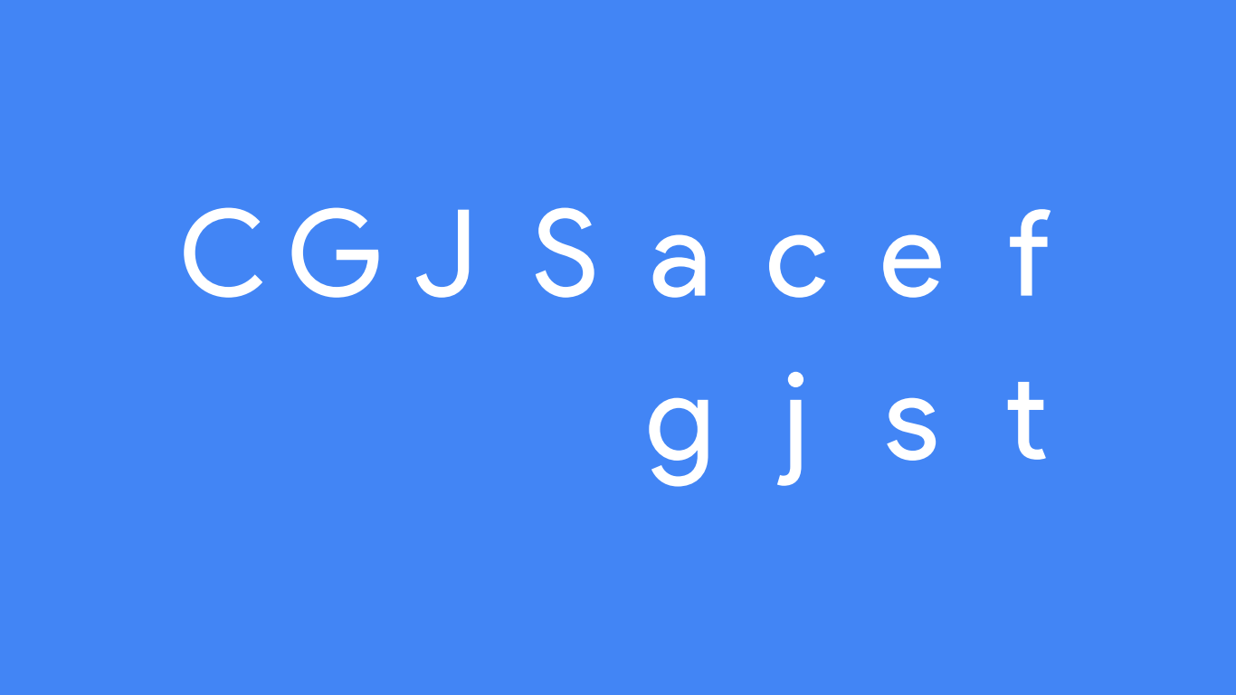
The end of the stroke of Google Product Sans is as close to 45 degrees as possible, and the cut is perpendicular to the stroke. As the explanatory text in the proof sheet says, the design of the end of the stroke is one of the important features of sans-serif fonts. So, the design orientation of Product Sans doesn’t have much good or bad to evaluate, it’s just a choice.
In comparison with Avant Garde Gothic, you can see that Google Product Sans has slightly different design orientations for uppercase and lowercase letters-uppercase letters tend to retain pure geometric characteristics and only make limited visual corrections; lowercase letters are There are more corrections of text fonts, such as the design of “f” and “t”, and the slightly narrower circular-based letters such as c and e. Combined with a specially added double-layer to guess, perhaps this font will also have the opportunity to present longer text in the future, not only in Google’s logotype and product name.
2. Schoolbook Letters
Product Sans font is a unique typeface that seamlessly blends geometric forms with the simplicity of traditional schoolbook letter printing.
3. Numerals
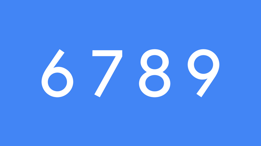
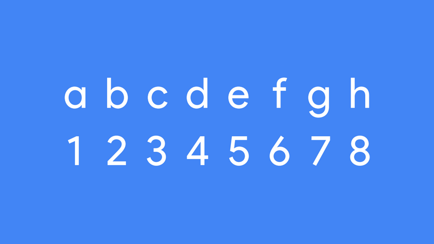
One of the most striking features of Product Sans font is its numerals, which adopt rigid geometric forms. The counters of the numerals ‘6’, ‘8’, and ‘9’ are nearly perfect circles, with only slight optical corrections to enhance their legibility. This attention to detail in the design of the numerals adds a level of sophistication and elegance to the font.
In addition, Product Sans font also features squared-off terminals on the numerals ‘6’, ‘7’, and ‘9’, which extend over the baseline/cap height. This geometric detail serves to further reinforce the font’s focus on geometric forms and adds an interesting visual element to the typeface.
4. Localization
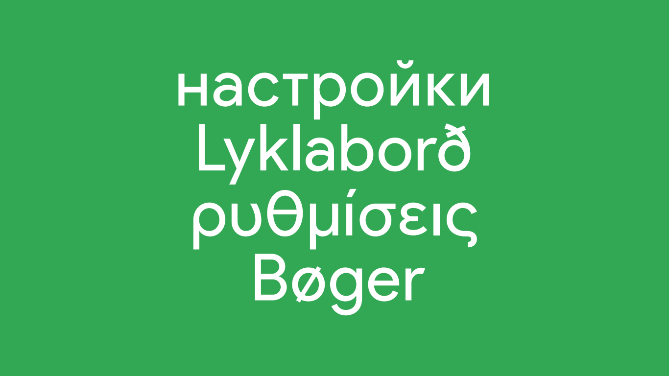
Product Sans boasts a comprehensive collection of scripts, comprising Cyrillic, Greek, and Latin scripts. In addition, Noto Sans offers an expansive array of thirty global scripts, thus effectively bridging the gap between various international languages.
4. Product Lookups

Product Sans is a typeface that has been meticulously kerned, meaning that the spacing between each letter has been precisely adjusted, to ensure that the names of Google’s products can be easily and seamlessly incorporated into every visual layout and presentation, regardless of the size of the text. This attention to detail ensures that the branding of Google’s products is consistently and effectively conveyed, enhancing the recognition and perception of the company’s offerings.
Furthermore, the recently revamped Google Logotype and the less ubiquitously utilized Google G icon have been seamlessly integrated into the Google Product Sans Font as special characters. These characters have been specifically designated to the custom Unicode section, allowing for a streamlined and cohesive visual representation across all Google products.
Google Product Sans Font License
The Product Sans font is an exclusive typeface that is proprietary to Google and falls under the purview of the Google Product Sans license. This license precludes the font from being classified as open-source, and as such, it is strictly limited to non-commercial use. Any attempts to use the font for commercial purposes would be a violation of the license agreement and could result in legal repercussions.
Product Sans Font Free Alternatives
Some free alternatives to the Product Sans font to use for commercial endeavors include:
It’s essential to note that these alternatives may not be exact matches to the Product Sans font, but they are similar in style and can be used as a substitute.