The Font Behind the Famous Pizza Chain
Domino’s Pizza, a global giant in the pizza industry, is instantly recognizable by its iconic logo. However, the Domino’s Pizza Font, which spells out its name, often goes unnoticed. This article dives deep into the Domino’s Pizza Font, tracing its evolution and understanding its significance.
The Modern-Day Domino’s Pizza Font
From 2012 onwards, the Domino’s Pizza Font underwent a transformation. While it’s a bespoke design, it closely mirrors the Pluto Sans Heavy. This font, a brainchild of HVD Fonts, is a humanist sans-serif typeface with varying weights.
If you’re keen on using the Domino’s Pizza Font look-alike, Pluto Sans Heavy, for personal projects, it’s available. But for commercial ventures, a full version needs to be acquired here.
The Historical Domino’s Pizza Font
Before the current Domino’s Pizza Font, the brand utilized the Futura Condensed ExtraBold. This geometric sans serif font, designed by Paul Renner, was introduced in 1927. It was birthed as part of the New Frankfurt project, a movement that aimed to champion modern, functional design and architecture in Germany. The essence of Futura is deeply rooted in geometric shapes, especially circles, resonating with the Bauhaus design philosophy of its time.
The influence of this Domino’s Font predecessor, Futura, is profound. It has adorned a plethora of logos, posters, books, films, and ads. Renowned brands like Volkswagen, IKEA, Calvin Klein, HP, and NASA have all embraced Futura in their branding.
What the Domino’s Pizza Font Symbolizes
The selection of Futura as the Domino’s Pizza Font was a deliberate choice. It encapsulates the brand’s core values and identity. Futura, with its bold, modern, and elegant design, exudes a vibe of confidence, quality, and innovation – attributes synonymous with Domino’s brand image.
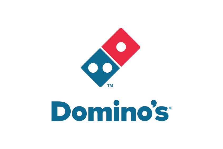
Furthermore, the design of this Domino’s Pizza logo Font subtly pays homage to the brand’s moniker. Its uncanny resemblance to a domino tile is evident. The dual squares represent the two facets of a domino, and the three dots are a nod to the brand’s first three stores. The domino imagery also suggests the idea of a domino effect, reflecting the brand’s exponential growth and outreach.
Wrapping Up
The Domino’s Font is not just a collection of characters. It’s an art form that narrates the brand’s journey, ethos, and vision. With the Domino’s Pizza Font, especially the classic Futura, the brand not only spells its name but also shares its legacy. It stands as a testament to the timeless appeal of classic design, epitomizing Domino’s essence of innovation, modernity, and boldness.