What is the NASA Font Used for the Logo?
When we think of NASA, we often picture outer space, powerful rockets, and groundbreaking discoveries. The National Aeronautics and Space Administration has had a significant impact and is widely recognized. The NASA font, featured in its logos, is also quite iconic. Have you ever been curious about the fonts NASA has used?
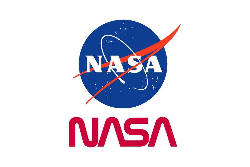
Exploring the NASA logo font is interesting, as there are two main designs: the red curved “worm” and the emblematic “meatball.” Let’s take a closer look.
The NASA Worm Font
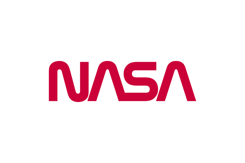
In 1975, NASA, keen on modernizing its image, introduced the worm design. This NASA logo font was crafted by Richard Danne and Bruce Blackburn. They envisioned a futuristic yet elegant design, symbolizing the next frontier of space discovery. Interestingly, the NASA font used for the worm logo is custom-made, but closely resembles the font ‘Nasalization‘, which is inspired by rocket nozzles, exuding a sense of speed, curvature, and sharp precision.
The full Nasalization family can be purchased here.
The NASA Meatball Font
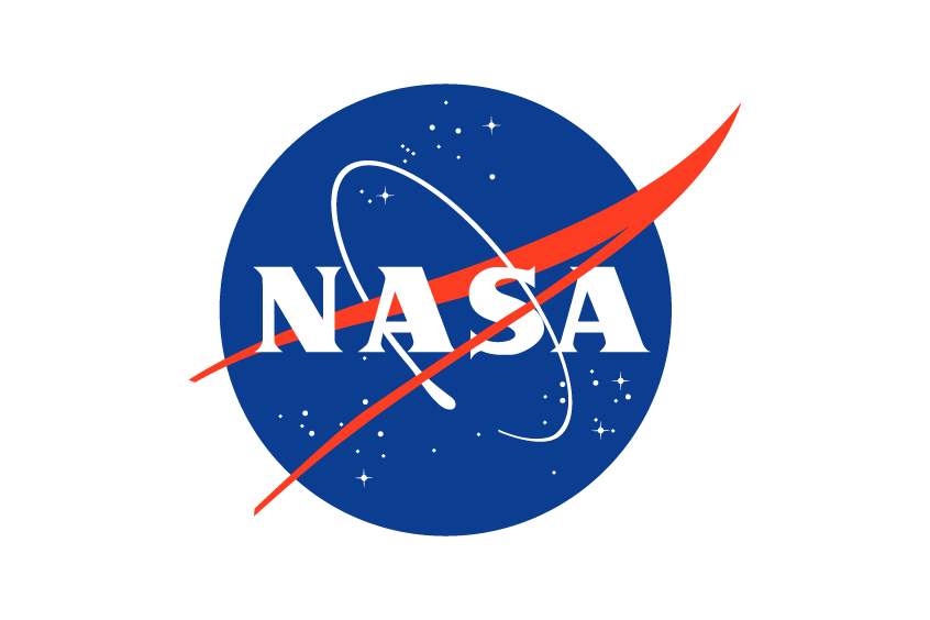
Going back further, the original NASA logo or “meatball” came to life in 1958, thanks to James Modarelli, a NASA employee. The inspiration? An airplane wing’s aerodynamics and a spacecraft’s voyage. Elements of the blue Earth, twinkling white stars, a bold red chevron, and an orbit speak volumes about NASA’s mission. The NASA font used here draws parallels with the font ‘Bambi‘, characterized by dominant thick strokes. ‘Priamos-Serial-Heavy Regular‘ is another font that matches the meatball’s typography.
While both these fonts – inspired by the NASA logos – can be downloaded for free, remember they’re not the official NASA typefaces and might slightly deviate from the originals. If you’re looking for NASA’s proprietary fonts, they’re kept under wraps and aren’t publicly accessible.
If you found it fascinating to explore the fonts NASA used in its logos, you might also be intrigued by the story behind the SpaceX font as well. Together, NASA and SpaceX are scripting a new chapter in space exploration, marked by their iconic typefaces.
Wrapping Up
In essence, the NASA font is far from being just typography. It’s a beacon of human curiosity, achievements, and the indomitable spirit to explore the unknown. As we gaze at the stars and ponder the vast expanse of the universe, the NASA font remains a testament to our journey – from Earth to infinity.