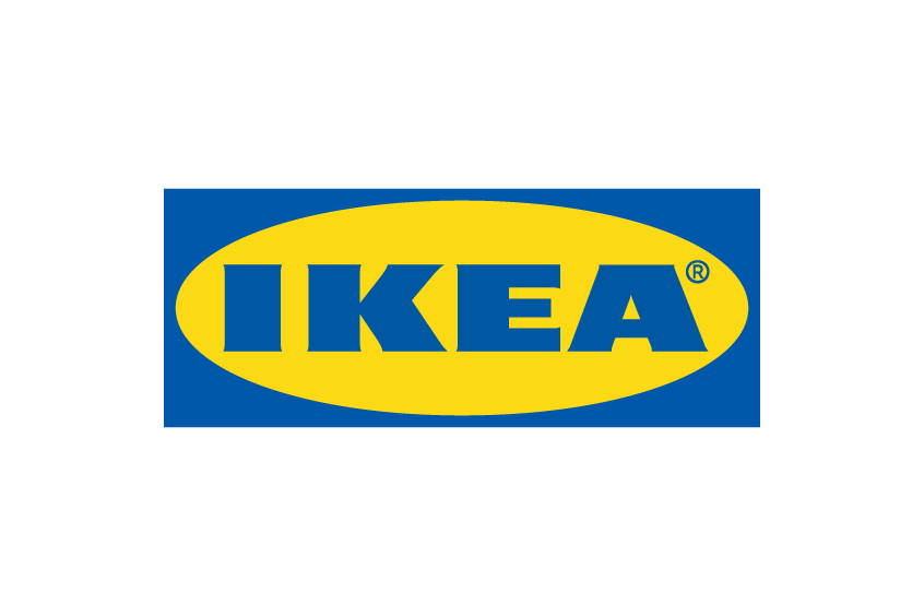
IKEA, a Swedish-origin giant in the furniture industry, has a presence in over 400 locations worldwide. Integral to its global identity is the unique IKEA Font, designed to effectively communicate with its expansive customer base spanning diverse languages, scripts, and digital devices. The iconic oval-shaped IKEA logo, illuminated in bold blue and yellow, is a testament to the brand’s wide recognition. The tale behind this logo, its typography, and how it mirrors IKEA’s storied past is a fascinating journey into branding and design.
What is the IKEA Font Used in the Logo?
The IKEA font used in the logo is known as ‘Ikea Sans’. This font, while reminiscent of the Extra Bold Futura font, carries its own tweaks and modifications. The brainchild of British font maestro Robin Nicholas, Ikea Sans is fundamentally inspired by Futura, a geometric sans serif font that Paul Renner brought into existence in 1927.
When closely observed, the IKEA rendition of this font reveals nuanced modifications – the introduction of minuscule serifs to certain letters and alterations in the form of others. Marrying this unique typography with Sweden’s national colors, blue and yellow, the logo pays homage to IKEA’s Swedish roots. While the authentic IKEA logo font remains proprietary, those seeking a similar vibe might find solace in ‘Futurapress‘, a freely accessible font that’s apt for personal endeavors.
Futura, the inspiration behind the IKEA font, isn’t unfamiliar to the world of branding. It graces the logos of global giants like Volkswagen, FedEx, and Supreme. However, IKEA’s iteration carries distinct nuances, especially evident in letters like A, E, K, R, and S. It’s these minute alterations that give the IKEA font its unmistakable identity.
IKEA’s wordmark, another variant of its branding, forgoes the signature oval frame and background, often visible on store facades and flags. This iteration employs ‘Ikea Sans’, a bespoke typeface that while reminiscent of Futura, introduces more rounded edges.
IKEA’s Branding and Its New Font
2019 marked a pivotal shift in IKEA’s typographic journey. Responding to the demands of a varied global clientele, the company overhauled its typeface across platforms and linguistic variations, opting for ‘Noto‘. Conceived by tech giant Google in collaboration with Monotype in 2016, ‘Noto’, short for “No Tofu”, addresses the issue of unsupportive fonts, which are visually represented by tiny rectangles, colloquially referred to as tofu. With an impressive capability to cater to over 800 languages, Noto emerged as the ideal font solution, reflecting IKEA’s expansive global footprint.
The Takeaway
The IKEA font is more than just about typography. It’s about identity, adaptability, and how a simple font choice can encapsulate a brand’s ethos. It reminds us that every design element speaks volumes about a brand’s values and vision. In the branding world, every font choice is more than aesthetic; it’s strategic. And in IKEA’s case, it’s a blend of heritage, functionality, and global connectivity.