Unveiling the Volkswagen Font
Volkswagen, a beacon of German craftsmanship and vehicular brilliance, has consistently woven innovation into its fabric. Beyond the sleek designs of its cars, the Volkswagen Font stands as a testament to the brand’s commitment to human connection and its rich legacy.
The Volkswagen font used is a custom typeface designed by Hannes von Döhren and Livius Dietzel for the Volkswagen brand. It was created in 2015, together with MetaDesign, to replace the previous Futura font that had been used since 1997. The Volkswagen font is inspired by the design of the cars, with a square basic shape and soft curves that convey a sense of reliability, engineering, and friendliness. The Volkswagen font is used for various purposes, such as advertising, editorial design, website, store design, manuals, and car interiors. It is also used inside Mac devices as a system font. The Volkswagen font is not available for public use, but the provided font is a suitable alternative.
The Volkswagen Font Families
Understanding the vast typographic needs of such an expansive brand, two complementary type families emerged:
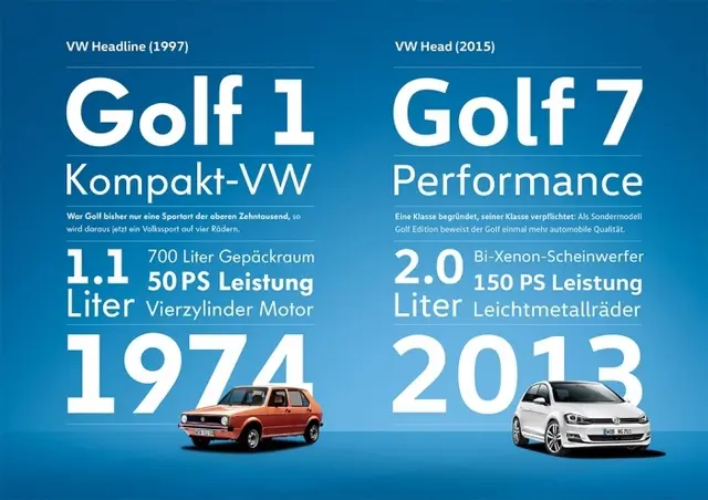
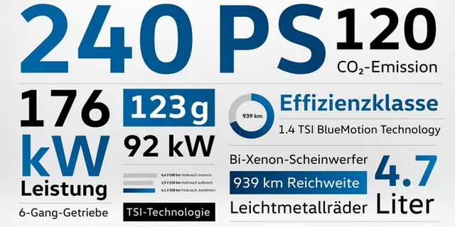
- VW Head: Crafted for bolder statements, like headlines. It exudes confidence, has a robust character, and is best showcased in larger type sizes, preferably above 16 points.
- VW Text: Tailored for detailed narratives in smaller sizes, this typeface prioritizes readability, rhythm, and is fine-tuned for digital displays. It shines brightest in sizes below 16 points.
Crafting the New Volkswagen Font
In a heartwarming collaboration with MetaDesign, Volkswagen set forth on a mission to birth a new global typeface. The vision was clear: a typeface that would not only echo the brand’s innovative spirit but would also resonate with the hearts of its customers. They sought a font that was dynamic, compassionate, and centered around the human experience.
Creating this typeface was no small feat. It needed to be resilient and versatile, seamlessly representing Volkswagen across diverse platforms, from captivating advertisements and digital landscapes to the intimate spaces of car interiors.
Design With a Heart
Drawing from the very soul of Volkswagen cars, the new typeface encapsulates the brand’s essence: steadfast reliability, unparalleled engineering, and a design purity rooted in functionality. The letters, with their square foundational shape, mirror the technical prowess of the vehicles.
Yet, at the heart of Volkswagen lies a profound respect for humanity. The Volkswagen Font, with its gentle curves, welcoming forms, and delicate nuances, radiates warmth and approachability. It’s designed to make readers feel embraced, ensuring every interaction with Volkswagen’s written word feels like a comforting conversation.
Where the Volkswagen Font Lives
This versatile typeface system breathes life into various realms:
- Advertising: VW Head captures hearts, while VW Text imparts knowledge.
- Digital Realms: Every Volkswagen Font is meticulously refined for digital clarity, ensuring crispness in the virtual world.
- Editorials & Magazines: The VW font family, with its diverse weights and styles, is a storyteller’s dream. A unique serif variant even graces the pages of the Volkswagen Magazine.
- Car Interiors & Infotainment: Developed hand-in-hand with Volkswagen’s interior visionaries, specific numerals were sculpted for speedometers, and the fonts grace the digital interfaces within the cars.
Conclusion
In essence, the Volkswagen Font is more than mere letters. It’s a heartfelt ode to the brand’s heritage, its values, and its dreams for tomorrow. It underscores the profound impact of typography in crafting a brand’s soul and forging genuine connections with its community.
Check also Tesla font.