Subway, with its delightful submarine sandwiches, zesty salads, and savory wraps, has a place in the hearts of many food enthusiasts worldwide. However, have you ever glanced at their sign and thought about the font staring back at you? Dive in with us as we embark on a typographic journey, tracing the history, evolution, and intriguing tales behind the iconic Subway font.
What is the Subway Font Used in the Logo?
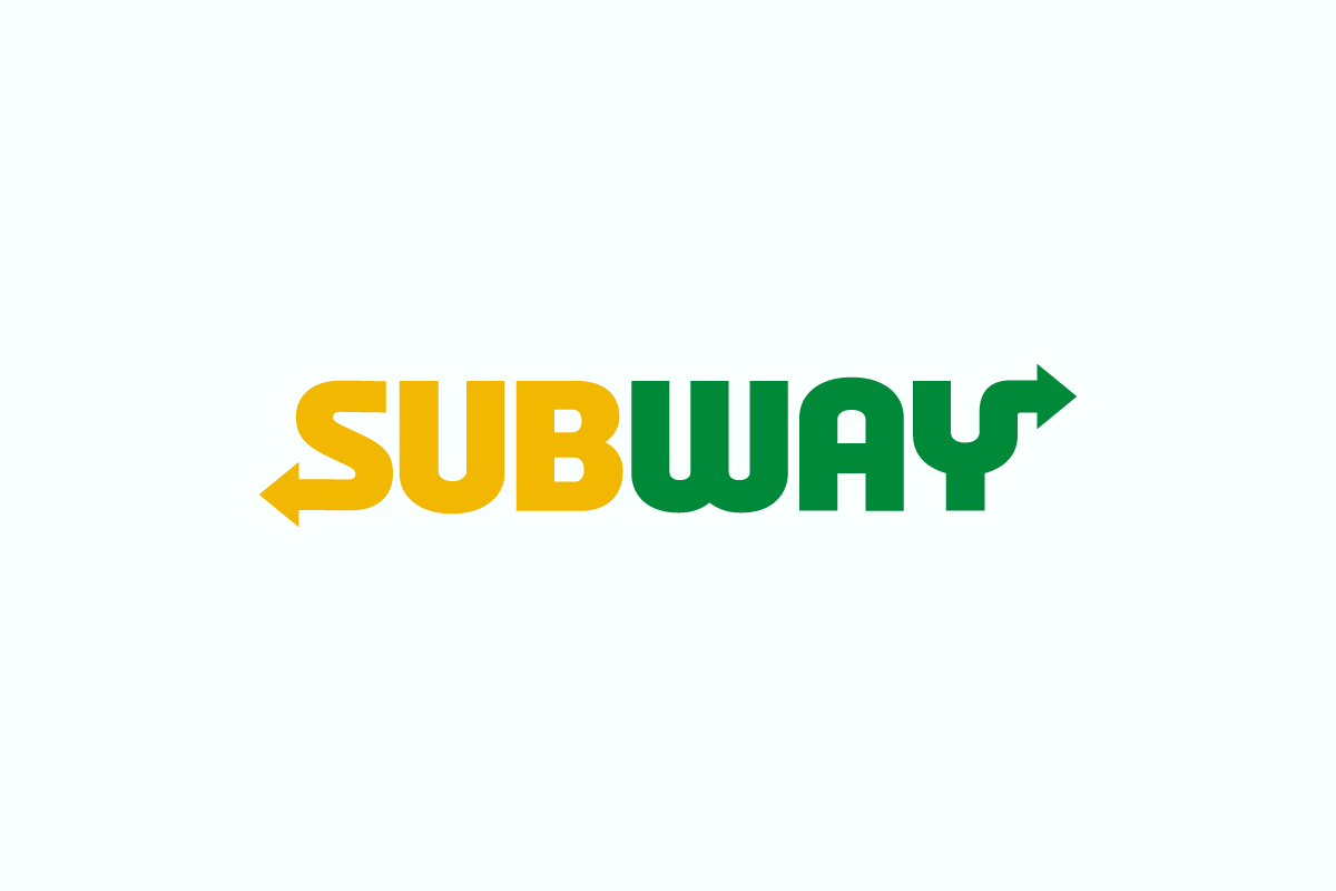
The Subway Font used in the logo is a custom typeface similar to a replica font called “Eat Fresh” by the North Carolina-based graphic design studio, Sharkshock. Crafted to emulate the original Subway logo’s flair.
Subway Font Download and License
While “Eat Fresh” is freely available for personal use, there’s also a commercial alternative known as YWFT Unisect Black for those interested.
Evolution of the Subway Font
Subway’s typographic journey began in 1968. Back then, you wouldn’t find a “Subway” sign but one that read “Pete’s Super Submarines”. The initial design was straightforward – a clean sans-serif typeface graced by a yellow arrow accenting the “S” and a green arrow playfully hinting at the “Y”. These arrows weren’t mere design elements. They symbolized the quick, fresh service offered and subtly hinted at the sequence of the sandwich-making process.
As we ventured into the 2000s, 2002 to be precise, the brand underwent a significant transformation. Now known universally as ‘Subway’, its logo adopted a sleek, modern demeanor. The font, reminiscent of Helvetica Neue Black Condensed, was fine-tuned for a contemporary audience, featuring rounded corners and fluid curves. The iconic arrows? They got a style upgrade too, emerging sharper and sleeker.
Then came 2016, a year that witnessed another chapter in Subway’s branding saga. A refreshed logo graced storefronts, characterized by a minimalist, geometric typeface devoid of the curves and serifs of yesteryears. Drawing inspiration from YWFT’s Unisect Black, this new design gave the arrows a sleek makeover, presenting them as thin lines appended to the letters “S” and “Y”. Through this transformation, Subway wanted its logo to be an emblem of its unwavering dedication to innovation and freshness.
Check Out More Fonts
There’s so much more to explore! Come along on a journey as we uncover the intriguing stories behind the fonts used by Burger King, Domino’s Pizza, and Taco Bell. Each font has its own unique story in the world of design. Join us and embark on this exciting adventure!
In Conclusion
The story of the Subway font isn’t just about letters and design. It’s a testament to how typography, often silently, communicates the essence and values of a brand. Over decades, while the font has seamlessly adapted to shifting customer tastes and market dynamics, it has clung onto certain core elements, like its symbolic arrows, ensuring the brand’s legacy is unmistakably felt. For budding designers and established businesses alike, the Subway font stands as a beacon of inspiration, illuminating the path to crafting unique and impactful brand identities.