What is the Burger King Font Name?
The Burger King Font used in the logo is very similar to the Insaniburger font family, skillfully crafted by the talented Adam Nerland of Insanitype. This font family consists of two captivating variations: “Insaniburger Regular” and “Insaniburger with Cheese.” These fonts are inspired respectively by the classic Burger King logo from 1994-1999 and the current logo that reigned from 1999-2021.
Allow us to shed some light on these marvelous fonts. “Insaniburger Regular” pays homage to the old Burger King logo that can still be spotted on signs in smaller cities. On the other hand, “Insaniburger with Cheese” captures the essence of the new logo, which retains elements of the classic design while introducing a delightful blend of playfulness and futurism.

Burger King Font Download & License
Now, the exciting part! If you’re an enthusiast yearning to infuse the Burger King font into your personal projects, you’re in for a treat. The Insaniburger font family is available for free download, granting you the opportunity to bring the spirit of Burger King to your personal or educational endeavors. However, it is essential to bear in mind that Insaniburger is not recommended for commercial projects, as it lacks the official endorsement of the esteemed BK company.
But wait, there’s more! As you embark on your quest for captivating knowledge, why not delve into other intriguing subjects? Explore the fascinating worlds of Starbucks, Chick fil A, and Dunkin Donuts, where each brand’s unique story awaits your discovery. These iconic establishments are brimming with secrets and inspirations that might just ignite your imagination and lead you to new horizons.
Burger King Font: A History of Whopper Typography
Burger King, a renowned fast food brand with a global presence encompassing over 18,000 outlets in over 100 countries, has gained widespread recognition. While the brand is widely known for its iconic sandwich, the Whopper, which has remained a staple on the menu since 1957, it is equally intriguing to explore the evolution of typography that represents Burger King. This visual element holds the power to convey Burger King’s identity and personality throughout the years.
The Early Years: Insta-Burger King
Established in 1953 in Jacksonville, Florida, by Keith J. Kramer and Matthew Burns, Burger King drew inspiration from McDonald’s success. Initially named Insta-Burger King, the restaurant adopted a straightforward sans serif font for its logo. The inclusion of a star atop the letter “i” served to emphasize the brand’s commitment to fast and convenient service.
The First Bun: 1954-1969
In 1954, franchisees David Edgerton and James McLamore purchased the rights to operate Insta-Burger King in Florida, leading to the rebranding of the chain as Burger King. Along with the name change, a fresh logo was introduced. This logo featured a slanted circle with bun halves on either side, accompanied by the restaurant’s name in a bold serif font. The purpose of this logo was to visually communicate the freshness and quality of Burger King’s burgers, as well as highlight their distinctive flame-grilling method.
The Second Bun: 1969-1994
With Burger King’s expansion of its menu and market share in 1969, a significant rebranding initiative took place. Lippincott & Margulies were tasked with designing a new logo that would reflect the brand’s evolution. The resulting logo showcased a more stylized circle with bun halves and employed a modern sans serif font for the restaurant’s name. Additionally, the introduction of blue and red colors enhanced visual contrast and appeal. This redesigned logo aimed to capture the essence of innovation and growth within the brand, while also attracting a younger and more diverse audience.
The Third Bun: 1994-1999
In 1994, Burger King underwent another logo update, this time adopting a more realistic and three-dimensional appearance. Sterling Brands was responsible for designing the new logo, which featured a detailed circle with bun halves and a dynamic sans serif font for the name. The font displayed curved edges and slanted letters, contributing to a vibrant and playful atmosphere. The inclusion of yellow and green colors added depth and vibrancy to the logo. This iteration aimed to convey the freshness and flavor of Burger King’s products, as well as its lighthearted and amiable approach.
The Fourth Bun: 1999-2020
In 1999, Burger King pursued a simplified logo design, opting for a flatter and minimalist approach. The logo, designed by Jones Knowles Ritchie, featured a streamlined circle with bun halves and refined the sans serif font for the name, employing straight edges and rounded corners. The color palette was reduced to red, yellow, and blue, enhancing the logo’s visibility and recognition across various media platforms. This modernized logo sought to establish a contemporary and timeless image for Burger King.
The Fifth Bun: 2020-Present
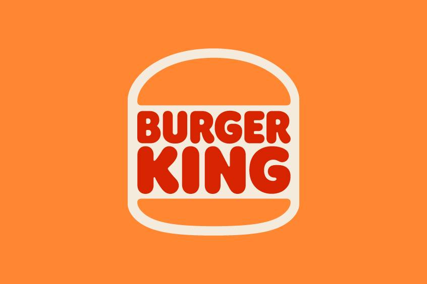
In 2020, Burger King embarked on a comprehensive rebranding effort, encompassing a new logo, packaging, menus, uniforms, and more. Jones Knowles Ritchie once again took charge of designing the new logo, this time embracing a retro and nostalgic aesthetic. The logo reverted to the original circle with bun halves, accompanied by a classic serif font reminiscent of the 1954-1969 era. The color scheme adopted warm and natural tones such as brown, orange, and red. This logo aimed to celebrate Burger King’s heritage and authenticity, emphasizing its dedication to quality ingredients and sustainability.
Conclusion
Burger King’s typography has changed a lot over the years, but it has always reflected its core values and identity. From the simple and speedy Insta-Burger King, to the fresh and quality Burger King, to the innovative and diverse Burger King, to the modern and timeless Burger King, to the retro and authentic Burger King, the font has always been a key element of its visual identity. Whether you prefer Insaniburger or Flame, you can always enjoy a Whopper with your favorite Burger King font.