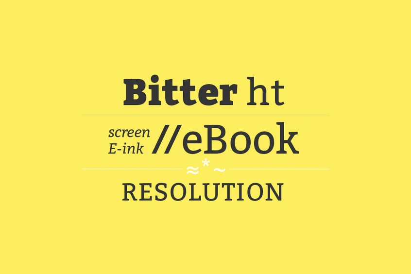
About Bitter Font
We are interacting with screens a lot more these days. What happens on screen ends up being more important than what comes out of the printer. With the rise of electronic books, typographers are working hard to define what is the ideal design to read on the screen.
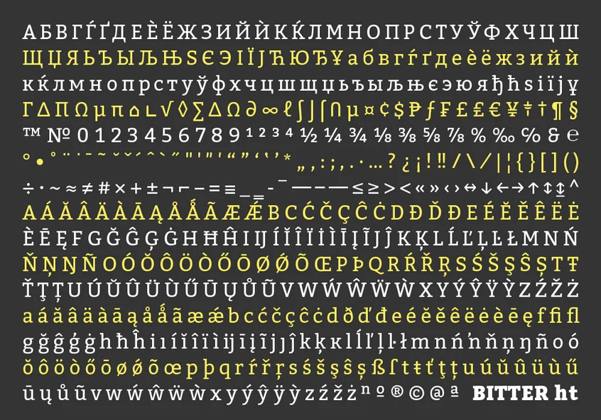
For the love of pixels, Sol Matas designed Bitter Font for Huerta Tipográfica. Bitter is a complete contemporary slab serif typeface designed specifically for texts to read on any computer or device. The robust design started out of total austerity, with a pixel grid, based on rational rather than emotional principles. It combines the high elevation of x with the readability traditionally found in humanists. With some special features that give rhythm to fluent text reading.
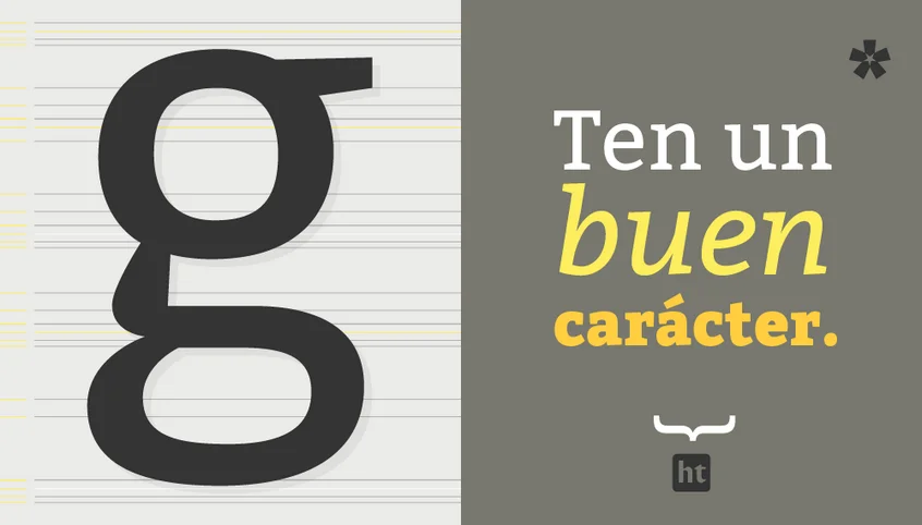
The thickness of the Bitter Font varies slightly, and the regular version is thicker than the regular version in any print design. This creates a strong color in the paragraph and is emphasized by serifs that are as thick as the square terminal strokes.
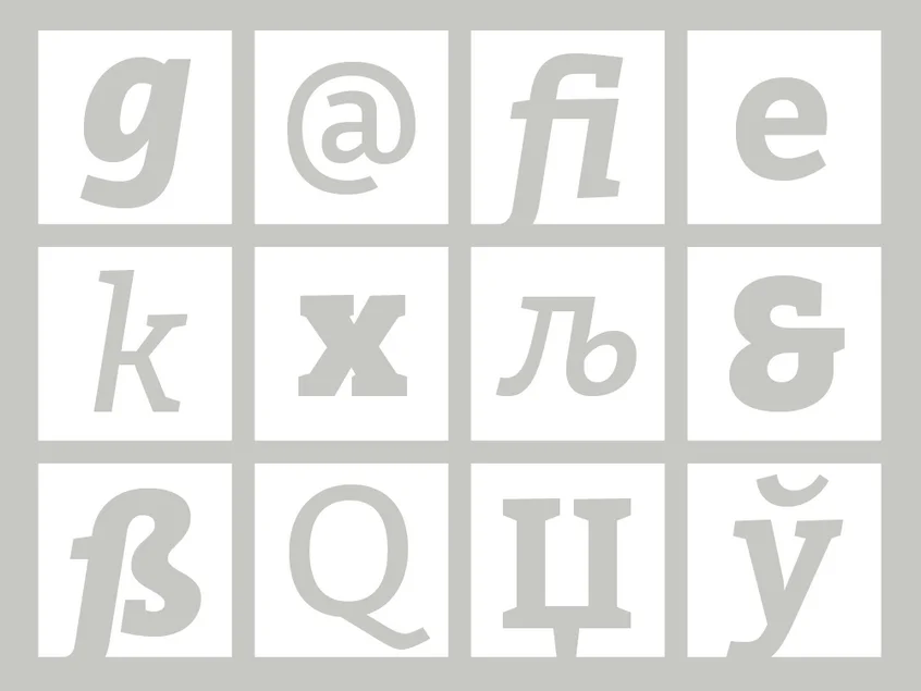
Each of the glyphs is carefully designed with excellent quality in its curves. With the addition that the first design stage was carried out completely on a grid of pixels. The typeface is handcrafted balanced and carefully spaced. Especially for a web format, since many browsers do not allow this setting.