The Porsche font and logo are some of the most iconic symbols in the automotive industry, representing the heritage and excellence of the German sports car manufacturer. As many enthusiasts will attest, Porsche is not just another car brand – it’s a legend. Porsche, a renowned German automaker, has gifted the world with luxury sports cars and SUVs that are synonymous with performance, luxury, and precision engineering. Founded in 1931 by the visionary Ferdinand Porsche, the same genius behind the design of the legendary Volkswagen Beetle, this brand has cemented its place in automotive history. But a question lingers for many – what is the Porsche font used in the logo and these magnificent machines?
The Porsche Font Name
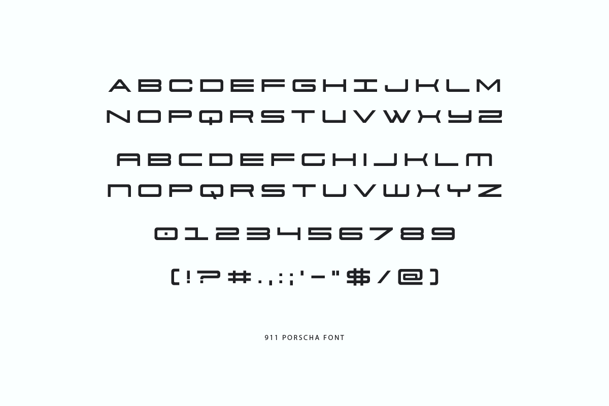
The Porsche font used is a proprietary design of the company. Though unique in its own right, there exists a very similar font named “911 Porscha,” a replica font fashioned by Iconian Fonts in 2002. For those intrigued by the Porsche design, the “911 Porscha” font, boasting 16 styles, is inspired by the Porsche logo and car models, albeit available for personal use only.
The Design Evolution of the Porsche Font
Erich Strenger’s Touch: Digging into the annals of Porsche history, the genesis of the Porsche font finds its roots in the early 1950s. Erich Strenger, a gifted graphic designer hailing from Stuttgart, was entrusted with the monumental task of creating Porsche’s visual identity. This wasn’t a mere job, but a journey wherein Strenger meticulously crafted posters, catalogs, manuals, and a plethora of printed materials for Porsche. His pièce de résistance? The iconic logo and the accompanying font. The genius of Strenger was evident as he adapted a popular sans-serif font of the era, finessing it into a distinctive and instantly recognizable emblem for Porsche.
Weidemann’s Refined Touch: Yet, as with all legends, evolution is key. Fast forward to 1990, Porsche sought the expertise of Kurt Weidemann, a graphic design maestro and typographer. The mission? To refine and elevate the existing Porsche font. Weidemann’s genius lay in his subtle, yet impactful modifications, such as delicately tweaking the thickness, heights, and widths of letters, and enhancing the font’s readability, particularly when emblazoned on the sleek, speeding silhouettes of the cars.
Embracing the Digital Era: The digital age beckoned, and Porsche was ready. In 2016, as the world was rapidly transitioning online, Porsche partnered with Meta-Design, a creative agency based in Berlin, to script a new chapter in its branding journey. The result? Porsche Next, a font introduced in 2017 to replace the erstwhile Porsche Franklin Gothic. This new creation wasn’t just a font; it was a digital adaptation, versatile across print, online portals, displays, and delicate car lettering. Porsche Next embodied the brand’s signature clarity and dynamism in the internet age.
Conclusion
To the untrained eye, it might just be a font. But for the cognoscenti, the Porsche font transcends typography. It’s an emblem, a symbol, and a testament to the brand’s unwavering commitment to quality, innovation, and its storied history. In essence, the Porsche font is a visual poetry that encapsulates Porsche’s undying passion for sports cars.
Check also the fonts used in Volkswagen and Tesla.