The Nike font is a subtle yet powerful element in the world of branding, often overshadowed by swift athletes, groundbreaking shoe designs, and motivational advertisements. Nike stands tall as a titan, its influence stretching far beyond the realm of sports and athletics. Behind all these iconic visuals lies the typographic choice that plays a pivotal role in Nike’s branding. Ever paused to ponder about the Nike font used for its emblematic logo and branding? Let’s dive deep into this typographic journey.
The Nike Logo Font
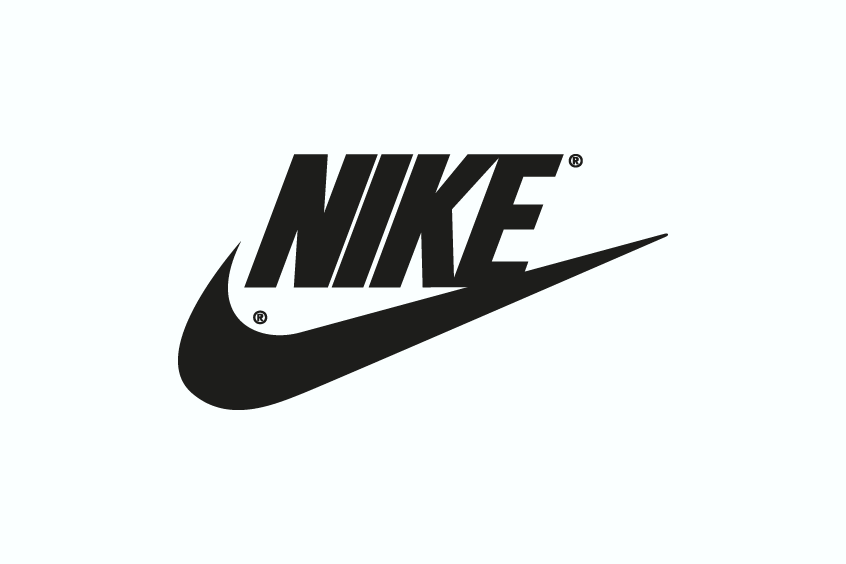
The Nike font used in the logo isn’t just any typeface. It’s a custom adaptation of the Futura Condensed Extra Bold, a creation by Paul Renner from 1936. While you can purchase the original Futura here, we’ve also provided a free alternative for personal use.
You might also love exploring the fonts behind Supreme, Louis Vuitton, Balenciaga, and Dior.
The Unique Features of the Nike Font
Now, let’s dive a bit deeper. The Nike version of this font isn’t a carbon copy of Futura Condensed Extra Bold. It’s been tweaked to perfection. Notice the slanted ‘E’ or the uniquely curved ‘K’? These subtle changes, along with a gentle italicization, infuse the font with a sense of energy and motion, mirroring the dynamism inherent in sports.
The Genius Behind the Nike Logo Font
The story behind the selection of this font is as fascinating as the brand itself. Enter Carolyn Davidson, a then-graphic design student, who not only chose this font but also designed the legendary Nike swoosh in 1971. For her groundbreaking work, she received a modest $35. Little did she know, her design would go on to become one of the most recognizable symbols worldwide. Davidson’s vision for the font? Something “strong and simple” – and she nailed it.
The Ubiquity of the Nike Font
From that point on, this font became synonymous with Nike. Whether you’re looking at a product label, an advertisement, or their website, the font is omnipresent. And let’s not forget its association with the “Just Do It” slogan. Introduced in 1988, this phrase, often set against a stark black background, is rendered even more impactful with the Nike font.
Wrapping it up
The Nike font is more than just letters on a page. It’s a testament to the brand’s ethos – embodying quality, innovation, and a never-back-down spirit. In the world of branding, where every detail matters, the Nike font stands as a beacon of excellence, reminding us that sometimes, it’s the subtle touches that make all the difference.