What is the Gap Font Used for the Logo?
Gap is an American clothing and accessories retailer founded in 1969 by Mr. and Mrs. Fisher in San Francisco. The company name originated from the term “Generation Gap”, and it initially targeted younger customers with Levi’s jeans and records. Gap has a simple and recognizable logo, consisting of a white wordmark on a blue square. The logo has changed slightly over the years, but it has always maintained a consistent personality. But what font is used for the Gap logo, and where can you find a similar font for free?
The Gap Logo Font

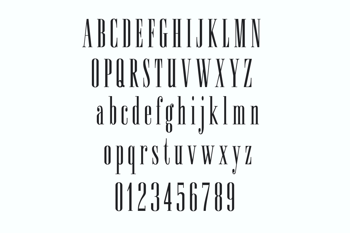
The Gap font used for the logo is called “Spire Regular,” which was initially created by Sol Hess for the Lanston Monotype Foundry in 1938. Ann Pomeroy later revived this font in the early 90s. Spire is a condensed serif typeface that exudes a retro aesthetic reminiscent of the 1930s.
Download & License
You can use Spire Regular for free for personal use, but for commercial purposes, you need to obtain a license from Here.
Additionally, take a look at Patagonia, Yeti, and New Balance.
Conclusion
The GAP logo serves as a great illustration of how a straightforward and easy-to-remember design can establish a powerful brand identity. The selection of the Spire Regular font aligns with the company’s core values of quality, style, and innovation. This versatile font is suitable for a range of uses, including headlines, logos, posters, or banners.
