The Enigmatic McDonald’s Logo Fonts
When you think of the iconic McDonald’s brand logo, the golden arches and the distinct McDonalds font undoubtedly come to mind. This simple yet impactful symbol is universally associated with the global fast-food titan that satisfies the cravings of millions daily. However, behind this emblematic ‘M’ and the name “McDonald’s”, there lies a fascinating tale of fonts and design decisions. Let’s delve into the intricacies of the McDonald’s font used in the logo to understand how it reflects the brand’s heritage and values.
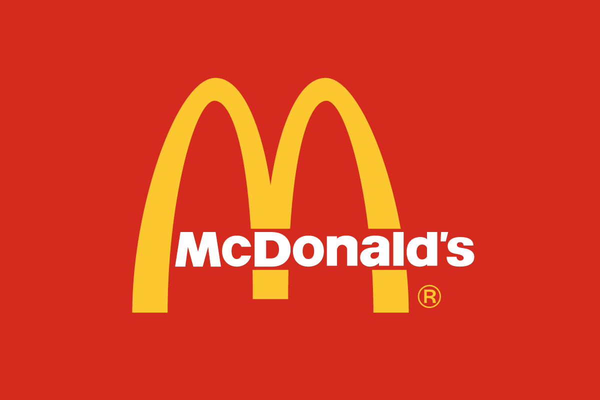
The McDonalds Font Used in the Logo Text
The McDonalds font used for the lettertype is a revamped version of Helvetica Black, a widely embraced typeface. But the folks at McDonald’s didn’t just stop there. They developed a bespoke typeface aptly named ‘Speedee‘, drawing inspiration from their logo. And while the logo has seen numerous facelifts over the decades, the rendition we recognize and love today has proudly represented the brand since 2003.
This font is for personal use only.
The McDonalds Font Used in the Golden Arches “M”
If the McDonald’s brand had a crown, the Golden Arches would be its crowning glory. This emblematic ‘M’ not only stands for McDonald’s but has also become a beacon for those seeking a quick bite. Jim Schindler birthed the golden arches in 1962, taking cues from the novel arch-like structures gracing the restaurant’s sides. By intertwining two arches, Schindler gave birth to an ‘M’ that was crisp, audacious, and ingrained in memory.
Now, here’s a fun tidbit: The McDonalds font used for the golden arches ‘M’ isn’t plucked from a typical font repository. It’s a unique creation, tailored and tweaked over the ages. For those smitten by the design, there’s good news! Jesse Burgheimer fashioned a font called ‘McLawsuit‘ mimicking the aura of the golden arches. Despite housing 99 characters, don’t expect to find lowercase letters in it, making it all the more intriguing!
This font is free for personal and commercial use.
When considering the McDonald’s text alongside the golden arches, it’s evident why Helvetica Black was the choice. It harmoniously complemented the style and heft of the golden arches. This font encapsulates modernity, professionalism, and excellence — aligning perfectly with what McDonald’s stands for. And though Helvetica Black is a staple in many designer toolkits, its application in the McDonald’s logo gives it a distinct flavor.
Check also the fonts used in Burger King, Domino’s Pizza, Pizza Hut, and Chick-fil-A.
Final Thoughts
The saga of the McDonald’s logo fonts isn’t just about typography; it’s a testament to the brand’s evolution, vision, and unwavering commitment to its identity. Both the golden arches and Helvetica Black coalesce to craft a logo that’s more than the sum of its parts, echoing McDonald’s rich lineage, ethos, and aspirations. Their choice of fonts is simplistic yet robust, ensuring adaptability across mediums. The McDonald’s logo fonts stand as shining exemplars of how typography can shape, reinforce, and amplify a brand’s voice and essence.