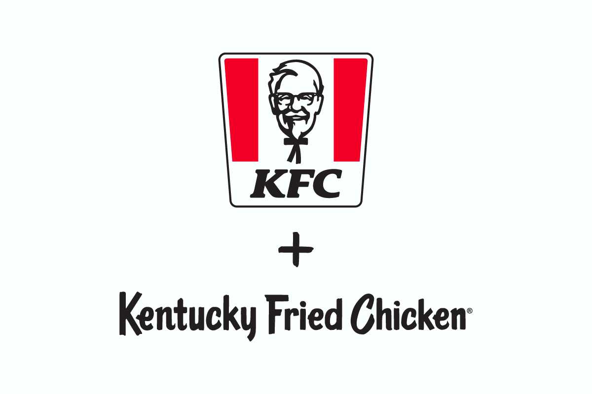
Have you ever been seated at a KFC, waiting for your crispy bucket of chicken, and found your gaze drifting over to the logo, marveling at the unique and striking typography? If you’ve ever wondered about the KFC font used to spell out those iconic letters “KFC” and the beautiful slanted and curvy style used for “Kentucky Fried Chicken”, then you’re in for a treat. Today, we’re diving deep into the world of typography to introduce you to the fascinating story behind the KFC font.
The KFC Font Used in the “KFC” Logo
The KFC font used in the “KFC” part of the logo is no ordinary typeface—it’s a custom creation known as “KFCClassicScript.” Crafted by Typebox, LLC, this unique font was exclusively designed for Yum! Brands and their beloved KFC brand, intended for international markets, back in 2006.
KFCClassicScript stands out as a bold, attention-grabbing display font that exudes a timeless and classic aura. It serves as the perfect vehicle for conveying KFC’s core values of fun, family, and, of course, mouthwatering food. This font is not just any font; it’s an integral part of KFC’s brand identity.
You’ll find KFCClassicScript gracing everything that embodies the KFC world, from the iconic logos adorning storefronts and signage to the tantalizing menus that showcase their finger-licking-good offerings. Even their packaging proudly dons this unique script, ensuring a consistent brand experience for customers. The font has also made its way into the brand’s advertising campaigns and social media posts, maintaining KFC’s unmistakable visual identity.
However, it’s important to note that KFCClassicScript is free for personal use only, with no commercial applications permitted. If you’re on the hunt for a similar font for commercial purposes, you might want to consider alternatives like “Friz Quadrata Bold Italic.”
The Font Used in the Kentucky Fried Chicken Logo
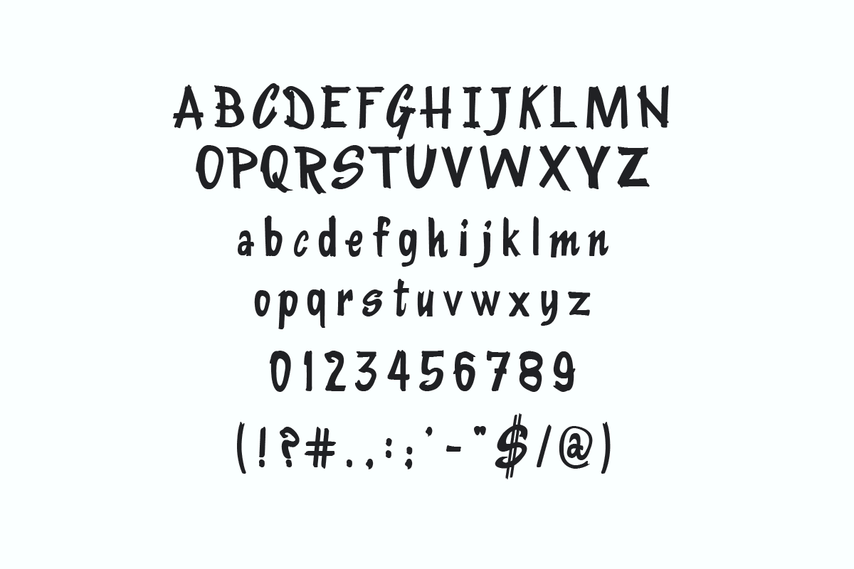
On the other hand, the Kentucky Fried Chicken font used for the fuller “Kentucky Fried Chicken” logo has its own tale. This font remains custom-made, a brand secret not available to the public. However, for enthusiasts or those keen on replicating its style, there’s good news. A font maestro by the name of Daniel Gauthier took upon the challenge to replicate a similar font and named it “KentuckyFriedChicken“. Just like its counterpart, this KFC font doppelganger is free for personal use.
Intrigued by The KFC Font?
There’s more to discover! Let’s journey together through the fascinating stories behind fonts from McDonald’s, Chick-fil-A, and Subway. Each has its own special tale in the world of design. Dive in and enjoy the adventure!
In Conclusion
The next time you’re at a KFC or even passing by one, take a moment to appreciate the beauty and intricate history behind the KFC font. It isn’t just about letters; it’s about encapsulating the very essence of what KFC stands for. And who knows? Maybe it’s not just the aroma of fried chicken but also the KFC font that makes you hungry for more.