What font does Coca Cola use? Have you been looking for the Coca Cola font name used in their logo and other products? In this article, we will try to cover everything possible on this topic. We hope that you will find what you came for from the list of fonts similar to Coca-Cola that we are going to present for you to use in your personal projects. Each item on the list contains a link to download a free Coca Cola logo font.
Just a little note before we get started, regarding free fonts, always make sure to read the license details for each Coca Cola font before you download it. These fonts that we will present to you are free for personal use only, and we do not advise you to purchase any commercial license from anywhere.
What is the Coca Cola Font Used in the Logo?
The Coca Cola Font used for the brand logo is similar to a font called “Loki Cola”. This font is inspired by the company’s logo only, not the original. Actually, Coca-Cola utilizes a custom font for its trademark. The style of the lettering used is called “Spencerian Script”, it is a type of cursive handwriting that was popular in the United States in the 19th century. The original Coca Cola font is not widely available for public use, and the company closely guards its intellectual property.
The Coca-Cola logo was created in 1885 by John Pemberton’s bookkeeper, Frank Mason Robinson, and the Spencerian Script style was chosen because it was considered very elegant and valuable at the time. The font has been modified slightly over the years but has remained largely unchanged since its inception.
Coca Cola font, as a custom typeface, the concern for the body starts from the emotion and adopts it in the visual design style. With every stroke, it expresses human understanding and interpretation of care, harmony, strength, responsibility, tranquility, and adventure.
1. Loki Cola
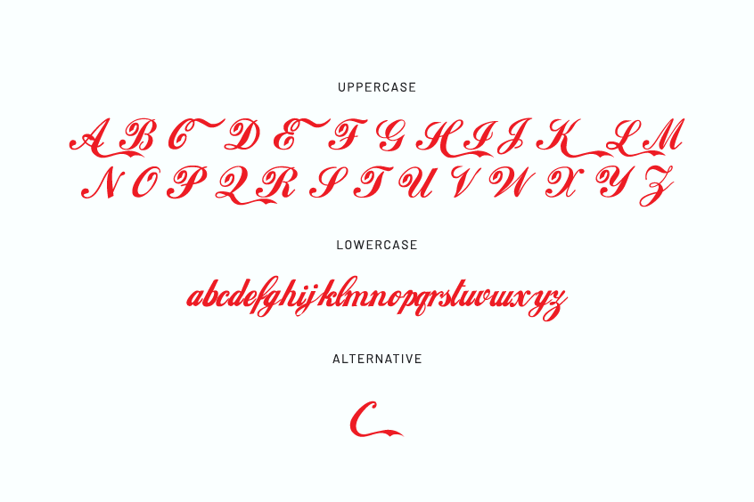
If you want to mimic the style of letters used in the logo, we recommend using Loki Cola. This Coca Cola font is characterized by the letter “C”, which looks similar to the logo. The font doesn’t have numbers or punctuation marks. The font was designed by Dale Thorpe, a type designer who founded Utopiafonts and is now called Dale Harris.
This font is free for personal use only.
2. Coca-Cola ii
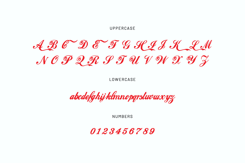
There is not much difference between this font and the one we mentioned before, Coca-Cola ii font, contains uppercase and lowercase letters, Common Latin, and punctuation marks.
You can use this font for personal use only.
3. Ederson
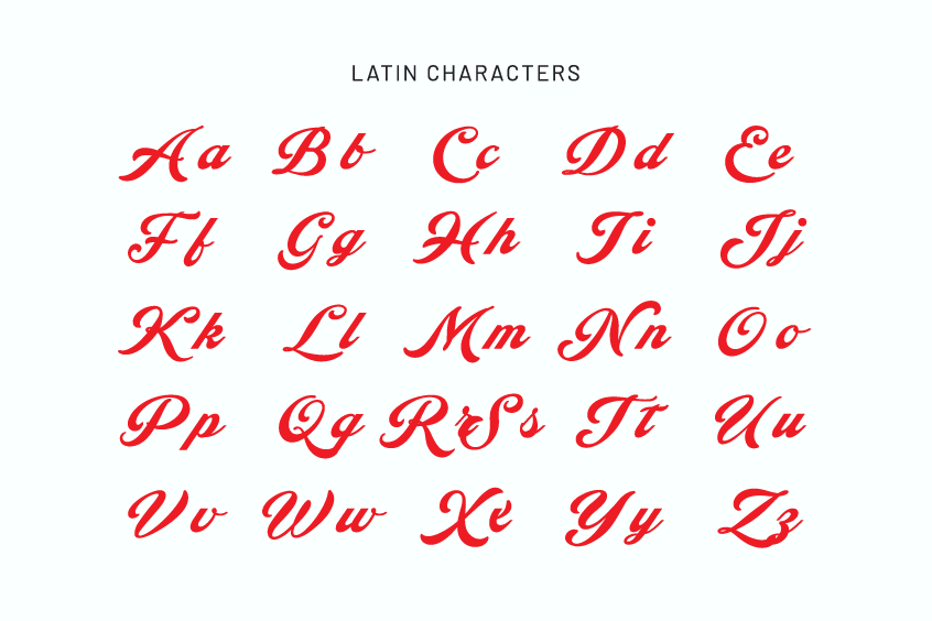
Ederson by Måns Grebäck is another option to consider, as it comes with a decorative version and has plenty of glyphs including accented characters.
This font is free for personal use only.
What is The Coke Font Used for Diet Coke Cans?
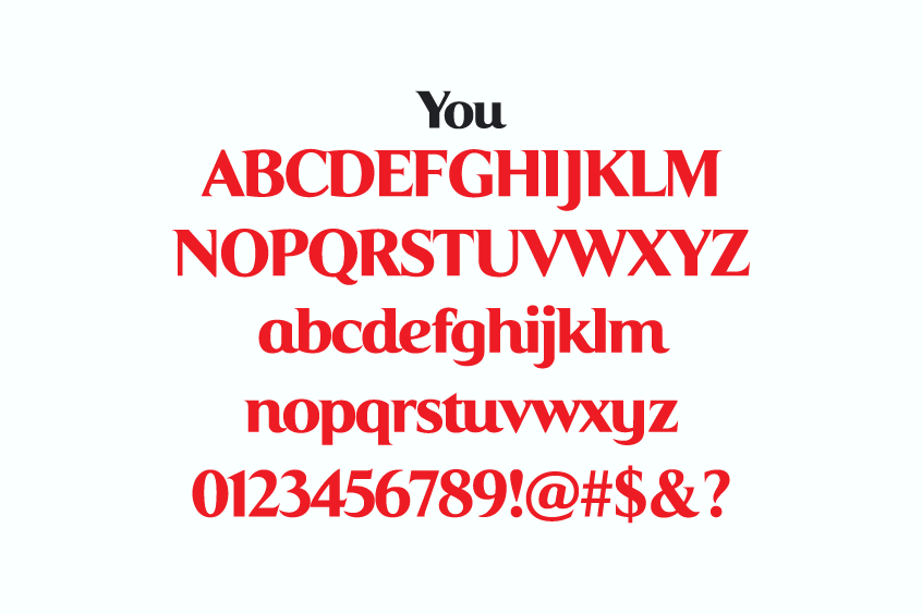
The Diet Coke font that was used in the logo is called the Coke “You” font. It was first developed by Ian Brignell for Coca-Cola, Australia in 2011. After their test campaigns met with great success there, the project has since branched out to the rest of the world. It is licensed by The Coca-Cola Company. We don’t recommend using it for commercial projects.
This font is free for personal use only.
Download Coca Cola Logo PNG & SVG
We also offer the Coca Cola logo to download as an SVG vector file and PNG transparent image.
Coca-Cola has its own Typeface
Coca-Cola has announced the launch of its own typeface, which debuted in 2018 and was the first basic typeface created for the company since its launch in 1886.
Unit TCCC. A custom sans serif font created by The Coca-Cola Company for use in its branding and marketing materials. Its name responds to the acronym for the Company, whose shapes are intended as a tribute to American modernism and the company’s traditional designs.
The font is not available for download or use by the general public. If you need to use a font similar to the TCCC Unity font, there are many alternative fonts that you can get from our site. Some of these include:
- Metropolis – This is a sans-serif font that is similar to TCCC Unity in terms of its geometric structure and use of corners.
- Montserrat – This is also a sans-serif font that is inspired by the architecture of the city of Buenos Aires. It has a similar feel to TCCC Unity, with a clean and modern look.
- Raleway – This is a humanist sans-serif font. It is more casual and elegant compared to TCCC Unity.
- Lato – This is a sans-serif font with a clean and modern look, notable for its semi-rounded details and strong structure. It is very readable in small sizes.
- Open Sans – This is a sans-serif font with a friendly and open feel. It has a clean, modern look and has been designed to be highly readable at small sizes and is often used for body text.
Info About Coca Cola
Coca-Cola (known as Coca in many Spanish-speaking countries; also known in English as Coke) is a sugary, carbonated soft drink sold worldwide in stores, restaurants, and vending machines in more than two hundred countries.
It is the main product of Coca-Cola of American origin. Initially, when it was invented by pharmacist John Stith Pemberton, it was conceived as a patented medicinal drink, although it was later acquired by businessman Asa Griggs Candler, who made the drink one of the most consumed in the 20th and 21st centuries.
The company produces concentrate which it then sells to various licensed bottlers, who mix the concentrate with filtered water and sweeteners, then sell and distribute the beverage in aluminum cans and plastic or glass bottles in stores.
About The Coca Cola Logo
The logo is the visual design that has the best relationship with consumers. The famous Coca-Cola brand has been popular all over the world for more than 120 years. It is the most famous and largest beverage company in the world. It is also a market leader in soft drinks sales.
Coca-Cola has long gone beyond the simple meaning of a soda bottle to consumers around the world. More than what is the culture of the brand and its artistic value? The Coca-Cola logo also uses text as the main logo design element. Although the Coca Cola font has been modified several times since 1900, it still maintains the elegant dynamics of the Spencer cursive Coca Cola font.
The significance of the Coca Cola font design changes embodies the principle of harmony without a difference. In several changes, the Coca-Cola logo still retains the basic elements most recognizable by consumers: In addition to the aforementioned standard Spencer font, there is also a standard red and italic in sharp contrast to the white font.
Curves, unique Coca-Cola bottles, and other items. These items have been tested for hundreds of years, and they not only conform to the Coca-Cola brand culture and business philosophy but also meet the needs of consumers the masses. The Spencer font of the Coca-Cola logo, the standard red color, the flowing curves, and the classic Coke bottle as an expression of “harmony” reflect the high degree of generality and simplicity in the design of the Coca-Cola brand.
If you have any questions, additions, or requests regarding this topic, please contact us at:
https://fontswan.com/contact/