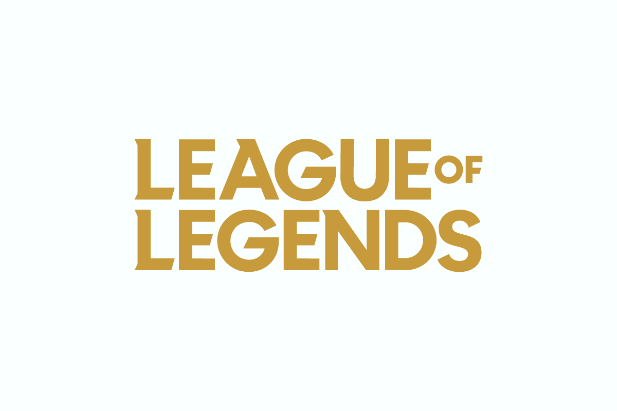
League of Legends (LoL) is a popular multiplayer online battle arena game developed by Riot Games. The game has a distinctive visual identity that includes its logo, typography, color scheme, and graphics. In this article, we will focus on which font League of Legends uses for the logo and in-game text.
Which Font is Used in the League of Legends Logo?
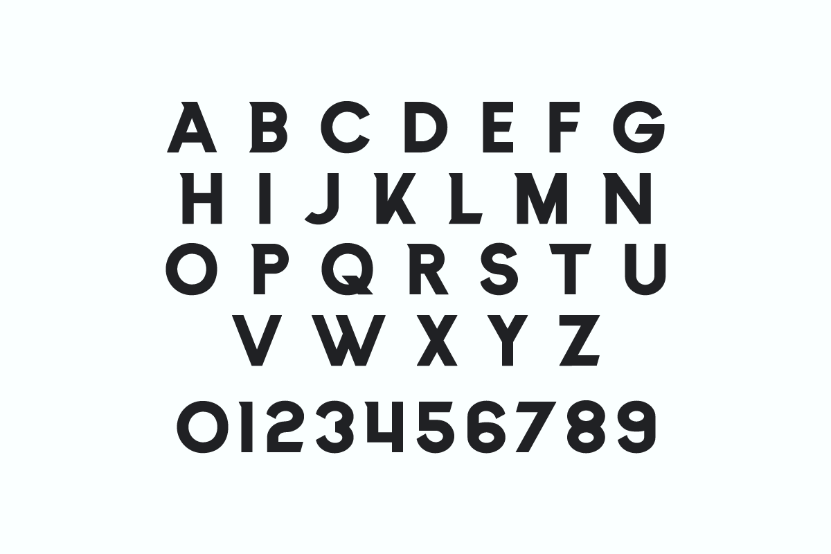
The League of Legends font used in the current logo is similar to a replica font called ‘League‘ which is free to use, both personally and commercially. The original font used in the logo is custom-designed and is not available.
The previous version of the League of Legends logo is based on ‘Friz Quadrata,’ a serif font created by Ernst Friz and Victor Caruso in 1973.
Which Font Does League of Legends Use for In-Game Text?
The primary font used throughout League of Legends is “Spiegel,” which delivers most of the in-game text with clarity and style. For headlines and other prominent displays, the game employs “Beaufort For LoL,” a font that adds an extra layer of impact and flair, perfectly complementing the game’s overall aesthetic. These fonts work in harmony to create a cohesive and engaging visual experience for players.
→ Spiegle
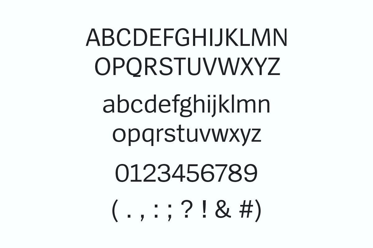
The League of Legends game and websites rely on ‘Spiegel‘ for most of their text. From paragraphs to captions, labels to navigation, this font gets used everywhere! Designed by Lucas de Groot in 1999, Spiegel draws inspiration from classic American fonts like News Gothic, but with a more human touch.
Think of it as a friendly face compared to the bolder, custom-made “Beaufort” used for headings. While Beaufort grabs attention, Spiegel works behind the scenes, making sure information is delivered clearly and easily.
→ Beaufort For LoL
The original font used for headlines and displays in the League of Legends game was Friz Quadrata. However, the game and its designers later switched to ‘Beaufort For LoL,’ another font style inspired by inscriptions. Crafted by Nick Shinn, published by Shinn Type Foundry, and customized and extended for Riot Games by Monotype Imaging, Inc.
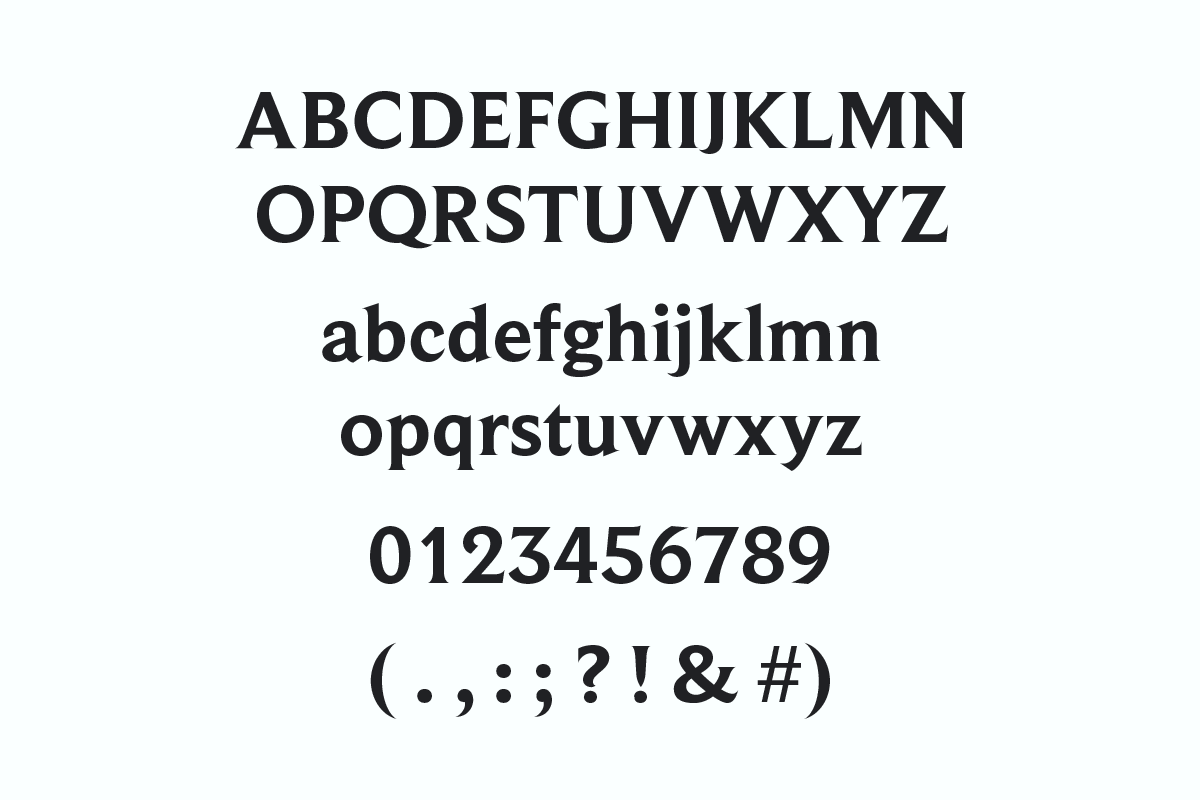
Beaufort was chosen as a replacement likely due to its wider range of weight options and less distracting features compared to Friz Quadrata. This makes it more versatile for different uses.
Now, Beaufort serves as the main font for everything in the LoL experience. You’ll see it in the game’s interface, menus, buttons, and textual elements. It also graces the headlines, titles, and subheadings on various League of Legends websites. Beaufort comes in five different weights, from light to heavy, each with its corresponding italic version.
Conclusion
In my experience, the 2019 rebrand of League of Legends really hit the mark with fonts that truly capture the essence of the game. They’re not just easy to read but are versatile enough to fit seamlessly across different platforms. The blend of old-school charm with modern design creates a unique balance that enhances the overall gaming experience.
For further insights, explore the font choices in Fortnite and PlayStation.