Incorporating the distinct “Popeyes Font” in its branding, Popeyes, renowned for its delectable fried chicken and biscuits, is a widely recognized fast-food chain. Originating in New Orleans, Louisiana, in 1972, the brand has since witnessed extensive growth, with over 3,000 outlets globally. The name “Popeyes” draws inspiration from the well-known fictional character, Popeye the Sailor, celebrated for his love for spinach and his strong arms.
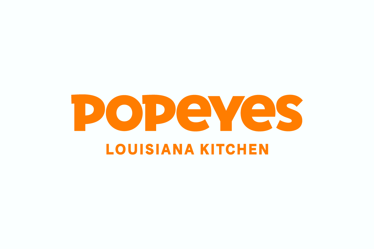
A defining feature of the Popeyes brand is its unique logo, which is comprised of two elements – the vibrant orange “Popeyes” rendered in the characteristic Popeyes Font, and the tagline “Louisiana Kitchen” in the same color. This logo is designed to embody the flavorful Cajun and Creole culinary traditions of Louisiana, while simultaneously making a subtle nod to the iconic cartoon character Popeye.
The Popeyes Font Used
The Popeyes font used in the logo is a bespoke creation, not accessible to the public. However, Aller Display serves as a comparable and freely available alternative for personal and commercial purposes. The Popeyes font exhibits a bold and whimsical appearance, with unique characteristics, such as the curved tail of the letter P.
The Font Used in the ‘Louisiana Kitchen’ Tagline
The font used for the phrase “Louisiana Kitchen” is another specialized font named Chicken Sans. Colophon Foundry meticulously crafted this custom typeface exclusively for Popeyes Louisiana Kitchen, Inc. It is designated for use by Popeyes Louisiana Kitchen, Inc. and affiliated partners solely for brand-related projects. Any modification, adaptation, conversion, translation, or alteration of the font software is strictly prohibited without permission from Colophon Foundry.
Conclusion
The Popeyes logo font serves as a testament to the capacity of fonts to communicate a brand’s essence, identity, and the nature of its offerings. It mirrors the company’s heritage, cultural backdrop, values, and intended audience and market. Moreover, the logo distinguishes Popeyes from competitors like KFC, Chick-fil-A, and Church’s Chicken, standing as an iconic and memorable symbol that cultivates customer attraction and loyalty.