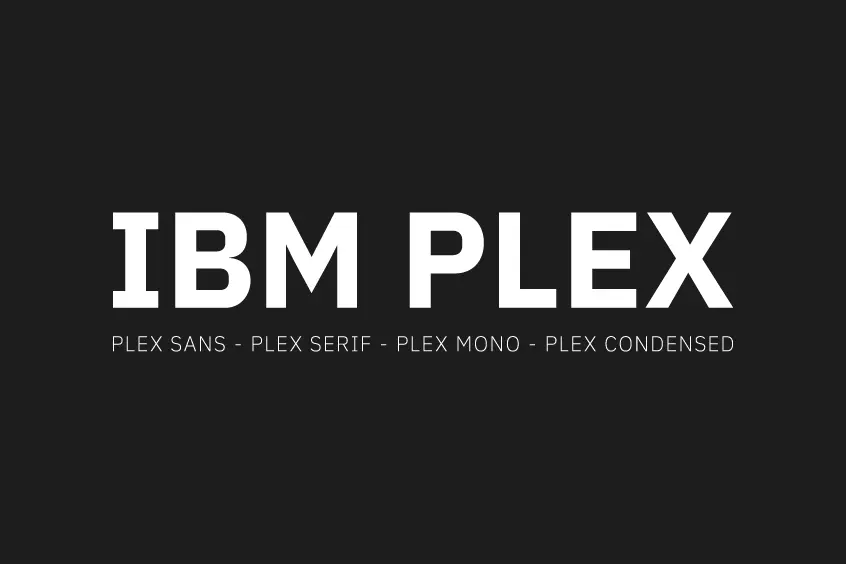
Introducing IBM Plex Font Family
IBM Plex Font is a very versatile set of typefaces, it was designed by Mike Abbink (IBM’s Managing Creative Director) in association with Bolt Monday (an independent Dutch type foundry), the IBM Flex® family was created for IBM and released in 2017 to fulfill their design principles and brand identity. Despite IBM’s long history and reliance on Helvetica without a custom typewriter, the IBM Plex™ family went into production within two years of its introduction, resulting in lower costs for the company to rely heavily on Helvetica for licensing issues. As the company became a “standard corporate typeface”, Helvetica no longer provided the “right story for IBM” because the company no longer considered itself a “standard company”.
The typeface took over two years of design work, which was used to communicate and convey the ideals of IBM as a company, along with creating a more consistent look and feel in their landscapes. IBM Plex family as part of its name is designed to be versatile and flexible, especially since it was meant to be used across all platforms related to the company, from advertising to code development as well as blog posts and editorial articles. In total, the superfamily of four specific characters including IBM Plex Mono, IBM Plex Sans, IBM Plex Serif, and IBM Plex Sans Condensed is free for use by the public as an open-source project via the Open Font License (OFL).
IBM’s reputation as a company that rediscovered itself through decades of technology was demonstrated by their investment of billions in Watson, the AI platform for business. Watson was emphasized as a tool for incorporating human ideas into creating business ideas and was the main catalyst for proposing a new typeface to be used for their company. Their AI led them to create ideas and think about how a typeface could have a character personality, and voice, which led to the sudden creation and release of a typeface after their long history without their own one.
Displaying specific graphic design elements for the typeface, IBM is using a seamless animated site to showcase its type models, articulate their ideas and communicate the intended use of the superfamily. Besides their motivation for creating fonts, the company also emphasized the different ways and contexts in which their typefaces should be used, which is reflected in their style guide to the font family.
IBM ultimately backs up its pronouncements in creating a “half-man, half-machine” thing, in both figurative and materialistic ways that have been a core philosophy through its themes for IBM since the start of the new century through the super typeface family.
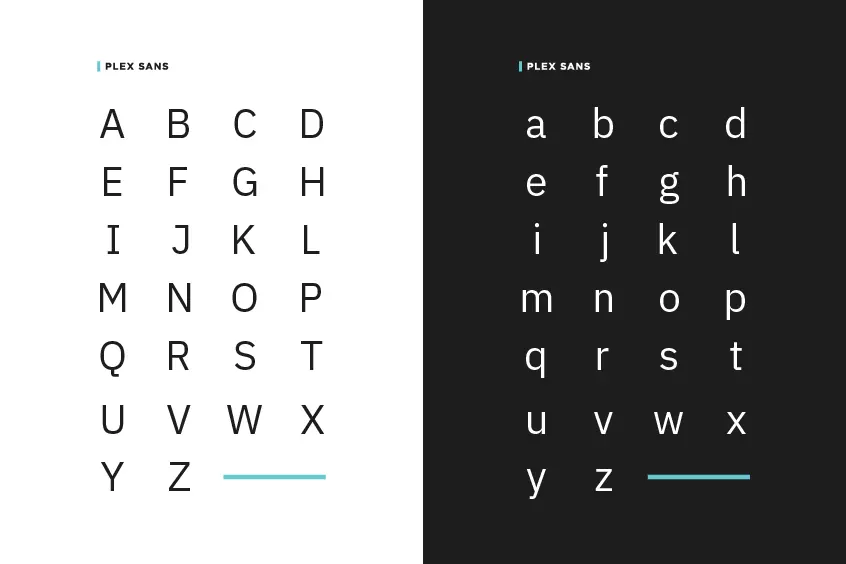
IBM Plex Sans Font
IBM’s brand identity has been a major component of the font family design, particularly the variation of sans fonts included in the IBM Plex family, where the initial idea originated from its iconic eight-bar logo. Abbink provided his ideas on how to base the nature of typography on the group questions before creating the typeface, “If the eight-bar logo spawned a typeface, what would that look like?”
The feature of the three-letter logo was a stimulus to the question. There, it was observed that people saw the shape as recognizable characters from the eight-striped logo. For the design of other typefaces in the family, the IBM Plex sans version is available in a more modern context. This can be seen on websites that specialize in collecting American social news, rating web content, and discussing – Reddit introduces the features of typefaces in the user interface. In particular, the infamous website is using typefaces instead of link titles around 2019, when the website’s interface changed and IBM Plex Sans has been integrated as part of its brand identity.
As evidenced by the design of IBM Plex Sans, the typeface reflects the logo with its bold and sharp characteristics, as emphasized on the IBM Sample Website for IBM Plex. This continues away from the idea of creating a recognizable typeface, using the letters “T”, “B”, and “M” to represent IBM’s brand identity only in the letter form in which the slab serif type influenced the letterform “I”. In addition to this, the vertical font and right angle are designed to be striking in contrast to the curve of the letter “B”, the third detail contained in the “M” is the sharp point at the intersection of the last letter shape.
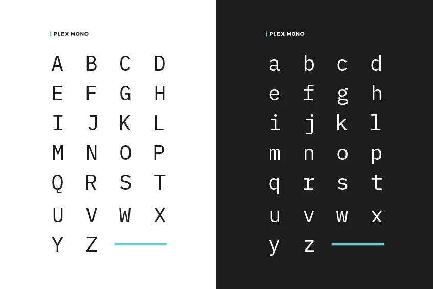
IBM Plex Mono Font
IBM Plex Mono Font is specially tuned to appeal to developers who associate the typeface origins with the IBM brand. This is especially visible in the way that the “zero” is formatted with a dot in the middle “O” to properly distinguish it from the letter “o”, which is a common rule in software development and coding. with the use of an alternate diagonal line through 0.
Due to different settings, many developers choose to use IBM Plex Mono in italics and regular as the chosen typeface in programming, from extensive discussions on its use in this notation since the aforementioned typeface was released. The monospaced members of the Super Family were created on the basis of older-generation technology. The IBM Selectric typewriter (1961) introduced IBM exchangeable typefaces, which were also taken into account when designing the superfamily in the IBM Plex family.
Usage
The IBM Plex superfamily is extremely flexible in the context in which it can be used, from website design, and coding development to UI design. In addition to the wide variety of visual contexts of this typeface superfamily, the features of IBM Plex are also very noteworthy.
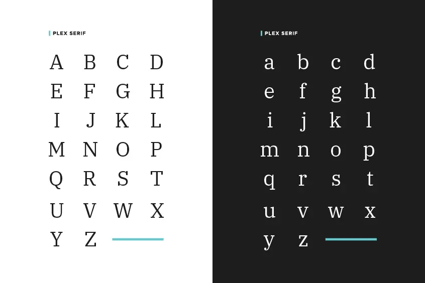
IBM Plex Sans in particular is well suited for body text, along with headlines for a more modern look. This is especially evident in Font Sharing which is often used as part of UI design, being compatible with the digital era. IBM Plex Serif font, on the other hand, is suitable for use in editorials and printed matters. This shows how both fonts are suitable for application within the body text.
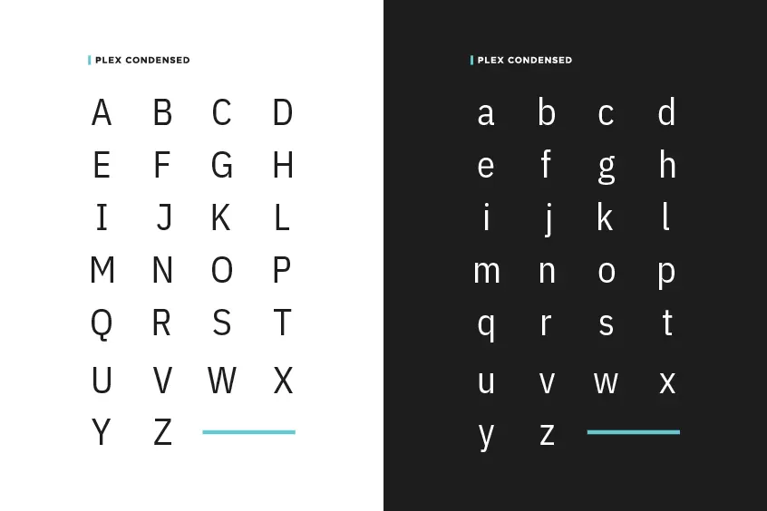
IBM Plex Sans Condensed has the same functionality as IBM Plex Sans, with the choice to be more compact, as the IBM Plex Mono can also be used as a base text by comparison. Ultimately, however, the IBM Plex Mono font is often used for coding, as the versatile family is often featured in the visual design alongside its use for more practical purposes.
Including
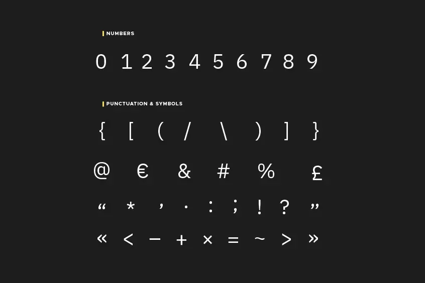
IBM Plex fonts are open source, anyone can download and use them, The IBM Plex Family is composed of three font types: Sans (Sans-serif), Serif, and Mono (a monospaced font). I believe that friends who are familiar with English fonts are no strangers to these three font types. Each category has eight different font weights: Thin, ExtraLight, Light, Text, Regular, Medium, SemiBold, Bold, and italic series. It is worth mentioning that the font files included in IBM Plex are in .ttf and .otf formats for Windows and Mac. If users want to apply web fonts, IBM Plex also provides web fonts in .eot, Woff, and .woff2 formats, it can be said that almost all needs are fully taken care of.
Language Support
IBM Plex supports over 100 languages, along with an enhanced Latin version covering the need for communication in international situations. This can be very helpful for global companies in thinking about language support and communication that supports image and brand identity in reaching different people of different cultures and backgrounds.
IBM Plex Sans and its seven scripts are the only differences within the type family to support non-Latin characters due to the long time devoted to research and design modifications for each alphabet and symbol. Despite extensive language support, well-known such as Japanese (scheduled for release in early 2021) and Traditional Chinese and Simplified Chinese (the size of the project currently has a release date of 2022), while Korean support was released on June 8, 2020. Other language support for math will come in 2021, along with Kannada and Tamil – also in 2022.
Extensive support also applies to multiple non-Latin characters such as Greek, Hebrew, Arabic, Cyrillic, Devanagari, Korean, and Thai, and some variations of many non-Latin characters. This difference in editions gives the superfamily more flexibility in a variety of contexts, including the Thai version. One is looped and the other is the regular version of the Asian language.
IBM’s decision on language support through IBM Plex Sans specifically addressed the needs of its international audience, ultimately further demonstrating the resilience of the type family. In essence, although the development of the IBM Plex family is not finalized in all language support, it does illustrate how the continual evolution of identity within the writing and printing industry continues over time.