Discovering the FedEx Font
FedEx, a name synonymous with swift deliveries and global reach, stands tall as one of the world’s premier courier delivery services. Its logo, instantly recognizable with its vibrant purple and orange hues, is more than just a name; it’s a symbol of reliability, efficiency, and innovation. But have you ever paused to think about the FedEx Font that spells out this iconic brand’s name? Or why that particular FedEx Font was chosen?
FedEx Logo Font
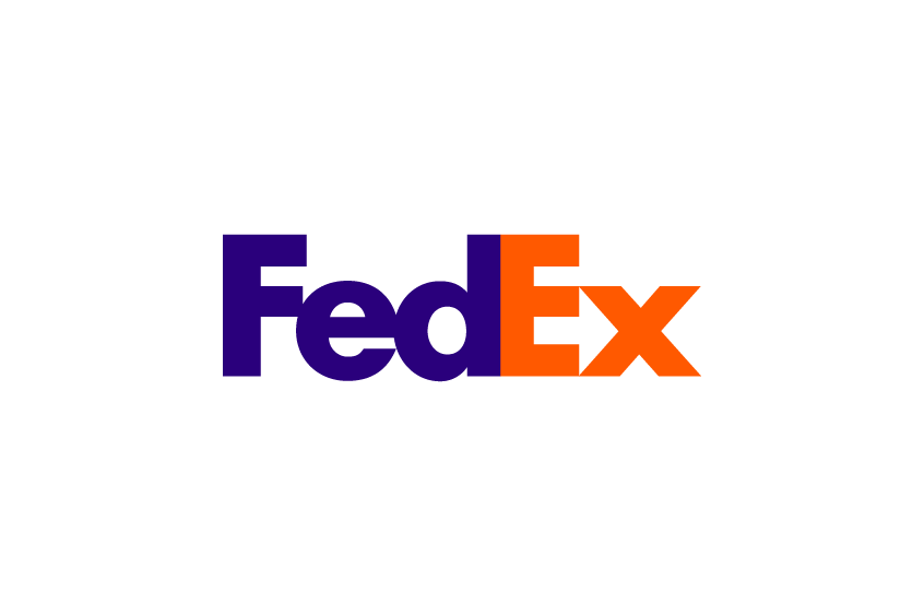
The FedEx Font gracing the FedEx logo is none other than Futura Bold. This sans-serif typeface, with its roots dating back to 1927, was the brainchild of the talented Paul Renner. Futura’s design is a beautiful amalgamation of geometric shapes, with the circle being a predominant influence. The result? A typeface that exudes modernity, elegance, and a certain timeless appeal. Futura Bold, a variant of Futura, is characterized by its thicker and heavier strokes. This gives the FedEx Font a robust presence, ensuring that the FedEx logo stands out and remains etched in the minds of viewers.
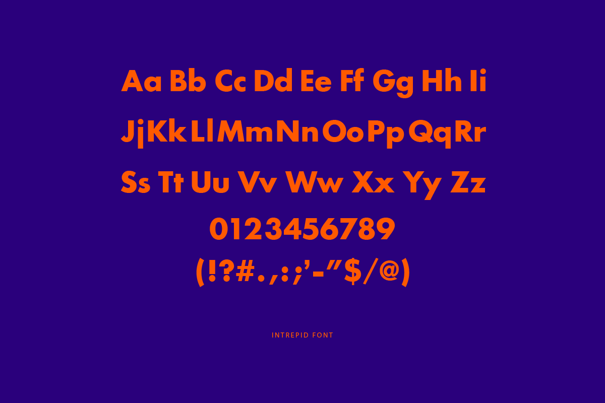
For those keen on getting their hands on the FedEx Font, you can purchase it here. Alternatively, if you’re looking for a free version for personal use, Intrepid Bold might be your best bet.
Why Futura Bold for the FedEx Font?
The choice of Futura as the FedEx Font wasn’t arbitrary. Lindon Leader, the creative genius behind the logo’s design, believed that Futura encapsulated the essence of FedEx. In his words, the FedEx Font is “universal, efficient, precise, and modern”. For a company that thrives on speed, innovation, and dynamism, Futura seemed like the perfect fit. Its high legibility ensures that wherever the FedEx logo appears, it’s instantly recognizable.
But Leader didn’t just slap on the FedEx Font and call it a day. He meticulously adjusted the spacing between the letters, giving the logo a compact and cohesive appearance. This adjustment inadvertently led to the creation of the hidden arrow nestled between the ‘E’ and the ‘x’. This arrow, subtle yet powerful, signifies direction, progress, and the relentless forward momentum that FedEx embodies.
Futura’s Legacy in Design
FedEx isn’t the only brand to have been smitten by Futura’s charm. This font has graced the logos of giants like Volkswagen, Domino’s Pizza (1996), and IKEA. The silver screen too has seen its fair share of Futura, with movie posters for classics like “2001: A Space Odyssey”, “The Social Network”, and “Gravity” showcasing the font. Its influence is undeniable, with modern fonts like Avenir, Century Gothic, and Gotham drawing inspiration from it.
In Conclusion
The FedEx logo, with its choice of the FedEx Font, serves as a testament to the transformative power of typography. By choosing Futura Bold and making subtle modifications, FedEx has crafted a logo that is not only visually appealing but also resonates with the brand’s core values. It’s a brilliant example of how the right font, paired with thoughtful design, can elevate a brand’s image to iconic status.