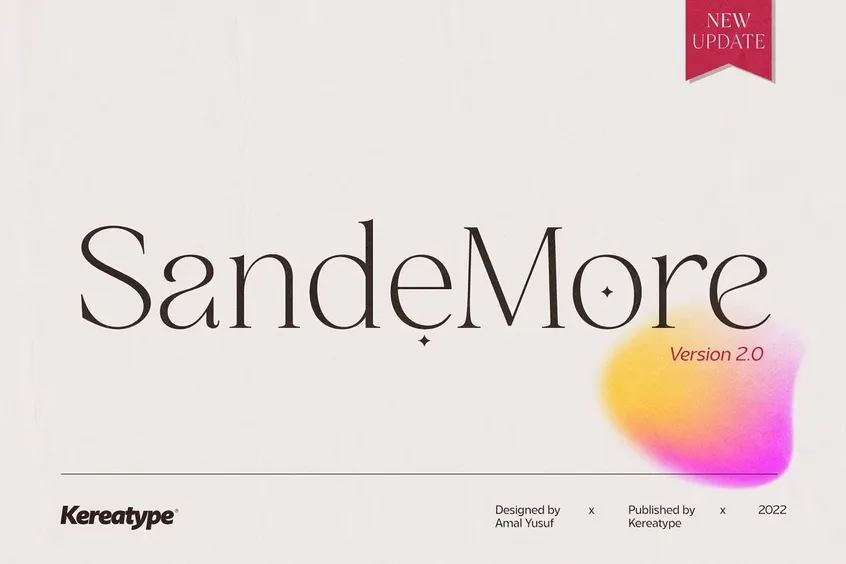
San de More Font
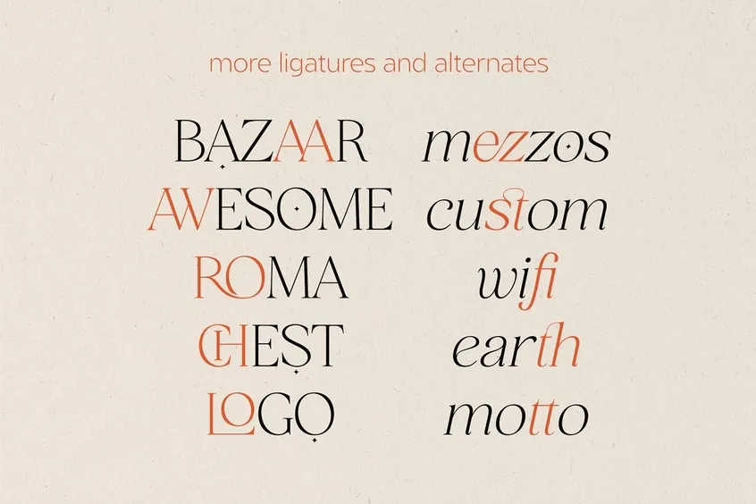
Introducing the San de More font, a highly fashionable and elegantly modern serif font family created by the renowned typeface designers at Kereatype. This serif font family comprises five distinct weights, each accompanied by matching italics, providing a versatile selection of typographical options for designers to choose from.
San de More is a summer-themed font that exudes a sense of style and chicness, making it an ideal choice for those seeking to add a touch of elegance and class to their designs. The designer of this font is an experienced graphic designer who has worked with a variety of clients, he understands the importance of creating unique and stylish designs that stand out from the crowd. That’s why he set out to create this font, with the aim of helping designers achieve just that.
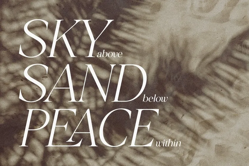
San de More is perfect for branding and logo design, as it offers a sense of class, elegance, and distinctiveness that is hard to come by. Its unique style and refined shape make it an ideal choice for creating logos that are both stylish and timeless.


San de More Font Usages Ideas
- San de More’s elegant and refined serif style makes it an ideal choice for creating a sophisticated brand identity. Its unique shape and stylish characters can be used to create a logo that exudes class and elegance, making it the perfect choice for luxury brands and high-end products.
- Also, it is an excellent choice for designing wedding invitations. Its subtle, sophisticated style and elegant characters provide a touch of sophistication that will make your invitations stand out from the rest.
- San de More’s fashionable and contemporary serif style makes it an ideal choice for designing advertisements and marketing materials for the fashion and beauty industry. Its unique characters and stylish shape will help you create designs that are both chic and elegant.
- It is an excellent choice for designing packaging for luxury products. Its refined shape and stylish characters will help your product stand out on the shelves, making it an ideal choice for high-end packaging design.
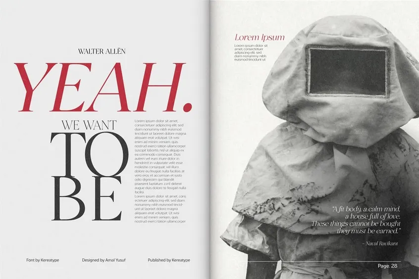
- The San de More font can be used to design the title of the book or magazine and it will give a sophisticated and graceful look to the cover. The serif style and stylish characters will attract the audience’s attention and make them want to read more.
San de More Font License
We are grateful to Kereatype for generously providing a free demo of this exquisite typeface for designers to try out. If you are impressed by the San de More font, we encourage you to purchase the full version through the provided link: Creative Market. By doing so, you will gain access to a commercial license and additional features that will enhance your design experience.
Furthermore, it would be prudent to meticulously examine different alternatives that exude a similar aesthetic allure, such as Amelaryas, Gyahegi, and The Seasons.