
About Neuropol Font
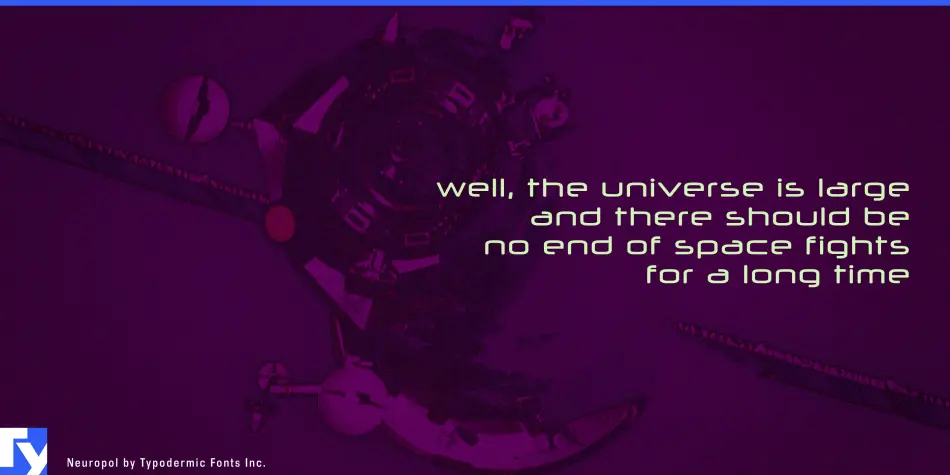
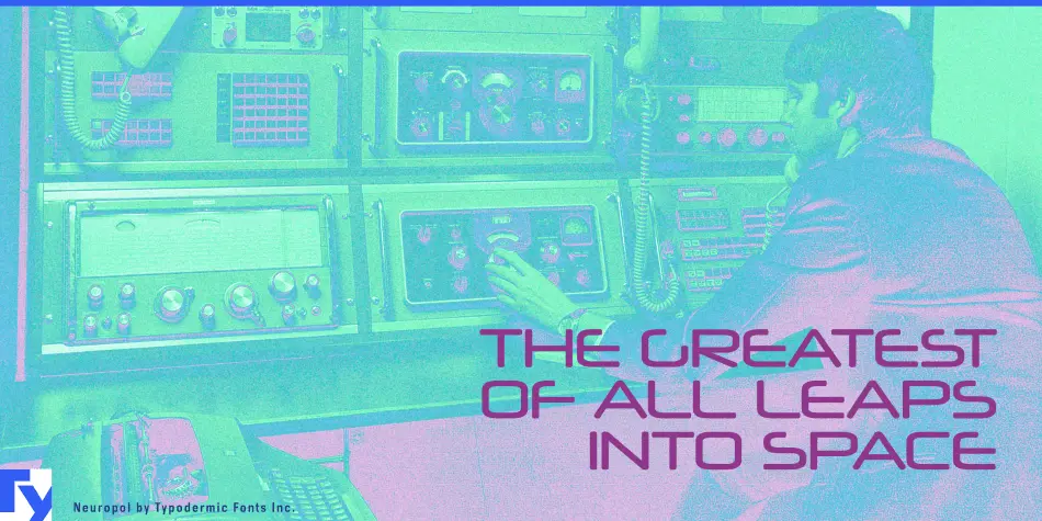
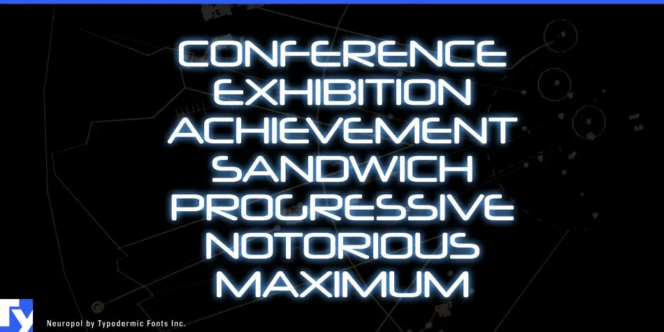
Neuropol Font is a quite simple, thin, and futuristic typeface that was created in 1996 by Typodermic. Its design is inspired by well-known techno fonts such as Microgramma, Digital, and Chimes. The super oval batten ends give Neuropol a symmetrical look. Cut-out horizontal strokes represent the trajectory of the laser beam or guided beam.
In the past few decades, several font collections related to Neuropol have been released. Neuropol was rebuilt and expanded to Neuropol X in 2004. The Neuropol font was discontinued at the time, but many people preferred the original 1996 version.
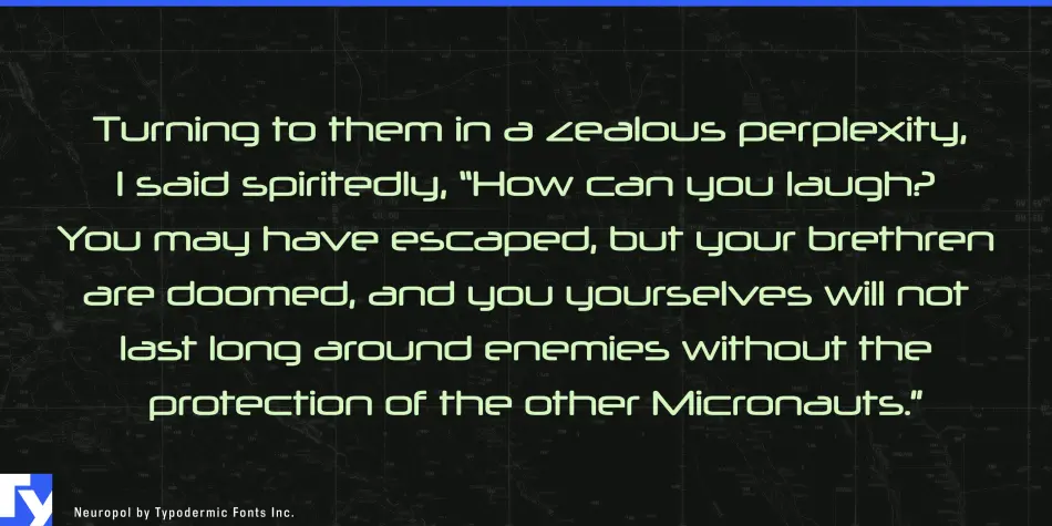
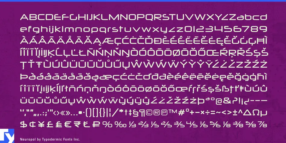
In 2015, the original 1996 Neuropol was overhauled and reissued. Changes include better kerning, higher dots on the letters (i and j), sharper curves, heavier accents, more languages, more punctuation, the latest currency symbols, and a better “@” symbol. If your application supports OpenType style substitution, you can access a full “Z”, similar to the one in Neuropol X.