Lego is a Danish toy production company that is famous for its plastic bricks and sets. The company has a long history of using fonts to create a distinctive brand identity that appeals to children and adults alike. But what font does Lego use in its logo?
The LEGO Logo Font
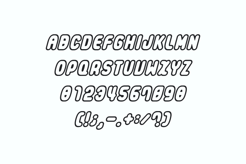
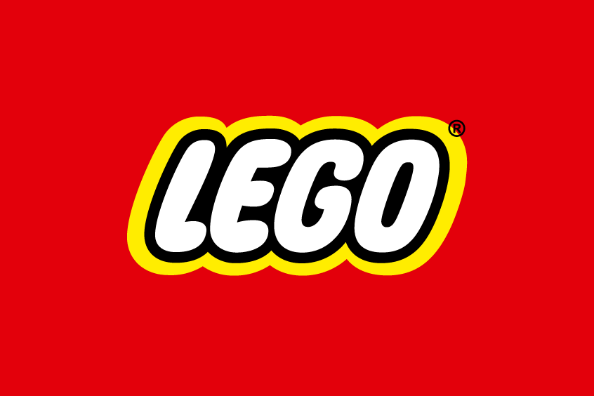
The Lego font used in its logo is a custom-made font that’s not accessible to the public. However, there’s a fascinating fan-made typeface called “LegoThick” resembling the original with its bold, blocky style and rounded edges, evoking a playful vibe. Notably, this fan-made typeface is presented exclusively in capital letters.
While there are several fonts out there that attempt to replicate the Lego logo font, it’s essential to acknowledge that the official Lego logo does not derive from a specific font. Instead, it stands as a unique masterpiece, a custom-designed logotype exclusively crafted for the Lego Group. Each letterform in the Lego logo is meticulously handcrafted and meticulously tailored to create a one-of-a-kind design that sets Lego apart.
A plethora of fonts and typefaces have been developed by passionate fans and talented designers, all in an endeavor to capture the essence of the Lego logo. Among them, is “LegoThick.” However, it is vital to emphasize that these fonts are unofficial replicas or imitations, not sanctioned or endorsed by the Lego Group. The true Lego logo retains its exceptional distinction as an exclusive and proprietary creation.
Downloading Lego Font & Licensing
For enthusiasts seeking to infuse their projects with the spirit of Lego, LegoThick offers an alluring option. It is available for free download, allowing individuals to utilize it for personal or educational purposes. However, it is important to note that LegoThick is not recommended for commercial projects, as it lacks the official endorsement of the Lego Group.
The Lego Logo: A Symbol of Creativity and Fun
Over time, the Lego logo has undergone subtle transformations, yet it has remained faithful to its signature font style. The inaugural Lego logo emerged in 1934, exhibiting an elegant handwritten script font. In 1953, it transitioned to a sans-serif font, characterized by rounded corners, projecting a modern and approachable image. Finally, in 1973, the Lego logo acquired its current font style, marked by bolder and more angular letterforms. This transformative phase also introduced a captivating yellow outline and a vibrant red background, heightening its visual appeal and attracting attention at every glance.
The Lego logo serves as a timeless emblem, representing the values of creativity, innovation, and unadulterated joy that the Lego brand embodies. It is an embodiment of endless possibilities, reflecting the boundless imagination of Lego enthusiasts worldwide. Moreover, the Lego font used within the logo plays a significant role in forging this identity, inspiring countless fans to embark on their creative journeys. LegoThick stands as one of the most beloved fan-made fonts, allowing individuals to personalize their projects, instilling them with the same spirit of ingenuity that defines the Lego brand.
See more: https://en.wikipedia.org/wiki/Lego
Conclusion
In conclusion, the Lego font used in the logo remains an enigma, an unparalleled creation that defies imitation. LegoThick, a remarkable fan-made font, enables enthusiasts to infuse their projects with the essence of Lego, albeit without an official endorsement for commercial endeavors. As the Lego logo continues to captivate hearts worldwide, it stands as a testament to the power of creativity and the enduring legacy of the Lego Group.
If you’re looking for more things to dive into, we have some other fascinating topics that might capture your interest, like Hot Wheels, Undertale, and Nintendo. They’re all full of excitement and wonder!
We genuinely hope that this article has brought you some valuable insights about the Lego font and its alternative options. If you have any questions or comments, we’d be delighted to hear from you. Please don’t hesitate to share your thoughts down below.