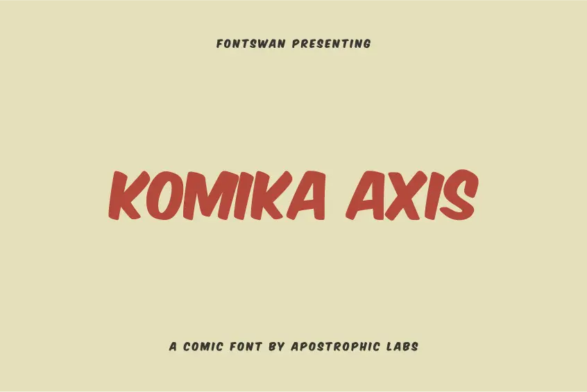

Introducing Komika Axis Font
The Komika Axis Font, a distinctive comic typeface, was meticulously crafted by the talented team at Apostrophic Labs. Exhibiting a whimsical and engaging design, this font is ideally suited for an array of creative endeavors, including comic books, children’s literature, and other imaginative design projects.
Developed between 1999 and 2001, Komika Axis Font belongs to an extensive collection of 50 Komika fonts, all of which were masterfully designed by Apostrophic Labs. The font was intentionally created to evoke a handmade aesthetic, reminiscent of the traditional comic book style. Additionally, its sharp, unblemished lines contribute to its readability, making it an appealing choice for various applications.
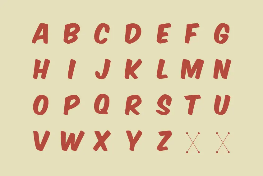
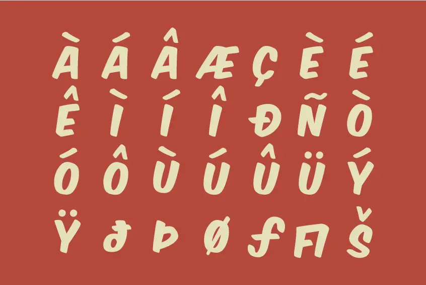
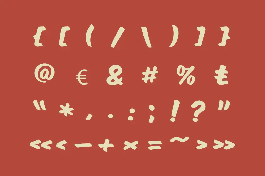
The Komika Axis Font is available in a single weight, Regular, and boasts a comprehensive character set that encompasses uppercase and lowercase letters, numerals, punctuation marks, and accented characters. This versatile font can be effortlessly adapted to suit a diverse range of design needs.
Komika Axis Font License
Remarkably, the Komika Axis Font by Apostrophic Labs is offered free of charge for commercial use and can be effortlessly obtained from our website. This generous offering makes it accessible to a wide audience of designers and artists who seek a unique and high-quality typeface.
In summary, the Komika Axis font is an exceptional choice for those in search of a lighthearted and inventive font design that can infuse an element of creativity and wit into any project. Its unparalleled style, coupled with its high degree of legibility, renders it a highly sought-after option among both professional designers and art enthusiasts alike.
Komika Axis Font Alternatives
Some fonts that are similar to Komika Axis are:
Komika Axis Font Story: The Early Days of Free Comic Fonts
In January 2000, there were very few free, high-quality comic fonts available for audiences who could not or did not want to purchase commercial options such as Ethan Dunham’s Comicraft. Throughout the history of free fonts, only a handful of designers have dedicated their time to creating comic fonts, and the market was predominantly focused on English-speaking countries.
Three prominent designers who invested significant time into creating comic fonts were Nate Piekos at Blambot, Dan Zadorozny at Iconian, and Derek Vogelpohl. Each of these designers produced impressive packages of comic fonts, although their character sets were mostly limited to the English language.
The Need for International Comic Fonts
As most of the available comic fonts were English-oriented, non-English-speaking countries such as Italy, France, Spain, Sweden, and Iceland faced limited options. Recognizing the need for a more inclusive comic font system, a collaboration between designers, including WolfBainX, began to take shape in January 2000.
The vision for the project was to create five packs of ten fonts, forming a complete writing system for various types of comic creators. This system would address the needs of professionals, freelancers, hobbyists, beginners, and casual users alike.
One of the most significant concerns for comic creators in the digital age was the text inside speech, narration, and thought balloons. Komika Text, based on WolfBainX’s Sunday Komix messages, was created to address this need.
For titles and cover designs, Komika Display and Komika Title were developed, drawing inspiration from WolfBainX’s Komixation and Supermarket Sale letters.
To add variety and flexibility to the overall set, an additional ten fonts were created as potential alternatives for the text, display, and title sets.
In the past, comic books often featured one unique, standout font used only once throughout the entire work. With the advent of digital lettering, this practice has become increasingly rare. To pay homage to this tradition and encourage creativity, the Komika Poster set, a collection of nine unique fonts, was included in the project.
The Komika Axis Font suite also included pre-made balloons and narration elements, as well as extensive language support, covering Swedish, Icelandic, Spanish, and Portuguese characters.
A Tribute to the Past: The Changing World of Comics
The comic book industry has undergone significant changes, with the increased use of computerization leading to a decline in the clarity and distribution of traditional comics. The development of the Komika Axis Font suite aimed to bridge the gap between old and new while providing versatile, inclusive options for comic creators around the world.
Acknowledgments
Special thanks to WolfBainX for providing the foundation for the Komika Axis Font suite and the designers who dedicated their time and effort to creating free comic fonts for a global audience.