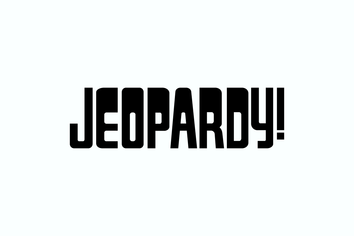
Identify the Jeopardy Font Used in the Logo
Discovering the font behind the iconic ‘Jeopardy!’ logo unveils a fascinating journey into typographic history. As one of America’s longest-running and beloved quiz shows, ‘Jeopardy!’ has captivated audiences since its 1964 debut, challenging contestants with trivia across diverse topics like history, science, literature, and pop culture. However, the lesser-known star of the show—the ‘Jeopardy Font’—holds a captivating story of its own.
The closest resemblance to the original Jeopardy font is ‘Gyparody,’ crafted by Ray Larabie in 1998 under his Typodermic Fonts design agency. A parody of the original font designed by Jay Stowell in 1984, Larabie’s iteration boasts refined elements—smoother curves and enhanced spacing—setting it apart. Notably, ‘Gyparody’ is freely available for commercial use, while the full font family can be accessed at the link here.
The timeless Jeopardy logo, introduced in 1984 during its syndicated run, boasts a stylized, angular typeface featuring the word “Jeopardy!” culminating with an exclamation mark. Beyond a mere visual representation, the logo endeavors to evoke a palpable sense of excitement, challenge, and amusement while distinguishing itself from other TV logos.
Yet, the Jeopardy font isn’t the sole typographic identity within the show’s realm. The game board, the canvas where categories and clues unfold, has undergone subtle metamorphoses over the years. Since the 1980s, varying widths of Swiss 911, a derivative of Helvetica, have adorned the categories and dollar levels. In stark contrast, the clues boast all-caps ITC Korinna, a serif font bearing unconventional Art Nouveau-inspired letterforms, adding a unique visual flair to the game.
Jeopardy’s typographical journey, from the evolution of its logo font to the intricate choices defining the game board, adds a layer of sophistication to its visual narrative. It not only encapsulates the show’s essence but also exemplifies the importance of design nuances in iconic television representations.
