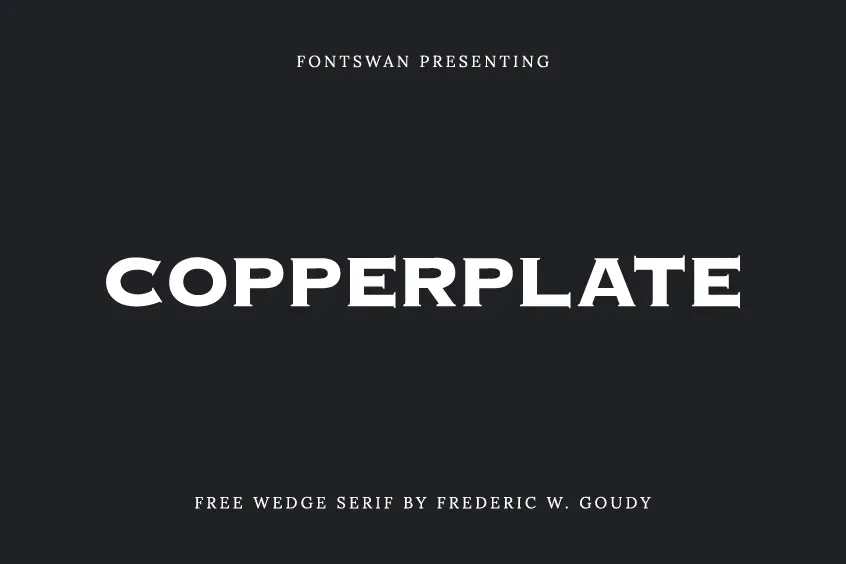
About Copperplate Font
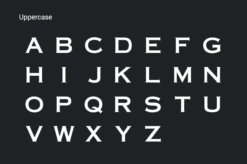
Presenting Copperplate Font — a letter-type family designed by Frederic W. Goudy and released by the American Type Founders in 1901. This design makes Copperplate look quite solid, making it a good font for headings, and since it was intended to be used only for headings and displays, Goudy built Copperplate out of uppercase and lowercase letters only.
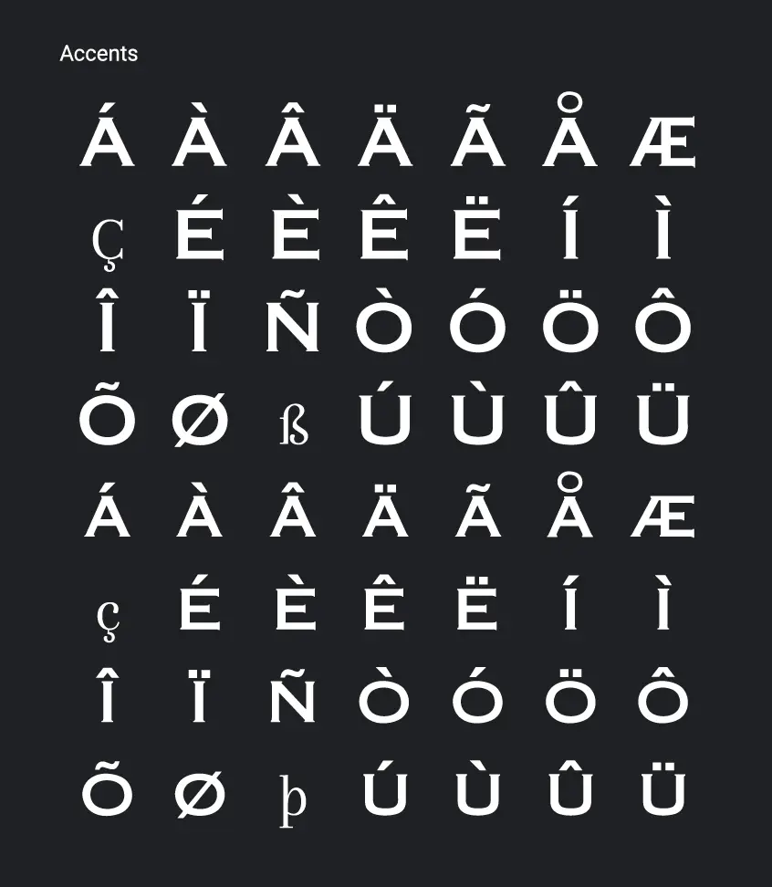
It was originally called Copperplate Gothic – “Gothic” referring to the sans serif typeface but has characteristics of both serif and sans serif fonts. Its tiny serifs were supposed to remind us of the inscriptions on the copper plate, hence its name.
Goudy created Copperplate Font early in his career, when a commission was required, however, he was careful to preserve the quality of the drawings, and the proof is that the designs are still widely used in many commercial prints such as Business cards and frosted glass doors for law firms.
Goudy’s typeface designs have always been recognizable, with properties that can get annoying at times. Copperplate was one of Goudy’s most recognizable typefaces. The typeface family does not have such different styles as italics, it is wider than it is tall, and because the font is written in uppercase and lowercase letters, it will not be useful in large groups of text. Instead, Copperplate’s main strengths lie in headlines and displays, such as storefronts, business signs, and elegant stationery.
Copperplate Font Feautures
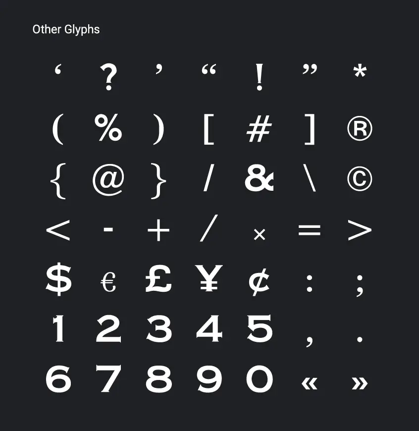
While serifs are subtle and barely visible in the alphabet, they are a bit overused in numbers and symbols. Most numbers in serif fonts have only two serifs, while Copperplate has three. The ampersand design is also unusual because it looks a lot like the number 8.
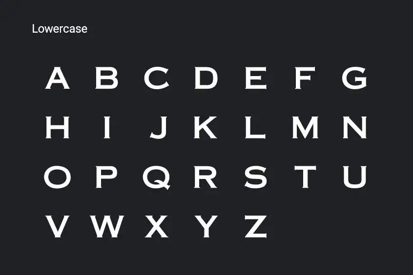
The height of x for lowercase letters in Copperplate is the usual of the average for lowercase letters in other typefaces, however, the thickness of the horizontal stroke in lowercase letters remains the same as in uppercase letters.
One of the unique features of Copperplate Font is that some of its letters appear horizontally overloaded. Their counters are taller and wider than average.