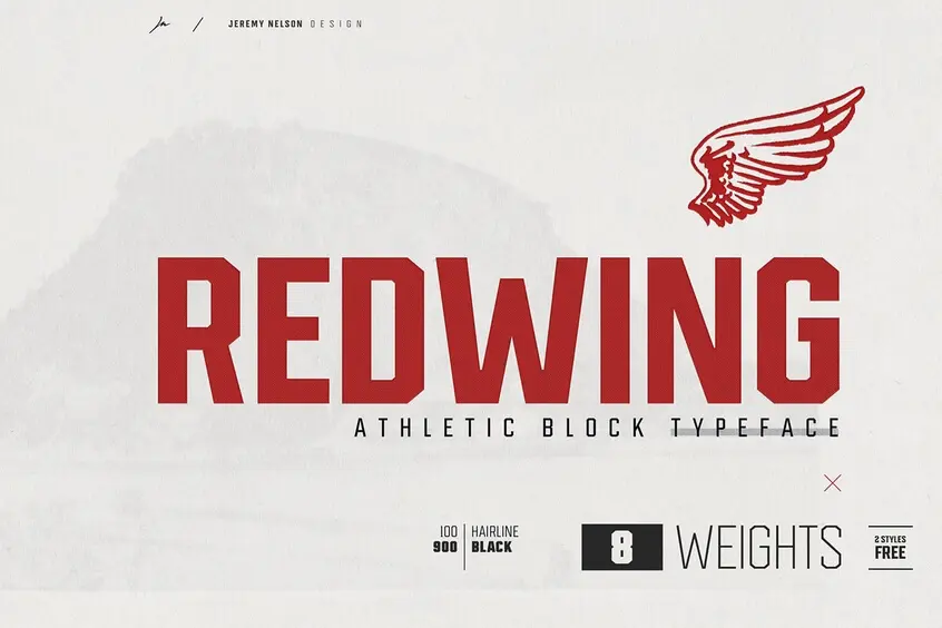


Redwing Athletic Block Typeface
Introducing Redwing font – a free display font pack that features bold and blocky typography, created by Jeremy Nelson. It was derived from the foundation of sports and industrial fonts, inspired by the pioneer heritage and blue-collar roots of the same name: Red wing in Minnesota (full background information below).
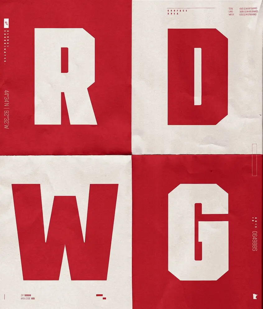
Founded on the banks of the Mississippi River and named after the chief of the Dakota Sioux in the early 19th century. It was originally a shipping and trading port, and then quickly developed into an industrial town. Home of Redwing boots, a global supplier of work shoes and the essential outfit for U.S. soldiers in World War I and World War II, the city has remained faithful to its origins in the industry while it prides itself on the quality of its work.
Reflecting the cities ‘character, Redwings’ aesthetic design reflects the heavy-duty chassis and backbone to withstand any typographic load, check-in, and go-to-work.
Sports teams have been individually tailored and sewn, and their uniforms are almost entirely handmade. In the absence of modern machinery, the process is simplified by replacing calligraphic curves with geometric angles.
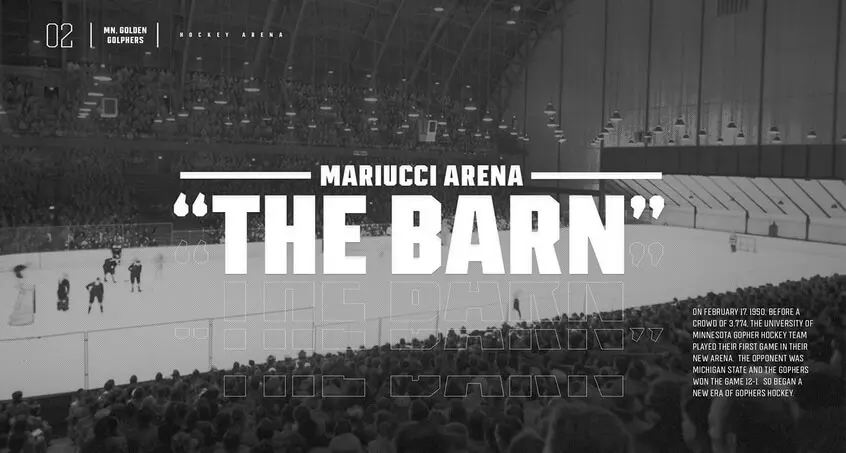
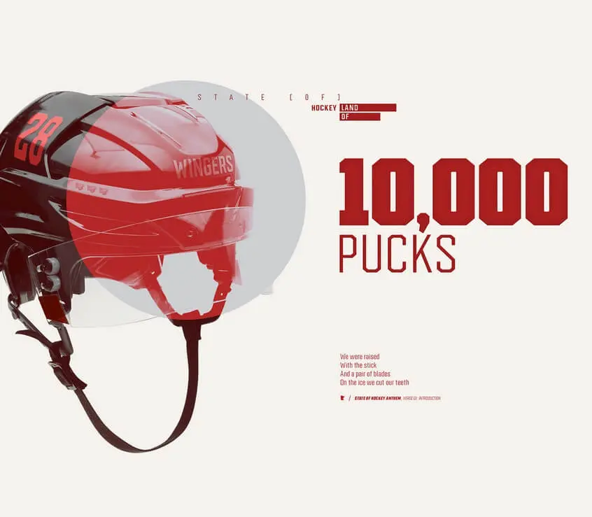
Everywhere in the field of track and field, the type of block is still closely related to its roots of utilitarianism.
Redwing Font has retained this essence by following the convention and cutting its main corners to 40°. At the same time, the rules were violated in some cases, bringing a unique sound to the classic style.
Redwing Font Features
Redwing issued a reliable and deep-rooted tone. The defining characteristics of Redwing are as follows:
- LOW CONTRAST: The subtle difference between vertical and horizontal strokes maintains a bold, consistent voice for all settings.
- X-HEIGHT: Large height allows for space-filling writing settings with greater symmetry and balance.
- DESCENDERS: Relatively longer than the ascending one as a way to balance the large x-height of the characters.
- ASCENDERS: Cultivate a higher vertical personality at 1/3 of the x-height.
- TERMINALS: Notched terminals present a distinctive design element unique to Redwing.
- CALLIGRAPHIC HAND: Shapes throughout the font such as the tail of the lowercase letters “t” and “l” preserve the stroke movement of traditional calligraphy.
- COUNTERS: Balance positive and negative shapes and create a coherent, rhythmic shape form.
- EXTREME JOINTS: Open to reduce the squeezing around these dense forms and reduce visual weight.
- UNDERSTATED TAPERING: The restricted taper of the corner strokes maintains a mono-weighted aesthetic while accommodating the necessary visual adjustments.
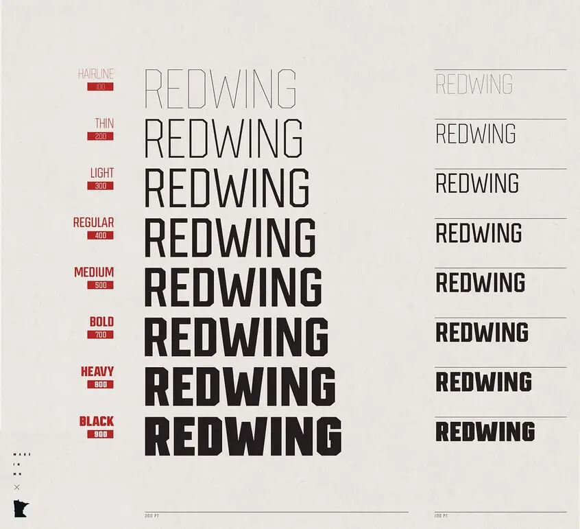
Redwing Font Download 2 Weights Free
Including two weights: Light (300) and Medium (500), this demo pair of Redwing Font is free for personal and commercial use, fully loaded, and ready for work.