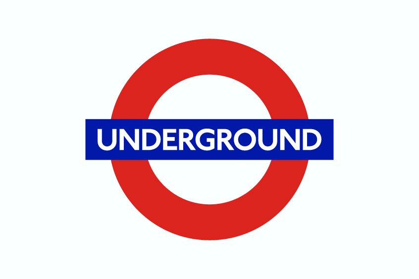
Upon visiting London, it is probable that you have encountered the distinctive London Underground Font adorning the signs and logos of the city’s rapid transit system. This may have piqued your curiosity regarding the specific font employed for its creation. In this article, we shall investigate the history and development of the typeface that has become a hallmark of London’s transportation network. Additionally, we will examine several comparable, freely available fonts that may be employed in your own projects.
What Font Is Used in the London Underground Logo?
The font used for the London Underground is known as ‘Johnston,’ which has become an essential part of London’s visual identity since its creation by Edward Johnston in 1916. The typeface was specifically designed for the Underground Group, an organization responsible for the London public transport system. Over the years, several variations of the Johnston typeface have been developed, each building on the original design to adapt to changing needs and technologies. Some of these variations include New Johnston, Johnston 100, P22 Underground, and ITC Johnston.
Edward Johnston, a British calligrapher, and typographer, sought to develop a typeface that embodied simplicity, clarity, and modernity. He wanted the font to reflect the company’s values and resonate with the public using the transport system. The Johnston typeface proved to be highly legible and well-suited to the underground environment, making it an ideal choice for the signage and branding of the London Underground.
In 1979, the New Johnston variation was introduced by Eiichi Kono, who was tasked with updating the original design for better legibility and use in modern printing techniques. New Johnston retained the distinct character of the original typeface while improving its overall readability.
The P22 Underground and ITC Johnston are two commercially available adaptations of the original Johnston typeface. P22 Underground was designed by Paul D. Hunt and released by P22 Type Foundry in 1997, while ITC Johnston was developed by Dave Farey and Richard Dawson in 1999 for the International Typeface Corporation (ITC).
To commemorate the centenary of the original typeface, Transport for London (TfL) commissioned Monotype to create an updated version called Johnston 100. Released in 2016, Johnston 100 preserves the essence of Edward Johnston’s design while incorporating subtle refinements to better suit contemporary digital platforms and printing techniques.
The Johnston typeface and its variations have had a significant impact on graphic design and typography throughout the years, influencing many other typefaces worldwide. Its longevity and continued use in the London Underground are a testament to the enduring quality and appeal of Edward Johnston’s iconic design.
Similar Free Fonts
Some free similar fonts that bear a striking resemblance to London Underground Font include:
Paddington
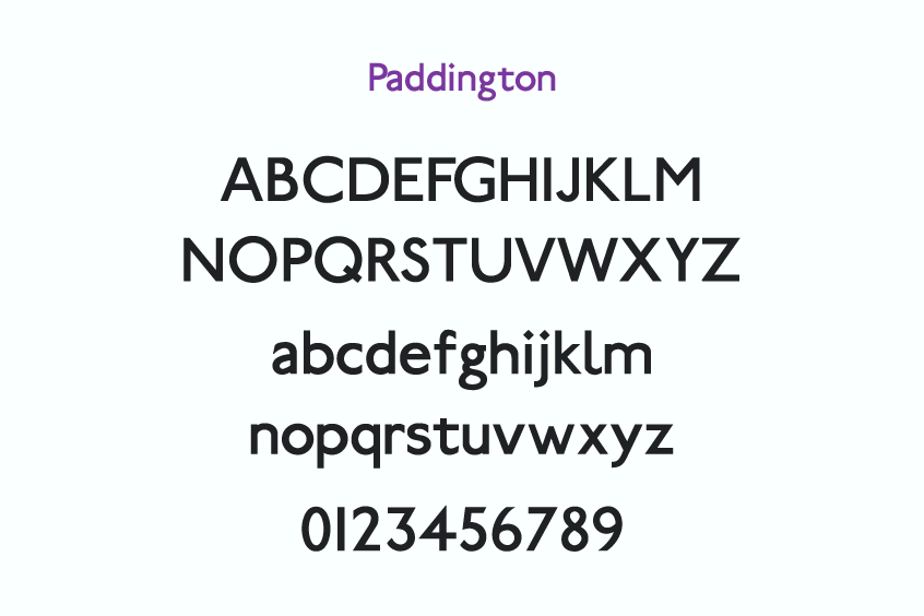
Paddington is a free similar to the London Underground font designed by Stephen Moye, a graphic designer, and typographer from Providence, RI. It is a sans-serif font with a geometric and modern look. It was created in February 1997 and has version 1.1.
UBahn
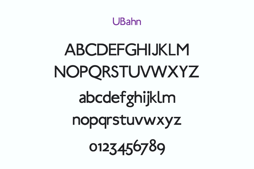
Ubahn is an elegant, free font meticulously crafted by Manfred Klein, a renowned German type designer, and artist. This exceptional sans-serif typeface exudes a clean and minimalist aesthetic, making it a versatile option for a wide range of design applications. The Ubahn font family consists of two individual font files: Ubahn.ttf and Ubahn-Light.ttf12.
You can download it and use it for personal or commercial projects.
Cabin
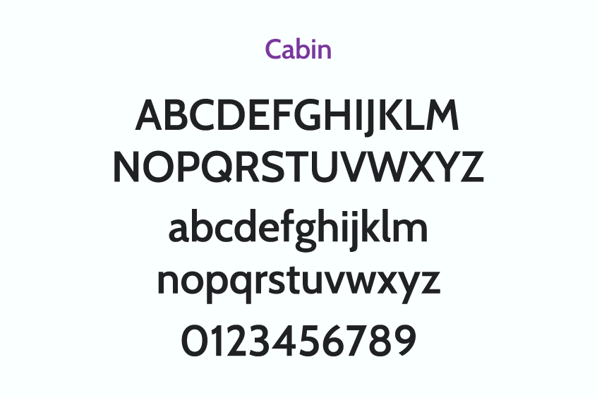
Cabin is also quite similar to the London Underground font, a humanist sans-serif typeface influenced by the work of Edward Johnston and Eric Gill, incorporating a hint of modernism. It features contemporary proportions, optical adjustments, and select geometric sans elements. While maintaining fidelity to its origins, Cabin possesses its own unique character.
The font is available in two variable styles, Roman and true italic, with a weight spectrum spanning regular to bold and a width range extending from normal to condensed. The stroke contrast approaches monolinearity, although the upper and lower curves exhibit slight thinning.
The counters of the letters b, g, p, and q are rounded, with each receiving optical adjustments. Cabin offers extensive language support, including complete Latin coverage for Vietnamese, as well as Western, Central, and South/Eastern European languages.
As a public-domain font, it is suitable for both personal and commercial endeavors.
Hammersmith One
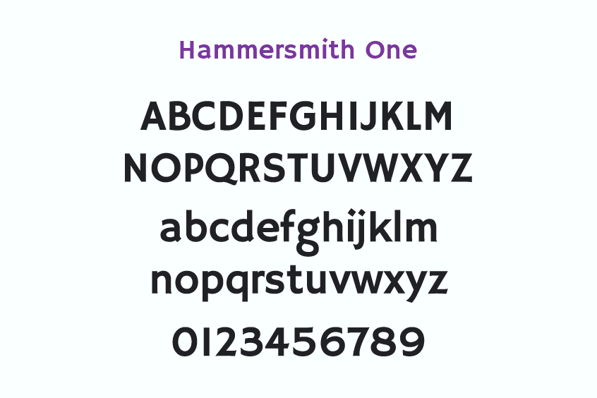
Hammersmith One is a low-contrast, sans-serif typeface exhibiting both geometric and hand-drawn qualities. Drawing inspiration from the Johnston UK lettering tradition, the font incorporates unique details and asymmetrical forms. It features a single regular style compatible with Latin languages and is appropriate for display and headline usage, as well as smaller text. Hammersmith One’s friendly and informal tone adds character to design projects.
As an open-source font, it is available for use in personal and commercial applications.
Railway Sans
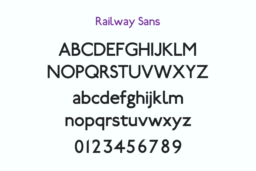
Railway Sans is a complimentary typeface designed by Greg Fleming, inspired by the London Underground Font used in signages. It maintains the geometric shape and proportions of the original font while incorporating subtle modifications, such as a more circular letter O, an elongated tail on the letter R, and a closed loop on the letter G. The font has a single regular style supporting Latin languages, making it versatile for various purposes, including logos, posters, signs, and websites.
Railway Sans is a free font, permitting usage for personal and commercial projects.
Conclusion
In conclusion, the Johnston typeface has become synonymous with the London Underground, serving as an emblem of the city’s rich history and forward-thinking approach to public transportation. From Edward Johnston’s visionary design in 1916 to its contemporary adaptations, the London Underground font has evolved to meet the demands of modernity while maintaining its core attributes of simplicity, clarity, and functionality.
The various iterations of Johnston – New Johnston, Johnston 100, P22 Underground, and ITC Johnston – have not only demonstrated the typeface’s versatility but also contributed to its enduring legacy. The continued use of Johnston in the London Underground is a testament to the profound impact of Edward Johnston’s work, which has transcended the realm of typography to become an indelible element of London’s cultural identity.
Upon your departure, you may find it worthwhile to delve into additional captivating materials that delve into topics such as Trapstar, Starbucks, and Nickelodeon.