Homestuck, a webcomic that has captivated many with its intricate storyline and distinct design choices, relies heavily on its font selection to convey mood, and tone, and differentiate various narrative elements. Over the course of the series, a variety of fonts have been employed, each carefully chosen for its specific purpose. While some of these fonts are computer-generated, others hold the unique touch of the creator’s hand, penned by Andrew Hussie himself. Let’s embark on an exploration of the Homestuck Font universe.
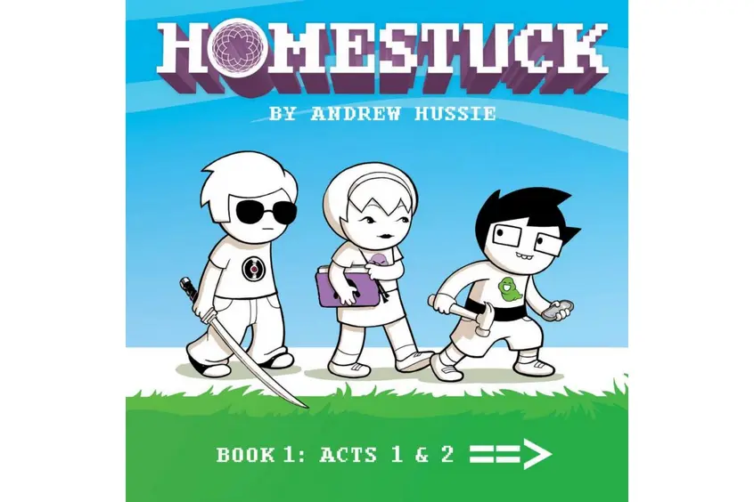
The Homestuck Font used in the Logo
The Homestuck font used in the logo is similar to Fontstuck Extended. Specifically, it adopts the characteristics of Courier New Bold without employing anti-aliasing. This particular design choice enables seamless scalability while maintaining consistent pixelation throughout various sizes. Noteworthy is the fact that this variant, denoted as “Fontstuck Extended,” encompasses an expanded set of features including both uppercase and lowercase letterforms, a range of punctuation symbols, as well as an array of multi-lingual characters.
Download Homestuck Logo Font Here
Computer-Generated Fonts in Homestuck
Homestuck uses several computer-generated fonts that are either predefined or downloaded from the internet. Some of the most common ones are:
1. Courier New
At the heart of the Homestuck textual narrative lies Courier New. This mainstay font is widely utilized for texts and commands. Its crystal-clear legibility offers an unobstructed view of the action commands and sound effects. The mere sight of Courier New signals the reader that they are about to immerse themselves in the essence of Homestuck’s evolving plot.
It’s no surprise that Courier New, a standard in Microsoft Windows and Office, is such a focal point, given its accessible nature. For those seeking it, Courier New is available here.
2. Verdana
Verdana serves as the clickable pathway to progress the comic, guiding readers to the subsequent pages. Beyond this, it plays an integral role in alchemy panels, detailing item names and the all-important grist counts. Verdana is available here.
3. Comic Sans
In the universe of Homestuck, SBaHJ holds a distinct place. It and the quotes derived from it use the Comic Sans font, a choice that adds a touch of whimsy and lightness. Get it here.
4. Lucida Console
Lucida Console finds its niche in the GameFAQs guides, notably in Rose’s walkthrough. Furthermore, the semi-condensed variation of this font illuminates the sylladex and strife specibus cards, enhancing their distinctiveness. It is available here.
5. Rapscallion
Rapscallion, with its ethereal quality, is chosen to introduce the kids’ lands as well as the majestic realms of Prospit and Derse. This font, brimming with a fairy-tale aura, encapsulates the enchanting journey that lies ahead for the player. From Jane’s and Andrew’s DEAD panels to the enthralling chess match between Calliope and Caliborn, Rapscallion’s presence is felt. Rapscallion is available for free download here.
6. The King and Queen font
The communication between the White Queen of Prospit and Black Queen of Derse with their designated children in their Exile roles is depicted in this font. With its regal and sophisticated appearance, it becomes clear why this Homestuck Font was Andrew’s pick for such exchanges. Download it for free here.
7. An All-Star
When it comes to representing the troll language, the Roman symbols of humankind weren’t sufficient. Instead, An All-Star font emerges with rune-like characters, each matching a letter in our alphabet. Almost universally used for troll-related content, some rare exceptions exist like Vriska’s handwriting and the names of the trolls’ planets. Interestingly, the font is an inverted and mirrored version of an existing font. Enthusiasts can find three versions of this flipped font available for download here.
8. Grimoire Fonts
The mystical feel of Rose’s Grimoire for Summoning the Zoologically Dubious is emphasized with the Nueva Standard font on its front cover. As for its inner contents, Mister Twiggy dictates the font of choice. When the Horrorterrors decide to converse with their chosen ones, as seen in Rose’s magical cueball interactions, this font comes into play.
9. Daunting Text Fonts
For the curious mind, Colonel Sassacre’s Daunting Text of Magical Frivolity and Practical Japery holds many secrets. Its cover employs Fontdinerdotcom Sparkly while its frontispiece leans towards a squished variant of Times New Roman. The main body? Good old Courier New. Download Fontdinerdotcom Sparkly for personal use only.
10. Batman Forever
Jack Noir, a significant figure, has his name aptly depicted in the Batman Forever font. It stands out, just like his character does. You can download it here.
11. Maverick
The Fatherly Gent’s Shaving Almanac, with its distinct aura, needed a font to match. Maverick was the choice, gracing its front cover. Download it here.
12. Berlin Sans Fb
In the Troll Call cards, Berlin Sans Fb serves to describe each character, setting them apart with clarity and style.
13. MoTenacity AOE
The game Sburb finds its identity symbolized in the MoTenacity AOE font, particularly for its logo.
14. GameBro Fonts
The GameBro Magazine, a signature piece within the Homestuck universe, features its title in the dynamic GhostKid AOE font. This font also makes a reappearance to detail the flavors of Fruit Gushers during John’s significant mental breakdown. Siesta N4 further complements the magazine, utilized prominently on its front page feature text.
15. Pony Pals Fonts
In a world of intrigue and fantasy, even the “Pony Detective” has its moment. Its chosen font? Hobo. As for the content within, the reliable Times New Roman is the pick.
16. Newspaper Fonts
The Common Hornographer takes a distinguished approach by using a modified variant of English Towne Normal. As readers delve into the body of its text, Times New Roman once again makes its presence known. Not to be overlooked, the METEORS!!! snippet opts for Arial (Bold), ensuring its message is loud and clear.
17. Hobbiton Brush hand
For those seeking something special, look no further than the box of Special Stardust in Calliope’s room. The chosen font? The whimsical Hobbiton Brush hand.
18. Dream Bubbles Fonts
Charles Dutton’s Dream BubblesHS brings a familiar font into play – Papyrus. Both the title and the author’s name rely on this often-debated font, adding a touch of dreamlike quality to the content.
19. Bone Regular
The mysterious and enigmatic Kurloz expresses himself through the Bone Regular font, further emphasizing his distinct place within the narrative.
20. Strife! cover art
Music enthusiasts will recognize the Strife! music album, especially its title rendered in the Bank Gothic BT font. This font also resurfaces during pivotal moments, like Rose’s conflict with JackHS and Vriska’s showdown against the same opponent.
21. Black Chancery
The enthralling Complacency of the Learned wouldn’t be complete without its captivating cover, made even more so by the use of Black Chancery.
22. Holy Empire
Genesis Frog, another staple in the Homestuck world, graces its cover with the elegant Holy Empire font.
23. Black Night
For all things related to Flarp, including posters and manuals, Black Night is the font of choice.
24. Betty Noir
The caption ‘HUMAN KINGDOM’ during the CreditsHS segment opts for Betty Noir. Despite its ominous undertone in the narrative, its name brings a touch of humor.
25. Featured Item
The intense hero mode panels depicting Gamzee in a frenzied state rely on the Featured Item font to capture the essence of the moment.
26. Data Structures Fonts
Readers diving into the DATA STRUCTURES segment will find Impact Bold gracing its title and other cover details. The cheeky “A**HOLES” part and blurb, however, turn to the quirky Leftovers font.
27. Paradox Space lettering
Almost all non-custom lettering in the Paradox Space comics is rendered in the playful Sunday Comics BB font.
28. Hiveswap logo
The Hiveswap game logo is brought to life with a slightly altered version of Republika Ps Cnd. Promotional materials for Act 2 occasionally revert to the unaltered font.
29. Adobe Garamond Pro
The epilogues of Homestuck utilize the Adobe Garamond Pro font, resonating with the vibe of entries found on the fan fiction platform Archive of Our Own.
30. Wet Dreamz
The font used in Pesterquest’s logo is Wet Dreamz.
Why Font Choices Matter in Homestuck
Each Homestuck font is not merely a design choice. It encapsulates character personalities, sets the mood for various scenes, and often provides hidden hints for eagle-eyed fans. These fonts, whether it’s the recognizable Courier New or the ethereal Rapscallion, contribute to the comic’s rich tapestry.
For creators, Homestuck’s dynamic use of fonts is a lesson in integrating design with storytelling. It showcases how fonts can be more than just text on a page. They can be characters, symbols, and pivotal elements in a narrative.
In essence, the Homestuck font and its varied textual companions serve as silent narrators, guiding fans through the webcomic’s intricate mazes and colorful realms. Whether you’re a creator seeking inspiration or a fan wanting to revisit the world of Homestuck, these fonts offer a captivating glimpse into Andrew Hussie’s genius. They stand as a testament to the power of design in storytelling, proving that sometimes, the pen (or font) truly is mightier than the sword.