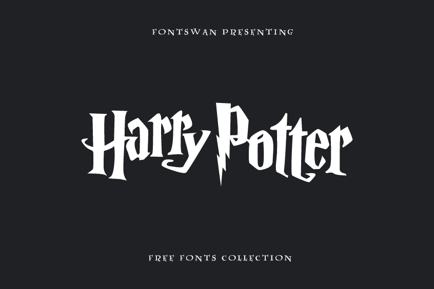
Explore the Harry Potter Fonts Used
Harry Potter is one of the most popular and beloved fantasy series of all time. The books and movies have captivated millions of fans around the world with their magical stories, characters, and settings. But have you ever wondered about the Harry Potter fonts used in the franchise? In this article, we delve into the fonts used for the logo, books, and movies, and explore similar styles that have enchanted designers and fans alike.
Harry Potter Font Download
There are many Harry Potter fonts available online, capturing the iconic visual style of the Harry Potter universe. These fonts can be perfect for enhancing various crafts, including printable stickers, cross-stitch embroidery, Perler bead creations, and other decorative items.
Downloading and using these fonts is typically straightforward, and they are compatible with popular software like Microsoft Word, Google Docs, Canva, and Cricut Design Space. To get you started, we’ve listed many examples of Harry Potter-inspired fonts that you might find appealing.
The Harry Potter Logo Font
The Harry Potter font used in the logo is custom-made but very similar to a font called “Harry P,” designed by Graham Meade, which imitates the unique text used in the logo.
1. Harry P Font: Close to the Original Logo
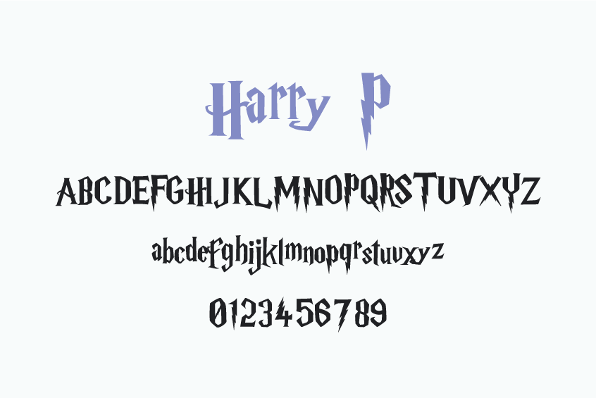
Since there is no official font available to the public or for sale that matches the Harry Potter logo perfectly, numerous fans and designers to attempt replicate or imitate it through various means. One of the most well-known and widely adopted fan-created fonts is “Harry P,” developed by GemFonts / Typotheticals in 1999, drawing inspiration from the logo of the inaugural book, Harry Potter and the Philosopher’s Stone (or Sorcerer’s Stone in the United States).
Featuring a similar lightning bolt shape within the letter “P” and a medieval design that invokes a magical and mysterious atmosphere, Harry P does not perfectly replicate the original logo design. It exhibits some distinctions in letterforms, sizes, spacing, and alignment.
“Harry P” is free for commercial use.
2. Parry Hotter: The Parody Font
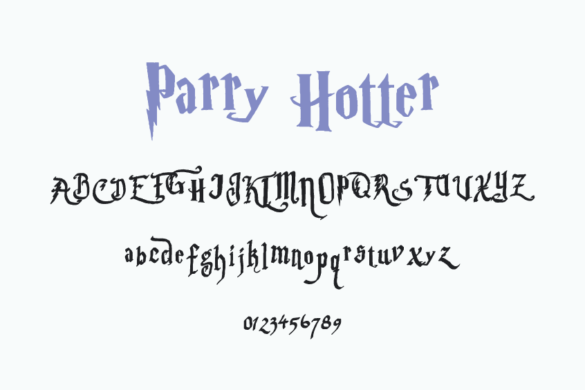
If you are in search of an entertaining and whimsical typeface that playfully satirizes the Harry Potter craze, consider exploring Parry Hotter. Designed by Anke Arnold in 2004, this font serves as a parody of the original Harry Potter text font, drawing inspiration from the enchanting charlatan Gilderoy Lockhart and his autobiography. The letter “P” in this font mimics the iconic lightning bolt shape, while also incorporating a unique twist and additional special characters.
Available for personal use at no cost, Parry Hotter is the ideal choice for crafting jokes, memes, comics, and other light-hearted content with a Harry Potter theme.
The Harry Potter Letter Fonts
The famous writing you see on the Hogwarts acceptance letter in the Harry Potter movies wasn’t made using a digital font. Instead, a graphic designer named Miraphora Mina handwrote it. She played a crucial part in shaping the visual look of the Harry Potter films.
However, several fonts have drawn inspiration from the lettering and successfully captured its essence:
1. 4PrivetDrive
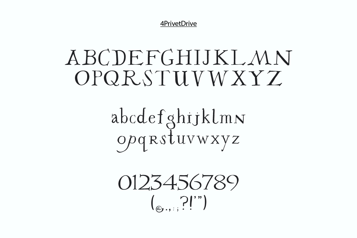
4PrivetDrive font is based on the text found in the Addressee Information section of the Acceptance Letter. Robin Springett is the creator of this font. You can find additional information in the “Read Me” file.
2. DearMrPotter
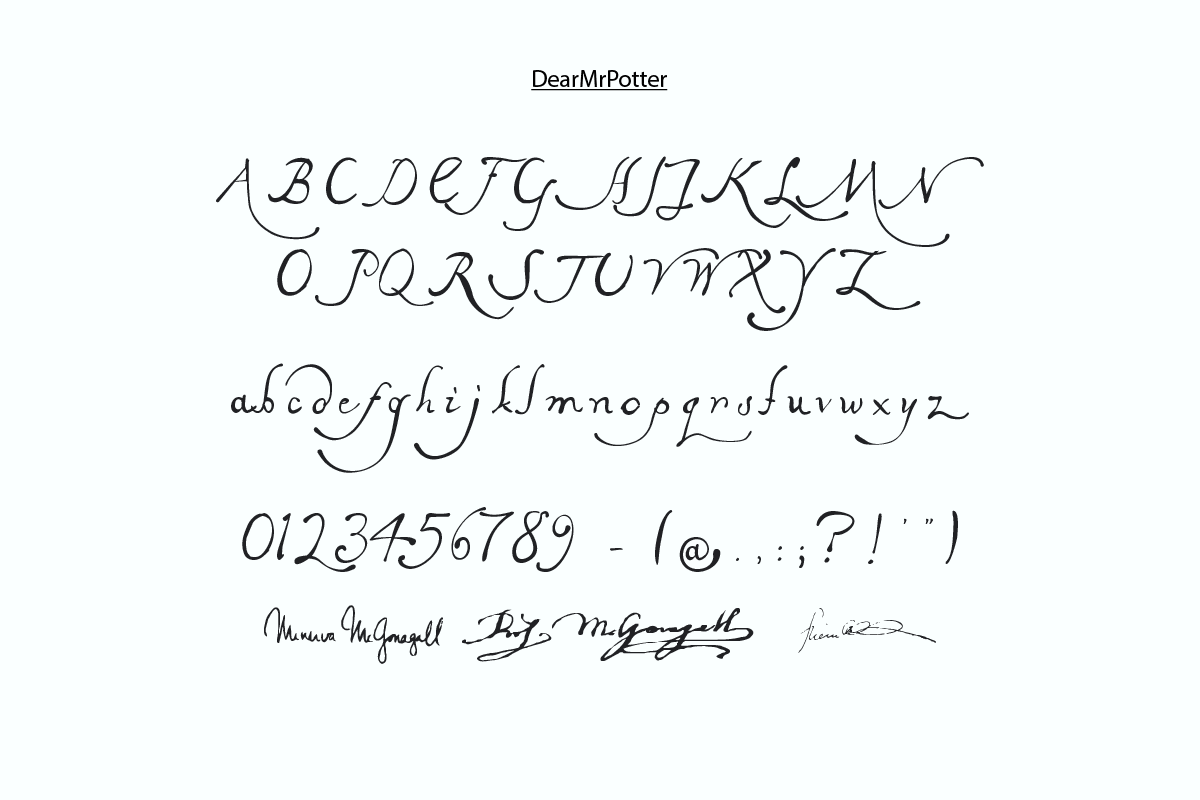
The DearMrPotter font is designed to closely resemble the text style used in the Body section of the Acceptance Letter. It was also created by Robin Springett. For licensing details, please refer to the “Read Me” file.
Keep in mind that if you type the words “mcgonagall” or “Minerva” using the DearMrPotter font, you’ll get a replication of Professor McGonagall’s signature.
3. Lumos
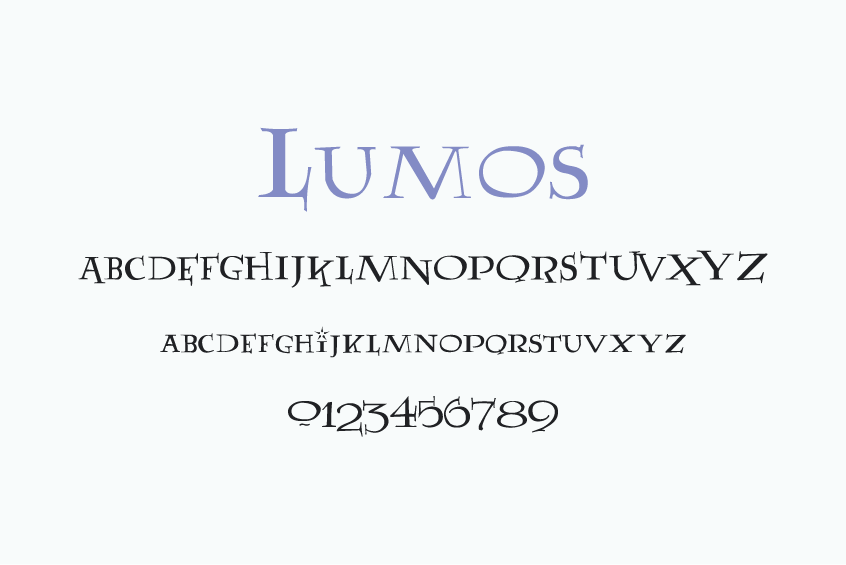
Among the most unforgettable moments in the Harry Potter film series is the instance when Harry Potter masters the art of spell-casting with his wand. The typeface that materializes on screen as he utters incantations such as “Lumos” or “Nox” is aptly named Lumos. This distinctive font was designed by Sarah McFalls in the year 2000, drawing inspiration from the symbols and lettering featured in the chapter headings of the US editions of the Harry Potter novels.
Lumos is generously available for both personal and commercial purposes, free of charge.
4. Magic School
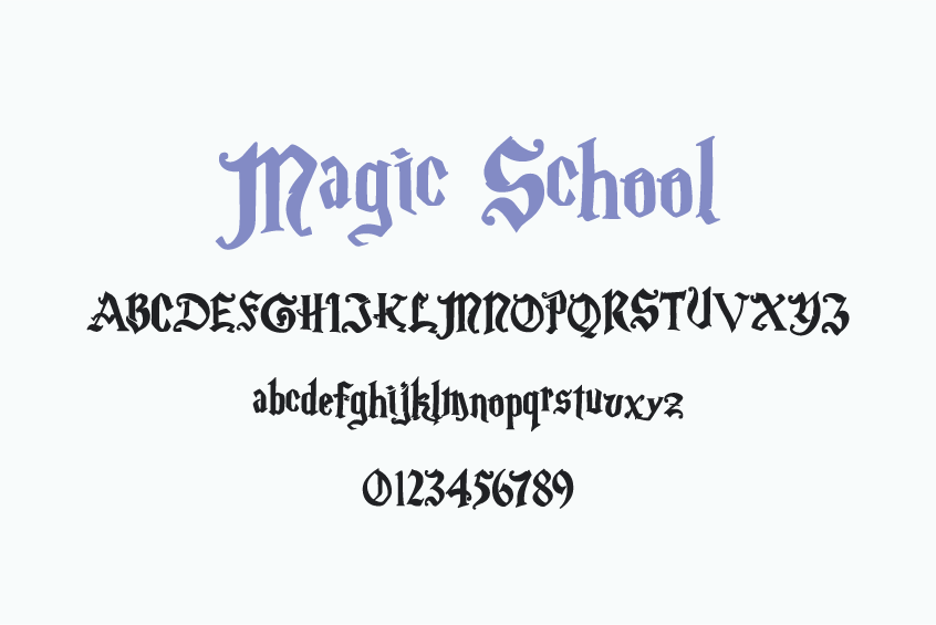
If you have ever been looking for a similar typeface to the one employed in the Hogwarts letterhead, your search ends with Magic School. Developed by FontMesa in 2001, this font draws inspiration from the lettering featured in the film, Harry Potter and the Chamber of Secrets. The typeface exudes a refined and sophisticated appearance, befitting the esteemed wizarding institution.
The font comes in two distinct variations: Magic School One and Magic School Two. The former features more elaborate characters adorned with flourishes and serifs, while the latter presents a simpler, more streamlined design. Each version encompasses uppercase and lowercase letters, numerals, punctuation, symbols, and accented characters.
Magic School is available free of charge for both personal and commercial applications.
5. Hogwarts Wizard
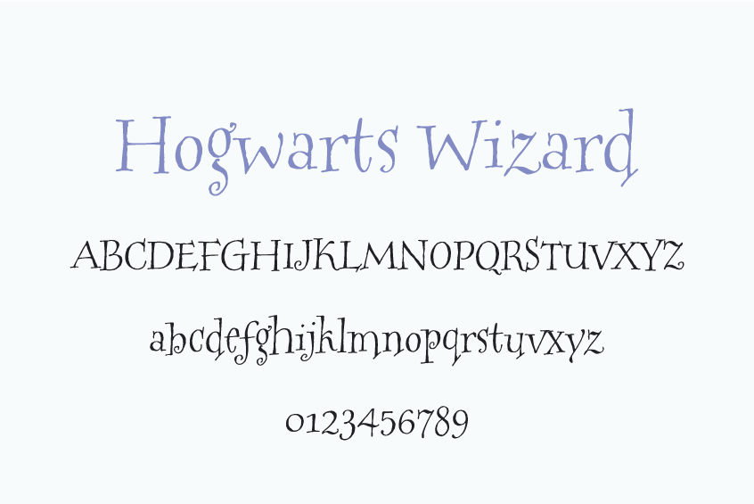
HogwartsWizard was designed by Charles Bud Braman based on style by Connie Smiley, commissioned by Warner Brothers.
There is no licensing information for this font, so we recommend using it for personal projects only.
What Font is Harry Potter Written in?
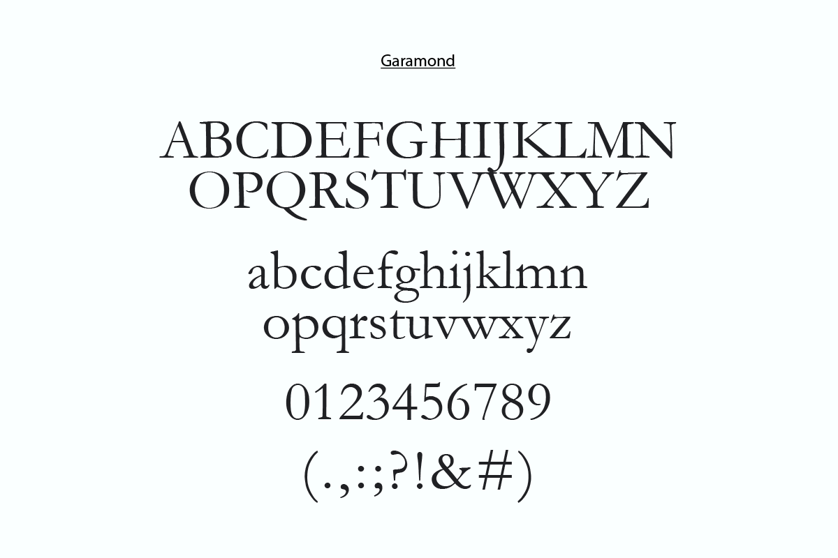
The Harry Potter books are written in a font called “Garamond,” a widely used typeface originally designed by French typedesigner Claude Garamond in the 16th century. Garamond’s elegant and easy-to-read design has graced the pages of numerous books, magazines, and websites, making it a popular choice for authors and designers alike.
The Harry Potter Wanted Poster Font: Caslon Antique
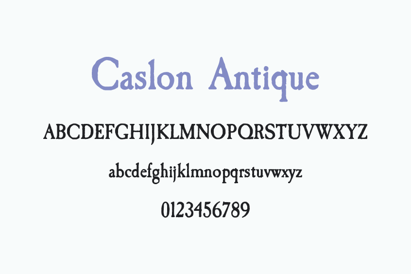
Caslon Antique is the font used for the Sirius Black Wanted Poster from the film “Harry Potter and the Prisoner of Azkaban“. Caslon Antique is a Display Serif font designed by Berne Nadall.
This font is free for personal and commercial use.
The Harry Potter Marauders Map Font
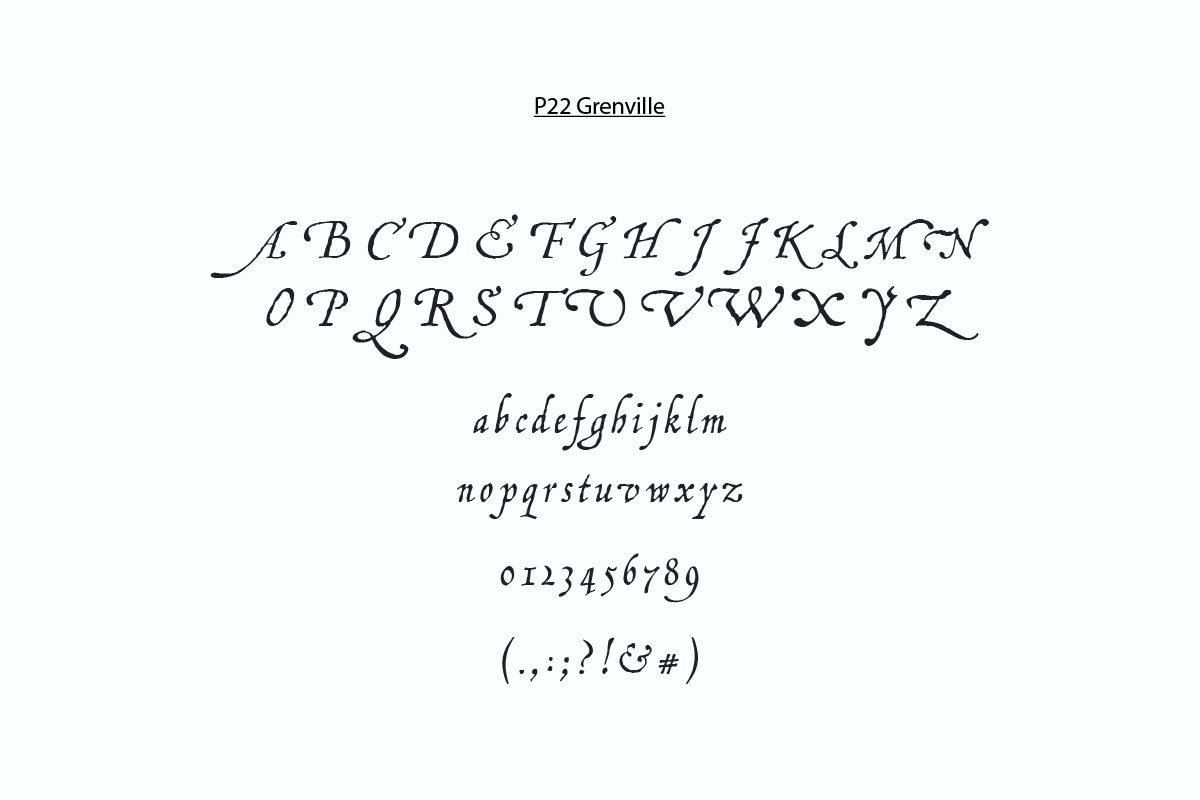
The font utilized for The Marauders Map isn’t a digital one; it’s actually hand-lettered and draws inspiration from the elegant “Chancery Calligraphy” style. If you’re interested in a paid option that closely resembles it, “P22 Grenville” is available for purchase here. It was crafted by Ted Staunton. Unfortunately, we couldn’t locate any free alternatives that quite match its distinct qualities.
The Fantastic Beasts and Where to Find Them Font
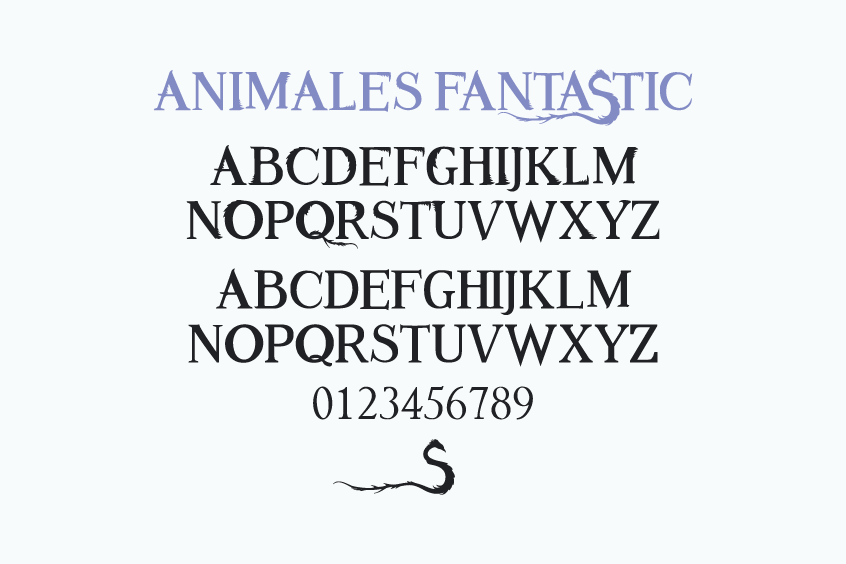
The Animales Fantastic font draws inspiration from the lettering featured in the cinematic adaptation of “Fantastic Beasts and Where to Find Them.” This font embodies a vintage, Art Deco aesthetic that mirrors the 1920s milieu in which the film is set.
The Fantastic Beasts: The Crimes of Grindelwald Font
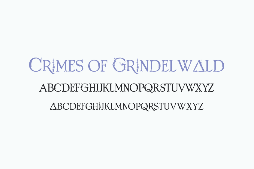
Crimes of Grindelwald is a typeface designed by FZ Fonts and inspired by the logo created for the Fantastic Beasts: The Crimes of Grindelwald movie poster. The typeface includes only capital letters.
Free for personal use only.
Other Harry Potter-inspired Fonts
Parseltongue
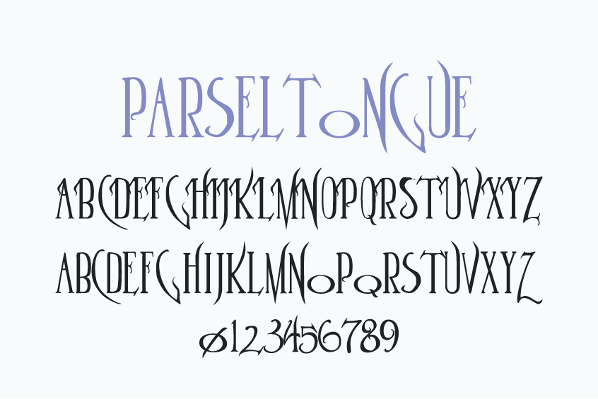
Parseltongue is an original font designed by Sarah McFalls. It was inspired by J.K. Rowling’s Harry Potter books. The serpentine aspects of the font and the font’s title are related to the second book of the series, “The Chamber of Secrets”. This font is best used for display purposes.
It is free for all uses.
Dumbledor
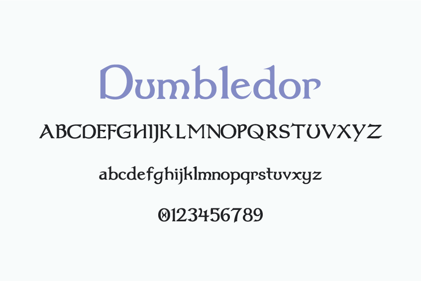
Dumbledor is a family of fonts designed by Graham Meade that has 30 different styles, such as italic, outlined, shadowed, 3D, and cut-up. It is inspired by the Harry Potter fantasy series and has a medieval and wizard-like style.
Dumbledor is free for personal and commercial uses.
A Charming Font
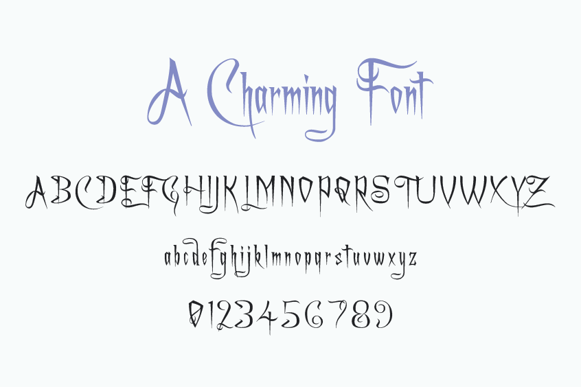
A Charming Font is another creation of Graham Meade. It is also inspired by the Harry Potter fantasy series and has a skewed, tall, and light style. It has six different styles, such as italic, outlined, expanded, and super-expanded.
It’s 100% free.
Conclusion
Harry Potter fonts encompass more than mere characters on paper or digital displays; they represent a crucial component of the visual identity and cultural significance of the Harry Potter franchise. These fonts contribute to crafting an immersive and bewitching ambiance for aficionados and spectators alike.
Should you have any inquiries or observations about the Harry Potter fonts or the topics addressed in this article, we kindly encourage you to share your perspectives in the designated comments section. We sincerely appreciate your active engagement.
Before taking your leave, you may be intrigued to explore additional enthralling resources, which cover themes from Wednesday, The Lord of the Rings, and Star Wars. We hope you enjoy a stimulating design journey!