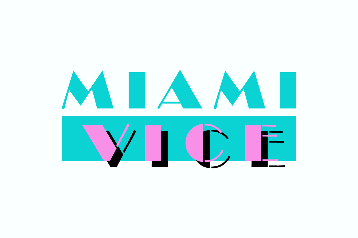
Miami Vice, an iconic American television series that graced our screens between 1984 and 1989, set a new paradigm for television production with its avant-garde approach to narrative, aesthetics, and overall presentation. At the core of its identity, beyond the intriguing dynamics of undercover detectives Sonny Crockett (Don Johnson) and Ricardo Tubbs (Philip Michael Thomas) battling drug lords in Miami’s dark underbelly, was its instantly recognizable visual design. Integral to this visual identity is the question: what is the Miami Vice font used?
The Miami Vice Font Used in the Logo
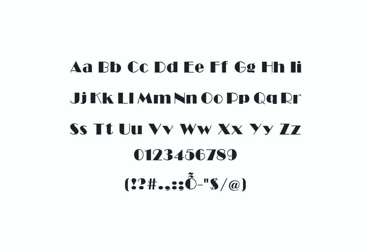
The Miami Vice font name used predominantly for its show title logo draws inspiration from the Broadway Regular, a brainchild of the immensely talented Morris Fuller Benton back in 1928. It exudes sophistication with its flowing serifs and angular shapes. What’s more fascinating about the Miami Vice font is its monospaced characteristic, ensuring each letter occupies the same space width-wise. This quirk lends the font a modern appeal, marrying perfectly with the show’s contemporary style.

For those keen to infuse their designs with the flavor of the 80s, Broadway Regular is commercially available here. Nevertheless, we’ve provided a complimentary version for you. Kindly note that this free version is intended for personal use only.
By the way, don’t miss the cool fonts from ‘Wednesday‘, ‘Guardians of the Galaxy‘, and ‘Black Panther‘. Worth checking out!
Impact and Significance of the Miami Vice Font
The deployment of the retro Miami Vice font in the series isn’t a mere coincidental choice; it’s a conscious embodiment of the epoch’s zeitgeist. This typeface, with its design nuances, mirrors the soul and ethos of Miami during the neon-lit 1980s. For designers aiming to encapsulate a dash of nostalgia or the signature 80s’ panache in their work, this font emerges as an impeccable candidate. Its versatility is further underscored by its availability in four typographic weights – regular, bold, italic, and condensed.
Beyond mere aesthetics, the Miami Vice font exemplifies the synergy between a medium and its typography. The typeface isn’t merely a tool for visual appeal; it’s an emblem, symbolic of the program’s pioneering spirit, excellence, and enduring legacy. Benton’s masterstroke in the form of this typeface not only enhanced Miami Vice’s brand identity but also fortified his standing as a typeface virtuoso with a plethora of exceptional designs to his credit.
Wrapping It Up
In summation, the Miami Vice font transcends its typographic essence to become a cultural artifact, reminiscent of an era and a show that revolutionized television paradigms. It serves as an instrument of expression, an avenue for creative exploration, and a testament to Miami Vice’s indelible mark on television history and 1980s pop culture. With its inherent allure, it beckons to both designers and aficionados, promising to elevate their designs to unprecedented heights. In essence, the Miami Vice font is not just a typeface, but an epoch immortalized in glyphs.
