Hey there, fellow FNaF fan!
Let’s talk about FNaF fonts—those distinct and memorable typefaces that are as crucial to “Five Nights at Freddy’s” as the jump scares and gameplay. Scott Cawthon’s indie horror hit has more to it than just thrills; its design elements, especially the fonts, play a huge role in creating that unforgettable atmosphere.
So, are you ready to dive into the fascinating world of FNaF fonts with me? Let’s explore the fonts used in the FNaF logos, screen titles, and menus and discover how they contribute to the game’s unique vibe and chilling experience.
FNAF 2023 Movie Logo Font
The font used for the 2023 “Five Nights at Freddy’s” movie logo is a modified version of Compacta Bold. If you’re looking for a similar free font, you might want to check out these options:
- Anton (Free for commercial use)
- OPTICompit (Free for personal use)
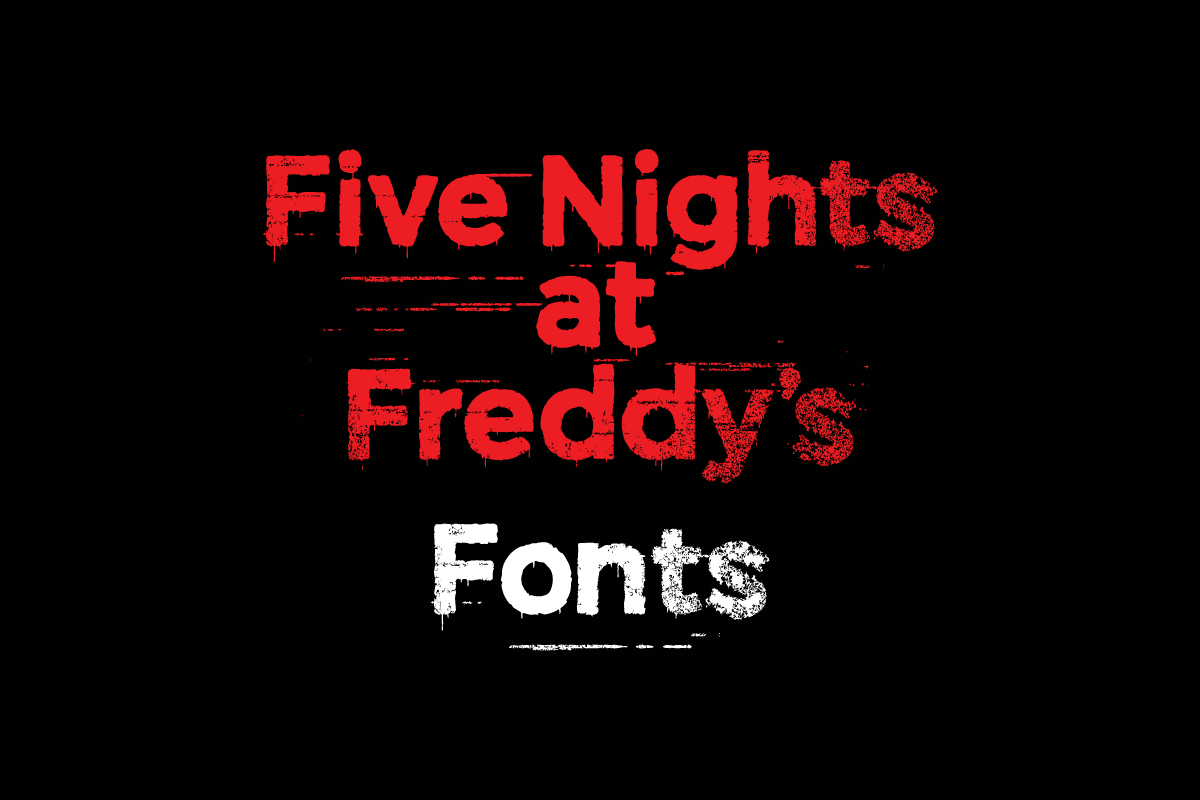
FNAF Logo Font – Five Nights at Freddy’s Main Logo
The FNAF font used in the main logo is a distorted version based on Montserrat Bold. This typeface is known for its clean, geometric design and strong visual impact, making it perfect for titles and headers. It’s a versatile typeface widely used in branding and digital design.
- Distorted Version: Download the logo-inspired version here.
- Clean Version: Download Montserrat for free here.
FNAF 1 Font – Five Nights at Freddy’s 1 Fonts

In Five Nights at Freddy’s 1, a bunch of cool fonts are used that amp up the game’s creepy vibe and retro feel. Let’s break down the different fonts and where you’ll see them in action:
- Consolas – This font is used in the main FNAF 1 title for “Five Nights at Freddy’s,” and menu screens.
- Download: Consolas (often pre-installed with Windows).
- LCD Solidr – This is the font used for the camera labels and text displayed on the “Camera Monitor System” screens.
- Download: LCD Solid (free).
- Courier – Used in newspaper clippings and the “Help Wanted” ad shown at the game’s start.
- Download: Courier on MyFonts.com (commercial license required).
- Free Alternative: Courier Prime – A free and updated version of Courier with similar spacing and style.
- Overmuchr – The font featured in several iconic phrases in the FNAF 1, including:
- “LET’S EAT!!!” on Chica’s bib
- “LET’S PARTY!” on Toy Chica’s bib and the Toy Chica poster
- “LET’S ROCK!” on the Toy Bonnie poster
- “CELEBRATE” on the FNAF 1 Office poster
- Download: Overmuch
- Buxton Sketch – The font used for the “It’s me” hallucinations text.
- Segoe Print – Used for the written text on Paychecks and Pink Slip.
- Constantia – Used for the printed text on Pink Slip.
- Lindsey Regular – Featured in the ending screen.
FNAF 2 Font – Five Nights at Freddy’s 2 Logo Font
The FNAF 2 font used in the logo is Palatino Bold. If you’re seeking a similar free alternative, consider exploring options like:
- Queens Park Bold (100% Free)
- FPL Neu Bold (Free for personal use)
- Tex Gyre Pagella Bold (Free for commercial use)
FNAF 2 Title Screen Font
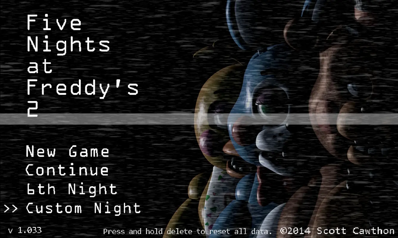
The FNaF 2 font that is known to be used in the title screen menu is OCR A Extended. This monospaced font was originally designed for optical character recognition systems. Its distinct, machine-readable design gives it a technical and mechanical feel, which complements the game’s setting of monitoring security cameras in a pizzeria.
You can also find OCR A Extended within Microsoft installations. If it’s missing, try the free alternative, Stalker. Download Stalker1 Font.
FNAF 3 Font – Five Nights at Freddy’s 3 Fonts

- 5 Computers In Love – This one’s the main font on the title screen menu, night screens, and other stuff.
- Download: 5 Computers In Love (free).
- Palatino Bold – The FNAF 3 font featured in the title screen logo and game icon. (Same as FNAF 2)
- OCR A Extended – This is shown in the Panel and the mute call button.
- MS Mincho – Used for good and bad ending text.
FNAF 4 Font – Five Nights at Freddy’s 4 Fonts

In Five Nights at Freddy’s 4 (FNaF 4), several fonts were chosen specifically to convey the eerie, unsettling theme of the game across different elements. Here’s a detailed breakdown of each FNaF 4 font and where it appears:
- Narkisim – Primarily used for the “4” in the FNaF 4 game icon and promotional materials. Also for the demo ending text “To be continued in the full version…”.
- Castellar – A modified version of Castellar font used for significant titles and headings, particularly in menus, volume adjustment, and sticky key warnings.
- Times New Roman – The font featured in Five Nights at Freddy’s 4 for the iconic yellow text appears during dialogue scenes in minigames.
- Book Antiqua – Primarily used in the game’s text boxes and narrative elements.
- Berlin Sans Regular – Used for the word “WARNING.”
- Edwardian Script ITC – Used for the night transition screens, such as “Night 8,” and other dramatic moments.
- Quartz MS – The font used for the clock or time display in Five Nights at Freddy’s 4.
FNAF Sister Location Font – Five Nights at Freddy’s: SL Fonts

- Candara – This is the font used for the FNAF Sister Location Teaser.
- Consolas – The font used for the menu.
- Arial Narrow – Similar to the font used for the game title “SISTER LOCATION” shown on the title screen.
The Font Used in the FNAF World Logo
- Berlin Sans FB Demi Bold – The font used for the Five Nights at Freddy’s World logo.
- Segoe UI Bold – The font used for Attack Command Buttons.
- Verdana – The font used for Dialogue Boxes and Loading Screens.
- LCD Solid – The font used Old Man Consequences (OMC) Text and others.
- Arial Bold – The font used for the Party Setup Screen.
- Times New Roman Bold – The font used for Enemy Name Tags.
The FNAF Twisted Ones Fonts Used in the Poster
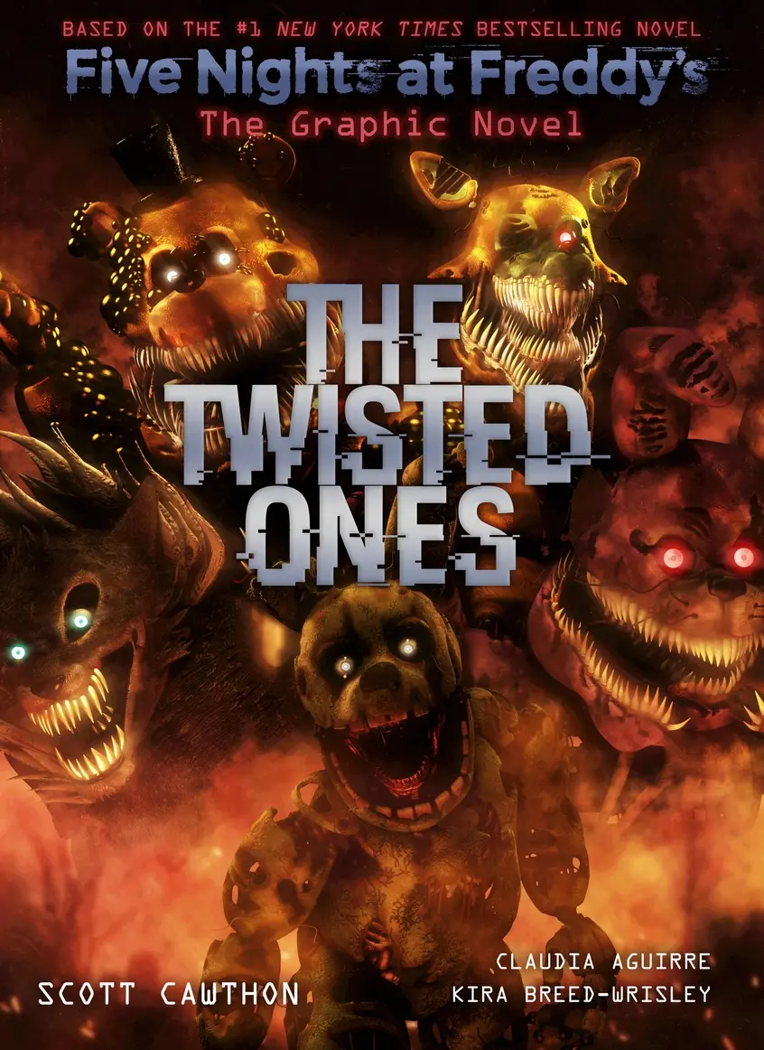
The poster for “FNaF: The Twisted Ones” uses:
- Hacked: A glitchy, distorted font perfect for the game’s darker themes. Download Hacked here.
- Stalker: Used for the small title, this font adds an extra layer of intrigue. Get Stalker here.
The FNAF Security Breach Font Used
The Five Nights at Freddy’s: Security Breach font uses a customized version of Orbitron Bold with a neon effect. Orbitron is a geometric sans-serif typeface with a futuristic design. The neon effect added for Security Breach gives it a vibrant, electric feel, in line with the game’s high-tech setting.
I hope this font guide gave you a cool glimpse into the Five Nights at Freddy’s series style!